Home › Forums › Sign Making Discussions › Graphic Design Help › help needed please with my business card layout?
-
help needed please with my business card layout?
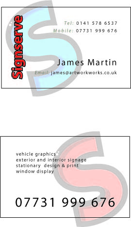
Posted by James Martin on 23 May 2007 at 14:25I’m at the burn out stage trying to make my mind up about this.
Any constructive would be very welcome.
Attachments:
 David Rogers replied 18 years, 2 months ago 11 Members · 25 Replies
 -
25 Replies
-

dont have time to give anything constructive at the moment but prefer the top one. 😀
-

The only thing I don’t like is the black outline around the red text on the business name. That combination always looks messy. Perhaps you could separate them with a thin white line.
-

James, if you are going to list your services on the back of the card I would increase the number of services to take in more of what you can provide for your customers. It’s not like a van where the idea is to keep things brief, on the back of a business card I always thing there is room to cover most of what you can do.
-

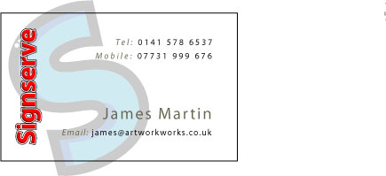
Sorry James but I like Karl’s option much better.
Your design is nice but too subtle, it seems to lack the WOW factor a bit. although like I said is "Nice" almost pretty :lol1:
sorry
Warren
-

Karl, which software did you use to produce them?
I like Karl’s first one.Glen
-

Sorry to hijack the thread, but for some reason I can’t post a new topic or edit my posts. Just thought I’d pop this on! The banner above me shop! 😀
-

The only thing I would change is the red text.
As has been stated, the black outline doesn’t help it.
Even the white pinline doesn’t.
I would solve this by simply making the text in black.
Love….Jill -

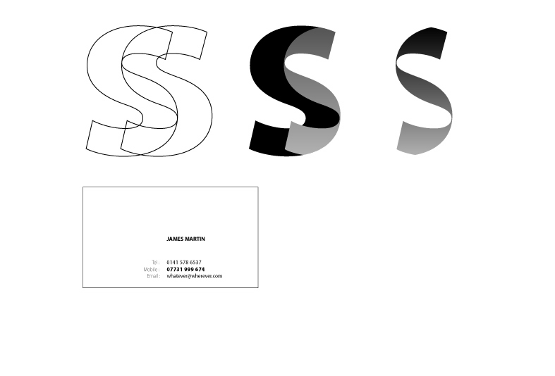
I would make sure you were 100% sure about your name and the way it looks…..
I would work on a logo or the way the name works and then the other type……..don’t have time but that’s the way I would go about it.
Cheers
Attachments:
-
Hi Andrew,
Can you explain your idea mate. Sorry for sounding dumb. 😳 -
No problem Karl 😀
I like what you have done and I really think it works, however I like to suggest alternatives because I still believe in creating something that was constructed out of maybe 2 spot colours, because it allows it to be used cost effectively in a variety of applications…….[not so much these days!]
So I have always gone down the route of creating a logo / logotype and then working on placing that logo and then dealing with the other text and keeping it consistant……
however it usually looks corporate and not always appropriate but I still like to suggest it……antiquated or correct I’m not sure?
Cheers
-
I see where you’re coming from Andrew. I like to use full colour in all the work I do which is why I came up with these. Glad you like them 😉
-

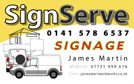
Thanks everyone all these points mentioned are valid.
Tks karl for that first card especially (it makes me look as big as tesco!)and the follow up call earlier on tonight. I will get back to you personally.
To late for much else tonight but tks for now.
-
TESCO
2 colour
vector
it’s all the other brand stuff that goes with the basic logo….and always used basic……….but the 1st one does have a big company feel and gives the impression you could do quality work………..
jeez is that the time!
😀 😀 :
Attachments:

-
Boy you must have been excited after the call to log on at this time of night. I’m pleased you like it. Give us a call, if I can help I will. 😉
-
digging this one up again.
I’ve had a leaflet along these lines working for me for a while but still haven’t got the card done, and I don’t like to leave this thread unfinished.
Anyone any thoughts?
Attachments:
-

First thing I thought was "joiner / builder". Maybe it a combination of the colour scheme – the ‘white vans’ and the house in the background.
OK, it says signs in text all over it…but I’m not ‘seeing’ signs / designs.
Maybe it’s just me…
Out of them all – Karl’s first one has the most appeal to me. Just it’s simplicity – nice & to the point.
Dave

Log in to reply.