Home › Forums › Sign Making Discussions › Graphic Design Help › help needed please on layout for own shop?
-
help needed please on layout for own shop?
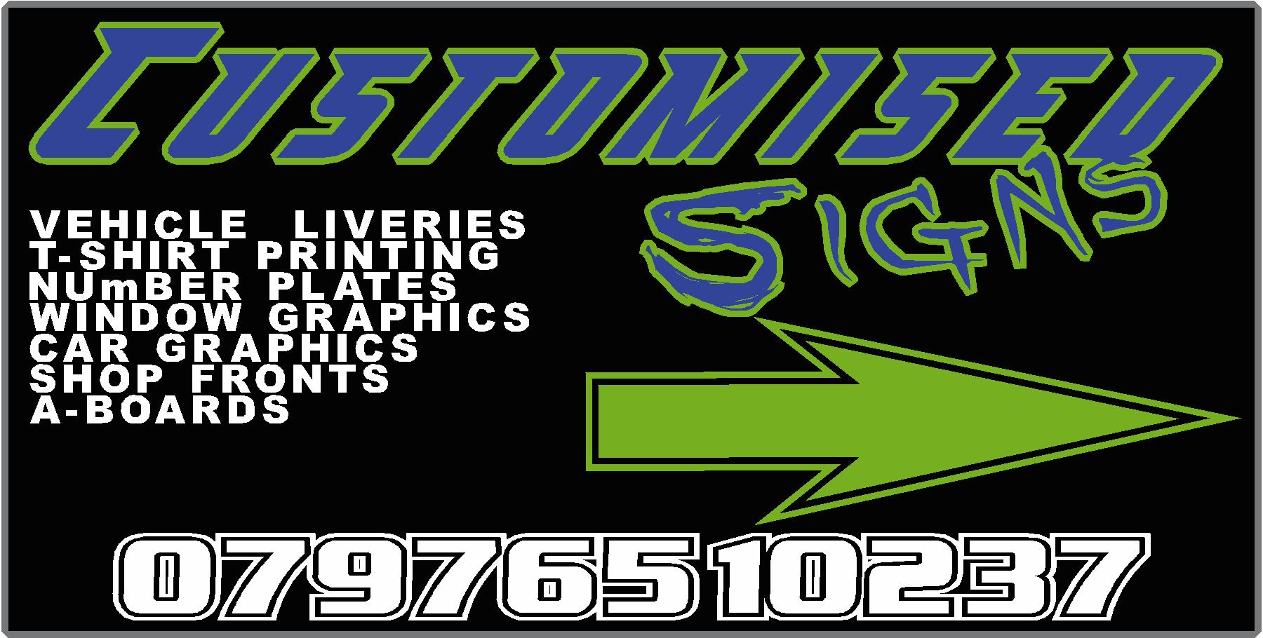
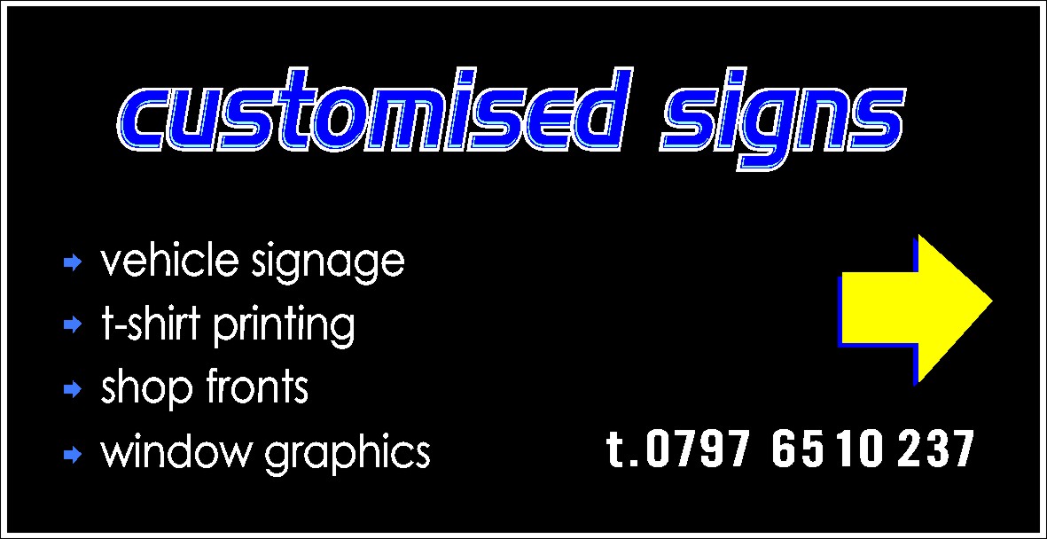
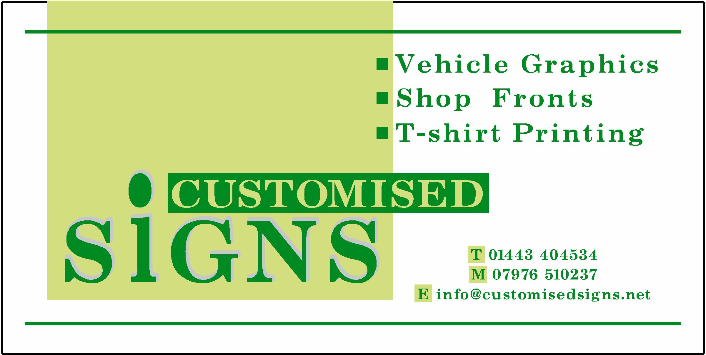
Posted by Scott.Evans on 12 September 2007 at 07:36here is my design layout.
its 8 ft by 4 ft, its going on a wall directing customers to the my sign writing shop.
i really would like it to be eye catching and my design aint really that!would like to keep the same fonts with "customised signs"
fonts
abberancy
angryblueiam also buyin a roland vp 54 in a few weeks so i could print the design.
but as for now it will have to just be vinyl.
Attachments:
 Steve Sandy replied 18 years, 3 months ago 28 Members · 73 Replies
 -
73 Replies
-

Increase the margin space all around your sign. Bigger lettering doesn’t mean more impact – the margin space framing the lettering is even more important than letter size.
Change the dark blue lettering that is outlined in green to a brighter colour such as Yellow to make it stand out as the main message.
The white lettering off to the left needs to be spaced out properly (each line is almost touching the line above – again no margins).
Change the arrow to a solid arrow without the outline and adjust it’s proportions so the the arrow is longer and thinner.
Just try these suggestions and I’m sure the sign will look much better.
Buy Mike Stevens book – "Mastering Layout" – for a deeper understanding of layout.
Good luck 😀
-
 quote David Glen:Sorry but that is just a mess and breaks every rule in the book.
Layout is non existent and the design smacks of “I’ve just bought some new design software and I’m going to use every feature”!
1/10 for having the guts to post it.
Only my 1st impression – nothing personal.
Not very constructive there mate. I think if you are going to give comments like that at least give the user some advice he can use.
If you have the time why not post up a quick visual and try pointing out where Scott has gone wrong.We all have to start somewhere.
also, nothing personal, just my opinion.
Andy
-
 quote David Glen:1/10 for having the guts to post it.
what kind of comment is that?
Any chance you might give him an insight into your thinking or are you just going to slate him & leave it at that?
-

Lots of custom fonts for a start…
get used to using basics like Arial / Futura and things like that.. mostly come with Corel draw, dont use fonts downloaded from DA Font or alike unless it is the title. -
just seen ur second post… looks better… but don’t stretch text, only scale!
-

Sorry to be harsh but if you start up in business then a basic concept or natural talent is required right at the start.
Both seem lacking and large format printer won’t fix it.
We all get mental blocks and look for inspiration on occasion but you seem to be going down the common route of overblown graphics.
Also, use a spellchecker – what’s a "Vichel"?
Phill has given you some good pointers.
Just start afresh with basic text and layout then work from that.
Just keep jazzy with a single part if need be, the name ideally, the rest is information. -

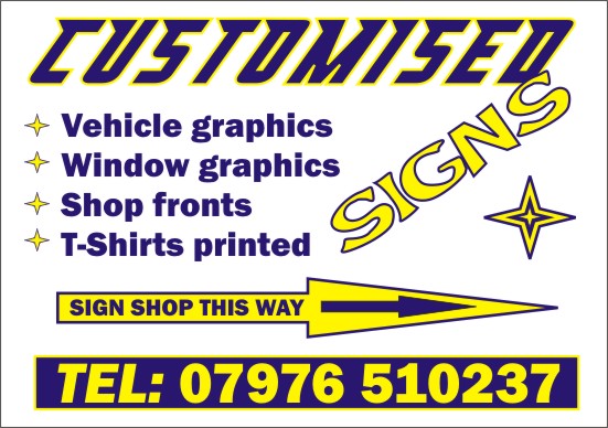
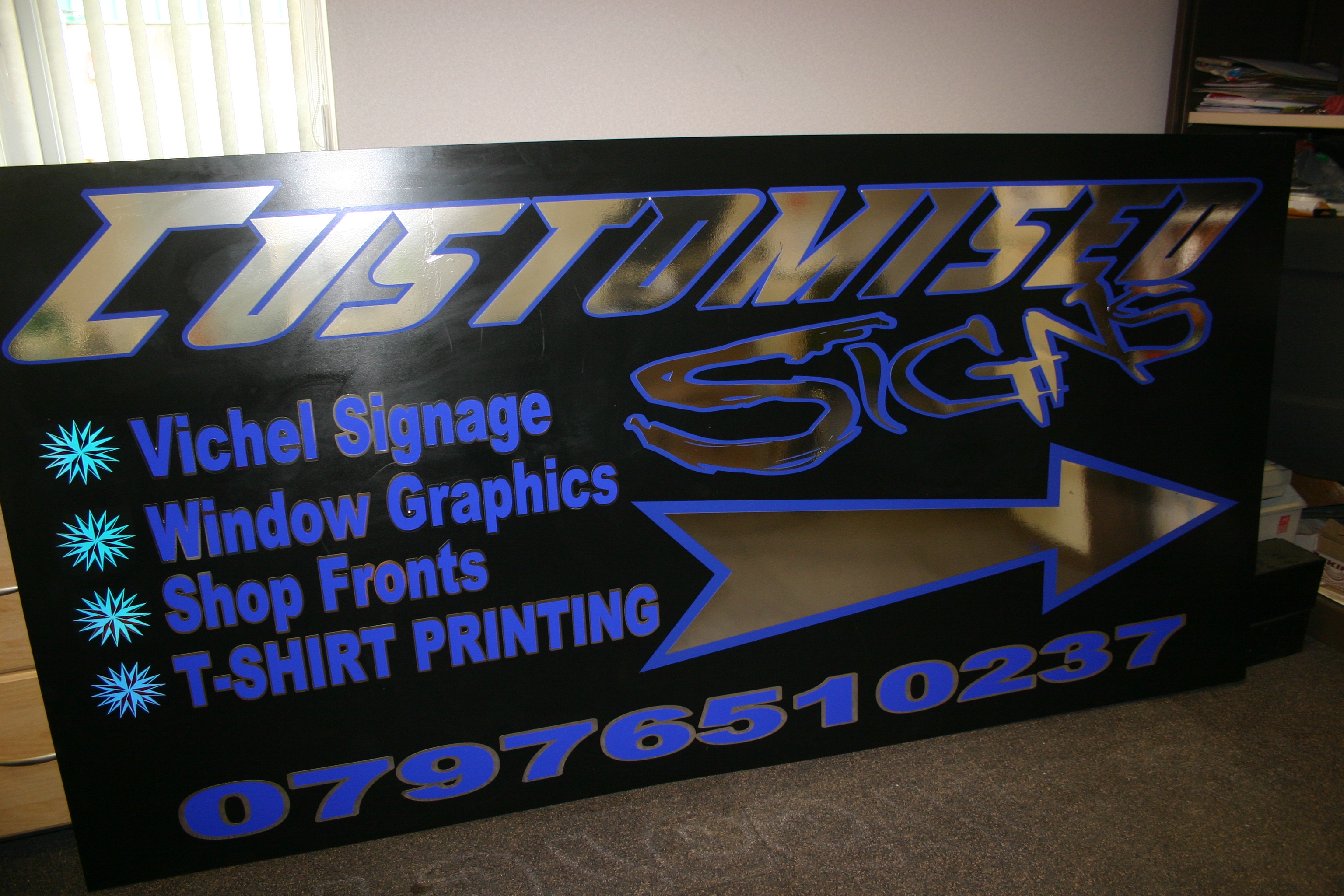
Scott your previous sign has the word vehicle spelt wrong, and why is the words T-SHIRTS all in caps as opposed to the rest of the list.
I must admit it looks much better than your latest attempt, and as said by other members you need to use space better.
We all have to start somewhere and this is a great place to learn.Peter
-

Morning Scott,
Not the most knowlegable guy here as a newby 1 years old. Tried to use Phils advise on the layout for you to look at. It is always harder doing your own stuff and somtimes you can go too mad I know that. Simple and readable is the best advice I have had on these boards so far. The colours can be changed to suit your needs and the sign font is not the one you had, I dont have it. But it just shows what the spacing can do to change a layout.Hope it helps you a bit, Good luck mate.
Regards
Steve
Attachments:
-
 quote David Glen:Sorry to be harsh but if you start up in business then a basic concept or natural talent is required right at the start.
Both seem lacking and large format printer won’t fix it.Got to agree with that. Not aimed at you at all. If I have the time later I will try and post a design for you. Try and get Mike Stevens book (search, sorry) about layout.
I would only call someone a Signwriter if they actually used paint and brushes, a Signmaker for everyone else.
(:)
-

It may sound mean, but I agree with everything David says.
I don’t think he intended to be harsh, just honest….and he’s right.The best thing you can do for yourself, kiddo, is to buy Mike Stevens’ Mastering Layout, followed by Dan Antonelli’s logo design books, available through Signcraft magazine, to which you should subscribe.
https://www.signcraft.com/secure/cart/items.asp?cat=7What makes a good design pop is not fancy fonts or chrome. You need to learn the basic bones of a layout, not to distort things so much (like the arrow) learn which fonts work well together, and to give your lettering breathing room on a sign (called negative space) …and to use Spellcheck.
🙂
We all started out somewhere. You can be anything you choose to be, you have the luxury of being young. Learn to blow away the competition with killer designs. By the time you’re as old as me maybe you’ll be writing your own book.Love…..Jill
-
 quote David Glen:Sorry but that is just a mess and breaks every rule in the book.
Layout is non existent and the design smacks of “I’ve just bought some new design software and I’m going to use every feature”!
1/10 for having the guts to post it.
Only my 1st impression – nothing personal.
Actually knowing your own signs were bad I would give you 10/10 for posting.
I have just drifted into vinyl cutting, and am now watching all of the posts regarding design, layout etc.
Even with engraving layout, KISS rules……Keep It Simple Stupid
Keep the number of fonts to an absolute minimum and remember open space can generate more visual impact than trying to cram in information.
-
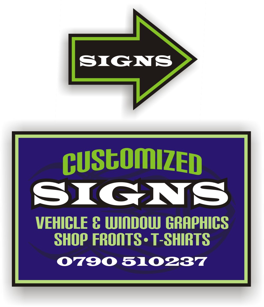
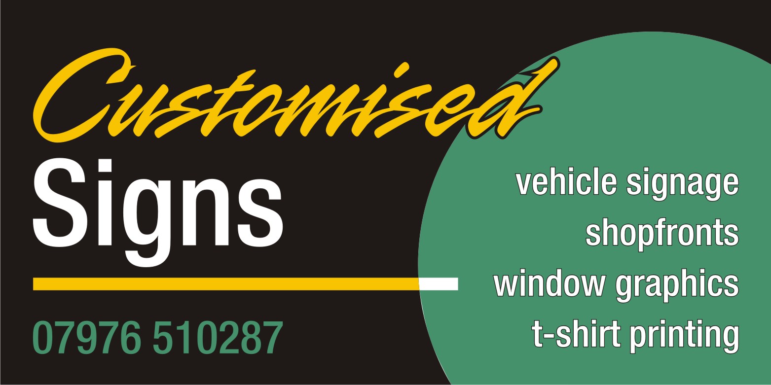
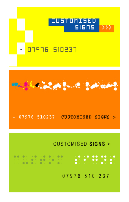
Here is a suggestion. I tried to keep it youthful and trendy, using regular Windows fonts, nothing custom.
We spell "Customized" differently here.
Is the arrow absolutely necessary? Because it could be made as a separate sign.
What I tried to highlight was SIGNS, the other info is just secondary.
Notice I never put "Tel" by a phone number, just like in your layout. It just adds clutter.
If you highlight every element, nothing stands out.
Just got Corel 12 and am fumbling along, but all the stuff I use when I design was learned in the Mike Stevens book and by looking at other signs/logos I liked in magazines and at Letterhead meets.
Thanks for posting….we are here to help.
Love….Jill
Attachments:
-

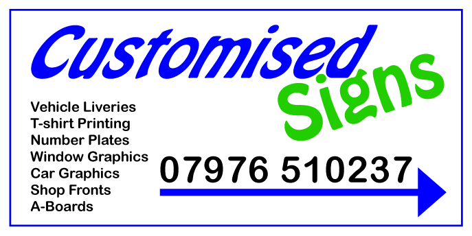
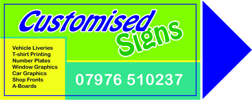
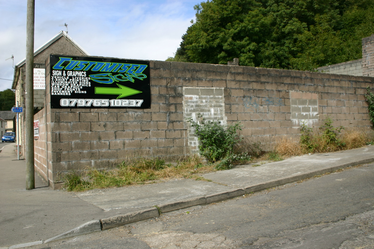
i did amend that before i erected the sign.
ill post a pic of the sign i have up nowive posted it on here to make it better.
iam working on the layout know needs a bit of work i can see :lol1:
here is a sign i made yesterday
whats your thoughts on this one??you re help on this site is great and i will have a top class looking sign by the end of the week>
Attachments:
-
What I have tried to show is, rather than a suggestion as such, is taking the basics that you have used… a title, bullet points, an arrow & a phone number…Is how it is much easier to read if you don’t "fill" the sign with text
Attachments:
-
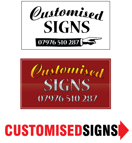
WHAT YOU THINK
NOT SURE ON THE FONTSI THINK ITS SIMPLE
WANT TO ADD THE WORD GRAPHICS IN.JILL I LIKE YOU RE DESIGN BUT LOOKS A BIT OLD FASHIONED
Attachments:

-

I would search for a font called Sandoval speed, its similar to your title font in the way it leans to the right, but it is more classy looking.
Also using the silver chrome idea, is the sign direct sunlight at certain times of the day, or most of it reason being is that being as well as not lasting very long outdoors, it can also be really hard to read if its dazzling people, placement can be an issue with the mirror films.Out of interest Jill is there a reason on your sign the T is in lower case as opposed to the rest of the letters, or is it just the font?
-

Scott, that’s still not right. Is the arrow essential?? Also, always break up the telephone number rather than run it altogether, eg 07770 123456. Makes it easier to read.
If I have time I will give another suggestion on layout too. 😉Steve is spot on about the chrome, it will not read well in certain lights. Don’t worry about being flashy ………….. try for a more classy/respectable/dependable look.
-
..and here I thought it was a classic look, not old fashioned!
I guess kids here go for the more old-skool approach.
😮
That was just the font, I typed the word in caps and L/C, the rest is the same font but all-caps. It’s some Windows font on my new PC.I’m sorry, kiddo, but that last attempt is even more difficult to read than your first. The outlines add confusion and the arrow is still distorted looking.
Do yourself a favor and order those books I suggested, they are far cheaper than a printer.On the other sign you posted notice how the copy runs to the edges.
You need to give your lettering more breathing room.
Love…..Jill -
Sorry Scott I dont like the new one you just posted. I prefer the Black and silver. You had what you did as a business on there for new customers but the arrow just needed changing. Looking at the new one I would drive by and think "Oh thats a thick arrow" and keep on driving. Keep playing with the original and scale things down a bit, Lengthen the arrow and keep the font changes to a minimum.
The building contractor one looks real good. Its spaced well and the Logo really works well. I said before its so hard to do your own, My thread on here for my logo had about 50+ replies, with the help on here I got there in the end and have just stripped my old stuff off the van today and will be doing the new stuff Friday.
Good luck mate and keep at it.
Steve -

You’d do well to heed Jills advice on design and layout. I would agree you need to give the lettering room to breathe. Get Mike Stevens book, it’ll teach you loads about the art of good design and layout. It gives you formulas examples and great ideas.
Don’t rely on the font you choose being the main design element but in choosing them make sure they compliment each other.
Another good book is Colour Harmony.
If I were you I’d forget the printer until you have a bit more experience, "don’t run before you can walk"
You’ll get there but it doesn’t happen overnight, I’ve been at it for 24 years and still learning.
Neil
-

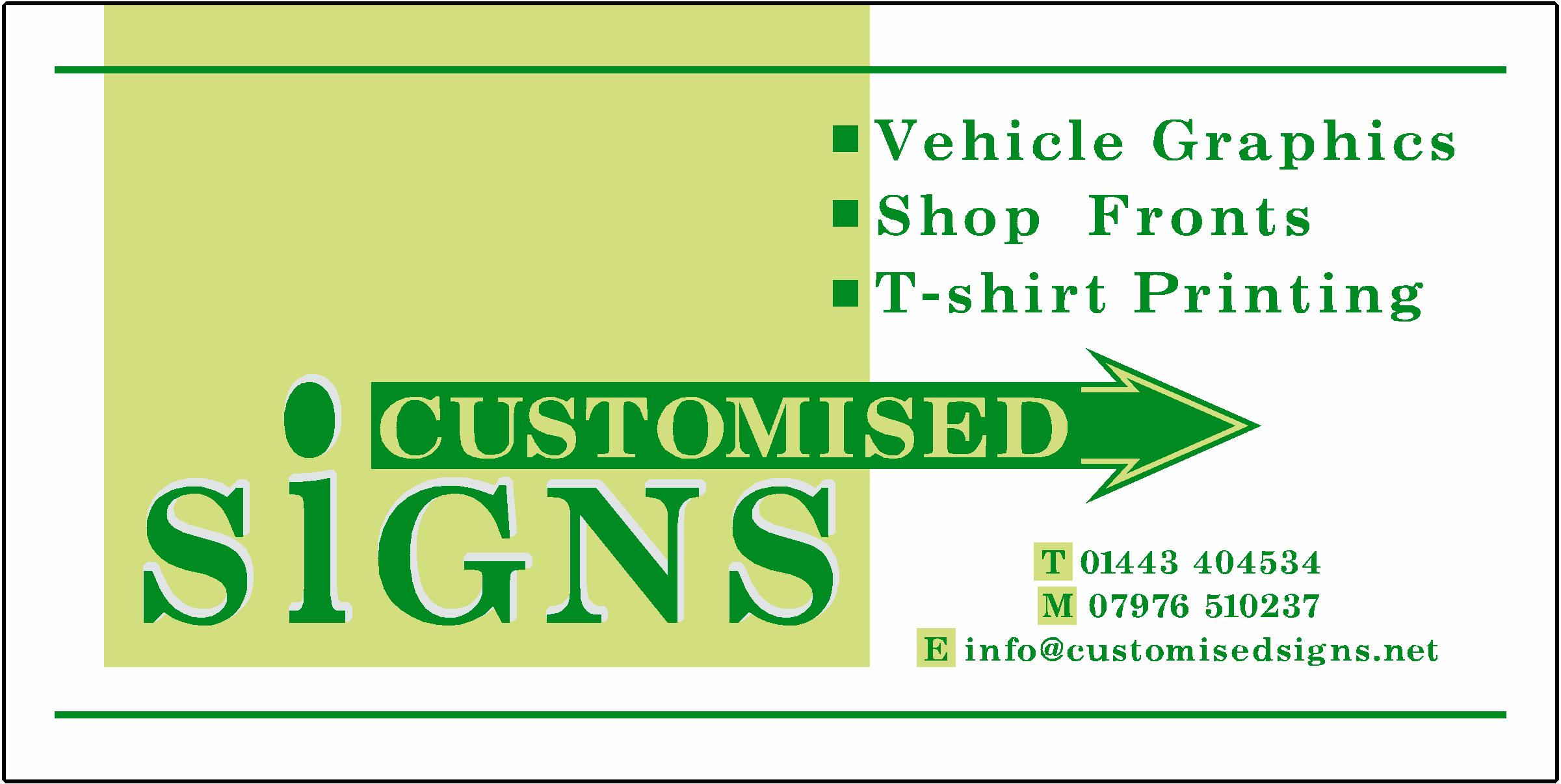
Hi Scott
Here is a quick one I did to try help, I kept it simple and with an arrow as it seems like that is what you want to go for (nothing wrong with that) I know how hard it is to change to a completely new design after you came up with one, it’s like your brain gets stuck on that one way track 😕 That’s what makes designers who they are, being able to design many very different ideas until they find the right one for the customer and one he likes.
You don’t have to be a designer to be a sign maker but you do need some basics to lean on. I am a newbie also but have both the Mike Stevens, mastering layout book as well as the Bill Stewart, signwork book.
You can use different fonts but don’t use more than 2 and make sure they are easy to read.
You will get there if you want it badly enough.
cheers
Warren
Attachments:
-

Well my first ever design – hey i don’t ever produce the things yet – so be gentle on me 😳
I took the posters original design and tweaked it…
look any good ? (simple B&W)

-
hey Marcella – fancy design – but get the phone number correct ! :lol1: :lol1:
-
quote Frank_Galloway:hey Marcella – fancy design – but get the phone number correct ! :lol1: :lol1:
:lol1: There is a good pointer for Scott – I COULDN’T READ THAT BAD FONT!!!!!!!!!!!!!!! 😮 :lol1:
-
quote Jillbeans:..and here I thought it was a classic look, not old fashioned!
Love…..Jillyours is a classic look Jill ………… I was referring to his layout. :lol1: :lol1: :lol1: :lol1: :lol1: :lol1:
-
quote Marcella:just an idea.
Like it, good clean and simple……………
-
very AFW Andrew 😉 at least you got all the correct info! 😀
-

Hi Scott
you’ve had some good advice posted up by the other members. . check out the books mentioned. . also try and notice good layout when you see it. . other signs, magazines, flyers etc. . ..
Also. . ( and don’t take this the wrong way ) have a look if any of the local colleges do evening classes in basic graphic design & layout, this might be money better spent than going of a WRAP course.
If you are already up and running your business, look carefully at the sort of work you are doing is a 20 grand printer going to earn your money or be an expensive piece of furniture ( basically do you have enough work for it ! )Don’t stress too much about the spelling mistakes, we’ve all done it. . . just try to double check everything and if your still not sure get someone else to proof read for you. . . ( I remember being over the moon when my new business cards arrived. . . until I realised I’d made a typo. . and ended up binning all 5000 of them ! )
Attachments:
-
Marcella, I wasn’t meaning you about the "classic" thing.
Here is another suggestion, kinda hip-hoppy. It’s rather busy.
Just wasting time while my pasta cooks.
Love….Jill
Attachments:
-
hey grate lots of new designs more ideas for me.
iam taking all your advice in.yes the sign dose get a lot of sunlight. and that’s why Ive changed it once all ready. ive also gone from using foamboard to dibond
Marcella i like your design the way you have that circle on it.
jill ive seen many of your designs on the boards and they are very good, your second design looks better i think.
i like that chris makes you think hours of work has gone into it but would have to be printed future design.
dave the hand could be another option.
i will have to post some more of my work because its not all this bad. when it comes to my company sign me mind goes on walkies.
i will post design 3 tomorrow
-
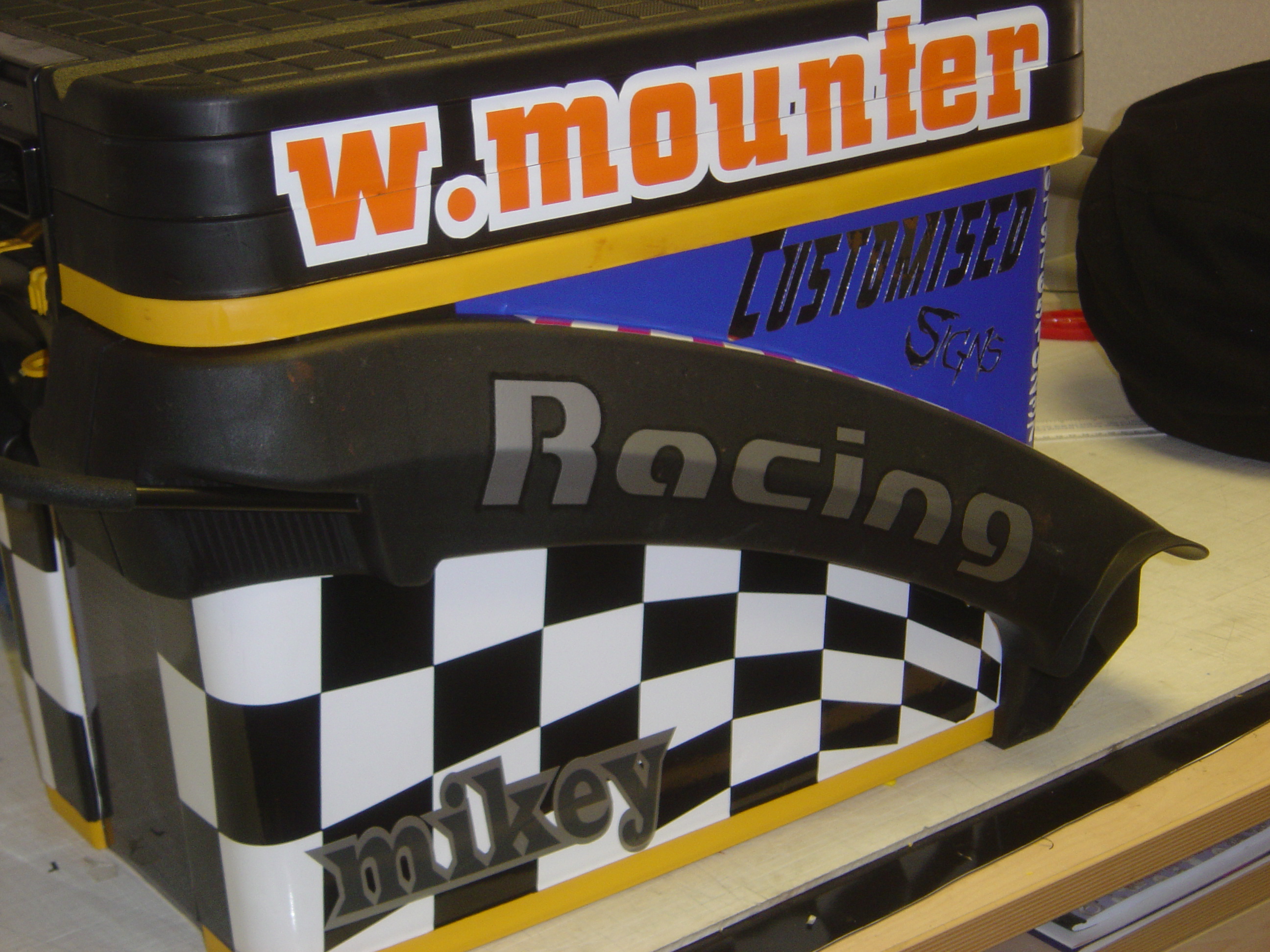
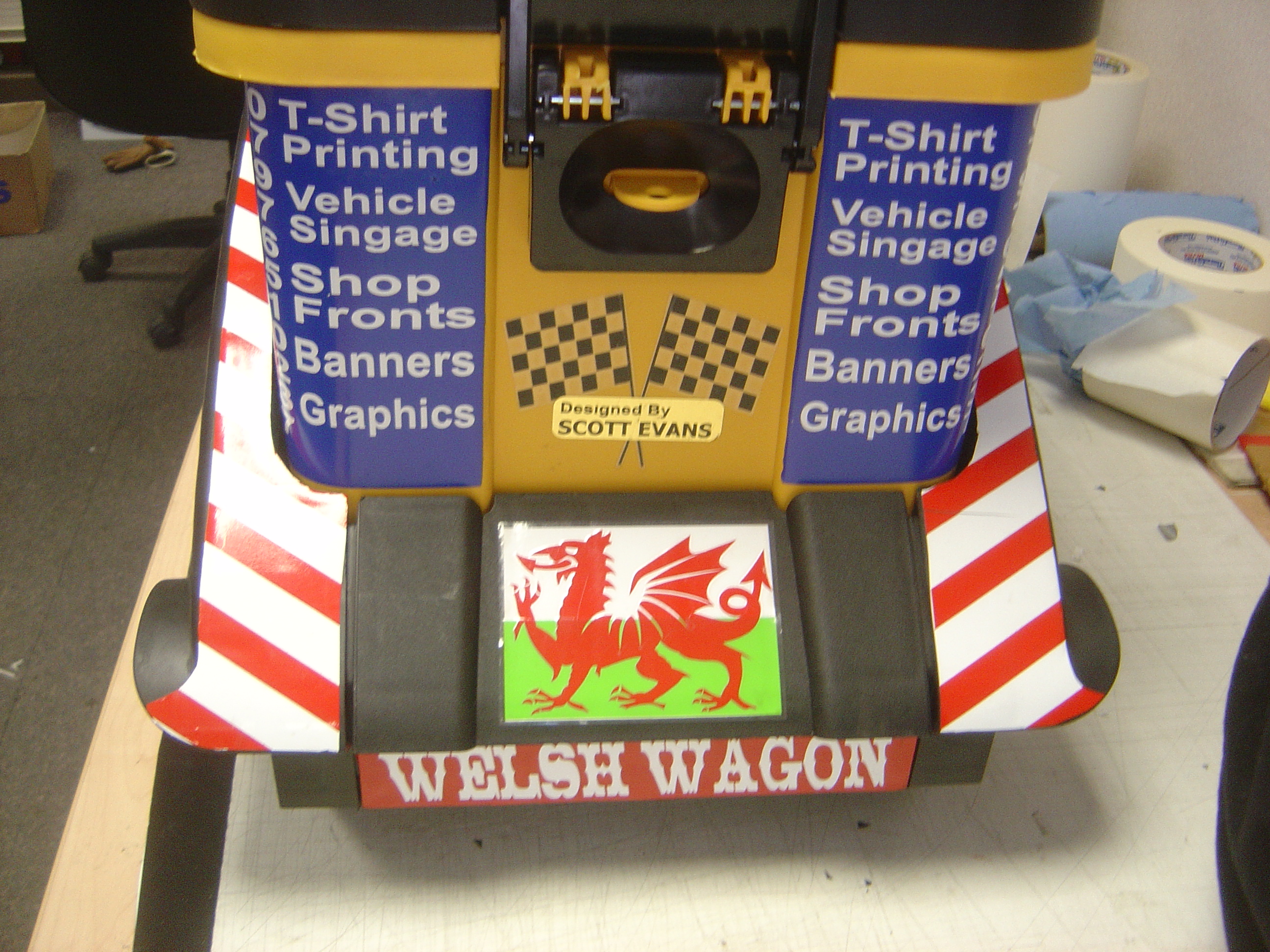
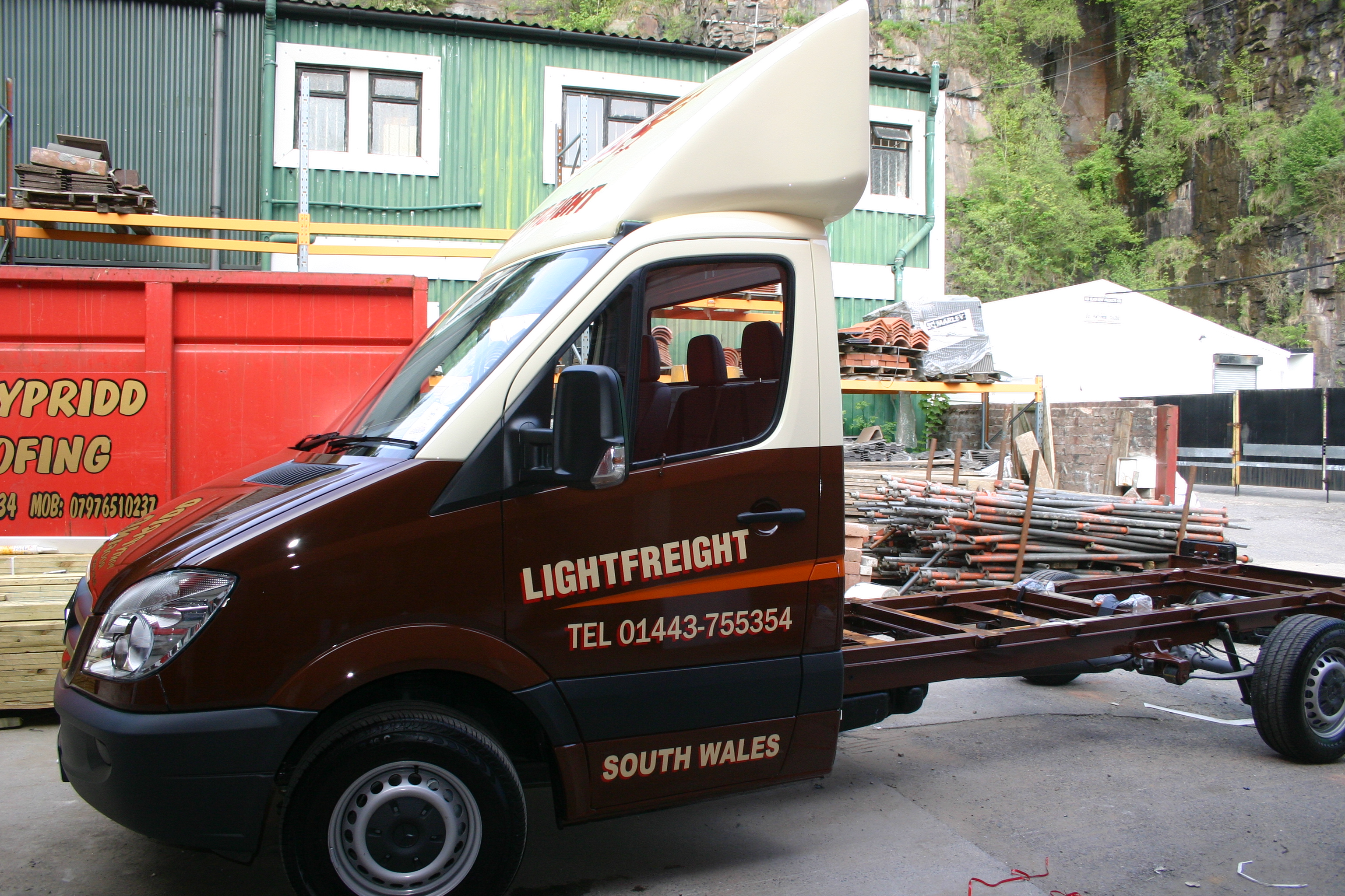
this is today’s work. (lightfreight van)
the toolbox is what I’ve done in my spare time
and the toolbox was all yellow Carnot wait to start wrapping
:lol1:ill have a good go at my sign tomorrow lets hope i get somewhere !!
Attachments:

-

I’m going to add myself to the list of people who are urging you to get Mike Stevens’s book. Buy it, read it and then read it again. Then spend your time applying the principles it shows, even if just for practice.
Don’t make the mistake of thinking that fancy typefaces and effects make a nice looking sign. Intelligent layout and correct font choice are the way to go. Jill’s first example, shown above, is text-book good layout, as are many of the other examples people have posted.
-
Marcella’s does it for me.
An education in layout and design.
-
quote scott evans_21:i really would like it to be eye catching and my design aint really that!
iam also buyin a roland vp 54 in a few weeks so i could print the design.
but as for now it will have to just be vinyl.Scott, think seriously about the printer mate!
Neil
-
To be honest the name ‘Customised Signs’ is suited more to Jill’s interpretations as they have a ‘custom’ look about them.
-
I agree with Marcella, your business name is ‘Customised Signs’ so your own sign should reflect that.
Jill’s layouts are awesome especially the first one.
By the way Scott, check your spelling on your tool box.
-

Been holding back a wee bit, as it’s all been said already in one way or another about layout, font choice, colour scheme.
We all have to start somewhere, and if layouts don’t come naturally then not seeing what’s ‘wrong’ can result in just ‘OK’ or even decidedly dodgy signs rather than something you’ll gladly say "I did that!" to everybody that sees it.
A good layout will attract MORE business as the customer is happy – and his mates will soon be round getting their vans done. Having a portfolio of ‘classic’ layouts ranging from the simple to the ultra fancy is a selling point, and you can always ‘raid’ previous designs for ideas!
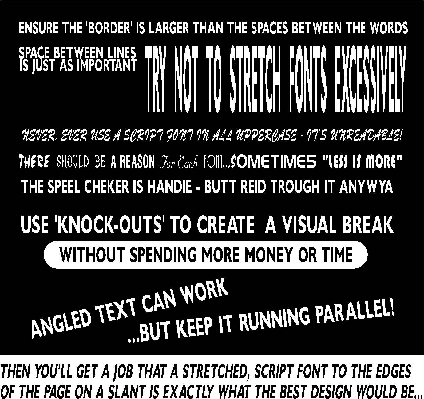
Gareth the guy who works with me has similar issues (spacing & scaling) – and this thread inspired me to do a little ‘RULE BOOK’!
Attachments:
-
Excellent post there Dave, Just another 150 pages of tips to do and you can go to the publishers. Well done mate. 😀
-
Hear hear for David.
Excellent advice that we all could do well to heed.
Love…..Jill -

Nice looking sign David but I think it lacks a bit of colour, it would have been far more eyecatching if you had done it in lots of different colours rather than just black and white. Maybe some really sparkly colours to make it really stand out.
-

Scott
You have had some pretty mixed reviews and suggestions on this thread. I think that the way you have handled them shows you want to learn and are willing to take criticism on board. Think hard about a printer my man. They are expensive to buy and to run. Try and create a relationship with somebody you can trust not to steal your business and is not too far away. It will make your life easier and they will probably be happy to do the extra work to keep their printers running at a higher capacity.
I suggest learning the cut vinyl trade to a level of competence and then consider if you really need that printer. There is no substitute for good design and a digital print will not make bad design look good. Spend a small fraction of the money you wish to spend on a printer on some books and see if you can attend a couple of seminars. Remember, it is not just the seminar itself which educates you. You will find most people at these do’s will be happy to share experiences with you. That is the best education yet!! Use this forum also. It is by far the best and without it I would not have the business I do now, no doubt in my mind.
I wish you continued luck with the business.Peter
-
quote Kenny Ramsey:What’s the “Customised” font Marcella? I need that 😀
yes it’s Rapier as Phill said. I only have it in Signlab but if you need any text I can do it for you.
-

I agree with most of the opinions expressed in this thread. I also offer the following tips:
Always stand back and look at your work at a distance and really check it objectively. You can get a better overall feel than when you are too close. This applies on the screen too.
I would advise you to take some positive steps to check your spellings. There are too many errors in the few bits of work you have shown. They are so obvious that I wonder if you are dyslexic. Even if you are not you need to set your quality checking standards much higher.
Do not buy a printer for at least a year. You are a long way from being off the ground. Your business is not about what you can do, it is about what you can sell. Establish your business first and build it up so that you can afford the printer.
Good luck. Peter
-
Here’s something eye catching and simple to cut from vinyl,

flood coat on the darkest colour and overlay the other 2.
the layout is simple and easy to line up.Its all inspiration for you.
I agree with what has been said here, don’t try to run before you can walk, font choice, layout choice and spelling needs a lot of work but you seem keen and it isn’t a very steep learning curve once you have the basics weighed off.
Hold off getting a printer for now, that 15 grand in the bank instead of being sat in your workshop wasting costly wrap vinyl because of simple errors.
Good luck with it, and most importantly listen to the advice you get here, there’s a lot of people a long time in the trade on these boards. -
I honestly hope Scott, if you’ve been keeping tabs on this thread that you take on board what has been said only as a community trying to better each other – nobody likes it when something we designed isn’t up to our own personal best…and somebody points it out! Also, a few of the newer members / businesses will agree, making up your OWN stuff is probably the hardest challenge of all.
There is a fabulous wealth of ideas in the members portfolio section – some will be better than others obviously. I should know! I’ve posted some fairly mediocre stuff, but also things that I’m really proud of.
Using that as inspiration will result in some spectacular signs I’m sure. As Jill said, it’s early days yet and there’s time to grow & develop your own style, but whatever you do, get known for one thing above all else.
QUALITY.
Quality of Service, of Materials, of Design. Get those right and customers will flood in from recommendations alone and stay very, very loyal for years to come…and be willing to pay more because they got more than they expected.
Keep keen, it might not make you a fortune, but you’ll be satisfied in your work.
Dave
-
thanks
i can see what your all saying about a printer.
i have all ready had some art work printed out by pink panther.
i will stick to subbing my print work for know.i have had a long day today 7.30am – till 7.00pm lots of headaches 🙁
cut and applied two vans. doing well, better than working for someone!!ive just bought mastering design layout so ill have a good look at that.
iam now designing a window fitters van (d-zigna windows).
will post it later will probably have some stick for it but iam sure my customer will love it 😛 -
I have a similar design on a piece of correx I did for a one day concert i sponsored, its in 3 shades of purple violet & lilac, got lots of attention that day.
Its a simple enough sign to do, its just the overlaying that might be a little tricky, but its good practice. -

Probably not your cuppa-tea scott but thought ide give it a go…
one font, few shades of colour, few basic shapes… but should still tidy and easy read at a glance.
.
-
It must be contagious
Custom Car GrpahicsLOL 😛
Nice business cards though Rob.
Actually nice subtle colours there, like em.
-
quote Steve Underhill:Nice business cards though Rob.
😕 It was meant for the 8×4 sign, no cards… :lol1: :lol1:
-
Yea I know I was only messing,
Would look good as business cards as well though for sure. -
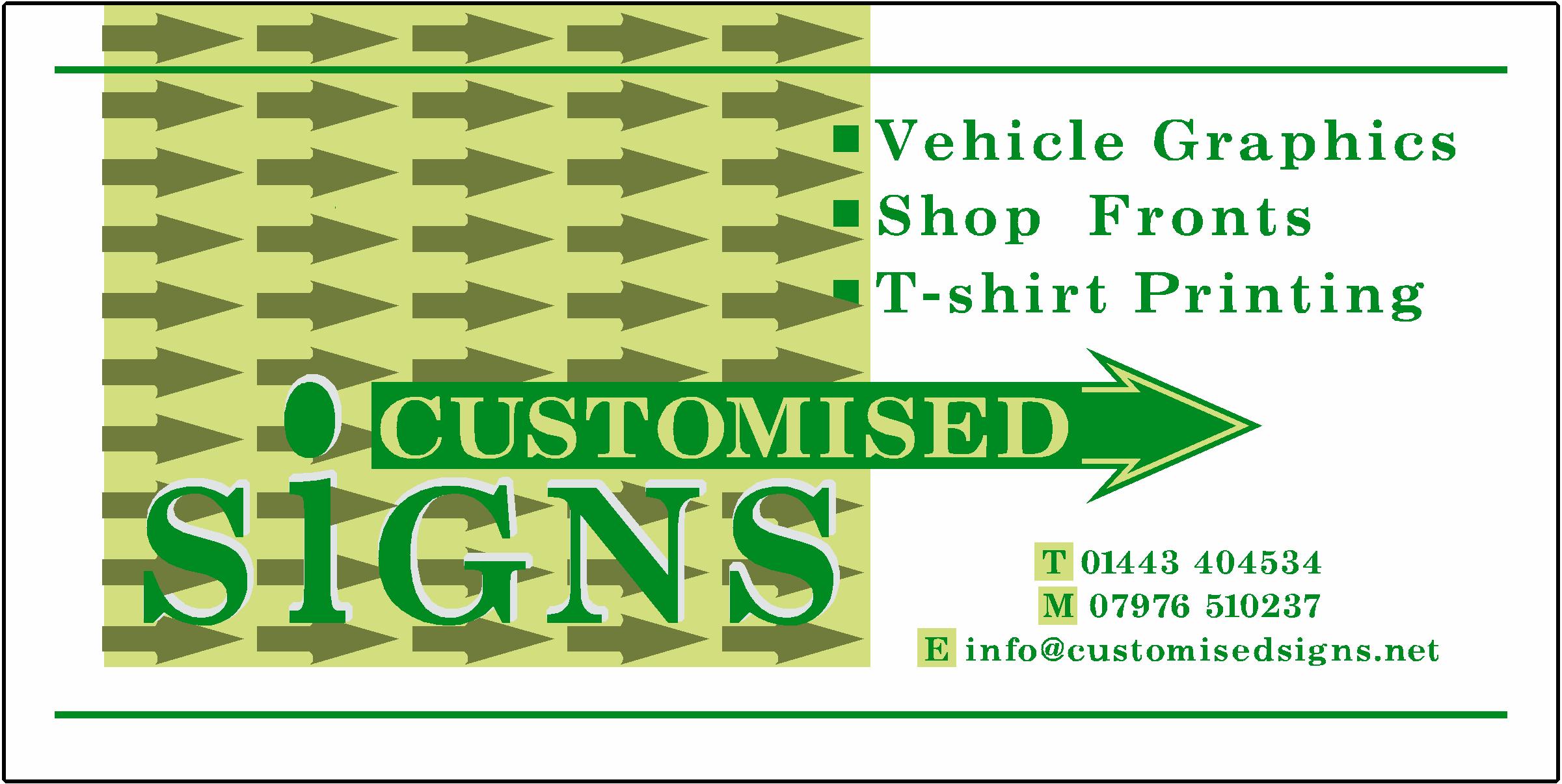
i would like to add multiple arrows in the square.
how can i multiple copy’s in sign lab.
do i have to put this in a different thread
Attachments:
-
Hi Scott
Why don’t you try something like this where you can put the arrow "outside" the sign so you don’t have to make space for it and use the sign area for more important things and make it easier to design a better layout.
just a thought
use it, don’t use it 😉
Warren
Attachments:
-

Scot, use the array command in Sl to make multiple copies
(layout array)Peter
-
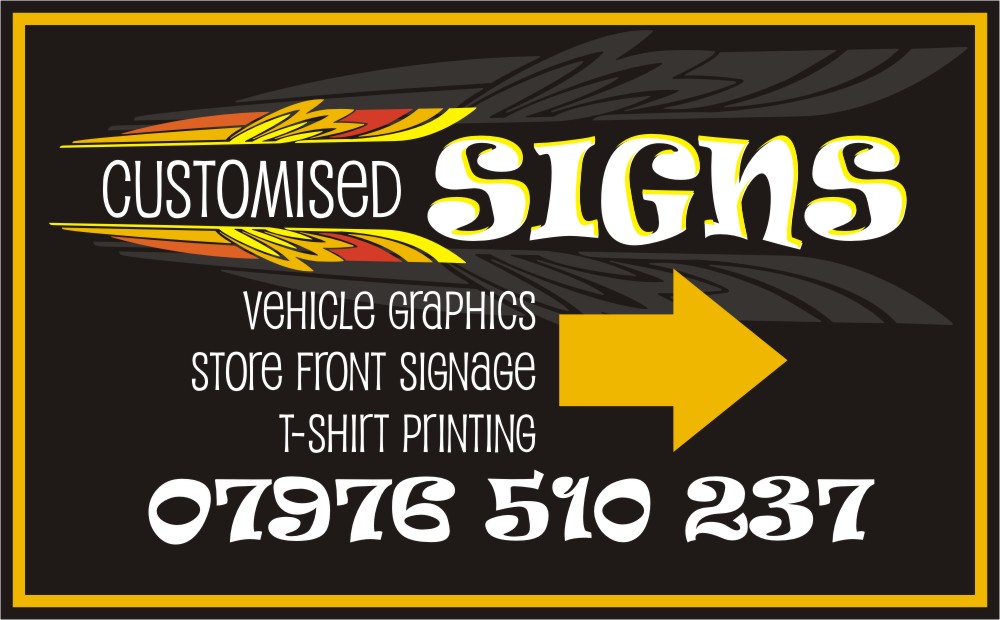
THOUGHT THE ARROWS WOULD WORK BUT THEY HAVEN’T THEY JUST MAKE IT LOOK MESSY!
ANY SUGGESTION’S
-
Hey Scott, I like the one before you put all the little arrows in it. It looked real good and without the extended arrow on the "customised" bit would be a really nice business card too. With the arrow on the sign serves the point you wanted to show people where your shop is. If they were given your card and came to find you they could not go wrong.
Only crit is the phone numbers are a bit small, enlarge them to the length of the email. By scale not stretch. Also is there one too many spaces between shop & front. Other than that it looks really good.Its come along way since your first post ay mate.
regards
Steve


Log in to reply.