Home › Forums › Sign Making Discussions › Gallery › Hand carved HDU dragon sign
-
Hand carved HDU dragon sign
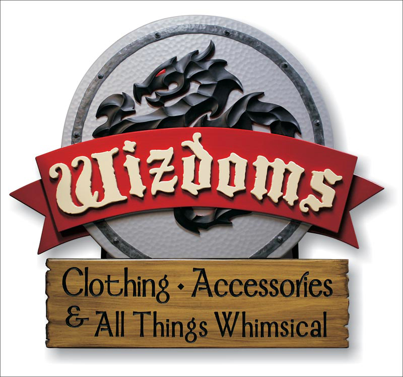
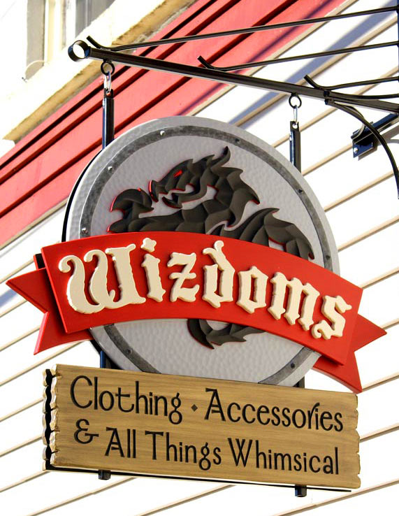
Posted by Adrian Page on 13 December 2010 at 03:00I thought this sign came out quite well and was wondering if there was a contest I could enter it in. It would be a great marketing tool to be able to claim "Award winning signs" or some such on my website. Do you think it would stand a chance anywhere?
The sign is HDU with a steel inner frame. It was handcarved. The hammered texture on the shield was done with a hammer.
Attachments:
 Robert Duma replied 14 years, 9 months ago 11 Members · 12 Replies
 -
12 Replies
-

I would think so, that is outstanding. I am sure Rob will be able to recommend the best route.
Jason
-

looks like a winner to me, more importantly I hope you got paid top dollar for it
-

Nice job, well executed.
Maybe it’s just me, but something annoys me about those two fonts together. Is it just me? 🙁
-

That really is a beautiful job, just a shame to hang it outside.
It is an unusual combination of fonts I have to agree Harry, but to me it works strangely well. Infact it’d be interesting to know what other considerations for fonts you’d had oreodeus!
-

Have to agree with the others, that looks top notch and if it only came out QUITE well I would like to see what your really good stuff is like :lol1:
How long did it take you to do and how long have you been doing this sort of work.
-

That is one nice sign.
Very reminiscent of the type of work you see in Signcraft.
Have you thought of submitting a pic to them.
I think the fonts work well, I particularly like the secondary font. -

I like it too, I like the bottom font.
😀
Agreed on submitting it to SignCraft.
Signs of the Times do run an annual contest and it does lean heavily towards dimensional work.
Love….Jill -
 quote Jill Marie Welsh:I like it too, I like the bottom font.
😀
Agreed on submitting it to SignCraft.
Signs of the Times do run an annual contest and it does lean heavily towards dimensional work.
Love….JillHi Jill! Fancy seeing you here! I will look into the sign of the time contest. The bottom font is nice. A friend turned me on to it. (The font is "Mordred" if anyone is interested.) The other font I have no idea. It was sent to me as curves in some horrendous client/nephew art.
-
quote Martin:Have to agree with the others, that looks top notch and if it only came out QUITE well I would like to see what your really good stuff is like :lol1:
How long did it take you to do and how long have you been doing this sort of work.
Thanks Martin(and the others).
The sign took about 20 hours to fabricate. It’s made from mostly HDU with a welded steel frame. The band around the shield is epoxy putty. As mentioned, the hammered effect was done with a ball peen hammer. The trickiest part of the job was the curved face of the 2 shields and fitting the dragon to it. Without the curve the hammered effect would hardly show. It really catches the light just right with the curve.I’ve been carving for 40 years and making signs for 6 of those. Here is a link to my website with some more of my signs if you’re interested. http://www.showpiecesigns.com

Log in to reply.