Home Forums Sign Making Discussions Gallery hammond: sign assortment

  • hammond: sign assortment

    Posted by David Hammond on 2 December 2011 at 14:01

    Had influx of work suddenly. Not sure if it’s from my networking events, or just a busy spell.

    Problems been that is mostly vehicle graphics, and its taken up loads of time! So when I speak with my accountant I think an apprentice is on the cards.

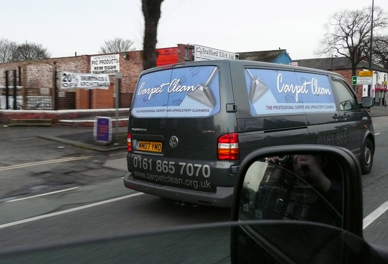
    We used Metamark MD-5 gloss white vinyl it stuck surprisingly well.

    1st image – Another new customer who had his van signed up, and the vinyl and laminate began to shrink, and generally looked a mess. Had a fun day out yesterday removing all the old vinyl and installing this! Metamark MD-5 with Matching metaguard over laminate.

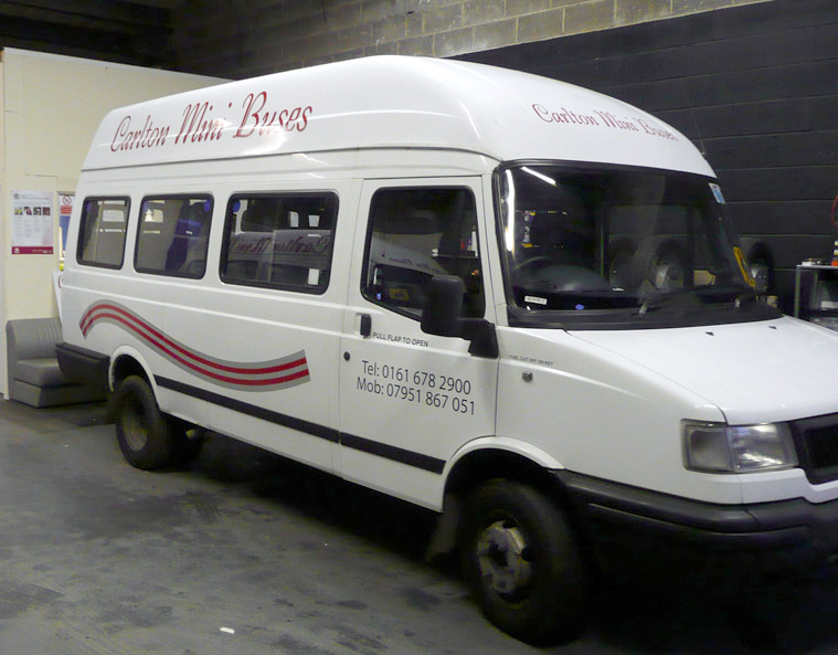
    2nd image is of a mini bus we did, using a similar design to what their previous signage company did on their fleet. Used avery 600 vinyl. Customer was delighted – we also did an external sign (supply only) based on the same colour scheme.

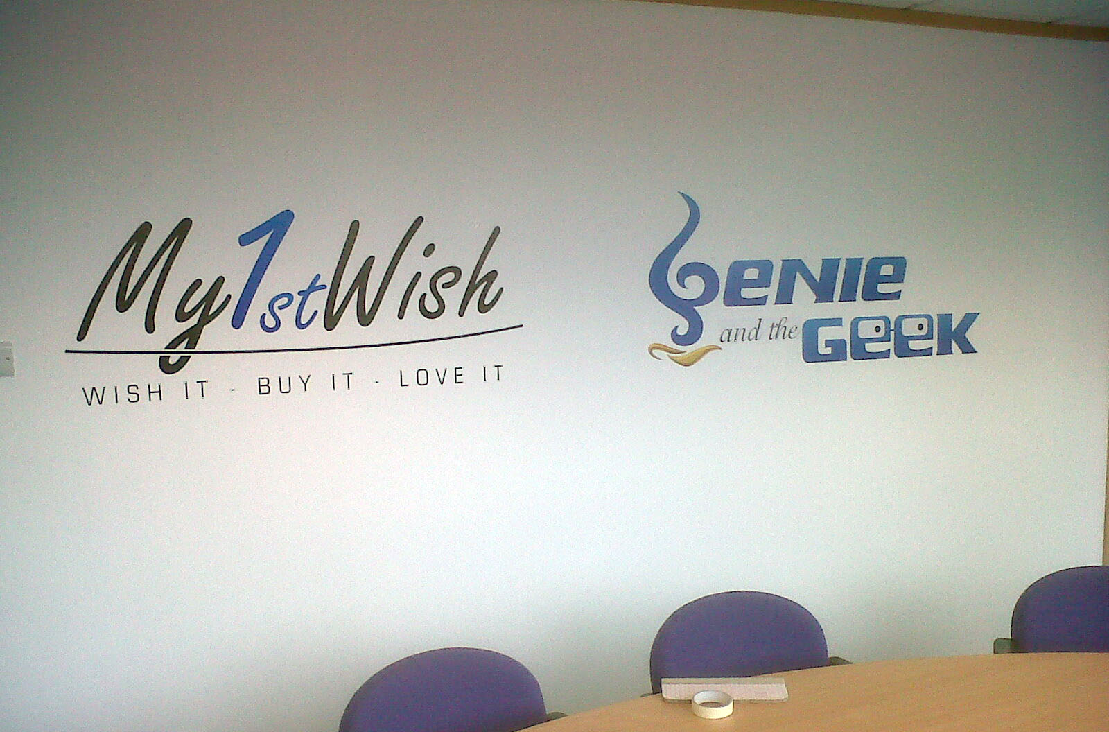
    3rd Image – This was a rush job the customer was having a meeting today, and wanted 6 logo’s fixing to their walls.

    Its been a big learning curve this week, doing my first digital van graphic for the carpet cleaner, and also did another van which required an cast film, going into the recesses. Pictures to follow!

    Thanks for looking


    Attachments:

    David Hammond replied 13 years, 10 months ago 6 Members · 8 Replies
  • 8 Replies
  • Mike Grant

    Member
    2 December 2011 at 20:28

    Not a fan of big telephone numbers and web addresses. Looks ugly as sin. The second van is on the button, small and on the doors where they should be, otherwise not a bad effort.

  • Neil Davey

    Member
    2 December 2011 at 20:57
    quote Mike Grant:

    Not a fan of big telephone numbers and web addresses. Looks ugly as sin. The second van is on the button, small and on the doors where they should be, otherwise not a bad effort.

    Ditto, I think the ‘not liking a big telephone number’ syndrome comes from once having to do this with a brush.
    We would never have done this and would have kept the contact details, phone number , address etc. pretty small.
    BIG doesn’t mean that they’re read any easier as you really need negative space around the lettering to allow it to breath. Sounds organic I know but take it on board and your layouts will improve tremendously.
    To me a big phone number smacks of desperation.
    Have you a copy of Mike Stevens – Mastering Layout book and get yourself a subscription too SignCraft magazine…..truly inspiring.

    Thanks for posting David and my comments are only meant as constructive crits.

  • David Hammond

    Member
    2 December 2011 at 21:33

    Taken on board – I will them on to the owner, to inform his previous company. :lol1:

    I should have said we only did the re-print of the digital vinyl… The phone number and web address were existing.

    The customer does want to change it though – there’s two different colours of vinyl used because the customer couldn’t decide on a colour. They do want it removing and a mobile number in its place, as they divert the landline to their mobile and is costing a bomb.

    I currently have a customer who’s van I have signed it looks ace… But they want their web address massive ‘we don’t care if it goes into the recess’ 🙁 no amount of persuasion can change their minds and I need to call back next week to fit some oversize lettering.

  • Neil Davey

    Member
    2 December 2011 at 21:41

    Yes, it’s difficult to educate customers a lot of the time.
    I think they get off on seeing the details written huge!!!
    Probably a good idea to show them examples and explain that doing it your way looks a whole lot more professional than theirs.

    Brickwall, Head and banging comes to mind!!!

  • Martin Pearson

    Member
    2 December 2011 at 21:58

    I’m another one who doesn’t like big phone numbers and web addresses but as has already been said there are those customers that don’t listen & want it as big as possible. Worst of it is normally when the van is finished they ask you what you think of it & when you tell them that you feel the contact details are to big they look at you as if you know nothing about design lol.

    I do have some visuals made up of a fake company that I use for explaining pricing to customers and at the back of the book I have the same company details at different sizes to show how bad a design can look if everything is to big.

    Apart from that it looks like you are getting a bit of work in now David, soon be an old hand at vehicle livery :lol1: :lol1:

  • John Singh

    Member
    2 December 2011 at 22:13

    Yeah! Good to know your busy-That’s good news in the current climate

  • Alan Drury

    Member
    3 December 2011 at 17:19

    I don’t mind large phone numbers or web addresses on a vehicle and speaking as an ex brushman size was never relevant but overall layout was and some jobs could take the larger numbers. Layout in many case is like beauty and in the eye of the beholder/cheque payer and some layouts and logos I hate but customer obviously approves ie Halfords the car accessories people to my eyes their signage is dreadful but I bet the design agency employed got paid a large wedge for coming up with it.
    Don’t be afraid to use large numbers or web addresses and for that matter there’s nothing wrong with Brush Script either, used in the right context they are all fine.
    My mate uses layouts that bleeds of the edges and I kid him that he’s cut his letters too big but some of the designs look fantastic others not so.
    Alan D

  • David Hammond

    Member
    3 December 2011 at 19:27

    Certainly need to perfect my technique.

    We installed the carpet clean wet. Which was not big problem.

    We installed the minibus dry, with the exception of the overlay along the top – I am sure there’s ways to do this dry.

    On the other two vans, we struggled installing the logo dry – frustrating because it was fairly simple. 🙁 I just need to practice.

Log in to reply.