Home › Forums › Sign Making Discussions › Gallery › Gray: various vehicle graphics
-
Gray: various vehicle graphics
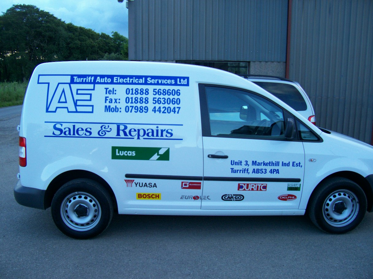
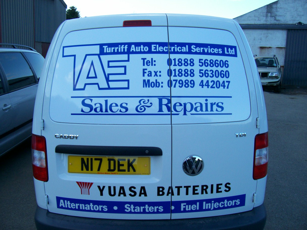
Posted by Martin Gray on 11 October 2009 at 16:43Hello
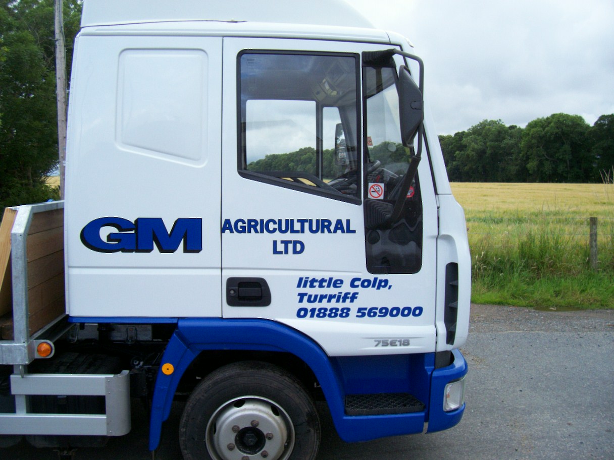
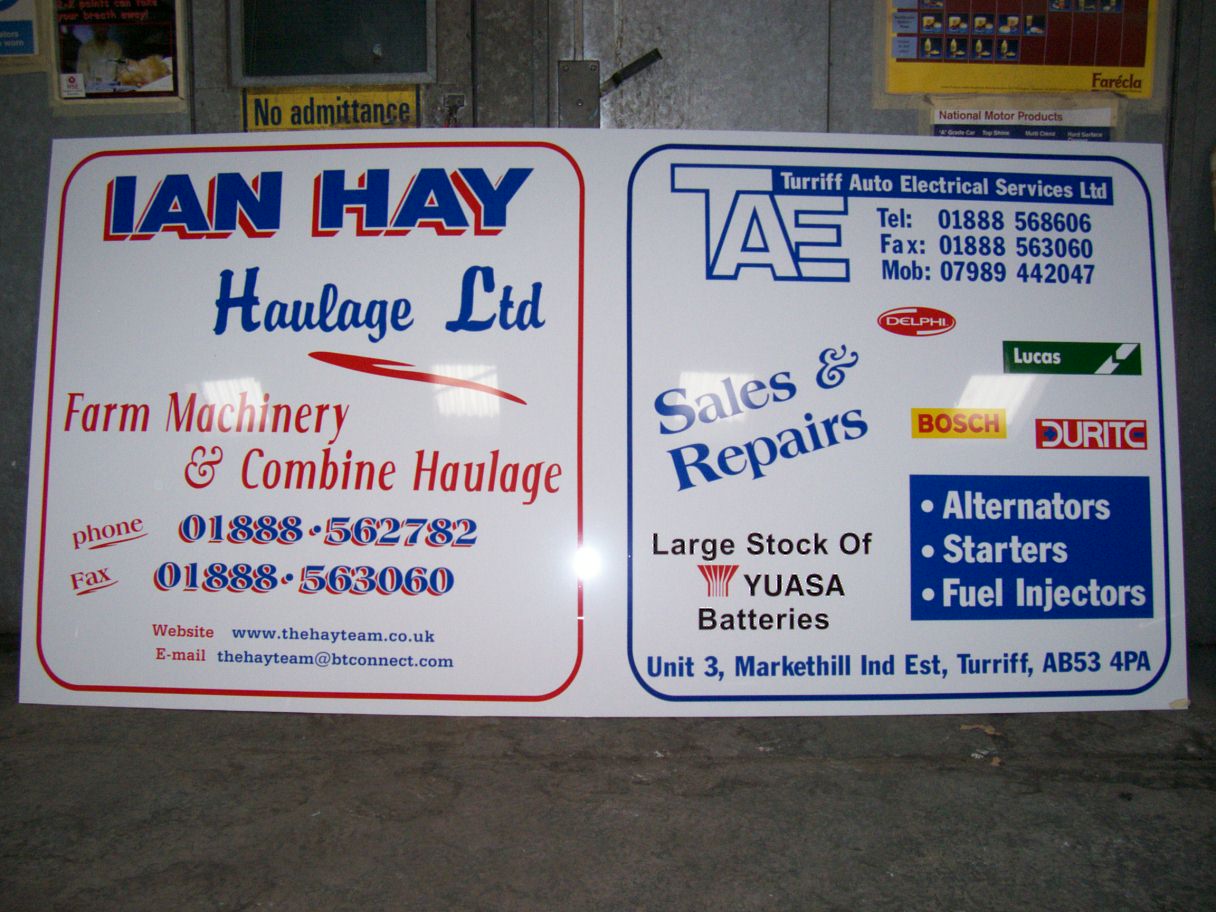
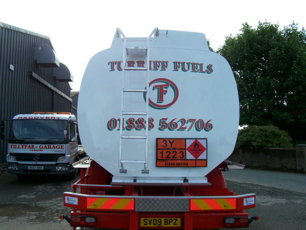
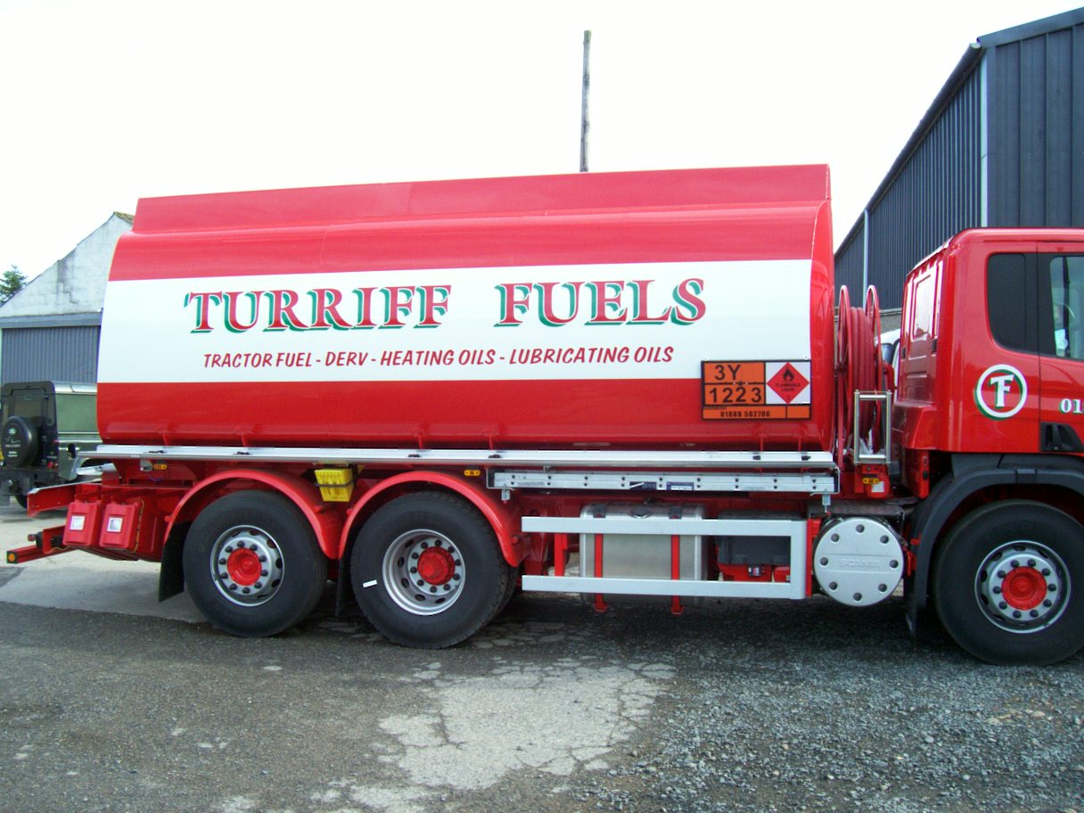
Had some spare time. Thought i would post some of my work.
Attachments:
 Martin Gray replied 16 years ago 5 Members · 7 Replies
 -
7 Replies
-

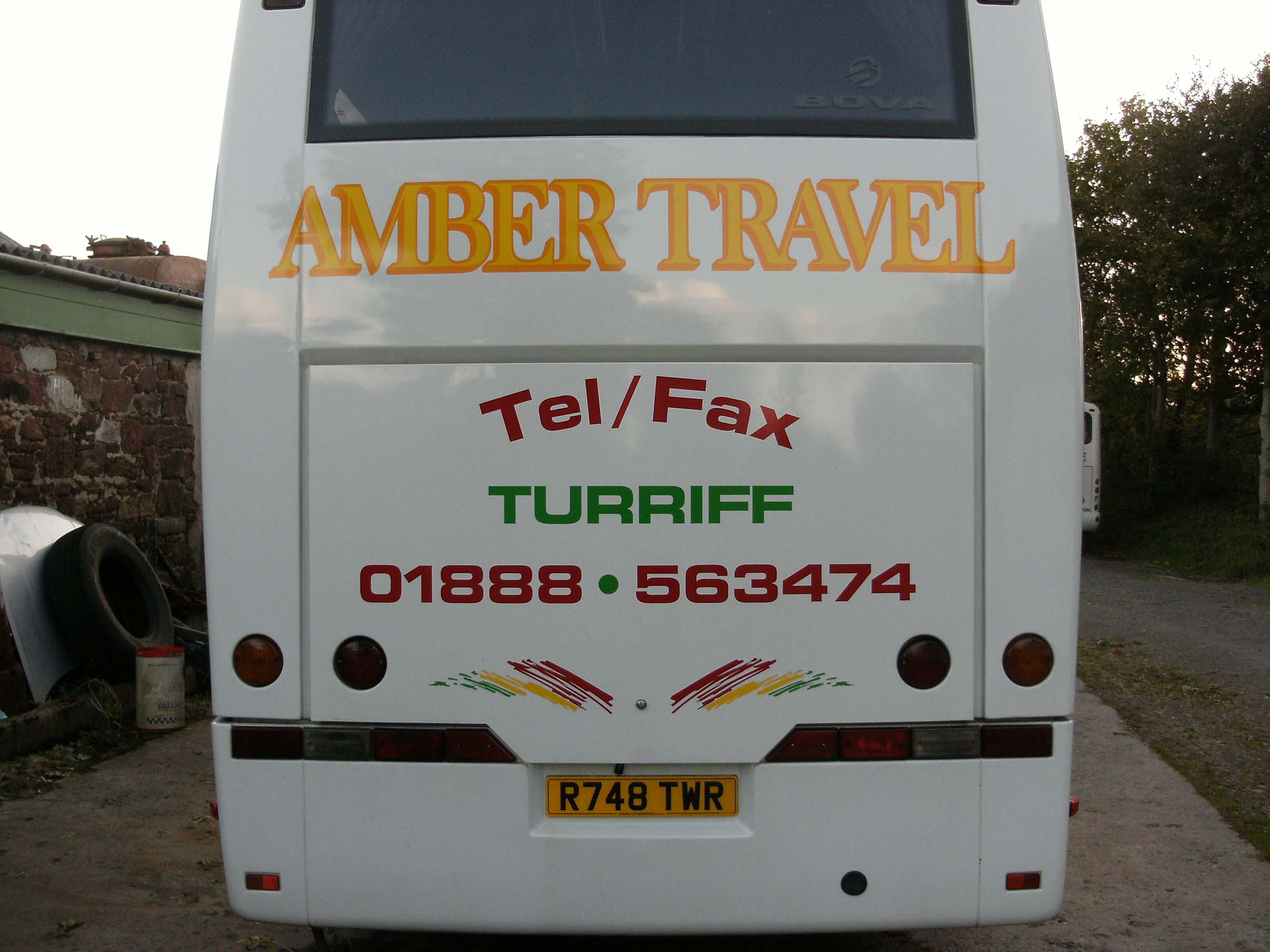
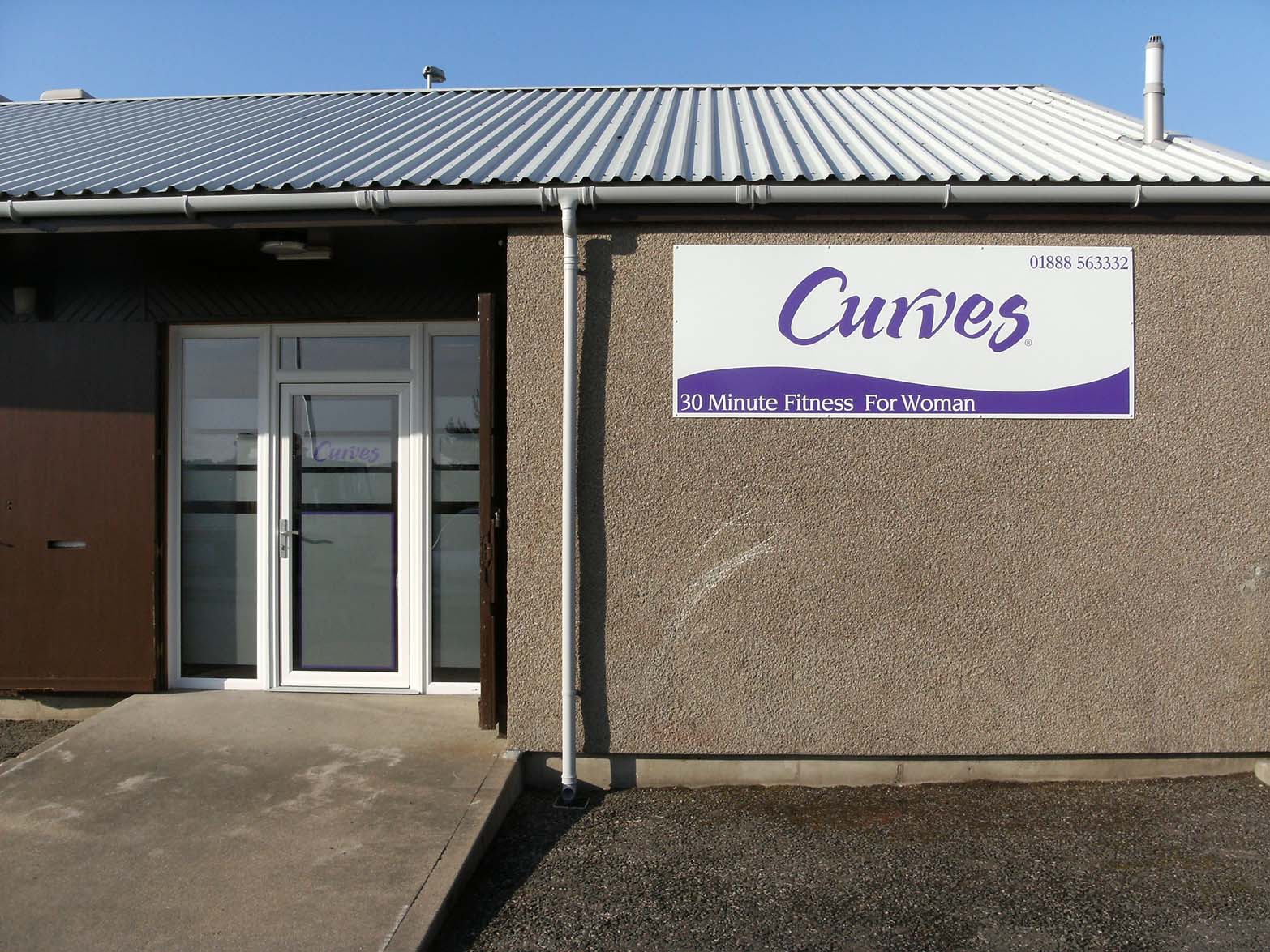
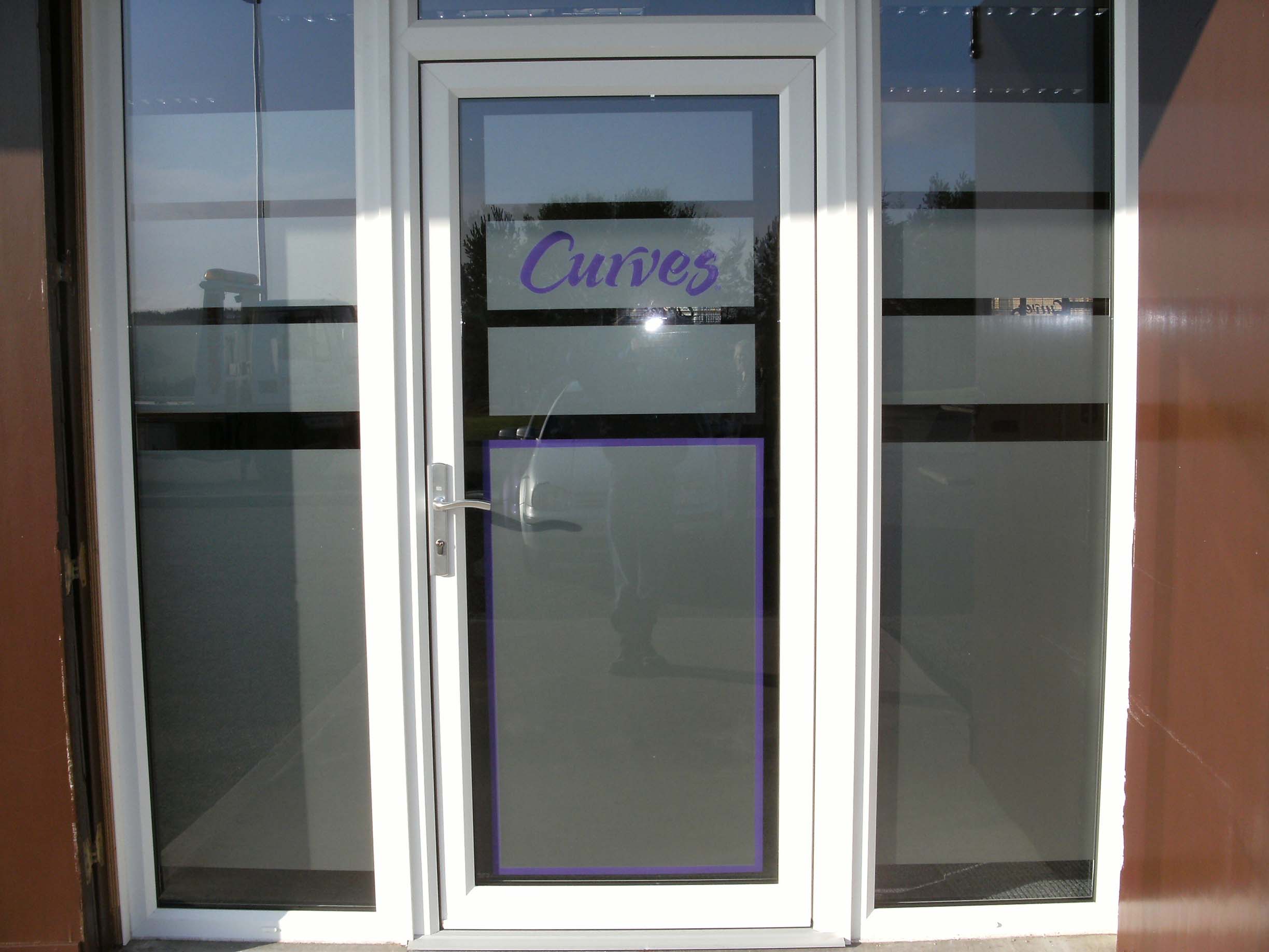
The Curves windows turned out really well.
And for the most part I like your work.
But why, oh why, do people insist on putting a freaking fax number on vehicles?
And have you ever considered using a nice grey drop shadow rather than the greens or blues?
Using such a dark shadow on a light background makes your lettering have not as much contrast as it could.
But I forgive you because you are cute, and also a nice guy. -

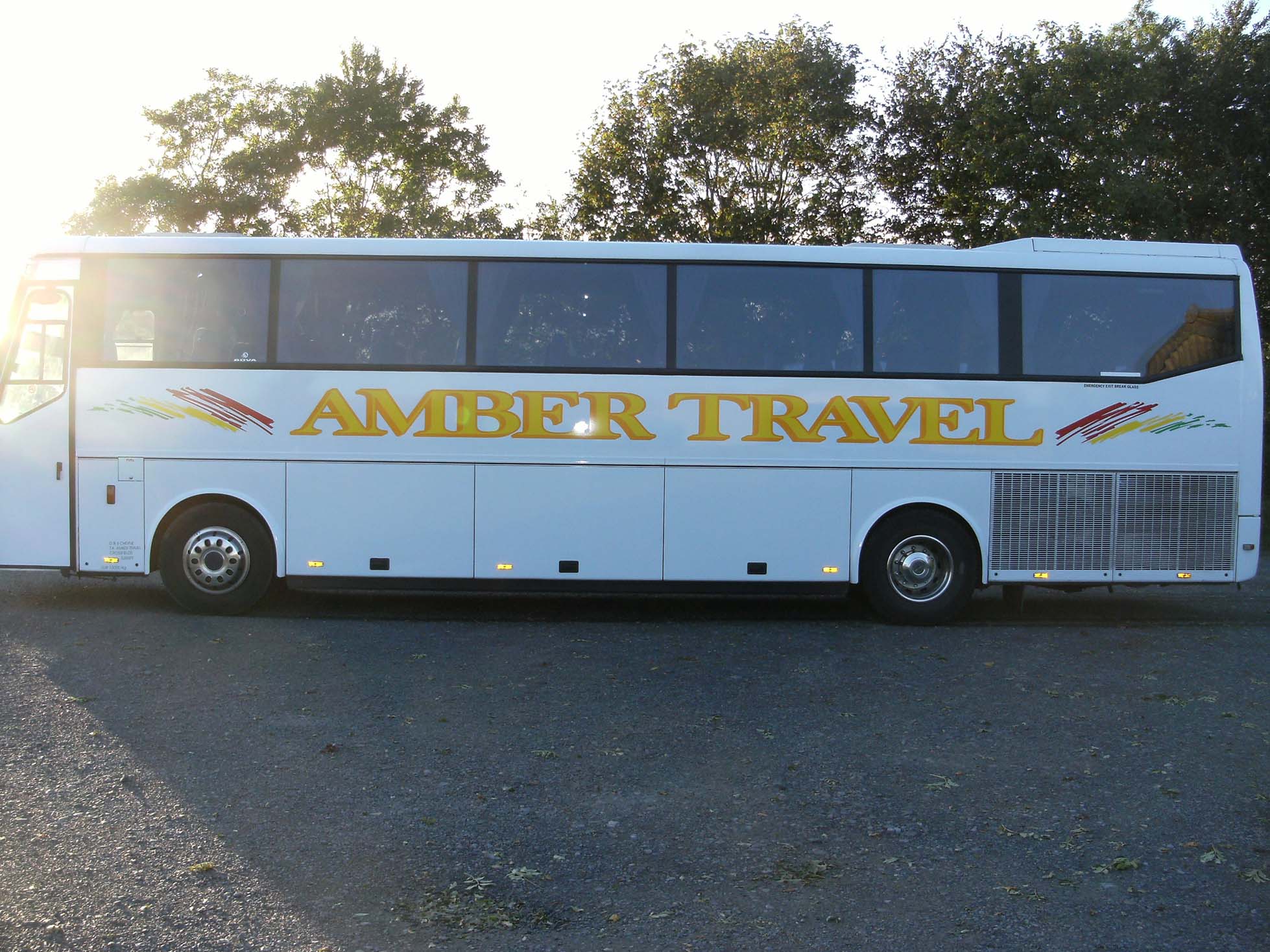
I’m glad you decided simple on curves looks good, I also like all the other stuff, but sometimes you could give a bit more room around the signs, some are very close to the edges and would look better with air around, also agree with Jill Tel/Fax who on earth uses a fax machine anymore!!!
Lynn
-

Thanks for the nice comments. @ least i know am heading in the right direction.
Jill if only we weren’t a ocean a part 🙄 🙂
Martin
-

Hi Martin, some nice work there, how long have you been doing this now?
Liam
-
Hi Liam
About 18 months. Am just part time tho. family ties
Martin

Log in to reply.