Home › Forums › Sign Making Discussions › Graphic Design Help › graphic help please need my logo re-vamped?
-
graphic help please need my logo re-vamped?
Posted by Hugh Potter on 11 March 2008 at 19:03hi all, not often i come in here, but i’m a bit stumped with this. this is for my own use, which is always a nightmare!
this is a design which needs to be used on t-shirts, stickers, packaging, etc, i’ve not really put too much time into it yet, but my head just won’t get into gear!
ok, the product is a reflective tape, so the logo needs to show this, i want it to look bright, shiny, etc.
I have no real idea how to make it look like this in corel12, and i have no clue on photoshop as i don’t use it either!
i have used this logo in the past, as a quickie, but really want to make it more ‘hi-tec’ and be easily transferable between the aforementioned media.
any help / corel 12 tips will be appreciated,
Hugh
ps, have attached cdr and a photo, tried to do as an ai, but it keeps crashing, i think it’s the distorted fill causing it, perhaps someone else could do that for me ?
Hugh Potter replied 17 years, 7 months ago 17 Members · 44 Replies -
44 Replies
-

This is the best I can come up with, Hugh.
On your original I think you need to try a more dynamic font.
Love….Jill -

Just a thought Hugh, how are you printing the t-shirts? this will make a big difference in the design that you can use.
Peter
-

Hugh….I haven’t done anything with the actual logo layout…… just wondering if this effect is any good ??
-

a go from me, I know bugger all about t-shirt printing so don’t know if it would work 😕
Attachments:
-

spect it depends on your resources to print Hugh ?and what your end aim will be ie: in house or out sourced?
Lynn
-

thanks for the input guys n gals,
glenn / martin… i like both the effects above
Jill, not had a chance to look at yours yet, promise i will in the morning
(just got back from braving 40mph winds on the beach at low tide, and now have over 500 razor clams, cockles and other shellfish to sort between food fridge and bait fridge!).sorry… i digress…
printing… i use an oki laser / magic touch set up, on a white shirt it can go pretty much straight onto the shirt, on a black, i would need to print a black box around the logo, trim and then apply. i wil only be doing small numbers for magazine give aways / promotions etc.
packaging will most likely be outsourced to a litho, or a sticker. not sure yet, but need to do something better and soon!
thanks again, and please keep idea’s coming.
Hugh
-
thanks Andy, love the idea, would look great on the t-shirts, thank you, how is that effect made? i have an idea of how i could botch it together, but i’m sure there’s an easy way!
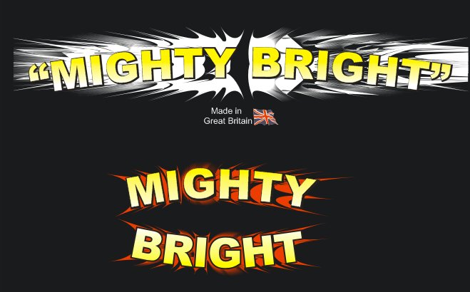
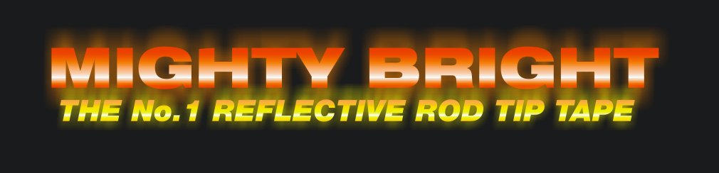
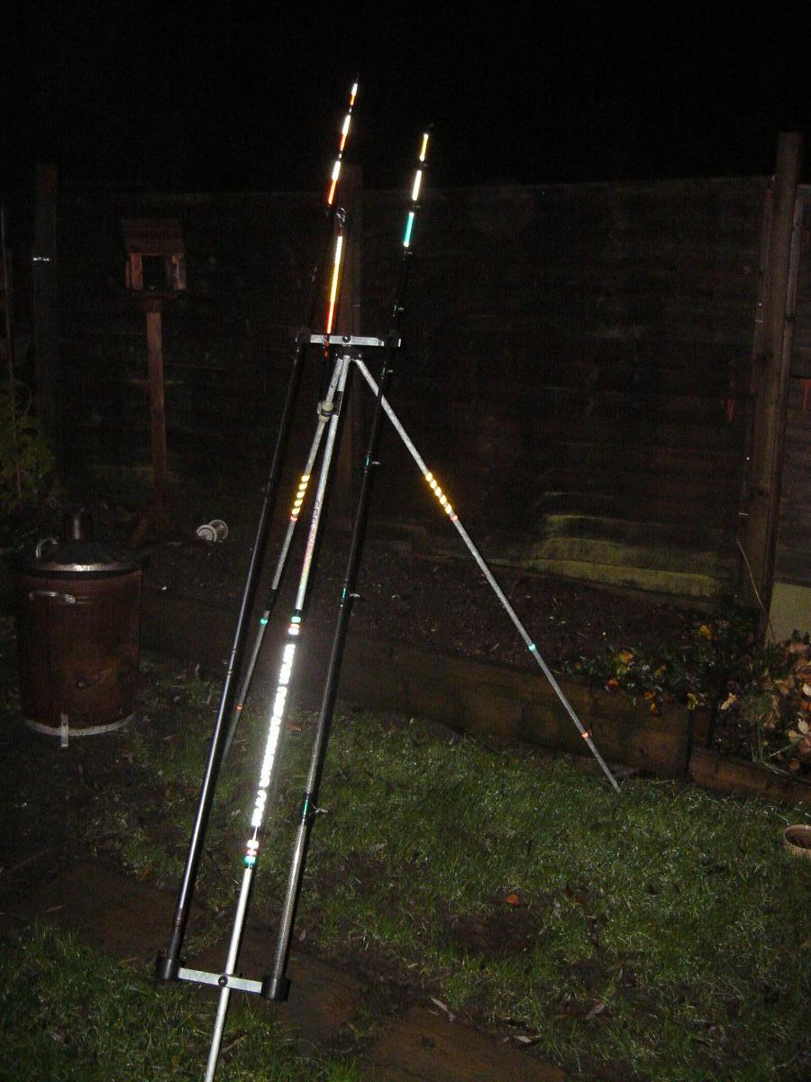
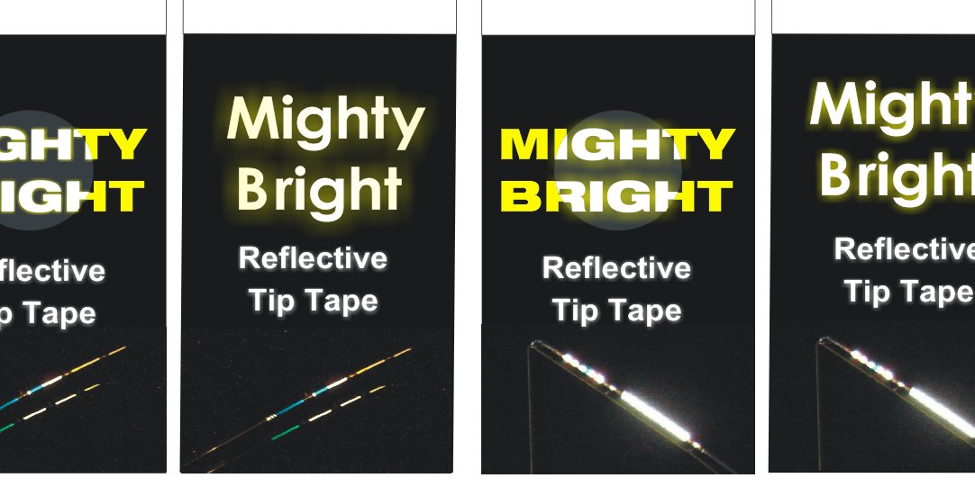
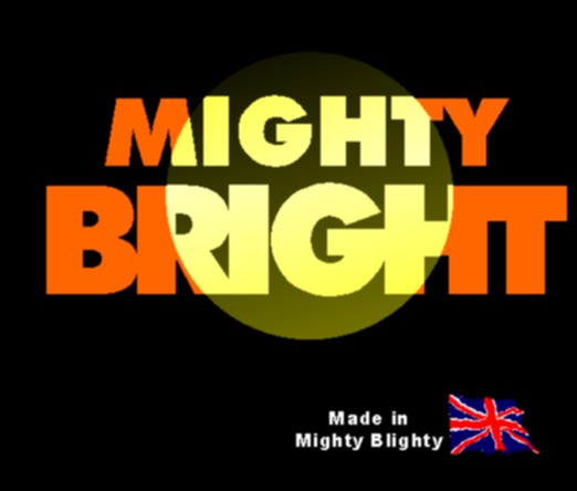
Harry.. fantastic! the main use for this tape is on kids bikes, helmets, fishing rods etc. the stuff does change colour when viewed with a headlamp (as we do when fishing), and that is a pretty clever way of showing it,
love the made in mighty blighty too, i mighty pinch that!
i reckon that could really be worked on,
Hugh
-

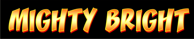
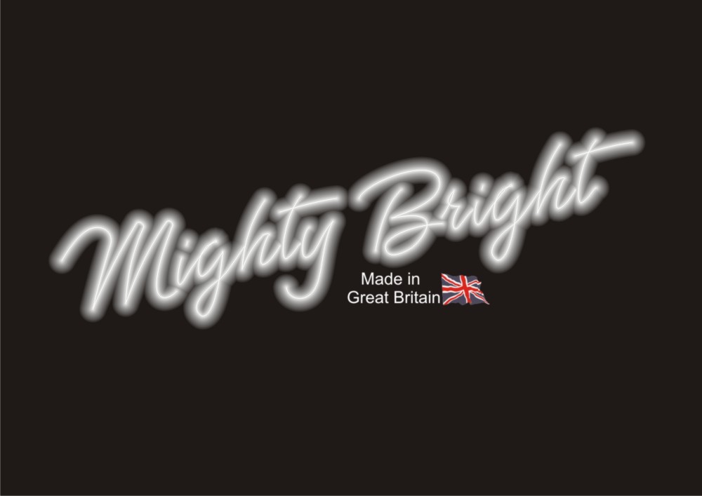
Andy does it again with the neoney look!
Mighty Blighty….Kewl. -
thanks again for the responses.
I would like to go with Harry’s idea, hope that’s ok! simple and can be quite effective.
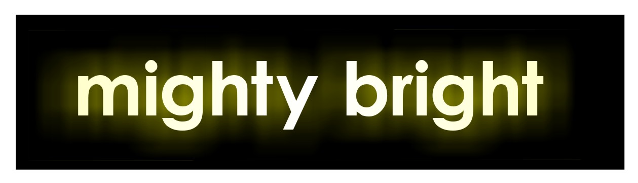
i would also like to do what Glenn has done on his lettering, with the fuzzy wuzzy brightness behind the text, but only where i’ve highlighted it,
now, two things, how can i make that effect in corel 12, and is there any way to make it look like a more realistic torch / light beam ? ie, as if it’s coming from a source rather than not.
thanks.
Hugh -
Hugh
the effect I got was just with the dropped shadow tool in Corel 12
Just have a play with the different feathering amounts until you get an effect you are happy with and change the shadow to yellow
I had also put a slight fade on the text which seemed to help the effect a bit….
from a very pale yellow to white and back to pale yellow again -
hi Glenn,
i wasn’t aware of the drop shadow tool! i’ve found it under effects > clone effects > drop shadow from, but it’s not enabled for some reason, any ideas?
cheers.
Hugh -
Hugh….it’s in the main tool bar….underneath the A for text on mine
click it and hold …you’ll get a flyout with a a square with a drop shadow round it…..you’ll pick it up by having a play
-
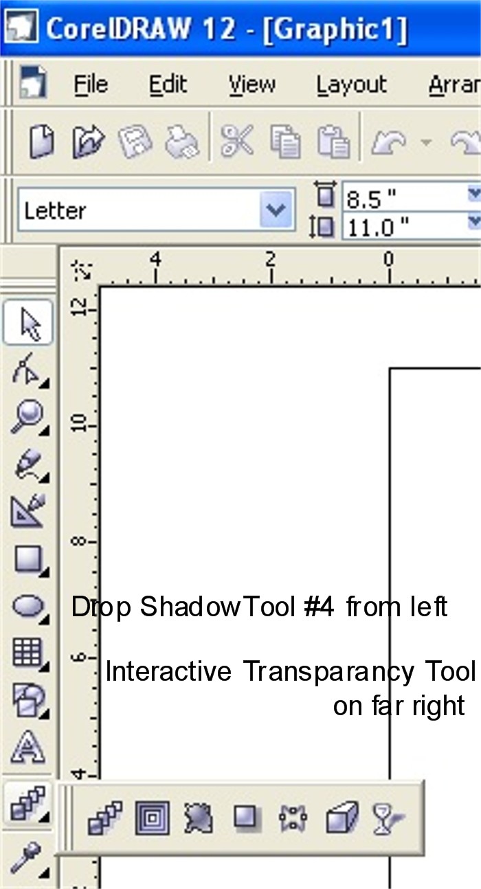
Here’s where it is in my Corel 12:
(I also use the interactive transparency tool all the time)
Attachments:
-
ah right, that one! never ever use drop shadow, always do my own! thanks!
HUgh -
hi guys n gals,
i think i’m getting there slowly, just not sure it’s working for me yet, i’m basing this on Harrys idea, as you can see, but am at a loss as to how to really get the most from it.
the problem lays, i think, in that i need to be able to reproduce this in small (couple of inches square) to large (A4) sizes,
any idea’s folks ?
ps Glenn, can’t find the feathering tool?
-

When you create the shadow Hugh there is a row of sliders along the top of the work area that will allow you to feather. That’s in X3 anyway ……cant remember if its the same in 12
-
quote Hugh Potter:hi guys n gals,
i think i’m getting there slowly, just not sure it’s working for me yet, i’m basing this on Harrys idea,
Hugh I think your trying to over complicate it, If Harry doesn’t mind I would use his.
Its crisp clean and very effective and would work from a 50mm sticker up to A4 very well.
Adding to many effects will make it far to noisy, especially when on a small sticker..
IMO of course 😀
-
Thanks Harry,
found it now!
George, point taken, the t-shirt can be as flash as i like, as it will be seen, as will any banners that i use when sponsoring comps, events etc, so…
two designs, one more simple, which will go on the packaging, and look ok when scaled down, the other, more elabourate, for t-shirts.
am i getting somewhere now ?
cheers.
Hugh
Attachments:
-
HI Rob
I don’t dislike Andy’s, it’s just that everything i’ve done so far has been arial black or helvetica bold ext. i use a chunky font as when i do banners for events which i use reflective sheet on, it needs to be a substantial font to carry it off well.
eg, if the guys are fishing on a beach comp i’m sponsoring, i want them to read what it says from 50yrds away, when they look to the top of the beach with their headlight on, make sense?
cheers.
Hugh -

Hugh,
I also like Andy’s.
What print method are you planning on using for your tee’s.
Dave
-
magic touch laser transfer. it will have to have some kind of black background whether on white or black t’s, though i’ll probably stick to black t’s and use the obm paper.
using obm, it needs to be a design i can contour cut by hand (only doing small batches) as my cutter doesn’t have opus reg thingy.
hmmm, i do like Andy’s, dont get me wrong, just fancy something that will be usable on everything i do.
i’m open to suggestions though!
cheers.
Hugh -
The obm should work at treat mate. Have you looked at the Graphtec a4 cutter with opus only about £250 and really helps with contour cutting the obm you can get some very good results.
Dave
-

I like Andy’s and personally think it would work better from a distance than a thick bold font as the letters will blur in to each other, think of a neon sign in a shop window and that’s what it would look like, a big neon sign in the distance!
Thin reflective letters from a distance would have the dark spacing in-between to make the shape of each letter more visible.
JMHO but I could be wrong as I’ve never seen anything in my experience.
Cheers
Warren
-
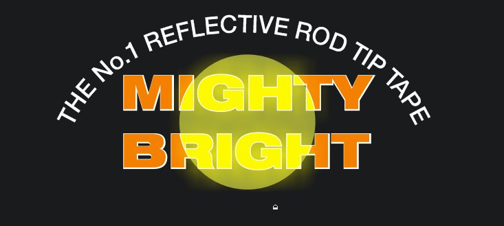
Hugh….I think you need to nail down exactly what effect you want…
I based my effect on a reflective tape which I think is what you are trying to promote
I think you are in danger of making it look like flames or something other than ‘bright’ if you’re not carefull
I personally think you are over complicating Harry’s design and not achieving the desired affect
Attachments:
-
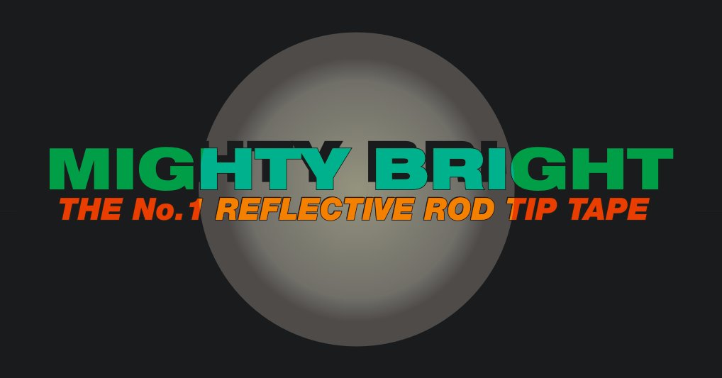
Based on the direction you seem to be going, maybe something more like this ( quick 5 min job ) ?

Keeps the bold look but should also stand out from a distance. Its also a vector graphic so you can rescale from 1mm to 1 mile if needed !
Attachments:
-

Maybe just me but I just think ‘Mighty Mouse’ when i look at that Mike. 😕
-
argggh, just don’t know what to do now!
Warren, think you might be right, I do like andy’s, but i’m not sure if it’s the way i want it to look,
Glenn,
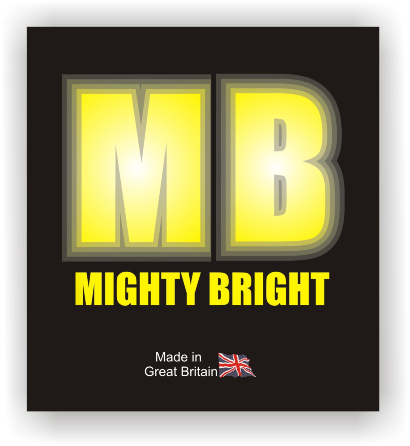
yes, over-complicating Harry’s design, just can’t seem to decide on how it should look, plus i found a new toy with the drop shadow tools.. dog.. bone !i see what you’ve done with yours, ie making it look like tape, which is what i want the effect to be. just can’t get it to look as clean as yours did!
Mike, thanks for having a go, like the effect, though not so much the font, nothing wrong with it, just not what i thought it should look like.
David E,
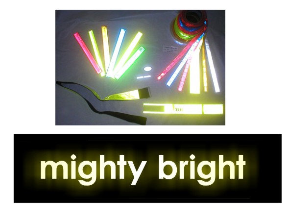
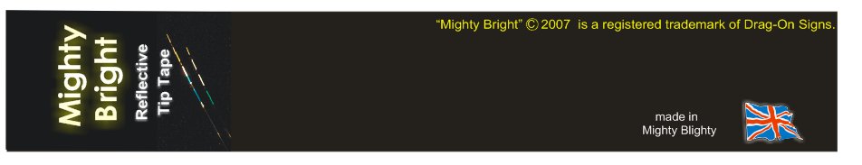
not seen that, do you mean the craft robo thing? if you do, then yes, considered that for just this reason! i can print a black surround for now and hand cut it, should suffice.ok, have attached a pic of the original prototype packaging, just to show you the idea of the finished product, maybe this will help a bit, the packaging is only about 45mm wide. initially went for a bold font for impact, most of the products on tackle shop walls are boring bits of card, computer printed with an inkjet, so my idea was to make it stand out.
based on that theory… which way would ya’ll go?
i think Andy’s has the most votes, therefore feel i should go with popular opinion, but still like glenns effect. i’ll have a nose back here later and go with the flow i think !
thanks again all.
Hugh
Attachments:
-
Hi Andy,
Any chance i could have the file you posted please? pretty please?
i’m just gonna print all the packaging samples now and go with what looks bestest.
thanks.
Hugh -
hmmm, double post.
right, have done a few samples, toned it down some, the problem i have now is that the oki printer (which i’m using to make samples), is printing a black outline where the yellow ‘halo’ / drop shadow should be, with barely a hint of the halo effect. any ideas on how to beat this problem ?
ta.
hugh
Attachments:
-
Personally, I think it’s a pretty good effect you’ve got on the upper & lowercase one…….but then I suppose I would 😉
just watch the kerning on the ‘Bright’ though Hugh if you do go with it
-
quote glenn:Personally, I think it’s a pretty good effect you’ve got on the upper & lowercase one…….but then I suppose I would 😉
just watch the kerning on the ‘Bright’ though Hugh if you do go with it
yeah, spotted the kerning after printing, thanks for mentioning it though, i’d forgotten !
Andy,
thank you dude.Hugh
-
thank you all for your help.
i’ve decided to go with the way Glenn interpreted my needs.
the issue i have now, is problems when printing this, i’m going to need to do some t-shirts, and a few other odds and ends, stickers etc.
i’ve got a thread going in ‘corel’, but can’t post there, so any help in "why i can’t get rid of the ‘drop shadows’ back fill" would be useful,
as you can see in the attached pdf. cdr artwork is attached.
thanks in advance.
hugh -
thank you Alan, i’ll let you know how i get on with that, the laptop is in the house today (printers all in workshop), so i’ll have a play mon / tues.
cheers.
hugh -

Are those the samples you were going to send me for that tackle shop over a month ago?? :lol1:
-
quote Steve Underhill:Are those the samples you were going to send me for that tackle shop over a month ago?? :lol1:
ermmmmmm,
sorry! only just made these samples! if they use wsb tackle (wholesalers) they’ll be able to buy it from them now, but pm your addy again and i’ll send you some samples for them to play with as soon as i have the packaging in.
did that printer bloke of yours ever get back?
-
thanks to all who helped.
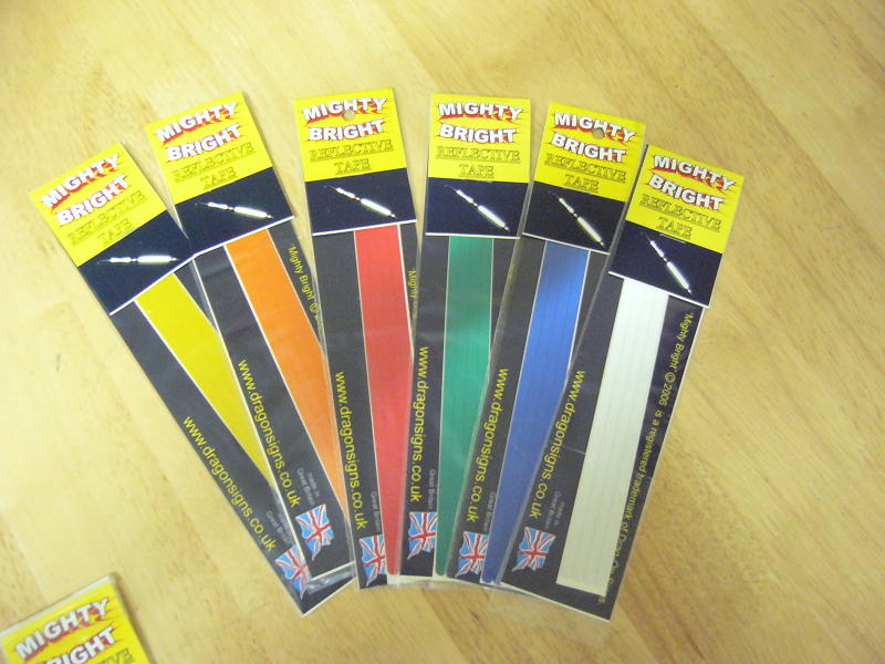
o got around the shadowy problem (caused by a tiff being on a solid cmyk black) by using a photo (bitmap) behind it as the background. i got the inserts printed by a local company, and they’ve turned out great!
i’ve attached a pdf of the designs, as the capture shows no detail !
If anyone ever needs any printing done, flyers etc, then i would thoroughly recommend fatflyers.com, based in Brighton, they’re simply the best prices i think you’ll ever find. well under half what others had quoted, and for a bigger qty too!
i paid £99 per 5000 of each design, full colour on 300gsm semi gloss artboard, and they were turned around in 4 days! the closest quote to this i had, was three times as much, for half the quantity, on 190gm paper!
they did me 5000 a5 flyers last year at only £160 for 5000 too, that was 1/3 of the next nearest quote!
cheers.
Hughps. off to wet n rainy devon now, se ya’ll in a week.


Log in to reply.