Home › Forums › Sign Making Discussions › Off Topic Chat › good or bad?
-
good or bad?
Posted by magpie on 17 December 2003 at 16:06Wanted to share this in the Good the bad and the funny but that forum is locked to me(?).
So I thought I’d sneak it in here…
Attachments:
 Steve Maple replied 21 years, 8 months ago 10 Members · 10 Replies
 -
10 Replies
-

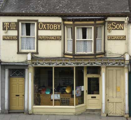
I took this a couple of years ago in York, long before any thoughts of getting into
signmaking.
I still can’t decide what drew me to it, I think that its probably because it just looks so
right and full of character. -

Its got character all right Peter
Can anyone put a date on this type of work
I’d say the 1920’sThanks for sharing
John -

wow what a sign!!
you may be right john, i asked ed (the other half) he collects old letters, he reckoned around the twentys too, but hard to tell! it so oozes of character!
Nicola
-

A fine testament to throwing away of the layout book and doing what fits……….and looks best. Nice one!
-
Humble opinion here and all, I appreciate it’s an old sign, but it looks a tad wierd 😕 😮
Don’t get me wrong with this, the sign/s is in keeping with the character of the property, but it just doesn’t grab me at all, kind of disjointed. Its got something you would stare at, simply because it looks a little odd, it just doesn’t seem to do anything else. 😕
Maybe I’m just tired today, so I’ll have another look tomorrow. Maybe if I squint a little….. 😉
Cheers, Dewi
-

If it makes you stare at it, maybe it’s doing its job very well………….
I last looked at this picture over an hour ago and I know it sayS “TM OXTOBY & SON PAINTERS PAPERHANGERS DECORATORS”
Would probably look a bit daft on the wall of a modern building. I wonder what today’s signmaker would have done with that. Probably gratuitous drop shadows and trompe l’eol (spelling?) effects everywhere!
😉
-

I have to confess – I couldn’t decide what category this was intended for – good, bad or funny 😕
Sorry but it does nothing for me 🙁 – but then I don’t like Ballet or Opera – yet millions do – so I accept that maybe I just have a brain that’s unable to see the art in these things.
-

Hey, I know I’m weird! But I like this.
It suits the building perfectly.
Nowadays it would be all vinyl…
white background with cheesy all-caps Old English
in red, of course…
Love- JILL -

sorry folks, i had a pm from someone ragrding this forum being closed & i did not realise it. i have now opened it & moved the post to here…. sorry for the inconvenience caused. folks.. 😕 😉
-
the local painter and decorator was the signman
probably all hand cut in hard wood with a coping saw
the bigger back ground panels are probaly 1 piece planks
thats if it was pre 1955-invention of ply
he obviousely knew what he was doing as its lasted so long
probably never been re-gilt either
so it was his shop and the best materials available to him
and the result is excellent
thats my opinion

Log in to reply.