Home Forums Sign Making Discussions Gallery Free standing Signs

  • Free standing Signs

    Posted by Phill Fenton on 14 May 2011 at 15:25

    A couple of slightly unusual free standing signs I did this week.

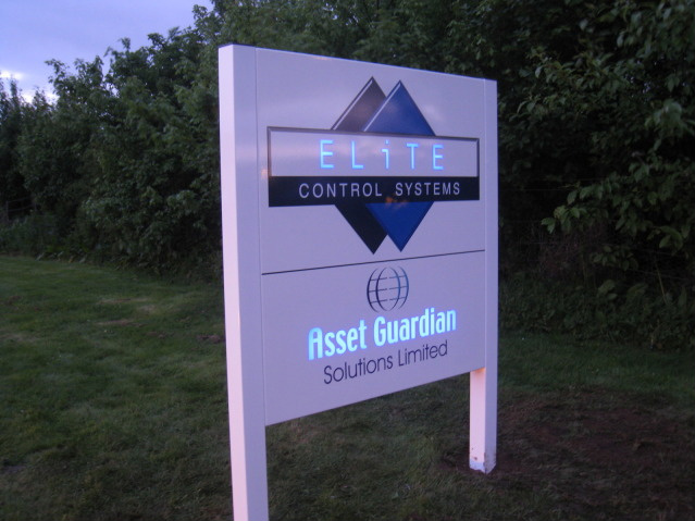
    The first is an illuminated sign which features a fret cut face, backed with coloured acrylic, and illuminated using LEDS. Ashby Trade signs fabricated this for me using eps files that I emailed to them.

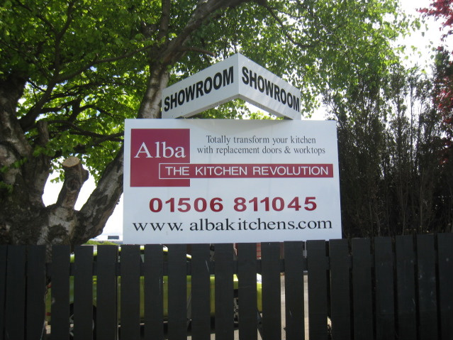
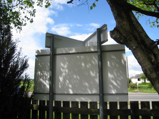
    The second is a straightforward post and panel with the addition of a angled projection mounted at the top with the word showroom. This was fabricated in house using composite aluminium which was grooved and folded before fixing to the posts using conventional rails and clips. I reasoned that the folds would impart rigidity and strength to the sign.


    Attachments:

    Phill Fenton replied 14 years, 5 months ago 4 Members · 5 Replies
  • 5 Replies
  • Glenn Sharp

    Member
    14 May 2011 at 17:51

    I really like the first one Phil…..nice neat, clean looking design. A night shot would be good to see.

    I’ve got to be honest with the second one though……I like the sign in general and the additional top piece is a great idea but the main thing that’s jumping out to me is the kerning. That font that you’ve used doesn’t seem to like the letter K for some reason

    sorry…just trying to be constructive

  • Phill Fenton

    Member
    14 May 2011 at 18:23

    You’re right Glenn 😳

  • Martin Pearson

    Member
    15 May 2011 at 00:41

    Look good Phill but admit it you hit the space bar after the "K" on that web address :lol1: :lol1:

    Did you get an electrician to work with you on the top one Phill? If you did I take it you had a price from them before quoting the customer.

  • Alan Drury

    Member
    15 May 2011 at 09:02

    If you are revisiting the kerning check out Al in Alba
    Alan D

  • Phill Fenton

    Member
    15 May 2011 at 11:07

    I’ve just thought of a legitimate excuse… (puppy-eyes)

    …Alison designed it 😕

Log in to reply.