Home › Forums › Sign Making Discussions › File Swapping › fox club opinions wanted please
-
fox club opinions wanted please
Posted by Mark Phillips on 22 February 2008 at 13:30Harry Cleary replied 17 years, 10 months ago 6 Members · 10 Replies -
10 Replies
-

Have you got magnetic borders pulling all the text to the edges? 😉
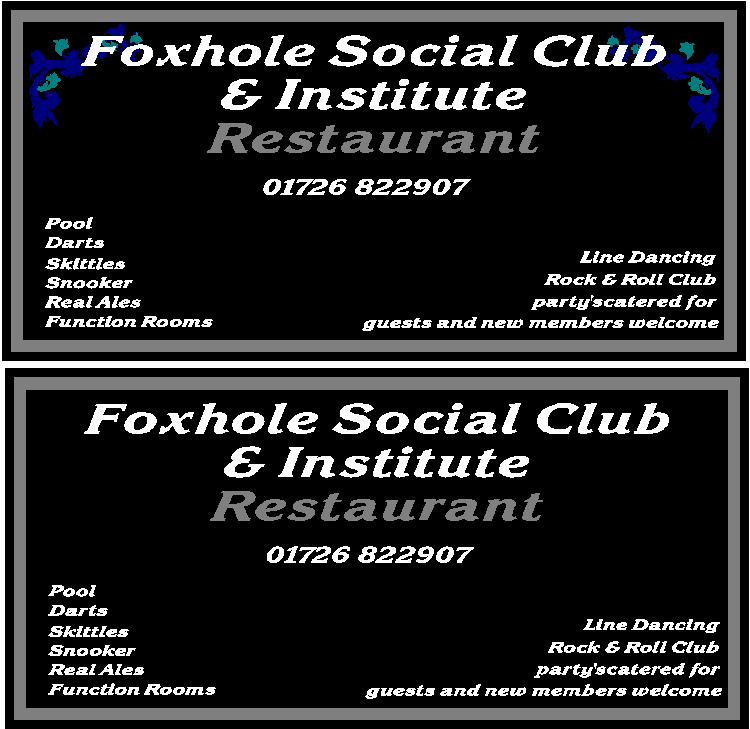
It all needs much more space, and move down the restaurant etc on the main sign to avoid the black hole which is present.
Parties not party’s (note the capital).
Capital G for Guests. -

I thought the restaurant had a lot of blank space centrally & needed a bit of a re-jig.
PS. Parties…
Dave
Attachments:
-

As Peter + all bar the last two lines on the restaurant sign start with a capital. Insert a space in partiescatered for – is that what David was pointing out?
The two blocks of copy at the bottom are different sizes can you not combine two lines to make one? and perhaps use a different letterstyle that is also not italic.Steve
-

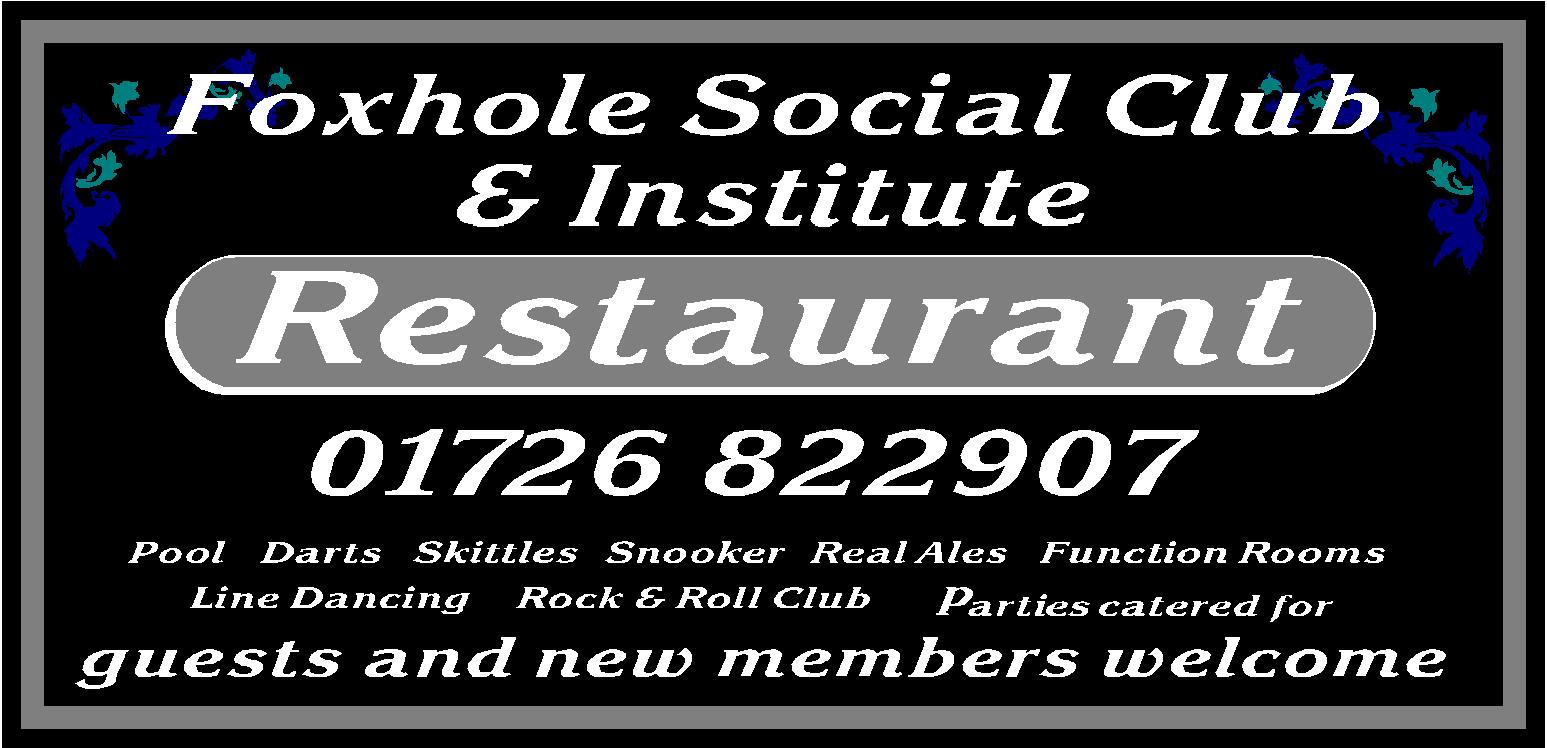
Just a different idea, using classier fonts……I think your clipart isnt working at all in this instance.
Attachments:
-

that looks superb !! much more stylish than mine. I have had problems finding the right clipart , i needed the touch of colour to brighten up the sign. originally required a fox bit have given up on that idea
-
 quote Harry Cleary:Just a different idea, using classier fonts……I think your clipart isnt working at all in this instance.
From my perspective, which in this business is quite handy, I find the blue on black quite hard to read. Im colour blind and dont tend to mix colours that clash e.g. blue/green red/green etc……I think I would stick with white in place of the blue text
-
Totally agree Graham would much prefer to use greens or even red.
-
harry , any chance of the design in AI so i can play with it , i do not appear to have the restaurant font on hand


Log in to reply.