Home › Forums › Sign Making Discussions › General Sign Topics › font suggestion for old building please
-
font suggestion for old building please
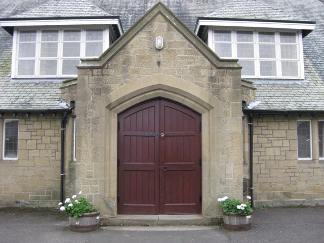
Posted by Derek Heron on 13 October 2011 at 08:33hi all been asked to produce sign for this old building
to go in an arc across the top under the light .not a problem to make but stumped on a
decent font to use any suggestions pleasederek
Attachments:
 Jill Marie Welsh replied 14 years, 2 months ago 9 Members · 18 Replies
 -
18 Replies
-

Possibly an old serif font like Goudy Oldstyle – not quite as harsh & common as Times for instance.
I think an arced sign will compete and look awkward against the doorway arch. Difficult without knowing what the sign will comprise of but black flat cut s/o letters might look smart, plus there will be no panel shape which is going to add yet another geometric set against the door arch and the roof pitch. -

It’s not really correct for the time period but this might look cool:
http://www.letterheadfonts.com/fonts/ne … lassic.phpAnd this one is probably historically appropriate:
http://www.letterheadfonts.com/fonts/hindlewood.php
Just not in all-caps of course.
😀I would also avoid arching it as I think it would be overkill.
Love….Jill -

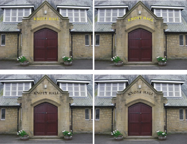
hi peter thanks for the suggestions
here’s the name on
in both straight and arch
customer wants it in gold but i think it will be lost due to the colour of the brickwork
any crits pleas i am lost on this one 😕derek
hi jill just missed your post
what a great font site more food for thought
Attachments:
-

Difficult – I think the arch and the strict apex features will conflict with any horizontal linear device. I’d be tempted to try the cut-out letters (in black) on two lines – fairly large.
Or perhaps play with a panel – square XxY – not rectangular.
Move the light up into the apex. Locate the panel centrally – background same as doors or slightly darker. Gold margin line – offset well inside panel edge. Small accents inside corners? All detail in gold.
– just thinking out loud 🙂
-

Arched version for me.
What about bronze or copper composite as apposed to gold.
-
 quote Peter Dee:Bottom left. Plain, neat & simple.
I agree, but how about the black text with a broad gold border, or the reverse, black border with gold inside?
-

How about gold moulded letters with a black acrylic flatcut outline? Accent do them nice & cheap.
Not a fan of Goudy in an arc. Maybe Aldine 401?
-
Not the same font, but similar to this?
Attachments:
-
That’s them, although I prefer the mirror finish bevelled ones with the outline, but I don’t think Friz Quadrata would be appropriate on that building :lol1:
-
Something like this maybe?
I don’t like the gold at all.
I think black wrought iron looking /flat black might look really cool.
Attachments:

-
 quote Gwaredd Steele:That’s them, although I prefer the mirror finish bevelled ones with the outline, but I don’t think Friz Quadrata would be appropriate on that building :lol1:
Gwaredd, I haven’t seen the style of lettering you have mentioned so may be wrong but from your description the first thing I thought was it sounded pretty modern and not appropriate on that building :lol1: :lol1:
Derek, talk the customer out of gold letters unless you have something behind them, have seem a few jobs where gold letters have been used on that colour building and they are almost completely lost, far worse than in the visual you have done I would say.
-
quote Martin:quote Gwaredd Steele:That’s them, although I prefer the mirror finish bevelled ones with the outline, but I don’t think Friz Quadrata would be appropriate on that building :lol1:
Gwaredd, I haven’t seen the style of lettering you have mentioned so may be wrong but from your description the first thing I thought was it sounded pretty modern and not appropriate on that building :lol1: :lol1:
I know, hence me saying it wouldn’t be appropriate on that particular building in my quote above your post, but thanks for clarifying 😉 :lol1:
-
It’s my age Gwaredd I get confused very easily :lol1: I did read your post but I thought it was just the font which you thought wouldn’t be suitable.
-
Hi All
thanks for all the input busy waiting on the customers decision
personally i was hoping they would go for the curved black text bottom right
and then jill threw the curved ball into play love the stratford one
so hope they go for that by the way what a font site that is jillwill keep you all updated on the decision
thanks for all the input
Derek

Log in to reply.