Home › Forums › Sign Making Discussions › File Swapping › Font ID Please
-
Font ID Please
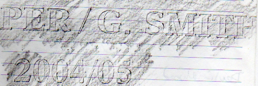
Posted by John Harding on 13 August 2006 at 08:57Hi Guys
Not the greatest picture but can anyone Id the font
Thanks in advance – John
Attachments:
 John Harding replied 19 years, 4 months ago 6 Members · 11 Replies
 -
11 Replies
-

Looks like a variation of Times Roman to me.
I thought the # was Goudy due to the 4 and 5, but I was wrong.
Love…..Jill -

It’s not egyptian bold is it? or centuary schoolbook maybe?
Not at work so I can’t check it, sorry
-

Hi Jill and Shane, thanks for taking the time to look really appreciate it, of course your right its neither Goudy nor century schoolbook, don’t know about Egyptian tho as its not in my collection.
Anyone else with a nugget of wisdom to offer please 🙂
Thanks all – John
-
Thanks Phil its not quite Aldine, and Nic it isn’t Dutch 801 although I don’t have the two specific variants you mentioned.
Thoughts anyone
Thanks again – John
-

Looks like New Aster Bold:
http://www.myfonts.com/fonts/linotype/new-aster/bold/
Cheers,
Jamie.PS. I have the Mac version if you need some text setting.
Doh…beaten to it!
-
Nick your the man 😉 and Jamie just beaten by Nics nimble fingers on the keyboard!
Thanks to everyone who took time to post 😀
John
-

Pleased to help mate, the only thing wrong with the font is that it has a round full stop not a square one as in your tracing.
-
quote :Pleased to help mate, the only thing wrong with the font is that it has a round full stop not a square one as in your tracing
Yep saw that nick – I think I can overcome that – even I can draw a square 😉
John


Log in to reply.