Home › Forums › Sign Making Discussions › File Swapping › font id please
-
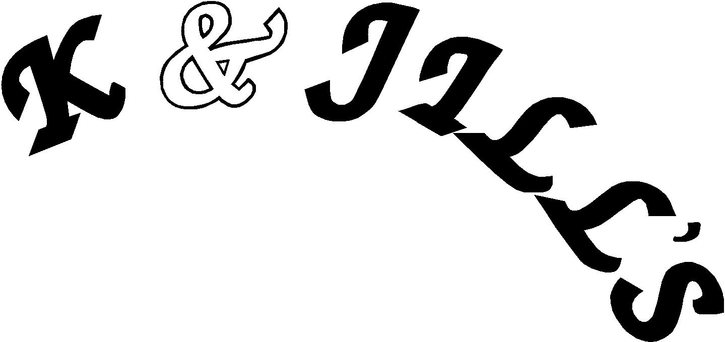
font id please
Posted by Nicola McIntosh on 6 September 2006 at 13:54Lorraine Clinch replied 19 years, 3 months ago 5 Members · 15 Replies -
15 Replies
-
oh I’ve got that font ……. I just remember what it’s called 👿 I’m sure it’s in signlab…..?
I’ll have a dig
-
quote HIDDENMOLE:zaff chancery with thick line we think
thats what i thought but the amphersand is totally different 😀
nik
-
the amphersand in Zapf bold is almost the same tho …..
-
quote Marcella:the amphersand in Zapf bold is almost the same tho …..
ive not got the bold one :lol1:
nik
-
can you just whizzzzz…….. them all over cheers 😉
nik
-
here ya go Zapf bold. Zapf Chancery Upright is in signlab as ‘zapfchl’, that’s got the same amphersand…. I’m sure! 😀
-
Talk them into using the proper form for a decorative font…
(no arching and no all-caps)
and they will never know the difference!
love…jill -
quote Nicola Rowlands:thats not the right font…………. 😥
nik
🙁 just tell them what they have is naff and they need something better! 😀
-
quote Marcella:🙁 just tell them what they have is naff and they need something better! 😀
i cant the customer had it done on something else..so it has to be the same…it is yukk i’ll just vector it later 😕
nik
-
Nik, I think the main font is Lucida Calligraphy, the amphersan is in SL as Zapfchl
Edit: All with a heavy outline, of course! I also had to change the K.
-
Oh dear…I thought this was a new post-sorry! Feel a right idiot now, you’ve probably sorted it anyway! 😳
Log in to reply.


