Home › Forums › Sign Making Discussions › Gallery › Evans: Signage Assortment
-
Evans: Signage Assortment
Posted by Scott.Evans on 17 June 2009 at 09:08here is some of the work i have been doing.
welcome to crits as i can only get better
:lol1:
Attachments:


 Ade Ward replied 16 years, 4 months ago 9 Members · 10 Replies
 -
10 Replies
-

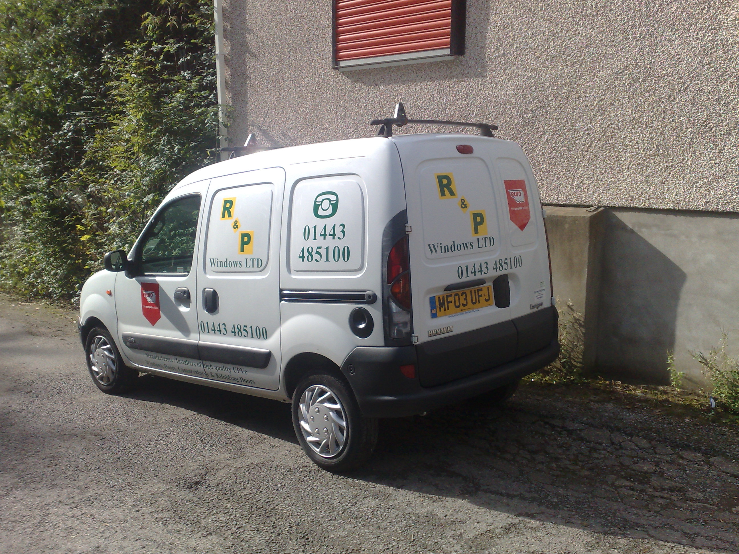
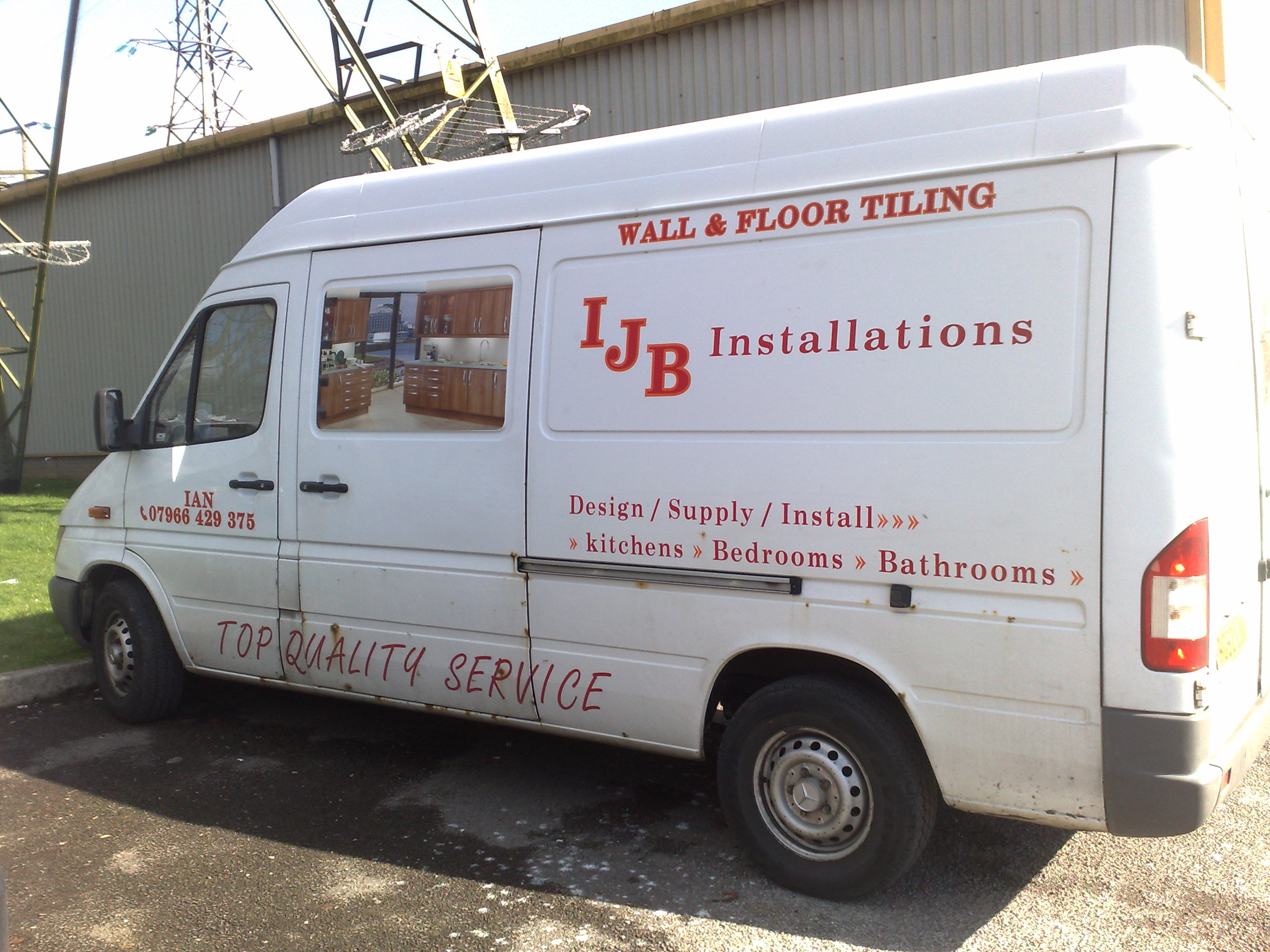
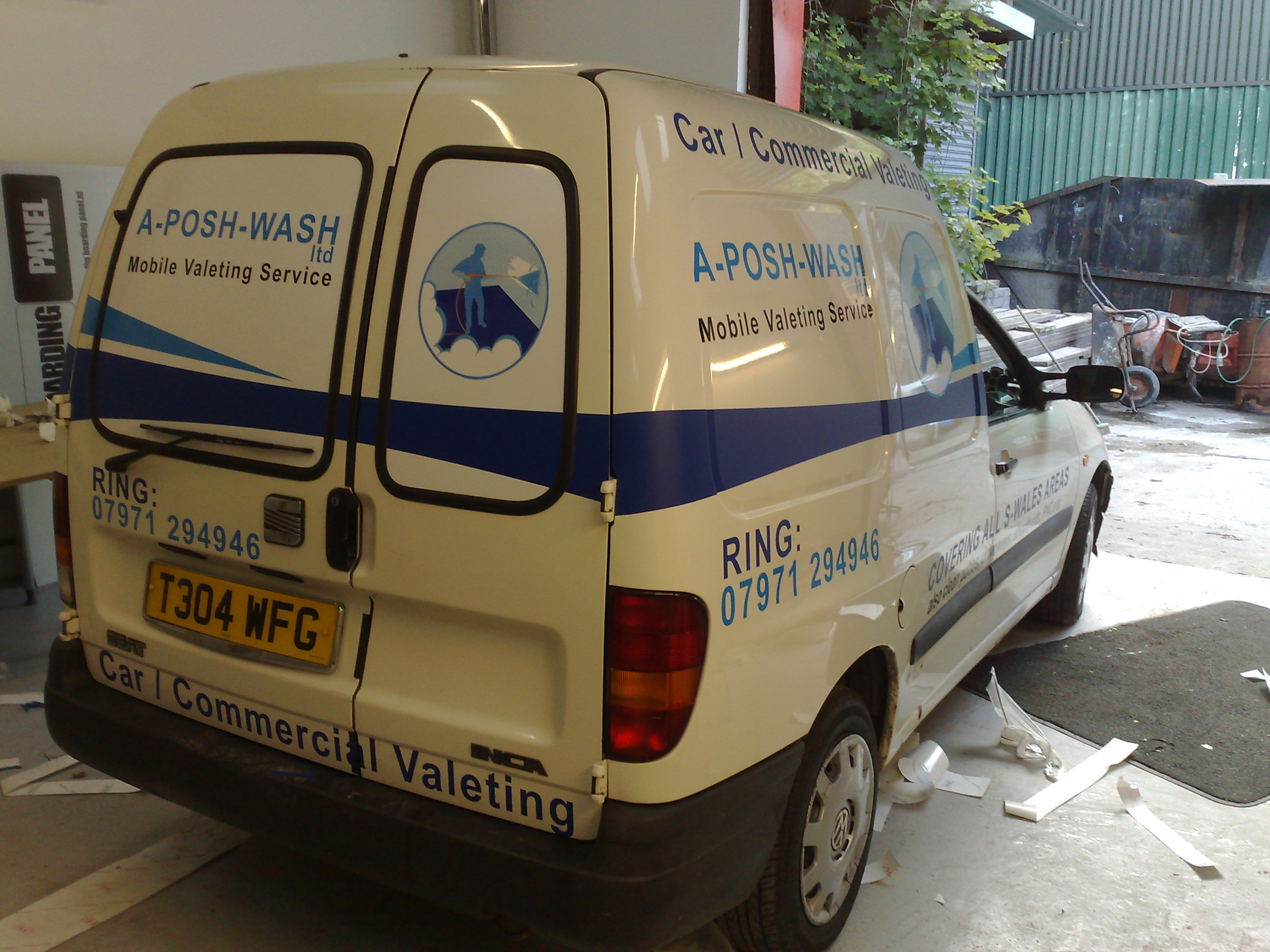
Like the look of most of that there…possible exception of the IJB van.
(forgive me) – it looks like the "customer designed it" as it’s not as ‘together’ as most of your other vehicle designs.
Dave
-

Like it Scott.
Whats the reclining guy on the glass, a print onto transparent?
-

Thanks for you re replies. 😀
With the ijb van i designed it a lot different but when he came in for his designs he had me moving it all on screen, some times you Cannot tell them, if it looks wright in there eyes they wont come from it, but they are the one paying so not complaining.
For the prints on the wall
What i done was printed and applied it to 3mm foamex and placed it behind 5mm clear acrylic, looks grate on the standoffs.
these prints get changed every 3 months< we have a template here to drill the holes in the right place.Better pic here, think i need to invest in a new camera
Attachments:

-

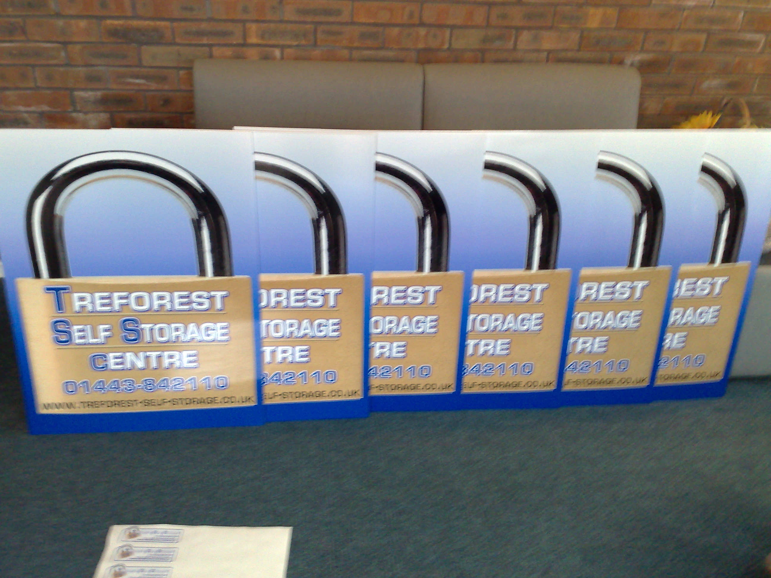
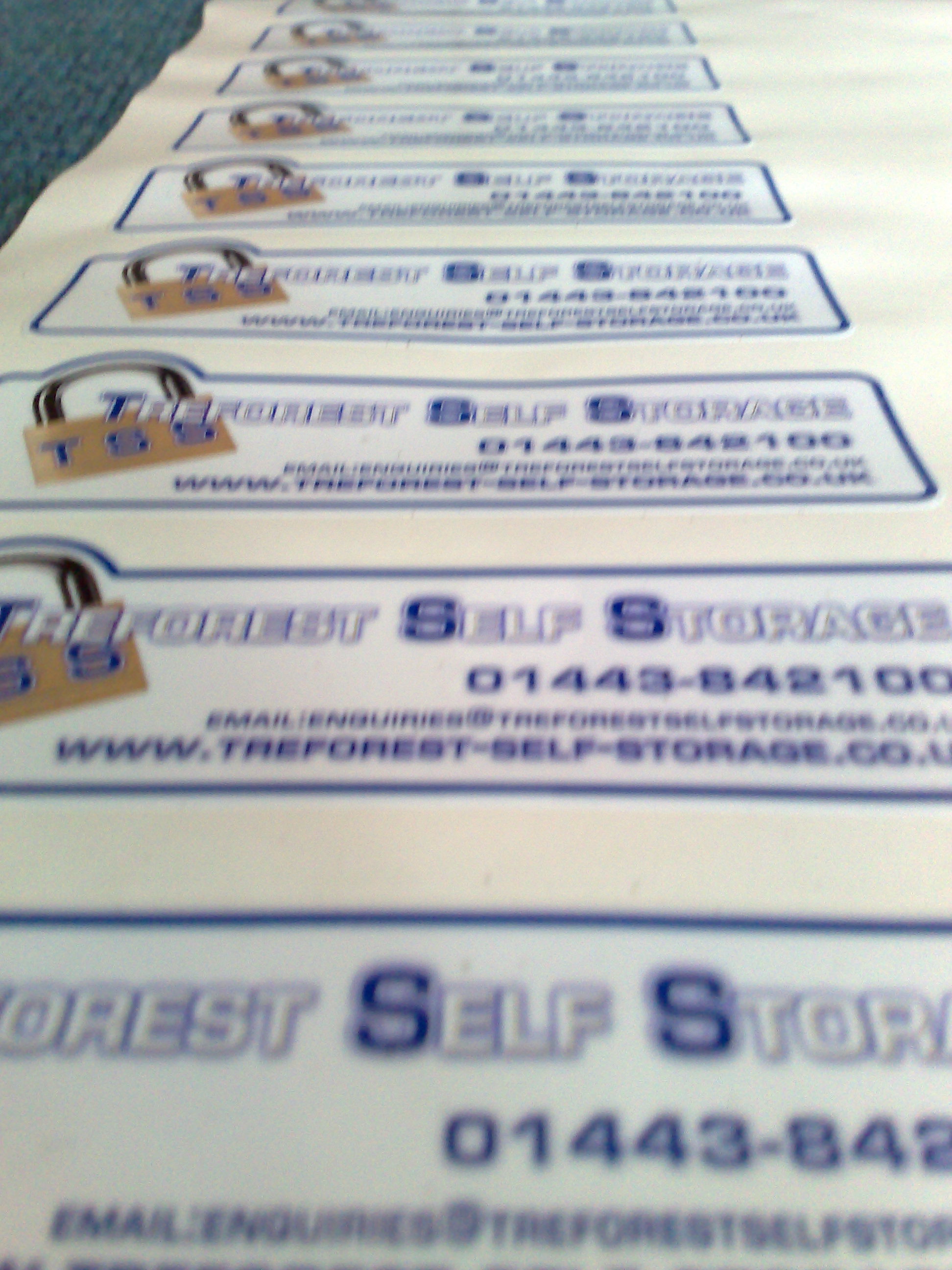
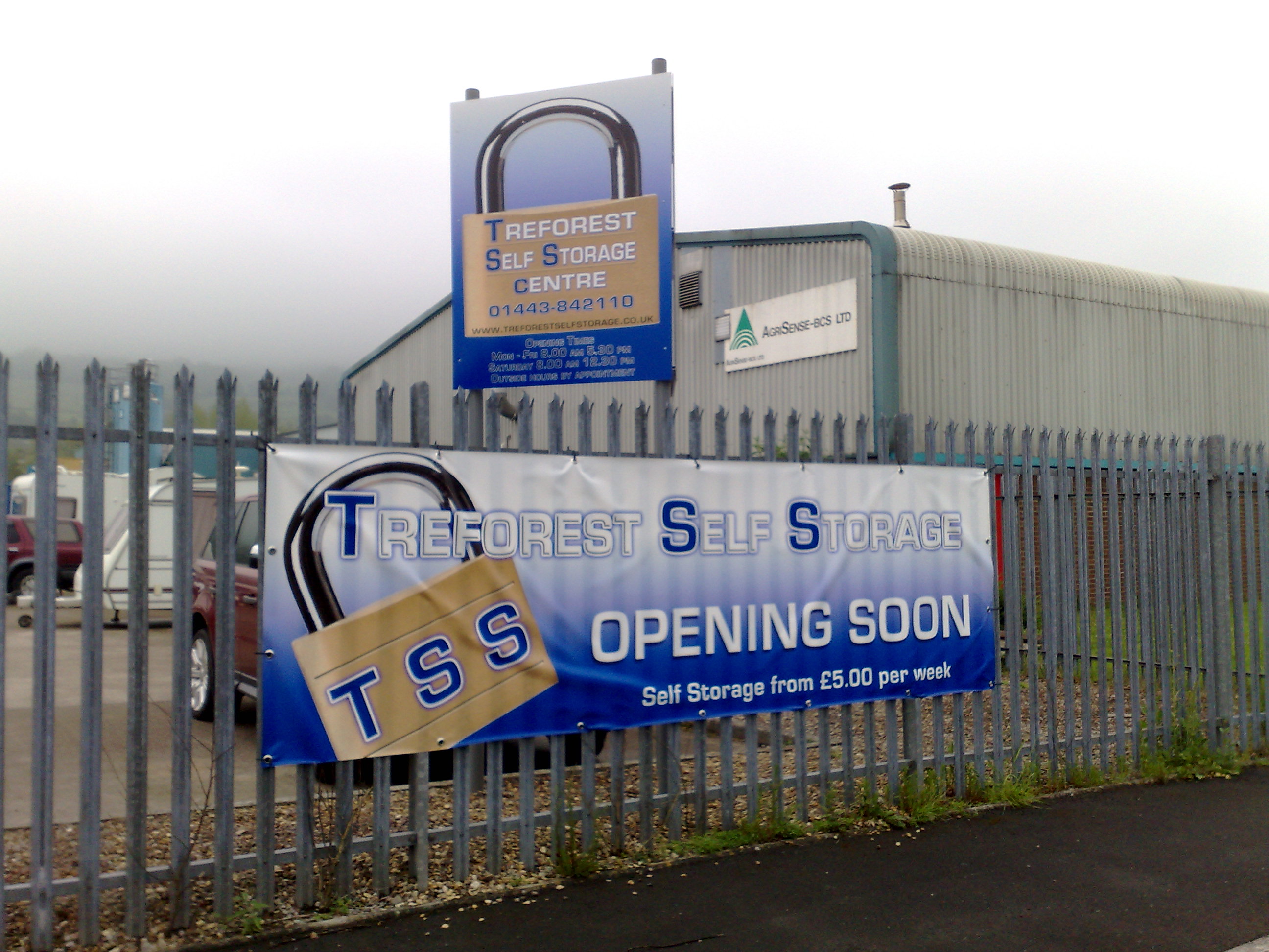
Some nice stuff there Scott……I think the Treforest ones look really good
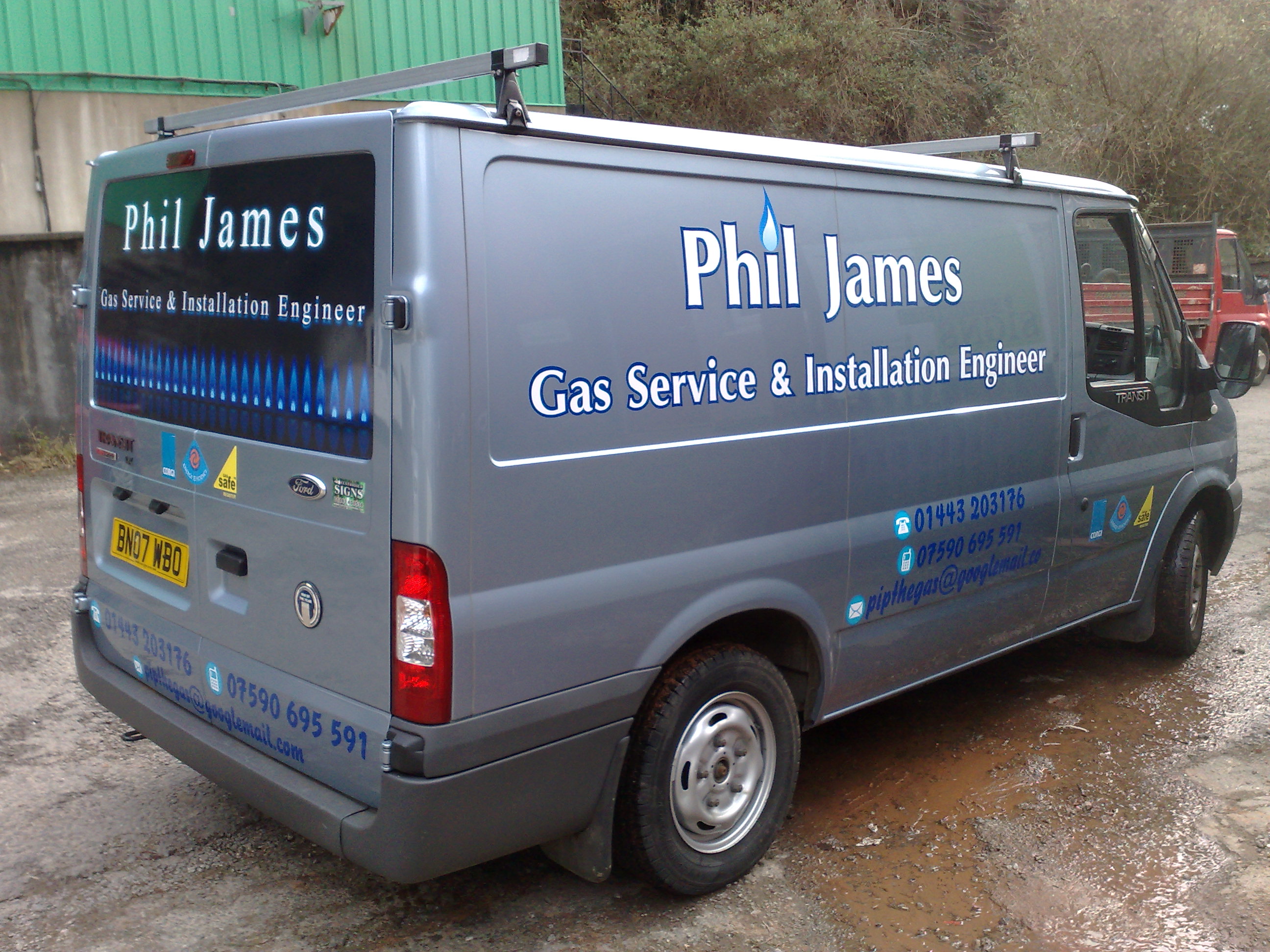
why the two different fonts on the Phil James one though??
-

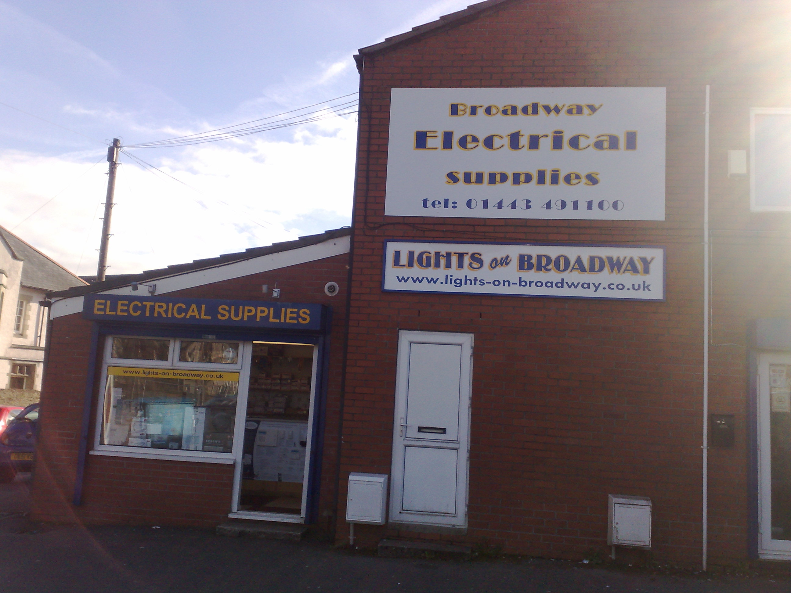
Some REALLY nice work there Scott, my favourite is also the Treforest. My only crit would be the font of phone number on electrical supplies place, but no doubt customer spec’t it.
How were the red stand offs done, big heads and glued into wall or on locators. My house is built in the same style stonework, and it’s quite uneven. Well done mate.
-

Scott your work is getting better and better, same crits as above the IJB didn’t look consistent with your work, and I think the Phil James appeared cramped on the back and needed more space. apart from that top notch
Lynn
-
Thanks for the replies.
The red flat cut letters where done using allocators from sign trade, what i done was screwed 1 letter each end, run a string from 1 to the other and then where the screws needed to come out further i cut a piece of tube and placed it behind the screw.
Bit time consuming but worked well
-
 quote Scott Evans_21:Thanks for the replies.
The red flat cut letters where done using allocators from sign trade, what i done was screwed 1 letter each end, run a string from 1 to the other and then where the screws needed to come out further i cut a piece of tube and placed it behind the screw.
Bit time consuming but worked well
well thought out mate!
you’re making me wish i’d bought a printer ages ago now! you’ve certainly come on a long way in the two years or so since your first posts. some real nice work, a few minor crits but nothing that hasn’t already been said and, probably nothing we’re all guilty of on occasion!
Hugh

Log in to reply.