Home › Forums › Sign Making Discussions › Graphic Design Help › do you think this design is a bit too much?
-
do you think this design is a bit too much?
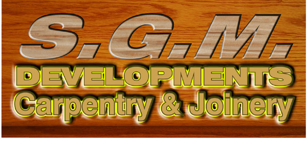
Posted by Chris Wool on 5 May 2004 at 15:50cant make my mind up before i show customer
chris
Attachments:
 Chris Wool replied 21 years, 8 months ago 12 Members · 20 Replies
 -
20 Replies
-

Not so sure about the yellow Chris? and maybe the SGM a bit larger also open up your line spacing that looks tocrammedtogether 😆 I’ve never been a fan of italic main texts it just looks a bit odd to me sorry. 😕
-

I agree that it has a lot of bells-n-whistles.
Perhaps a non-textured, non-italic,
serifed font for the initials, and tighten up the kerning.
For the lower part, I don’t care for the yellow outline.
Does it need outlines AND shadows?
And why are there no shadows on the initials?
I do like the woodgrain background,
but you need more space around the lettering.
But I think you need a different color, such as forest green,
for the copy. Just my 2 cents.
Sorry if I sound like a smarty-pants.
Love…Jill -

hi chris
nice work, nice effects mate. but i think there is a bit much going on.
as way of constructive critisism:
reading it confuses me a little. is it SGM DEVELOPMENTS or SGM, developments, carpentry & joinery?
i think the background does the job implying wood nicely. so ide probably loose it on the text.
S.G.M. DEVELOPMENTS needs to appear as one, if thats how it should read. i.e. same colours, font etc
like steve mentions ide drop the italics and yellow outline
i would knock the opacity of your shadow to about 50% and make sure its the same distance it casts on all the text.
the bevel emboss on the SGM is fine but i think it would be best to have the same on the lower text also.. just my humble opinions again mate.
all in the work is great, just that i feel needs some tweaks here and there 😉thanks very much for taking the time to ask opinions on your work 😉
-

Kerning, line spacing, outline? highlights and lowlights? textures…..mmmm maybe, all look good but not all together on the same sign. Outline probably a dark green or red to lift it from the wood background maybe but i would loose the highlights and lowlights for sure makes it look too much. 😕 MHO
-

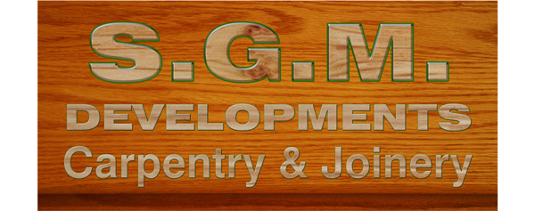
and again
thanks for comments guys & gals much appreciated
chris
Attachments:
-
hi chris. had a mess around using the same sorta layout, fonts etc and this is what i came up with. maybe not be your cuppa tea though.. 😀
Attachments:

-
I like BOTH of the re-dos,
but John’s is a different and clever approach.
(Rob’s ain’t too shabby neither! 😉 )
Love….Jill -
i prefer jons myself.. 😛
but based my own on what chris had done.. just incase he was replicating their own artwork.
if not, im sure they will love jons 😉 -

I’m not so sure on the block sans typefaces for the SGM, it dosen’t say craftmanship to me. Keep it clean and let the contrast to the work.
Attachments:
-
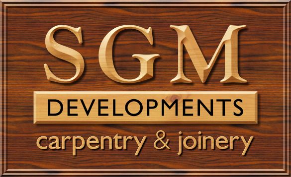
YES! YES! YES!
ahhhhh….I think I need a cigarette.
love…Jill
(and I don’t even smoke!)
😳 -

They are all great!
Where did the Wood Effect come from? Is it from Photshop?
-
yep james.. i think that one tops the bill for me mate.. top notch 😉
-
Very cool James 😀 Only bit I’m not keen on is the outer border, but its only because I’m in a niggley mood 😉 😉
Cheers, Dewi
-
well whot can i say
thank you every body james has hit the nail on the head i think
i bet its got some of you printer boys thinking though i have been thinking off this for a while just needed the right customer to try it with
i will try to replicate james idea to a usable resolution.
it has been a very worth while excersise i think
thank you
chris


Log in to reply.