Home Forums Sign Making Discussions Traditional difficult Hanging sign advice

  • difficult Hanging sign advice

    Posted by Peter Normington on 12 August 2009 at 22:25

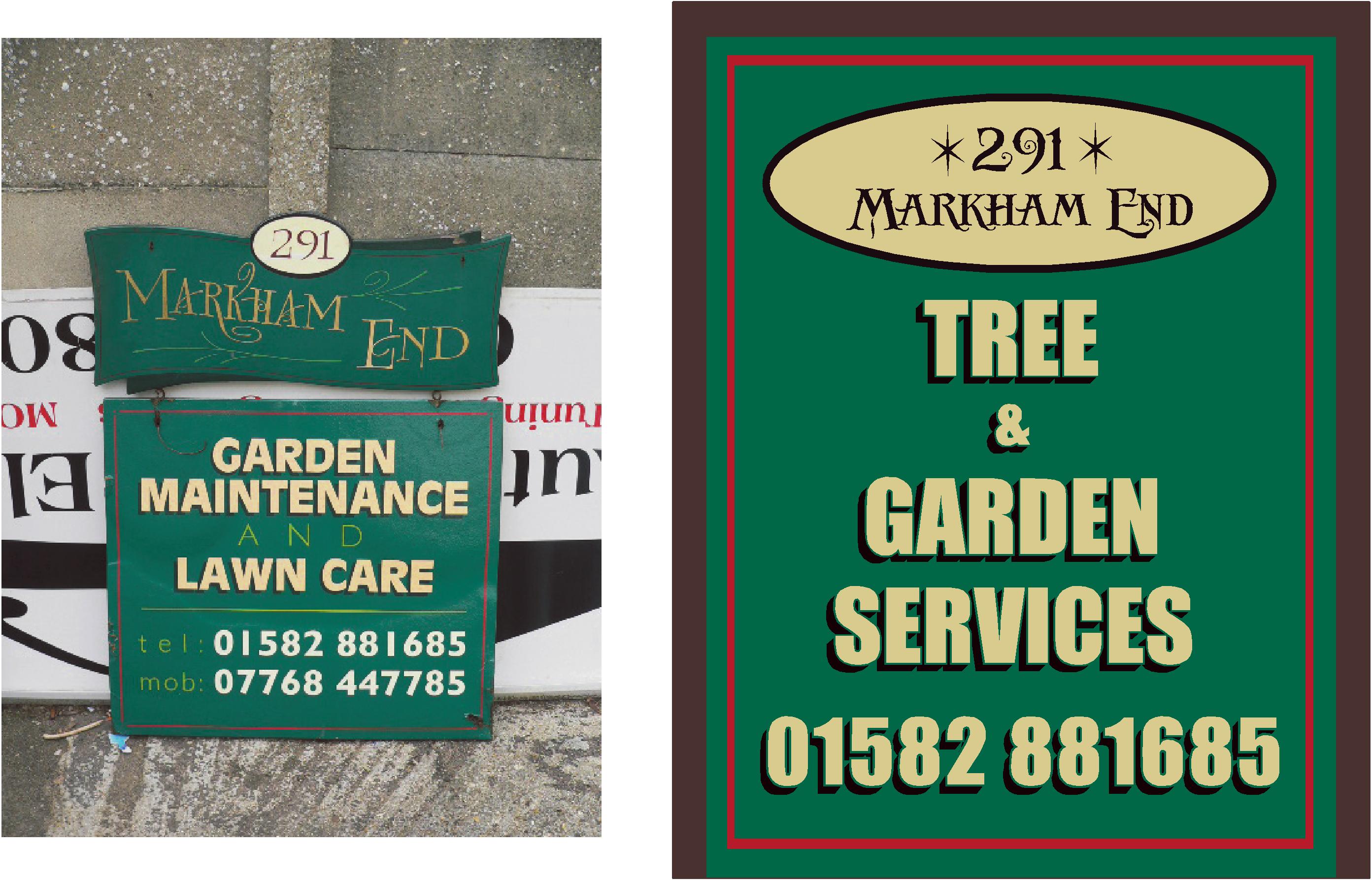
    I have to supply a hanging sign to replace a very nice hand painted one, unfortunately done on mdf which has blown,
    The client is on a budget, and I have had a quote to replicate, from a respected brushy, and I do appreciate the work that is involved,
    but out of the range the customer wants to spend.
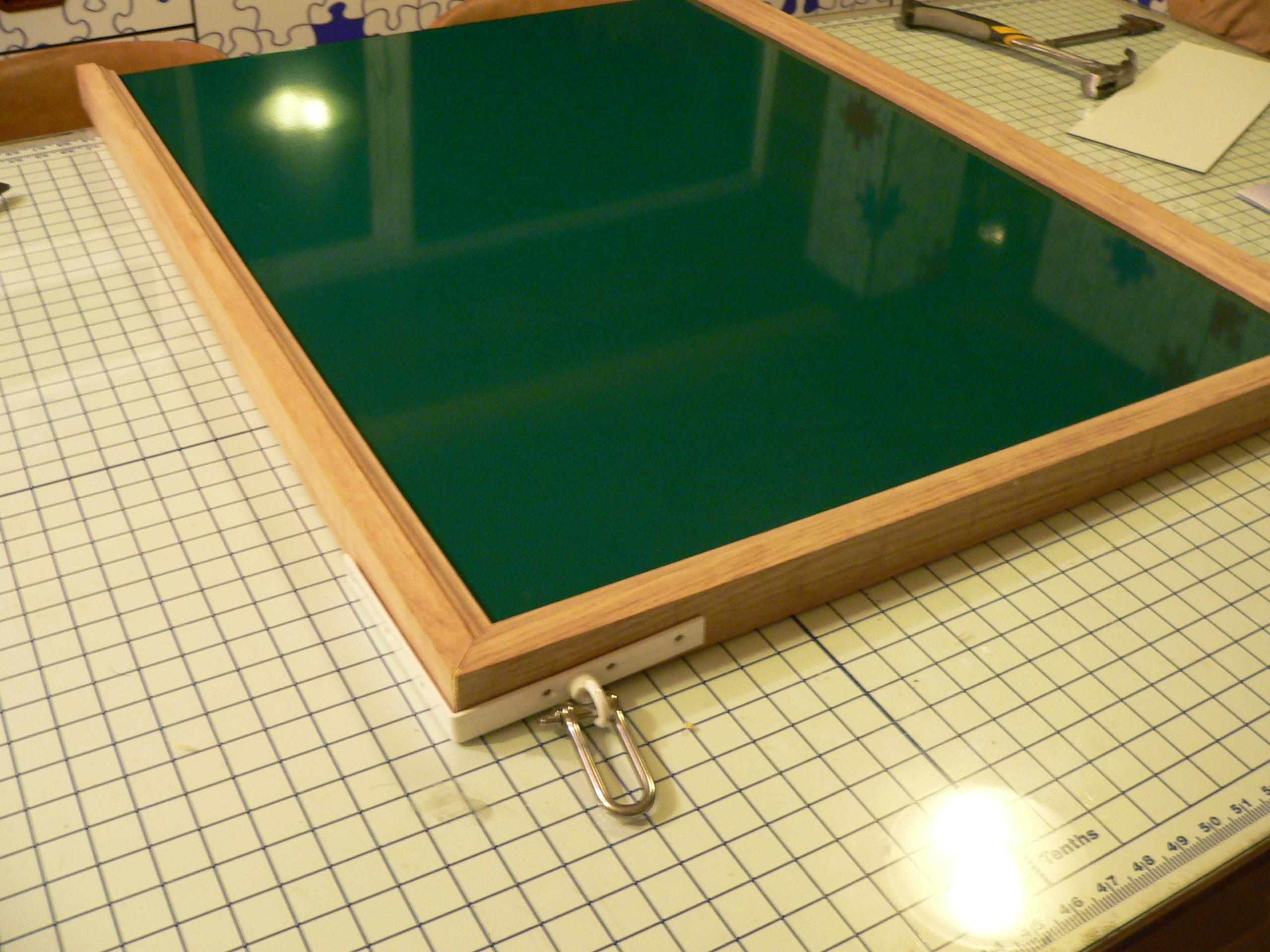
    will this do as an alternative?

    I will use the oak frame from jag signs, varnished, and composite for the panel.
    any advice welcome

    Peter


    Attachments:

    Chris Wool replied 16 years, 3 months ago 6 Members · 8 Replies
  • 8 Replies
  • Martin Pearson

    Member
    12 August 2009 at 22:32

    Like you say Peter the customer is on a budget and the cost to replicate is out of their price range. As an alternative I think your visual is OK, colours are good and it’s well laid out. How you going to mount it though if it’s a hanging sign ??

  • Peter Normington

    Member
    12 August 2009 at 22:35

    The post and cross bar is already in place, so using Jag corner brackets,
    and shackles

    Peter

  • Robert Lambie

    Member
    12 August 2009 at 22:36

    why not just replicate the sign in 10mm foamex if you have any off-cuts.
    its hanging so wont expand and distort and if you cover face in vinyl you should get the life out of it.

  • Martin Pearson

    Member
    12 August 2009 at 22:39

    Peter, I’ve not used the jag framing but I take it it is double sided. Not quite sure how the corner brackets work either so I will have to do a bit of research 😉

  • Phill Fenton

    Member
    12 August 2009 at 22:41

    I like the colours – nice and traditional looking. All you can do is put forward your proposal and let the customer decide.

    Personally I can’t see much difference between the two examples, and if yours is much closer to the customers budget then why not? It’s probably going to be longer lasting too.

  • Peter Normington

    Member
    12 August 2009 at 22:41

    This is how it looks up to now


    Attachments:

  • Jill Marie Welsh

    Member
    12 August 2009 at 22:43

    Peter yours looks like it would be much more stable than the original.
    Any time you get pieces like that on a hanging sign it’s almost asking for failure.
    I think it should be just fine.
    And now I am homesick for your house.
    Love….Jill

  • Chris Wool

    Member
    12 August 2009 at 23:29

    just my view on layout.
    move the no to the middle.
    i like the triangular shape of the main text but think that it should be a bit wider. or pale green swirls to take the large space away.

    :peek:

Log in to reply.