Home › Forums › Sign Making Discussions › Graphic Design Help › Design ideas please for shopfront signage?
-
Design ideas please for shopfront signage?
Posted by Marcella Ross on 26 October 2007 at 11:23I’m struggling with this layout ………… 😕
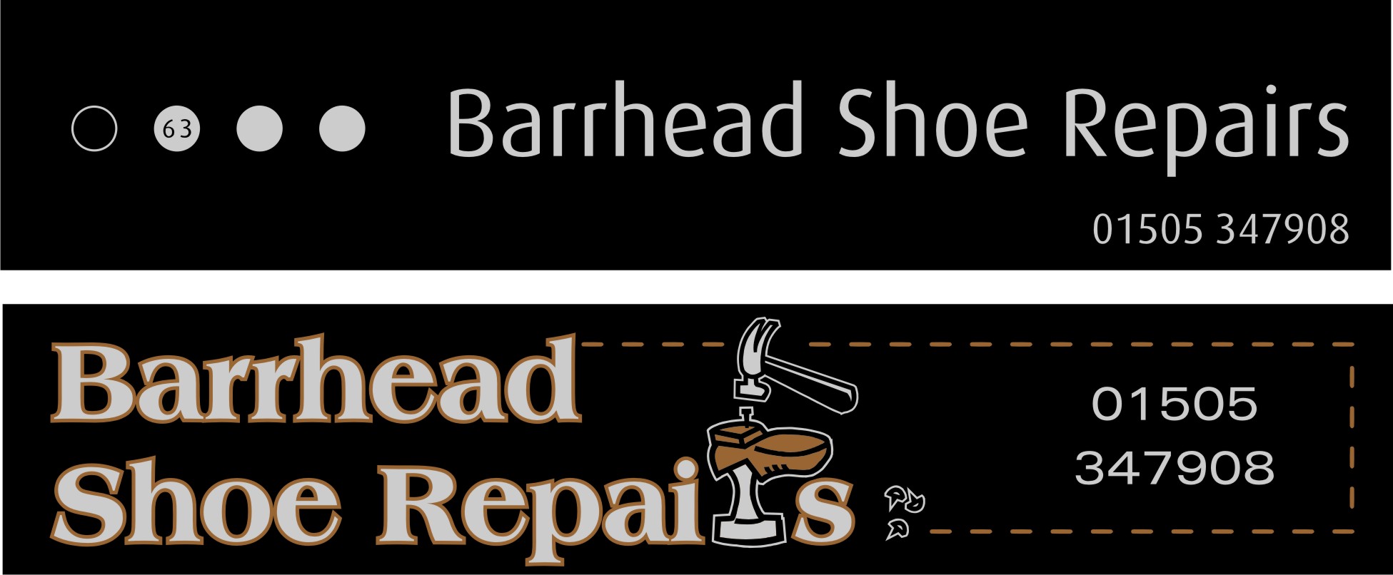
Shopfront sign customer wants a black fascia with silver text. Will not have any other colour way so that must remain. He also asked for ‘a wee man or something to do with shoe repairs’ on it 🙄
But I am struggling to come up with anything that I like. The black and silver just reminds me of a funeral parlour (which his brother owns and I did his sign) so here I am with an old fashioned looking naff sign. I can’t seem to come up with anything that looks a bit more modern……. think it’s the clipart that’s the biggest issue, although I haven’t managed anything better without it yet.Any ideas would be really welcome.
TFIF!!!!!!!!!!!!!!!!!!!!!!!!!!!!
Marcella Ross replied 18 years, 1 month ago 8 Members · 19 Replies -
19 Replies
-
quote Marcella:TFIF!!!!!!!!!!!!!!!!!!!!!!!!!!!!
:lol1: :lol1: :lol1: got that one straight away 😀
nik
-
Marcie
Thinking aloud here, what about something that looks like stitching around the sign boarder?
-
quote Tim Painter:Cobblers!
you got that right! :lol1:
-
The silver shoe stand and hammer will tie the clipart into the silver name.
The stitches might be a good idea for the border.
I would lose the orange, because it looks too Halloweeny to me.
Try a nice imitation gold instead.
I think it looks fine as a layout.
You might try saying to the client that silver, at some angles, has no contrast and will be hard to read. Maybe that will sway them.
Love….Jill -
quote Jillbeans:You might try saying to the client that silver, at some angles, has no contrast and will be hard to read. Maybe that will sway them.
Love….Jillthanks Jill, that was my opening gambit to the customer, but he’s adamant! I was thinking more along the lines of a tan colour as opposed to orange ……… just the way it looks on screen here I suppose (I was thinking of leather hence the tan and brownish tones!!! :lol1: )
😀 -
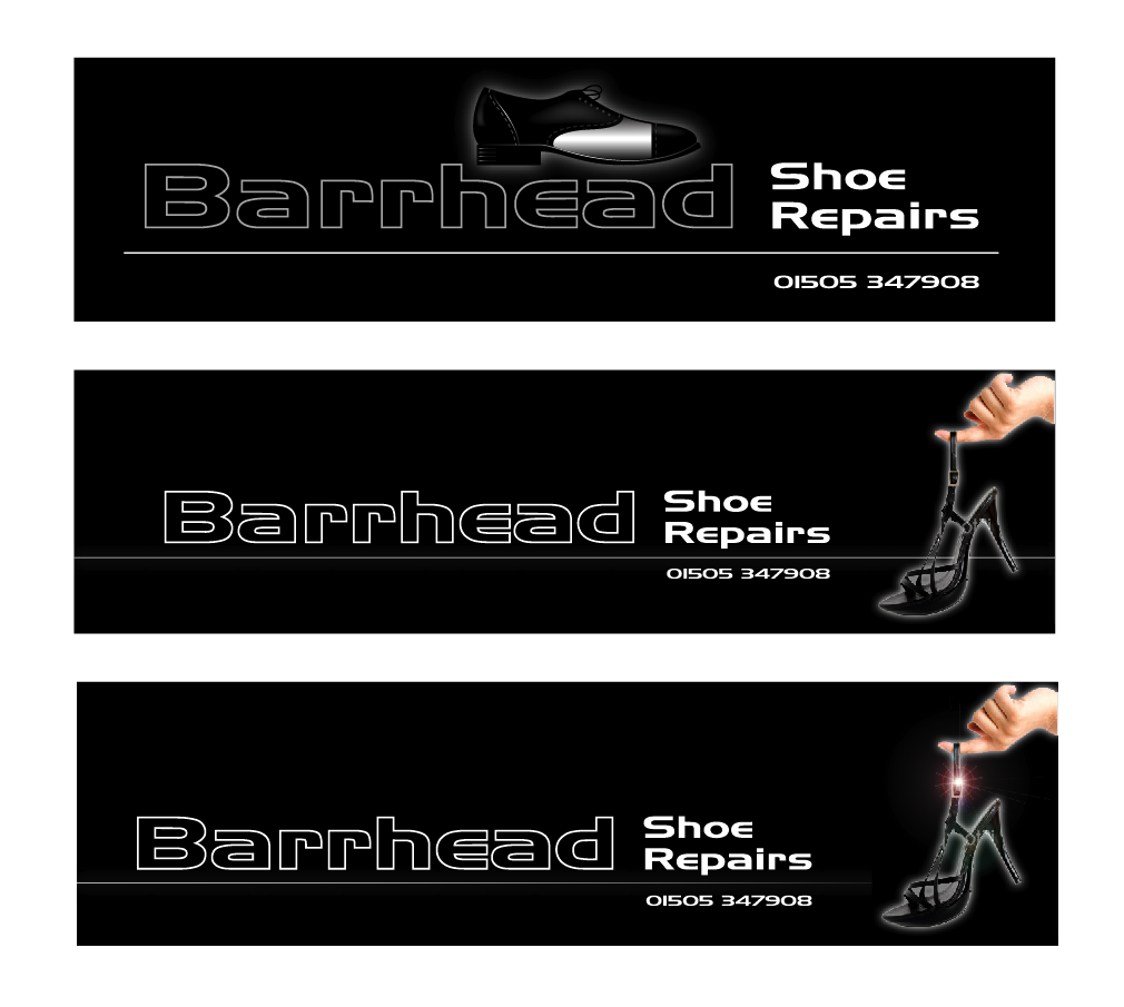
thats more my kinda thing! Thanks Glenn. 😀 Doesn’t look like an undertakers either :lol1:
-
I think I’ve got too much gap between the name & the "shoe repairs" but I was trying to keep the depth of the silver block to a minimum 😀
-
Marcella I like Glenn’s one as well maybe in the gap a pair of ladies high heels ??? or riding boots ???
Lynn
-
I’d rather do something with no clipart whatsoever, so here’s a plain take on it and also something along the lines of what the customer asked for.
Result – too plain and one’s too fussy! 👿 I’m not loving this job right now!
I think I should chill and have a glass of wine now, not even had dinner yet! 😕
-
thanks guys. Chris I like the Barrhead as an outline. That way shoe repairs has priority. ………….
Log in to reply.


