Home Forums Sign Making Discussions Graphic Design Help design help please with my own logo?

  • design help please with my own logo?

    Posted by Phil Barnfield on 20 November 2007 at 17:06

    Hi guys n gals

    Well, having been reading Warren’s thread regarding his logo, it has provoked me to do the obvious with my own!

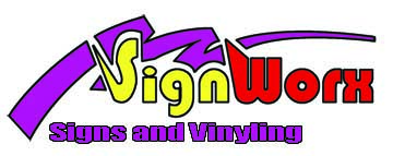
    When I started out I never gave it much thought in terms of name and design. I need to keep the name now as it has built a reputation for me, although I think the logo is loosing the point in many ways:

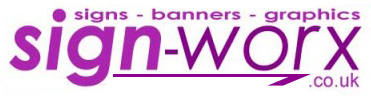
    1. Its complex in a way, and is frustrating. Too many colours, outlines, total abstractness about it.

    2. I modified the letters S and W and it really has not paid off at all!!

    3. Even now I don’t understand my own reasoning for adding the squiggle/swoosh behind the lettering.

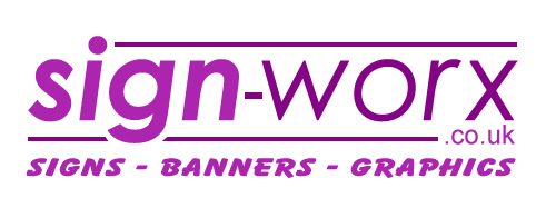
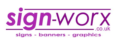
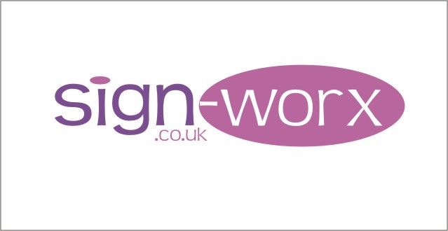
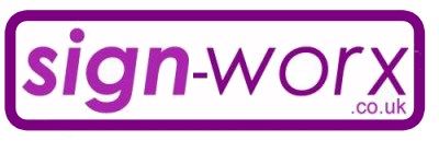
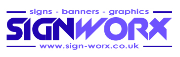
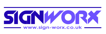
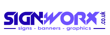
    Anyway enough of the old style logo…. I am looking for a nice clean, 2 colour logo (preferably close colours and in single horizontal line). Bit spoilt for choice on fonts and I am not too familiar with what font will look the best. I need to integrate a very small hyphen between the sign and worx and also need to add .co.uk to the end. This way it will save having a seperate logo and website – try to tie it all into one (www.sign-worx.co.uk). The design must be simplistic for cut vinyl only at this stage.

    I want to portray a cleaner, sophisticated image with a new logo. It will frustrate me slightly as I have clothing, cards, flyers all done and dusted. But if a change is for the better, then I will re-do the website into a more corporate style with the new logo and colours.

    For some reason I like the purple/plum contrasts – did a job for a large warehouse company and theirs is similar in terms of colour. Very nice looking I think.

    Enough blurb, here is my quick take on the idea. Anyone who cares to add will give me food for thought, and hopefully together we can drum up a good un! 😎


    Attachments:

    DaneRead replied 17 years, 11 months ago 5 Members · 7 Replies
  • 7 Replies
  • Marcella Ross

    Member
    20 November 2007 at 17:17

    your new one is MUCH better than the current one! But I’d lose that horrible font you’ve used for the secondary text. Keep it simple like the rest of it.

  • Phil Barnfield

    Member
    20 November 2007 at 17:29

    sorry I got this thing about Balloonist SF at the minute…lol


    Attachments:

  • Jill Marie Welsh

    Member
    20 November 2007 at 17:37

    Better without the Balloon, save that font for those wanting Comic Sans.
    Here’s a quick idea.
    Ideally the hyphen would be breaking the oval, but something musta shifted upon exporting.
    Love…..Jill


    Attachments:

  • Phil Barnfield

    Member
    20 November 2007 at 22:02

    few more ideas of mine…. 🙄


    Attachments:

  • Warren Beard

    Member
    20 November 2007 at 22:19

    Hi Phil

    Not had time to throw something in to your pot but now mine is basically finished maybe other will have time to help you out 😉 :lol1:

    Try hard to create a few really different ideas even if you don’t like them, keep them all together and keep looking at them, take on board what others have said and keep thinking about it, try different colours and fonts, the right ones will jump out at you, then post them here and Andrew will correct it for you :lol1: 😉

    Cheers

    Warren

  • Phil Barnfield

    Member
    4 December 2007 at 13:06

    Hope your right there Warren………. :lol1:

    Been putting the idea off for a while, but having thought about it again, I have decided to play with a few more idea’s!

    Firstly, was looking into buying a new domain name that would allow me to utilise the extension better….. i.e. domainuk.com and use the uk.com bit on the end of logo – this is already taken, so I cant do that. Still need to keep the name as it is recognised now locally.

    Few more idea’s attached here. Not sure what people might think of the font, but I am after a more striking but modern approach that says "Signs Work for you" type thing.

    My last one v7 is my favourite at minute, but I am not sure on the .co.uk placement on the side because of the dot before the co.uk looks out of place. Also in this idea I have placed a block between the Sign and Worx to simulate a hypen so that it reads correctly for the benefit of the web address… hope that makes sense. Can people be totally honest with me and say whether or not this visually works or not – I wouldn’t want people to omit the hypen in the web address as it wont take them to my website, so if it isnt totally obvious and legible then I had better think again.

    Any crit and advice is welcome!


    Attachments:

  • DaneRead

    Member
    4 December 2007 at 15:38

    anything between Jills design and idea 3.

    Dont want to complicate it by having the co.uk up the side.

    Thats my personal prefrence.

Log in to reply.