Home › Forums › Sign Making Discussions › Graphic Design Help › Design help needed please for large sign?
-
Design help needed please for large sign?
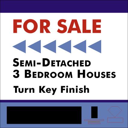
Posted by TimDouglas on 20 August 2007 at 19:33Hi folks , advice here, this is going on a 4ft x 4ft sign. I can only change the For sale, text below and arrow on this , The customer wants it to look like his company website and company letters, I have vectorized all the logos myself ( dead chuffed with them ) Am i using the correct color combinations / text style here or should i change anything to make it stand out.
Thanks Tim
Attachments:
 TimDouglas replied 18 years, 3 months ago 6 Members · 18 Replies
 -
18 Replies
-

quick reply…
you really need to advise the customer your not designing a letterhead or website but a "sign" something viewed from a distance. so has to be laid out to best suit the information "needed" at a glance i think there is too much going on…
from experience, estate agents do not want to pay allot for this sort of thing so tell them adding all these graphics and colours can be done but will cost extra. you will see them quickly drop things…im assuming its all cut vinyl graphics?
-

Its all cut vinyl, for a property developer who uses the two estate agents at the bottom. He has quite a few off these for sale so he wants to use it for a while. I see your point about being a little cluttered.. Will try to re think
-
is there a reason for the solid blue band on left and bottom in lighter blue?
-
Its just the design he asked for , Maybe I should do a simple one as well and see which one he prefers.
-

as Rob has said…there is too much going on
The arrow takes over the board..& from past experience the two agents will want equal coverage in terms of presence on the board…..the telephone numbers are way too small aswell
Although I would never advocate messing round with logos we’ve found that in most cases Estate Agents & the like don’t mind you doing it if is to their benefit…I would advice you seperate the phone no’s from the logo’s & get them right up in size
If you need to keep the borders I would put the "MAM" logo in the left hand border…..loose the blue arrow head (triangle)….that would give you a much cleaner space to work with so that everything can be centred within
-

Quick query-what is a turn key finish, and should it be hyphenated, ie turn-key finish?
As to the board, I agree, too cluttered, arrow needs to be much smaller, maybe red to enhance it, phone no’s larger.
-
I also think it would be worth getting a price to get it digitally printed ……I can’t see there being much money in it for you once you have cut & applied all that
-

Yeah, I agree, it’s a little cluttered. How about something like the attached. You might have to adjust it a little. It’s a mix of millimeters and inches (don’t ya just love the Imperial Measurement System?). I drew the outside at 150mm x 150mm. I think yours might have been a tad smaller. All the copy sizes were done in inches. I just used a Futura font. I’m not sure which one your client wants to use. I just roughed in the logos, as I don’t have them.
Attachments:
-
Thanks for the advice folks, When I see another example I realize my errors, will do a couple of posts and let him decide. Might just show him Simon’s ideas, much easier to apply . thanks
Tim
-
I think one of the previous posters was correct about the wording. "Turn Key" is wrong. It’s either Turn-Key (hyphenated) or Turnkey (one word) would be proper grammar. Also I didn’t know if the address and phone number was part of the logo. If not, it would be better to set it larger to maker it more visible as recommended in another post also. Also one thing to consider is that the size of the copy usually is recommended to be larger than 3" (75mm Approx.) when being read from a moving vehicle (the larger the more legible from a distance). This makes it easier to read. I know you are probably held back by overall sign size constraints though. If it’s to attract foot traffic, the smaller size is ok.
-
Then you should definitely have enough room to fit everything at a nice size. Cheers! 😀
-
here’s a rough layout to show you what I was trying to explain…..
Attachments:

-
Thanks very much for the designs, I will probably end up using one off them rather than mine, the drawing and vectoring experience was good and i done them fairly quickly. The sign has to be ready for friday! 3 cars and 3 vans also , under a bit of "P" so the less complicated the better and im over in xpres all day tomorrow (!)
-
Hi folks I just finished the for sale sign.
This is what me and the customer agreed on yesterday evening, needed today for 2pm, got it done at 1pm . This sign industry is not an easy number.Please go easy on the picking faults , but your comments will be remembered for next time.
Trying to work out a cost for this. 4×4 ft sign
£5.00 for the sign, 6 hours to cut and fit , 1.5 hours design
All cut vinyl ( had to vetorise the three logos ) . Would £70 pounds be to much, This was my first job of this size so I’m sure i would get faster was just double checking everything as i went along.
Attachments:
-

Hi Tim,
Just a design / layout tip, in most circumstances, it looks better when you have a border without text around the sign….. thinking of the telephone numbers at the bottom.Jeremy
-
I agree with Jeremy. I was going to say the same thing. As a general rule, I usually keep about a full X Cap Height as a border for whatever text I’m setting. Everything else looks pretty good. As far as what to charge, I’m not really sure. I don’t price anything that I work on, as I work for a large sign company.
-
yeah when i was doing it i noticed that the phone numbers where not great.To late to change it then. Customer is happy with it which is the main thing.
Thanks
Tim

Log in to reply.