Home › Forums › Sign Making Discussions › Graphic Design Help › DD Energy – Advice on this van design please?
-
DD Energy – Advice on this van design please?
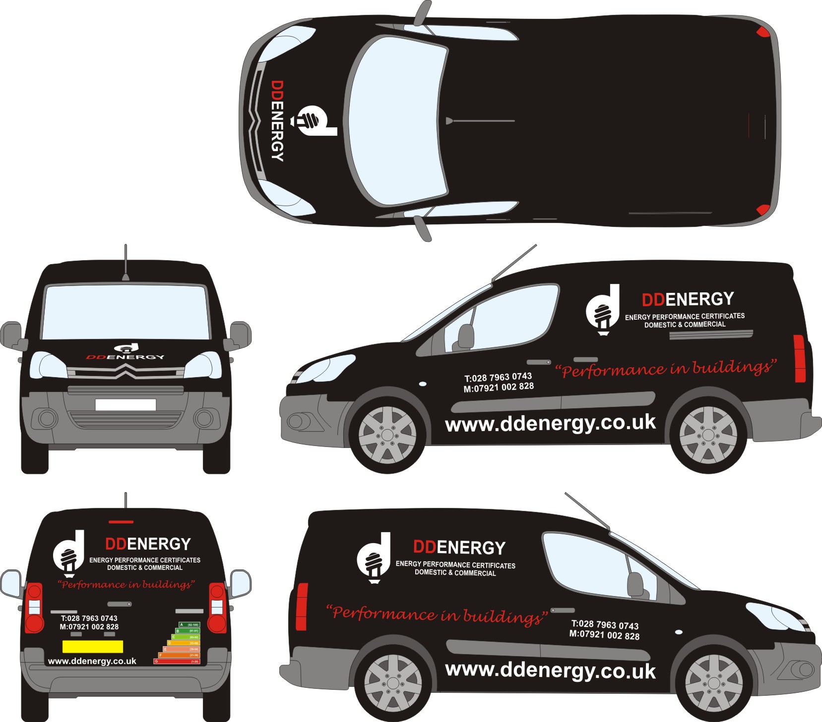
Posted by Nicholas Gormley on 17 October 2009 at 15:12What are peoples opinions on this van layout?? Any advice would be great. This is the colour’s the customer wants to use.
mod-edit 3 :police3:
please use descriptive topic titles.
this topic has now been edited.
Attachments:
 Nicholas Gormley replied 16 years, 1 month ago 7 Members · 11 Replies
 -
11 Replies
-

Looks OK, the only thing that immediately stands out is that the main panels on the sides of the van aren’t centred over the "performance in building" text underneath, which looks a bit odd, but that could be easily fixed when applying them.
-

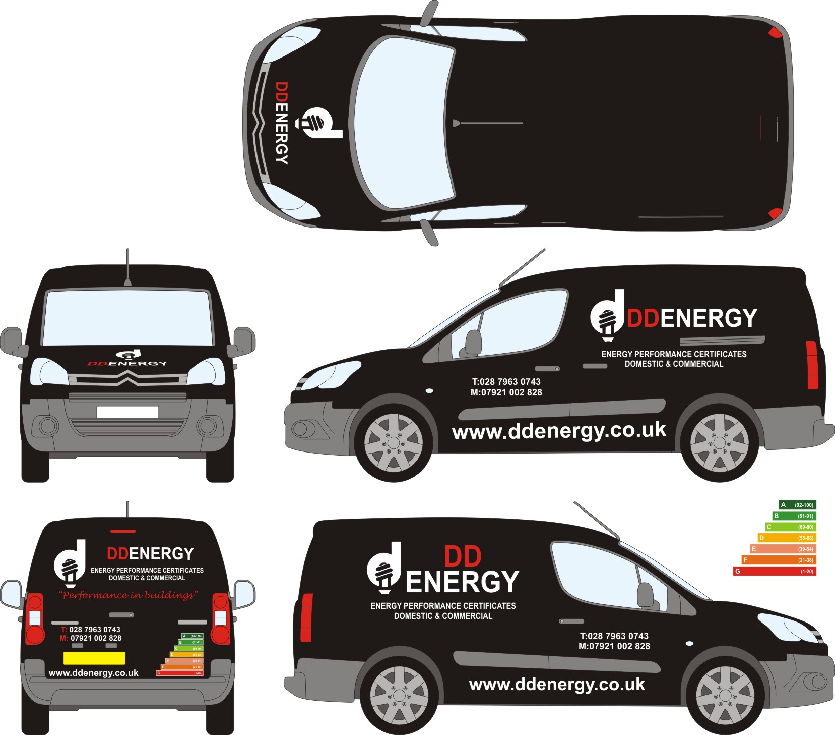
They are centered here. Which looks better??
Attachments:
-

Parts of the lettering on the sides are not parallel with each other. I normally pick the bump strip at the bottom and line everything up to that but I don’t think it would work here.
Looking at this I would choose the tops of the wheel arches, string a piece of fineline tape across and use that as your line to level the lettering off. -

i think your company name is lost, as the web address is bigger, and its all too busy, only because of the size of everything, and as neil has said nothing is lined up the same, it has potential though for a great layout because of the chosen colours and the logo 😀
nik
-

Personally Id ditch the strap line "Performance in buildings" move the text next to the logo to that position and change it to sentence case. Beef up the logo a bit more. Alignment on the side panels is difficult, and would just keep everything level………….Also be careful of the red on black, have a look at a thin white contour round the ‘DD’
Keep it simple as you have a cracking logo to work with……..as Nic says this has tons of potential
-
Hi
i think the website should be smaller, as it’s too large in proportion to everything else.If you have to put ‘T:’ and ‘M:’ in front of the phone numbers, you could make these parts of text in the same colour as ‘performance in building’ to level up the balance of colour and to seperate from the rest of the phone text (the numbers).
It is looking good though
Liam
-
If you need to keep the ‘T’ and ‘M’ open the space between the colon and number.
Straighten the website and reduce it in size, it’s way too big.
Getting there though
-
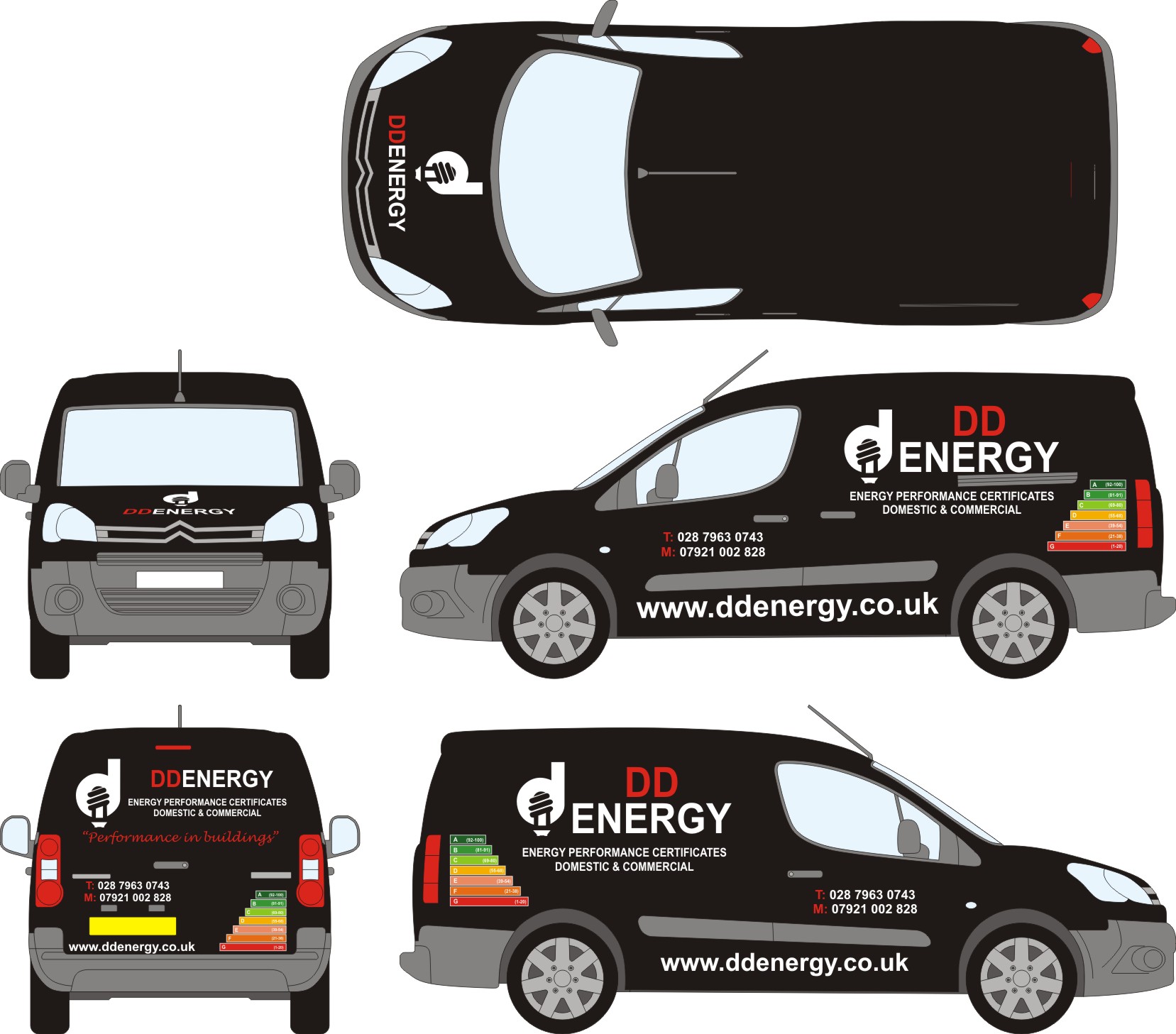
Customer really likes the back. I have taken everyone’s advice and changed a few things. Customer now wants to try and include the energy chart somewhere on the sides and try and make the logo bigger and above DDENERGY but i think the van is to small to do this?? maybe am wrong??
Attachments:
-

Hi Nicholas, it’s coming along well, don’t forget to alter every side when you make changes, or you’ll end up cutting different sizes (I speak from experience!) also the red T&M on sides. The smaller www is much better, could go a touch smaller still.
You need to move the whole panel on each side away from the window, and centre it to the panel.
If you HAVE to add the energy logo (overkill in my op), it would possibly be best on the bottom right of the main panel each side, but you run a huge risk of turning a good design into a gross one.Lorraine
-
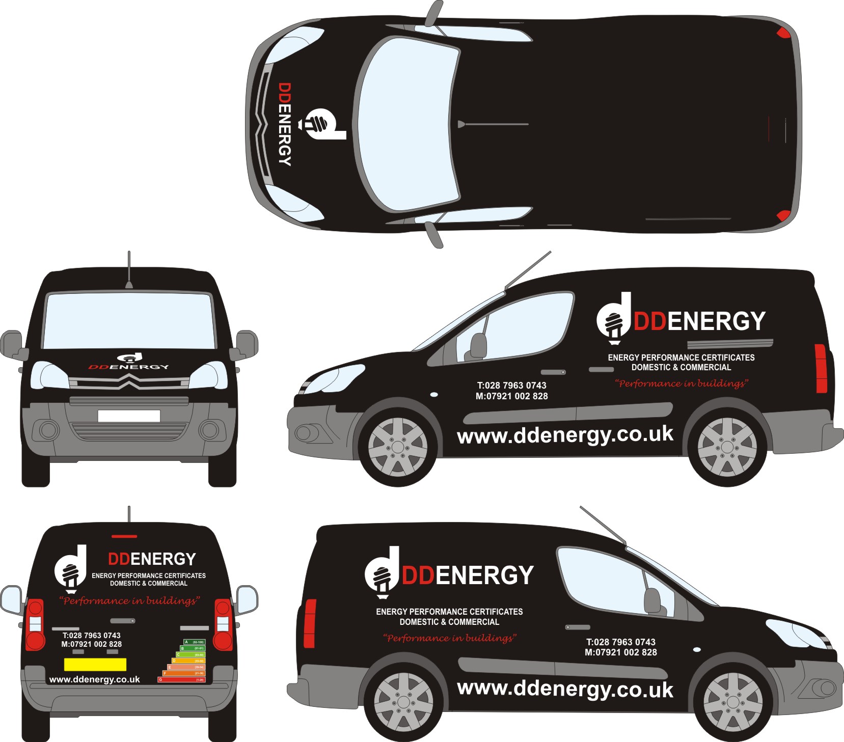
How does this look?? What about the chart??
Attachments:

Log in to reply.