-
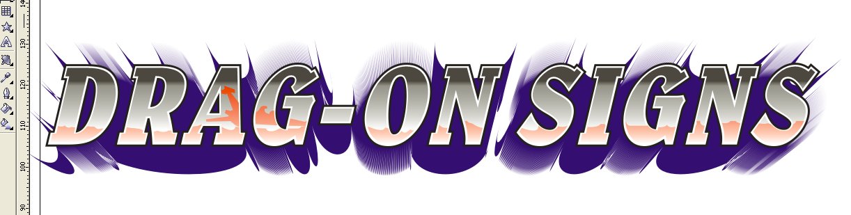
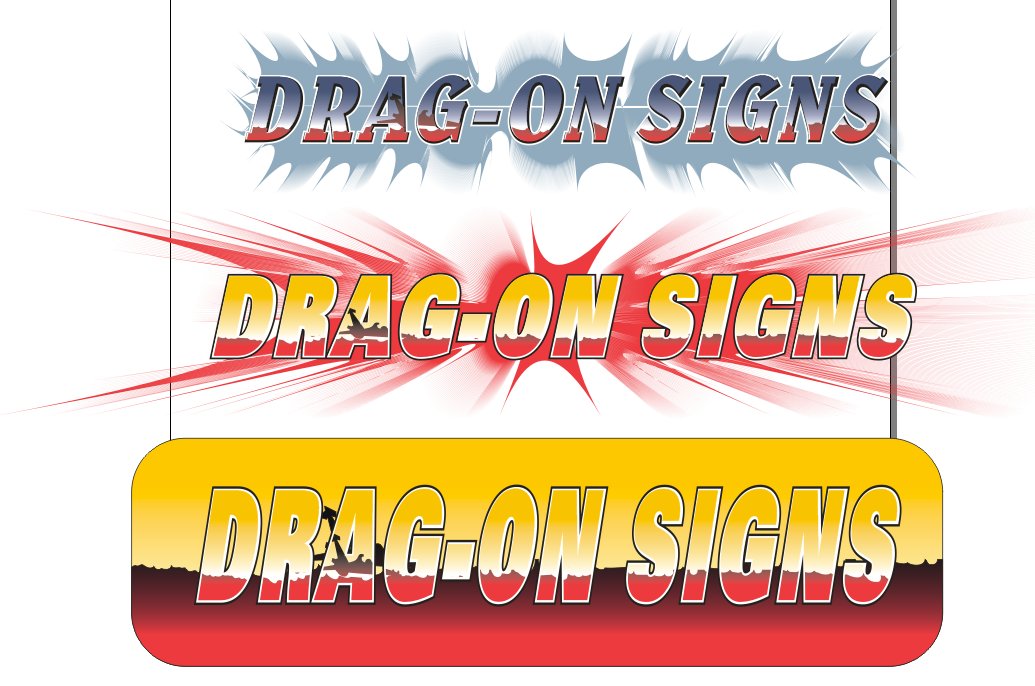
could i please have opinions on which logo looks best?
following Stevo’s chrome lettering corel demo, i decided to have a play with a new header for my website, so i did the chrome effects, and then had a bit of an experimental session to get the images below.
could i please have opinions on which looks best ? i cant really decide !
btw, i couldnt find the demo explaining how to make the detail on the lettering, i mean the little light reflections ! i use corel 12, can anyone help ?
Attachments:


Log in to reply.