Home › Forums › Sign Making Discussions › Gallery › Clinch: Todays job
-
Clinch: Todays job
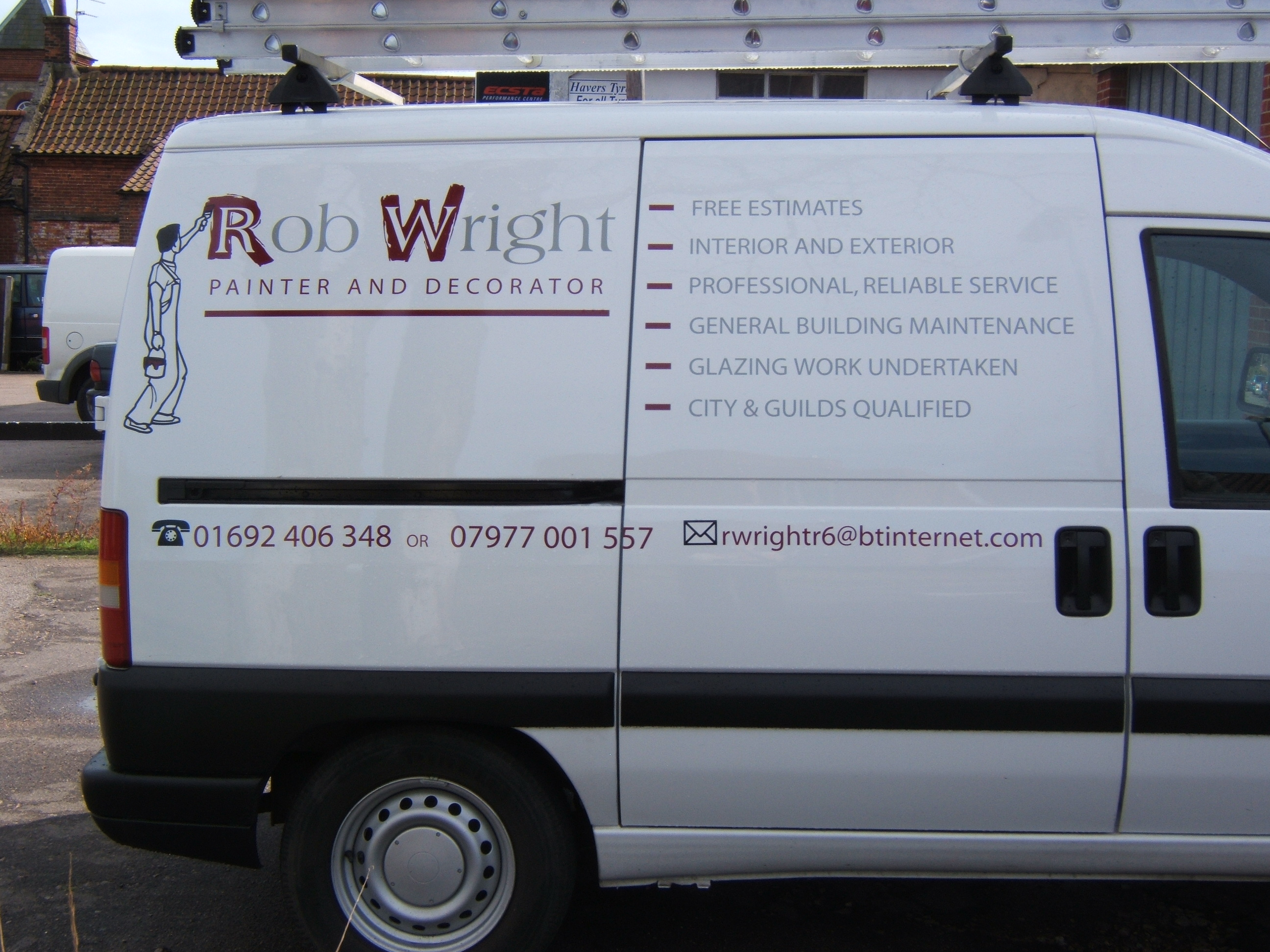
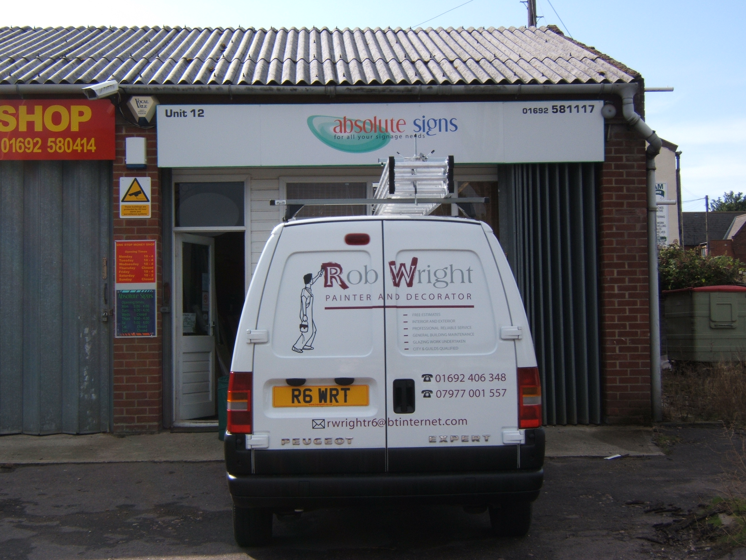
Posted by Lorraine Clinch on 30 July 2009 at 16:40Between the thunder and lightening…..
Thought some of you may be interested in seeing the outcome of my thread regarding the ‘painted’ font. This is why I wanted it. Thanks to Jill for pointing me in the direction of ‘Broken-stick’ font- this is what I used in the end, with a lot of tweeking!
There are a couple of things I would have done differently, but basically pleased, and customer is over the moon! (This was an up-sell from magnetics).
Attachments:
 Martin Pearson replied 16 years, 3 months ago 12 Members · 15 Replies
 -
15 Replies
-

Hi Lynn, thanks. The layout isn’t ideal, but what the customer wanted. I did try to steer him away from the huge space under the name, but he liked it!
-

nothing wrong with the space,
maybe the phone number would have been better not stradling the gap on the door though.
OK with larger stuff but small text across gaps is my pet hatePeter
-

Looks nice and clean Lorraine.
Pity he wouldn’t go with only one phone number.
I have on client that I always have to put 3 numbers on!!!!!
Love….Jill -

I like the Rob Wright "logo" design.
I would have preferred to see the business name/logo running across both side panels (like on the back) and put the bullet points in two rows underneath to use up the space. Same on the back.
Well done 😀
-
 quote Phill:I like the Rob Wright “logo” design.
I would have preferred to see the business name/logo running across both side panels (like on the back) and put the bullet points in two rows underneath to use up the space. Same on the back.
Well done 😀
ditto – but nice logo and colours
-
Hello everyone, thanks for the feedback. The colours/layout were chosen by the customer, as was the logo. He had several choices in layout, this is what he preferred.
I must make a public apology to Karl, he had digitised the W for me, and was doing the ‘R’, but I never received his email, hence why I re-made the letters from ‘Broken-Stick’ font, so no offence meant Karl, and thank you.Lorraine
-

The painted effect round the R and W looks good is that an actual font?
-
Hi James, yes, it is ‘Broken-Stick’ font, but heavily tweeked, to fit Americana font inside.
Lorraine
-
 quote Phill:I like the Rob Wright “logo” design.
I would have preferred to see the business name/logo running across both side panels (like on the back) and put the bullet points in two rows underneath to use up the space. Same on the back.
Well done 😀
Yep, that’s how I would have done it. But very good Lorraine the effect on with the painted letters is very good, well done.
Luv your logo btw 😀
-

Good Job Lorraine.
Nice and clean which is always a bonus.
Well done and thanks for sharing 😉
-
quote Martin Cole:Well done 😀
Luv your logo btw :D[/quote]
:lol1: :lol1: Yup! Still going strong. Designed by a real Signmaker you know :lol1:
-

I think it works well the font used works with the clients line of work, but I’m not a lover of clip art, but that’s just me, good work and nice of you to post.
Rich -

Looks good Lorraine, agree with what Phill said about layout but as you have said that was what the customer picked.
Sure he was delighted with it :lol1:

Log in to reply.