Activity Feed › Forums › Sign Making Discussions › Graphic Design Help › can i get some advice with my logo please?
-
can i get some advice with my logo please?
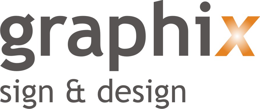
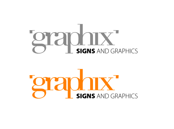
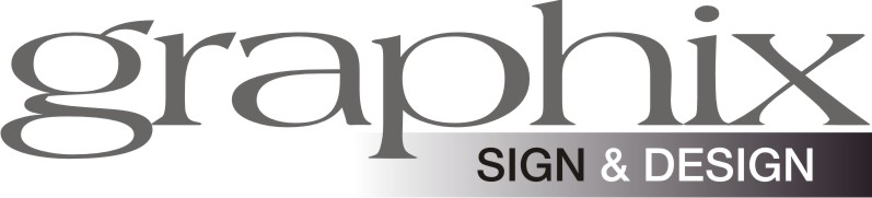
Posted by Marcella Ross on April 10, 2007 at 10:22 amI’m looking to update my logo for my business cards/ letterheads /web etc. But I’ve got a mental blank. Strange how when it’s for yourself it just doesn’t happen. 😕
This is what I currently have. 😕 Plain and bland.
Ideas welcome ….. anything goes …………..
Attachments:
 Debbie Astle replied 17 years ago 26 Members · 107 Replies
 -
107 Replies
-

Hi Marcella,
I will have a go later on…anything goes aye mmm
Just in the process of changing mine, as we all say it’s pretty tuff when doing your own. 😕
-
 quote Martin Cole:…anything goes aye mmm
………….. well, within reason!!!!!!!!!! 😉
thanks Martin
-

ooo…. can’t wait till Jill sees this… She’ll have some ideas I’m sure 😉 I’ll try and give it some thought before I go off :sleep3:
-

Shane! I love your new avatar!
Marcella!
Your old logo needs some tweaking!
(but I’m sure you know that)
One thing that stands out instantly to me is that "X", the slant of it seems odd compared to the rest of the letters.
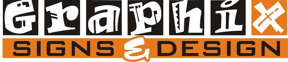
The Signs and Designs would look far better if placed in a reverse panel, giving some stability to the graphix.
Incidentally, around here, we would spell it the regular way, as adding the X (or an F instead of the ph) implies quicky-licky-sticky signs.
I think I’d try for a more cohesive look.
Love….Jill
Attachments:
-
the secondary text was in a reverse panel originally Jill. 😀 I hate the company name, not my choice. But when I was in partnership 10 years ago this was what the company was called. Since I continued with it and bought out the partner the name remained …………. that’s what I’d want to change most!!!!!!!!!
-
Thanks Jill…
quote Marcella:…………. that’s what I’d want to change most!!!!!!!!!Marcella I really like Jills design… but are you saying that you are/want to changing the name too? or you want to but can’t? 😕
I’m confused now… (its not hard)
-
sorry ………….. no the name will remain the same. I meant that I wish I could change it, as I dislike that more than anything :lol1:
-

Marcella, if you hate it that much then why don’t you change it? If all your contact details are remaining the same then you shouldn’t lose any business by changing the name and if customers ask you can just tell them after 10 years in the business you felt it was time to update things as your company had evolved over the last 10 years.
-
sorry, its late… this is all I could think of without having another glass of port 😳
Attachments:

-
quote martin:Marcella, if you hate it that much then why don’t you change it? If all your contact details are remaining the same then you shouldn’t lose any business by changing the name and if customers ask you can just tell them after 10 years in the business you felt it was time to update things as your company had evolved over the last 10 years.
maybe so Martin (now you’re almost talking me into this!!!)…………… keep thinking of the hassle it might cause to change it 😕
Because I didn’t choose the name in the first place, it doesn’t appeal. But with advertising sorted for the next year, my own web address etc etc etc ……….. too much agro to change.
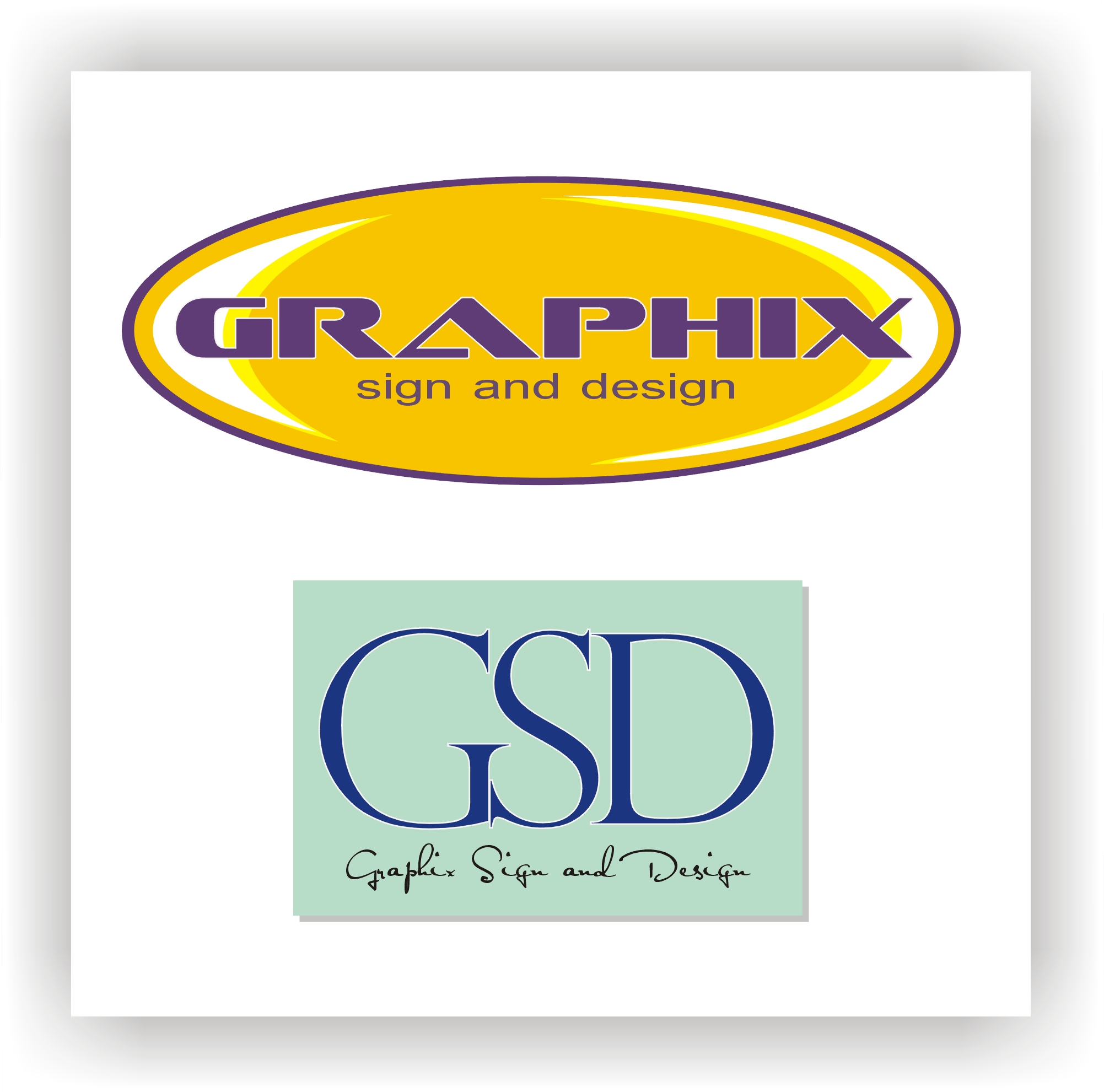
Maybe I should refer to it as GSD ……….. 😀 but that makes me think of my dogs!!!! German Shepherd Dog 😕 -
Marcella, I don’t think it would be a lot of hastle, you are still the same person, you will be operating from the same premises, all your contact details will be the same. You may even get some of your customers asking you to update their image.
If your not happy with it then why stick with it? If you were moving to a new location or new premises then I would say stick with it as people know who you are but as I say nothing is really changing from a contact point of view so why not find a name that you like and you feel good about.
Personally I don’t like names that are miss spelt but thats just a personal thing, I know a lot of people like it and think it is clever, I’m just not one of them. :lol1: -
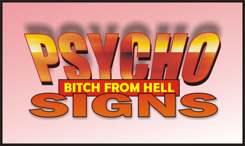
How about Psycho Bitch From Hell Signs ………… think that would work? 😉
-
It’s better than what you have, but the kerning looks wonky and the chosen font seems weak.
I don’t like how the bottom of the "g" looks smashed, perhaps if you changed it to a capital letter.
Love….Jill -
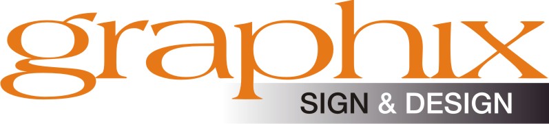
with a little colour …………
Jill, the kerning was out ……. 😀 I know what you mean about the font looking ‘weak’ but I kinda like it not too chunky. With a capital G it just doesn’t look the same ……. I tried it. 😕
Attachments:

-
quote Marcella:How about Psycho Bitch From Hell Signs ………… think that would work? 😉
Attachments:
-
Even if the kerning is intentionally out, the spacing is still off.
I like how Martin is the only one who got a comment…maybe I will grow a 5 o’clock shadow and then you will take me seriously.
sign & design is virtually lost in the black box.
Love….Jill -

marcella I really like your initial one best of all , maybe put the sign and graphics starting from the P in graphics to the end if that makes sense?
think it would look great on business cards, letterheads etc, maybe use the orange colour on the reverse of business cards etc.
cheers
graeme -

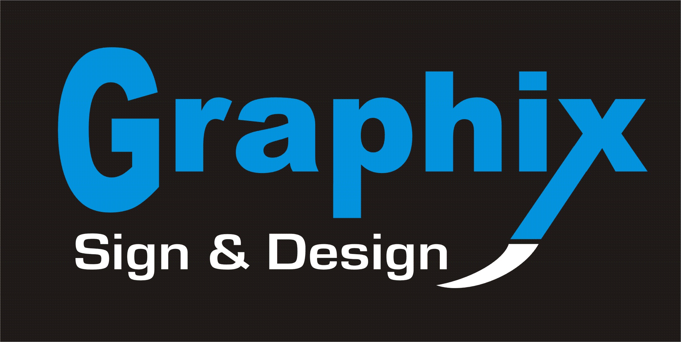
this is my effort 😕
the colours have gone weird on me???? will send you the eps
Attachments:

-
quote Jillbeans:I like how Martin is the only one who got a comment…maybe I will grow a 5 o’clock shadow and then you will take me seriously.
Love….JillJill, if you read my last post you’ll see I acknowledged your comments and agreed the kerning was out and changed it. It had been set incorrectly in Signlab and I hadn’t noticed in my initial post. I take on board everyone’s comments. I just laughed at Martins poke at fun…….
-
quote smedia:marcella I really like your initial one best of all , maybe put the sign and graphics starting from the P in graphics to the end if that makes sense?
think it would look great on business cards, letterheads etc, maybe use the orange colour on the reverse of business cards etc.
cheers
graemeright align it instead of left????? I like the font in my initial one …….. but it lacks something.
-
yes right align and shrinkl the text so it fit just under PHIX section. I really like it. Maybe do the signs and desing in the orange or maybe in white text in an orange box?
cheers
g -
?
Just another idea.
Off to work now!
Love….Jill
Attachments:
-
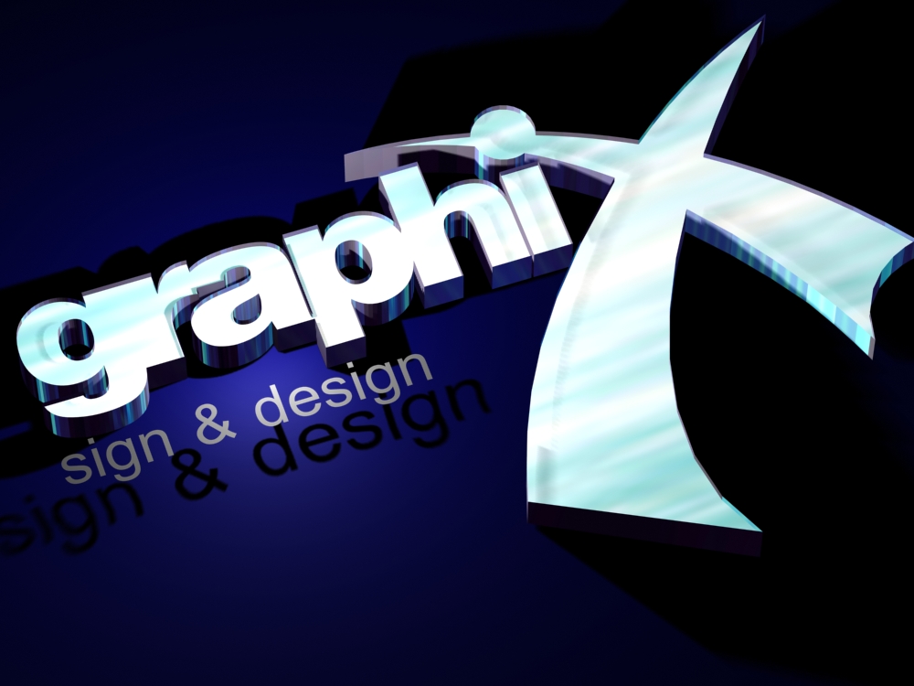
I like the way you’ve done the faded bit ………… that appeals to me. Did you do that freehand or did you use a piece of clipart?
-
Dave, I like the delicate shade on that, gives it a bit of lift. 😀
-
quote martin:I’m just going to keep my mouth shut from now on 🙁
why??????????? I agree that the name ain’t great. But as much as I’d love to change it Martin ……… my yellow pages ad is in etc etc …….
-

just out of interest (sorry im going a bit of topic etc) do you get much interest from the yellow pages, i had an advert a few years ago, all i got was water cooling companies phone me up.
-
I don’t see that as being a problem Marcella as all the contact details are the same, just my own personal opinion but I think you should be proud of your name as well as your actual business and if you don’t like it yourself then thats a bit difficult to do.
Does it mean that you are going to keep using the same name forever? If you are worried about things like yellow pages then even if you wait until next year or some point in the future to change it anyone looking for your company name in yellow pages isn’t going to be able to find it. This way if they know your name and find the number in yellow pages you can tell them that you have now changed your name rather than them looking for a Company that now doesn’t exist if you see what I mean.
-
Dave,
I’ve reduced the size of my ad a few times and it hasn’t reduced the calls! But I would say that yell.com is worthwhile. I wouldn’t take my ad out completely, it’s better there than any other book! The way I look at is, if I’m looking for a company where do I look ………… only 2 places for me. Yellow Pages and the internet!
I get calls from water companies too 😀
-
quote martin:If you are worried about things like yellow pages then even if you wait until next year or some point in the future to change it anyone looking for your company name in yellow pages isn’t going to be able to find it. This way if they know your name and find the number in yellow pages you can tell them that you have now changed your name rather than them looking for a Company that now doesn’t exist if you see what I mean.
that is a very valid point Martin. Never thought of it like that.
-
I like that one better than the last one G. I like the ‘x’
Your colours are coming up much brighter here than they did on the eps you sent 😕 -
think anyone would realise I was scottish if I used that Phill?
-
When I started to do a bit of work again at the beginning of this year I was going to use my old name again but there was another Company who were using the same name when I was working before and I couldn’t stop them using the same name because I wasn’t a limited Company.
So I have changed my name just to make things easier for myself. OK I haven’t started to advertise at all yet and I have only contacted a few of my old customers, as I get better I hope to contact more and more. I have also been called by some of my old customers who had heard that I was working again and had got my number from someone who I had given it to. The point is that they didn’t care what name I was using they just wanted me to do the work for them, if you contact all your customers to let them know that you have changed your name but still offer the same great service then I don’t think you will lose any work. In fact you may find that some of your customers were thinking about getting something done and this just jogs their memory.
-

Tricked ya Chris –
I spelt it wrong – so you’re gonna have to do it again :lol1: :lol1:
-
Very flash Chris !!!!!!!!!!!:o even though it’s spelt wrong :lol1:
-

the h fell off on its way up country probably just north of Liverpool.
-

Marcella
Where will your logo be used?
Do you print your letterheads in house?I ask as many people design a logo and then look at print costs after. Also some people use the fax heavily and full colour tints / shades etc don’t reproduce and look crap. Also YPages ads are like news print for quality and bells & whistles effects don’t reproduce very well.
Just a bit of the thought process I feel some people forget is all.
Tim.
-
You know, I really love that Scottish flag for the X.
It’s different, and it might attract patriotic people.
I’m not one for bells, whistles, fades etc even tho I used one. That blobby thing under mine is a piece from a dingbat font with splats in it.
Love….jill -
Tim,
mainly business cards and letterheads, but I intend to get those printed elsewhere rather than on my inkjet here. As for yellow pages, I’m not putting a logo on there this year so that doesn’t come in to it this time.
I’m just looking to freshen up the standard paperwork and internet site 😀
thanks to all who have contributed so far. Everyones idea of a logo is different and diverse ……….. it’s great to see how others interpret things, and a great learning tool.
-
marcella I can recommend printing dot com for your l’heads,cards etc, great quality and great price, there are 2 or 3 in glasgow if you need to call them.
If i ever do design for cards etc I always use them, very good indeed, just double or even triple the price and its still competitive.
cheers
graeme -

Hi Marcella
I actually don’t like this at all but while trying to do something totally different this poo is what I came up with in a few minutes but I wanted to at lease show that I try 😕
please don’t comment as I know what you are going to say. If I get more time later I will put some effort in to it 😳
Warren
Attachments:


-
thanks guys ….. 😀 All your ideas are very much appreciated.
-

😀
could spend half the day moving each letter and changing serifs and it still probably wouldn’t not be right…ah well 😀
the word design maybe should go in 😳
Attachments:
-
quote Andrew Boyle:😀
the word design maybe should go in 😳
……. possibly ……. :lol1:
-

i like andrews… appeals to me most. probably the orange one…
edit- just noticed there are two pages to this thread.. 😳
all very good work, some really nice.
i need to get off video editing for a bit, my heads twisted. 😕 :lol1: -
quote Jillbeans:I like how Martin is the only one who got a comment…maybe I will grow a 5 o’clock shadow and then you will take me seriously.
😛
I like a lot of these.. the Scottish flag concept is very good tho.
Chris has some good PS skills too….
I’m not a huge fan of fades or blends either, prefer striking colours to grab attention, especially if the name is remaining the same. Also, want something that is easy to cut in vinyl, if you don’t have a printer 🙂
-

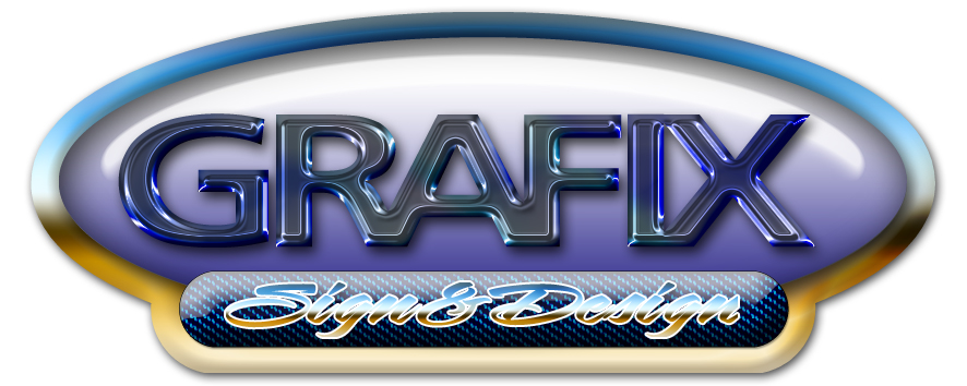
Easy to cut, hard to decipher, Might turn heads.
Attachments:

-
quote Chris Wool:i notice one does not drop ones h es does one 😉
Chris …………. the ‘h’ stays! :lol1: :lol1: :lol1: :lol1:
-
I feel sorry for Marcella now………..give a woman a choice……….lol
Attachments:

-
thanks Tim!!! :lol1: :lol1: :lol1:
that just muddies the water more ………….
I think I’m more confused now that I was before I started this thread 😉
-
quote :Chris …………. the ‘h’ stays!
some people have no sense of adventure have they – anyway it was phills fault he was to busy thinking about his capri.
😀
-
:lol1: :lol1: :lol1:
Uploaded the first one then though..ooooooo switch the colours on the X OK best get back to work before Marcella gets real confused…… (spin)
Attachments:

-
quote Jillbeans:I like how Martin is the only one who got a comment…maybe I will grow a 5 o’clock shadow
My kind of woman Jill, I love a lady with a five o’clock shadow 😀
anyway a couple of efforts from me just to add to the confusion.
Attachments:
-
lets face it – is this what this site should be all about.
a lot better discussion than wing wong cutters.
chris
ps martins last efforts get my vote
-
quote Chris Wool:lets face it – is this what this site should be all about.
a lot better discussion than wing wong cutters.
chris
ps martins last efforts get my vote
😀
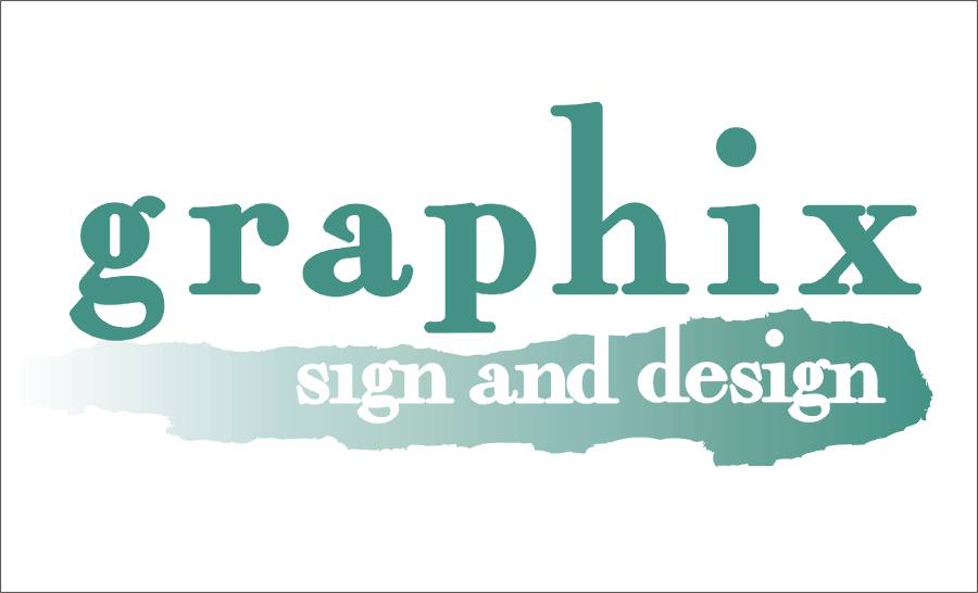
I like the GSD one ……… but there’s a local sign company called ASD ….. a bit too close in hindsight.
I’m kinda swaying toward this.
any obvious flaws here????????
Attachments:

-
Martin what was the script font you have used in the second design? I like it.
-
quote Marcella:Martin what was the script font you have used in the second design? I like it.
Marcella, the font is called ‘Satisfaction’
IMO, I would loose the shaded band in your last design, putting the word design in black.
-
Hi Marcella
I feel the ‘&’ gets lost in the graded band. Also personally my eye gets drawn to the dot of the ‘i’ as there is a great contrast between that and the main text colour.
Just my 2p’s worth
Tim.
-

Andrew Boyle’s gets my vote and your own b/w one, fantastic range of logos to choose from! But I would find it easy to feel confident in a company with Andrew’s branding….looks very professional.
-
Marcella, your last effort is your best, but I would make the sign & design all the same color.
The ampersand has no contrast whatsoever.
I would change the black to another color, maybe a navy blue.
Would you wear a shirt and pants together that are those colors?
That’s sometimes how I address what goes together.
Love….Jill -
quote Jillbeans:Would you wear a shirt and pants together that are those colors?
That’s sometimes how I address what goes together.
Love….Jill:lol1: :lol1: :lol1: in that case everything I’d ever do would be black on black!!!!!! ……… I’m always in mourning.
thanks for all the efforts and crits. Very helpful indeed. 😀
-
quote Andrew Boyle:
:rofl:
-
very nice Jason …….. looks although that should be accompanied by dramatic music!!!!!!! :lol1:
-

:lol1:
dun-dun-daaahhhhhhhhhh
dun-dun-dun-daaahhhhhhhhhh
lol
-
I like full colour work but i still like the idea of starting simple [corporate] and then introducing things after but still have a working basic…if you know what I mean 😕
[haven’t checked things and can’t see colours on laptop]
Attachments:

-
quote jason price::lol1:
dun-dun-daaahhhhhhhhhh
dun-dun-dun-daaahhhhhhhhhh
lol
😀 😀
Thats a cool bit of design work Jason, top stuff!
Like that aswell Andrew, works really well.
-
I really like the black background with the orange Andrew.
‘where she makes signs and stuff near glasgow’ – classy! :lol1:
-
i like the black and orange also, but like the top left for its simplicity with the touch of orange. if its a business card i think you have to be careful you get a good quality card for a solid colour background. a nice stiff silk/matt finish card looks good…
nice graphics and effect jason.
-
charcoal grey uncoated and fluffy on the back…… laminated on front and stand over the printers shoulder making sure the blacks solid but not bleeding into the text 😀
-
Really good andrew. Its a personal thing I know but I think that looks really good marcella.
regards,
graeme -
I had digital business cards printed with Vista Print on gloss stock and the black is perfect.
Make your solid black breakdown as follows;
100% K
50% Cyan
40% Magenta
40% YellowIt gives a very dense solid black and my cards look brilliant.
cheers
Warren
Attachments:

-
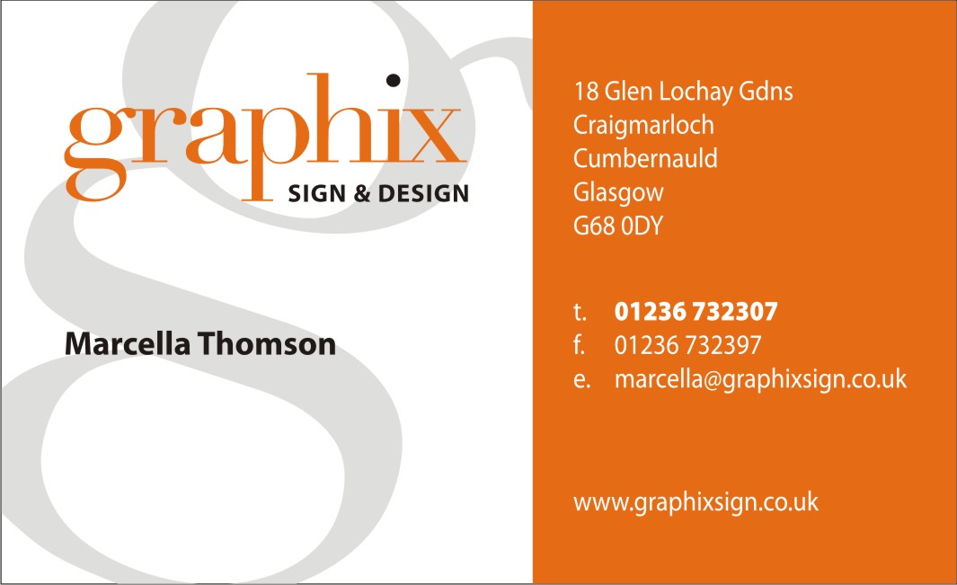
well I think I’m going with this. Here’s the business card layout.
Thanks to Andrew for the logotext and inspiration 😀 (sorry if I’ve just killed your nice corporate look by adding the marcellaisms 😳 )loads of help from everyone on this so THANK YOU
😀
Attachments:
-
Marcella, I almost believe you didn’t need any help at all 😉 , I think that is the best looking design so far.
well done, looks great as it is now.
Warren
-

thats the one 😀 looks ok to put on a vehicle as well
Lynn
-
quote Warren Beard:Marcella, I almost believe you didn’t need any help at all 😉 , Warren
I agree Warren,
I’m really encouraged by so much talent on these forums…
That looks the ‘bees knees’ tho Marcella.
-

Yes very nice Marcella, Andrew had a lot of input 🙂
I would expand Gdns to Gardens (If that what it is 😀 ) and the vertical spacing of t. f. e.
Tuppence worth
-
great result marcella… 😉
very helpful thread too… in 2 days its been viewed over 1200 times with nearly 100 replies! 😛
thanks for all the participation folks. nice one!
-
Yup, it really progressed nicely.
Marcella now has a clean professional looking logo as opposed to what she started with.
I agree about spelling out Gardens.
Love….Jill -

I think business cards look a lot more classy being 90 x 50 as opposed to 90 x 55.
They fit easier in your wallet and your business card holders and they don’t look as square.


Log in to reply.
