Home › Forums › Sign Making Discussions › Graphic Design Help › can anyone recommend a layout for this logo please?
-
can anyone recommend a layout for this logo please?
Posted by Steve Thurlow on 23 November 2004 at 16:12Hi Team,
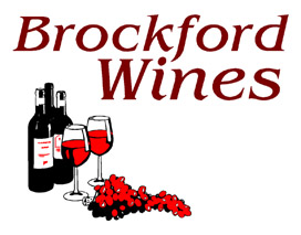
I’m having a problem with a design for a new logo, this is my first attempt at it but my client’s not sure about it.
it has to be used on a ‘A’ frame & a 8′ x 550mm fascia,Any ideas??? 😕
Cheers, Steve :drums:
Attachments:
 Steve Thurlow replied 21 years ago 11 Members · 18 Replies
 -
18 Replies
-

In stead of just having the grapes laying on the table, why not make a grape vine boarder and put the name and bottle etc inside.
Dan
-

just having a play will my edge is printing
because the logo has to take two forms landscape and portrait
i have made the A Board logo a header panel and repeated it
at the bottom and made the centre a mock chalk board effect – the customer can keep changing his message more £’s for you……i hate white backgrounds so reversed it so claret background and white text always to me makes things look more expensive…

-

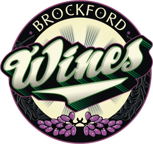
Here’s mine.
Its more of a logo design than a sign design. But I hope it gives you some ideas.
Stevo
Attachments:
-

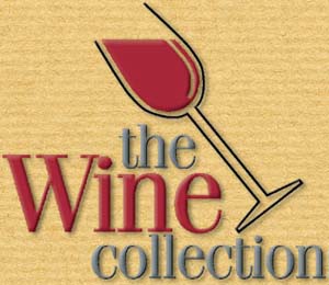
Don’t use this – it’s already taken, but might give you an idea.
It’s eye-catching, memorable, and I like its simplicity.
Attachments:
-

very nice stevo,
How long does it take you to draw something like that? and where does the inspiration come from? Even if I got the inspiration, (do now and again) It would take me all day to put it down on screen.
Peter -
Hi Peter.
This design took about an hour for me. Alot of my inspiration comes from old adds I see in “A Magazine About Letterheads”, Signcraft magazine, fellow letterheads, painting, package design. I pretty much absorb anything I see that I like and try to emulate or put my spin on it. Package design is a great way to get inspiration. I probably look weird to folk just looking at packages in the grocery store! I cant help it! I look at everything, I can be watching a movie and checking out the signs and lettering in it before the actors!
As far as how fast I did it, its basically all practice to me and I even tried out some new elements in this design to see how they would look. After absorbing all that I see I can usually come up with something within 5 minutes or so and execute it.Stevo
-

I really like Adrians design, nice and modern 😀
I really like Stevo’s design, nice and kerpowy 😀 (it just popped in there)
Carrie 😀
-

Thanks for all the great ideas!!
Adrian – I like the simple layout mate, what typeface are you using? it looks familiar…
Stevo… great design, fantastic stuff, I’m not sure the budget will go to this though. I have suggested digital prints & the extra costs but then again I didn’t really have anything to show as an example, I will keep you posted.
Cheers, Steve :drums:
-
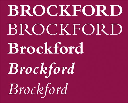
Brockford is in Bembo streched a little
and wines was in Corin both from Signlab fonts disc
If you want the vine and leaf i can upload itAdrian
-
Adrian, I was going to say Bembo!!! :thumbup2:
What confused me was the slightly different character shapes especially the ‘R’, I use the Adobe version of Bembo (see the font example below)
I’ve never used it all caps, looks great. I think the Bembo font family is a classic all rounder, it’s a very classy font for 9 point copy, a very easy font to read. (used a lot in books)
Thanks for jogging my memory about this useful font.(I’ll let you know if I need the ‘vine’, thanks again)
Cheers, Steve :drums:
Attachments:
-
I just wanna say thanks again to Stevo,
I didn’t really have any time this morning to take in all the fine detail of your design, it’s a great work of art!!!
Did you draw the grapes & vines freehand?
Would you say this is really for print output? I could see some of the elements could be vinyl cut (& if Mike the Sign was still about he would say yes 😉 )
I feel for this low budget job I will end up going along with the ideas that Adrian has suggested, but I will keep you posted.Cheers, Steve :drums:
-
No Problem Steve, glad to do it!
This time I resorted to using clip art for the grapes but what I did with them was add some shading and highlights to liven them up abit. I did go overboard on the effects and shading but it can still be an effective piece for vynull output minus some of the effects.
Stevo
-

stunning work as always stevo!! 😀 😀
just wondered why you put wee dots in the o’s & c? 😛
Nik
-

i agree on both accounts..
really likes adrians based on its simplicity and suits what its for. wine sales/bar…
stevo, what can i say.. amzing design mate.. really like it. as you say.. the shape would be hard to incorporate into sign shape but can be used as a top notch logo along side….
i also liked johns suggestion, i know it wasnt his own, but liked it also.
thanks for posting guys, great work as ever.
steve thurlow, thanks for taking the time to use the graphic forum mate.. 😉
-
Thanx again folks.
Nik, the typestyle I used on Brockford was from one my fav lettering designers Arthur Vanson, they’re neat little details. http://www.letterheadfonts.com
Stevo
-
quote :steve thurlow, thanks for taking the time to use the graphic forum mate..
Well thank you Mr Robert (The Bruce) Lambie.
I will do it more often, it’s great to bounce ideas off our talented members.
I will also let you know the outcome of this job.Your humble servent,
Steve (I’m an ARTWORKER not a designer) Thurlow :drums:

Log in to reply.