Home › Forums › Sign Making Discussions › Graphic Design Help › can anyone help with van layout please?
-
can anyone help with van layout please?
Posted by Tris Gee on 3 September 2007 at 19:11Evening all.
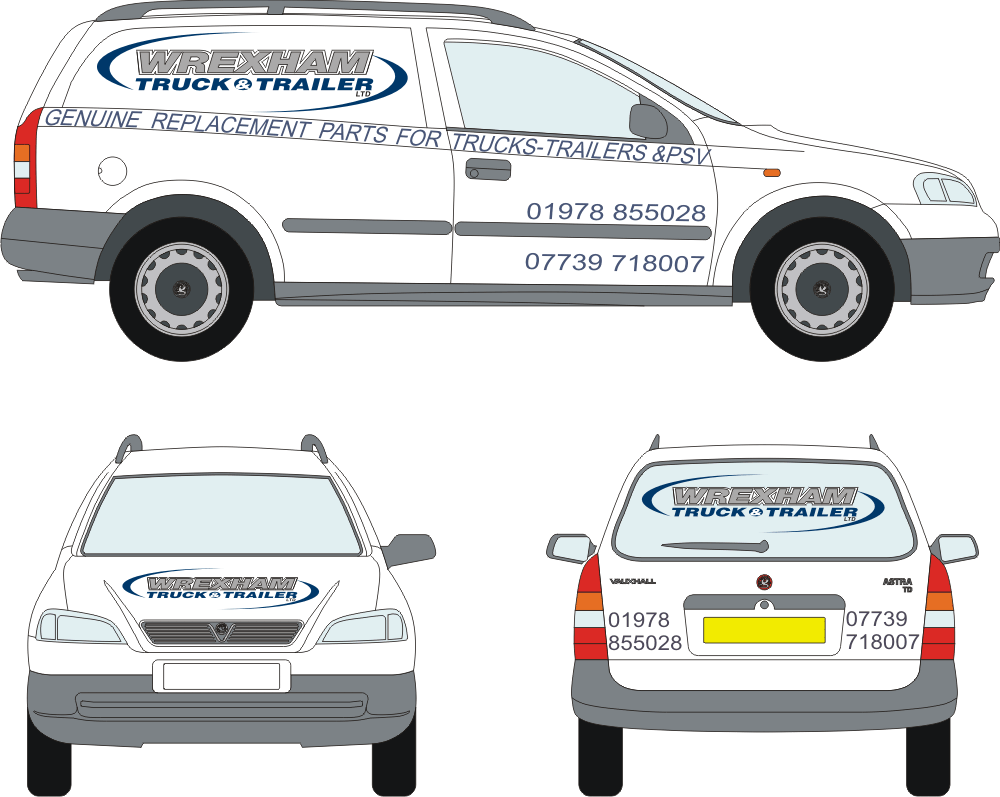
I have a customer who is most indecisive person I’ve met, he has had company logo updated and i have the logo from the designer, he wants four vans sign writing now…the wording has been changed several times and he has no clue of what he wants, this is my latest idea, but he wants "more" more what i dont know…
bear in mind the font is just a template at moment so i can get lay out right, and the wording is now what he wants. I’m just struggling now as to where i go now, as I’m getting no, or very little input from himany ideas or suggestions pls
Tris
Tris Gee replied 18 years, 3 months ago 6 Members · 15 Replies -
15 Replies
-

Tris if you upload it as a jpeg too you’ll get more feedback. Not everyone will download the link. 😉
-
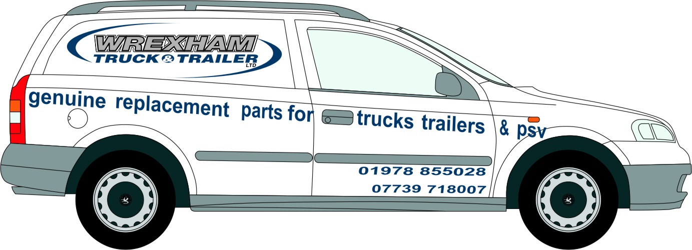
Tris, what about putting the strapline in a reverse panel?
This isn’t quite right but at least gives an idea. I don’t like the text running that line that you’ve put it in, it looks too squashed somehow, and too close to the logo. I do like the logo though, it’s nice. 😀
Attachments:
-

im having trouble uploading image as j peg.
oh i like that thou Marcella, ive been trying out all different ideas tonight and seem to have got no where, bet you all been there, going around in circles…lol
-
dunno what’s happening there, but the file is going weird when I upload it! 😕 But you get the gist!
-
do you know if or how i can get more of a selection of colours when im using corel 12, i cant get a close match with what ive got. i have the pantone number of the blu??
thanks
-
not got a clue Tris, I don’t use Corel 😳 but loads of folks here do and someone will soon tell you! :lol1:
When uploading it as a jpg make the file small. reduce the size of your graphic and export it from Corel as jpg then upload it. 😀 -

Here’s Tris’s file download as a gif. Sorryi don’t have time right now for any design input, have to run.
Attachments:
-

I like his new logo but it is having to compete too much with the strap line and telephone numbers as these are too big. Perhaps you could also use the same font as used in his logo but in regular (for the strapline) and bold (for the tel. nos).
On the side I would reduce the size of the strap line and run it level with the road surface. Just keep it on the back panel and not run it across the front door. Reduce the size of the tel nos. on the front door and place them both above the body moulding
On the rear I’m not sure how well the logo will look on glass. The blue will merge with the glass background unless you are planning to white out the window glass. Perhaps change the blue to white on the back window. The telephone numbers on the rear are also too big. Reduce these so that there is a margin space all around – they’re almost touching the edges which doesn’t look good.
The front bonnet looks fine.
Perhaps you could post your file up as an .eps since only those with corel 12 or newer can open your file? This way you may get more feedback and help.
:thumbup2: -
thanks for all the advice.
Phill, do you mean having two line of text in the strap line on just the rear panel? i get what you mean by the logo on rear window, he currently has it in bold black lettering which stands out ok at mo.
-
I meant a single line of text for the strapline (by reducing the size). At the moment everything is competing for attention.
I’m very surprised that black stands out on the back window – I would have expected this to be very difficult to see on glass.
-
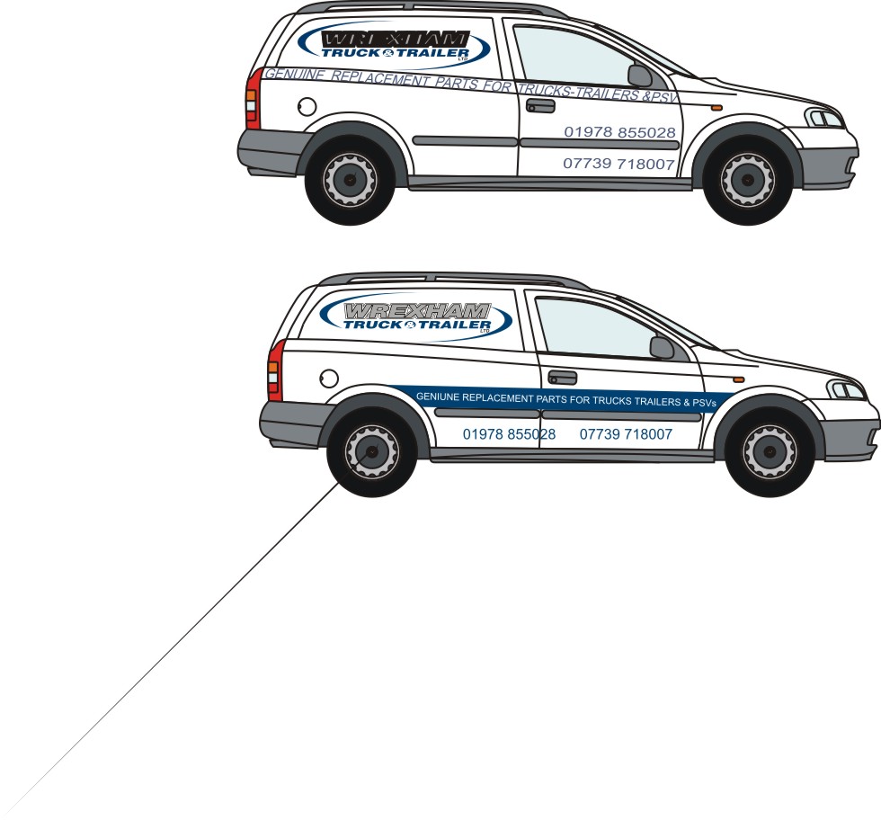
hi
this is what my customer has decided he wants,im not 100% happy with where he wants the text laying due to the door handle, crease in front wing .
i just wondered if anyone for-sees any problems i may encounterthanks
Tris
Attachments:
-
yeah, it just doesnt look right, im just playing around now, tryin to drop it down lower

Log in to reply.