Home › Forums › Sign Making Discussions › Graphic Design Help › can anyone help with van layout please?
-
can anyone help with van layout please?
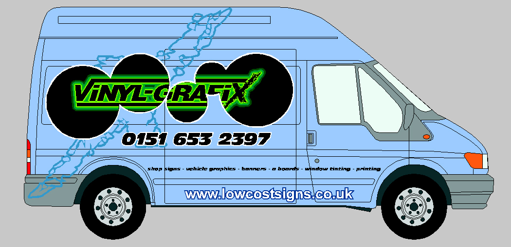
Posted by David Arch on 29 September 2007 at 11:08I have just bought an ex transco transit as our fitting vehicle and I am struggling with the design. Our other vehicle is a black L200 pick up which I simply put the green logo seen below on with the phone number. It was simple but to the point with the limited space.
Any advice on what to do with this one?
Attachments:
 Martin Grimmer replied 18 years, 2 months ago 11 Members · 19 Replies
 -
19 Replies
-

The "black holes" effect is eating up too much of your name.
List of services is kinda tiny.
Other than that, it has potential.
Love….Jill -

I think I will need to keep the logo simple, so what colour will work well on a light blue van. I’m really struggling on this one.
Thanks
-

I like the idea of the holes but as has been said they are nibbling into your name a bit too much….have you tried it with a looser shape instead of a series of circles
personal preference for me but on a light blue van i would go with darker shades of blue
-

sorry I don’t like that at all looks like it’s been attacked by Vandals, the one with the circles looked more a way to go, 🙄 the green looks like it may work on the light blue or a very small outline, have you tried it ?? maybe outline your aligator/croc a bit more
Lynn
-
Dawn/John I don’t think it can be it’s too far to the left 🙄
Lynn
-
 quote Lynn:Dawn/John I don’t think it can be it’s too far to the left 🙄
Lynn
It’s the X Lynn. If you look closely you will see it’s a copy, but in a subtle outline to sit in the background. 😉
-

It’s not a crocodile – it’s an alligator…….
Crocodiles and alligators – two creatures that share many similarities. But what are the real differences between them? This is probably the most frequently asked question when it comes to crocodilians, and while the answer may appear straightforward the real truths lie in the details.
SIAMESE
CROCODILE1. Different families: There are three groups (families) of crocodilians: the alligatoridae, which includes the alligator and the caimans; the crocodylidae, which includes the "true" crocodiles; and the gavialidae, which contains only the gharial. So, the first difference is that alligators and crocodiles are actually in different families.
2. Shape of the jaw: The easiest way of telling apart crocodiles from alligators, however, is to look at their noses. Alligators (and caimans) have a wide "U"-shaped, rounded snout (like a shovel), whereas crocodiles tend to have longer and more pointed "V"-shaped noses. This is illustrated in the diagram to the left (C = alligator, D = crocodile). The broad snout of alligators is designed for strength, capable of withstanding the stress caused to bone when massive force is applied to crack open turtles and hard-shelled invertebrates which form part of their diet. Of course, alligators eat softer prey too, but hard-shelled prey are ubiquitous in their environment and it’s a big advantage to be able to eat them. Conversely, the pointed snout of a crocodile isn’t quite as strong as the alligatorine shape, but the crocodile is still capable of exerting massive biting power. Crocodile jaws can be thought of as being more generalised – ideal for a wide variety of prey. The full extent of the way jaw shape influences diet isn’t particularly well studied in crocodilians, but it’s obvious that a very thin nose like a gharial’s is much better at dealing with a fish than a turtle! There are 23 species of crocodilians, though, and this simple broad vs. narrow rule doesn’t always work.
3. Placement of teeth: In alligators, the upper jaw is wider than the lower jaw and completely overlaps it. Therefore, the teeth in the lower jaw are almost completely hidden when the mouth closes, fitting neatly into small depressions or sockets in the upper jaw. This is particularly apparent with the large fourth tooth in the lower jaw (see [A] in diagram on right). In crocodiles, the upper jaw and lower jaw are approximately the same width, and so teeth in the lower jaw fit along the margin of the upper jaw when the mouth is closed. Therefore, the upper teeth interlock (and "interdigitate") with the lower teeth when the mouth shuts. As the large fourth tooth in the lower jaw also fits outside the upper jaw, there is a well-defined constriction in the upper jaw behind the nostrils to accommodate it when the mouth is closed (see [B] in diagram on right). This constriction occurs at the boundary of the premaxilla and the maxilla in the upper jaw.
4. Lingual salt glands: Crocodiles and gharials also differ from alligators and caimans in having functioning salt glands on their tongue. Structurally, these are actually modified salivary glands, and while alligators and caimans also have these structures they appear to have lost the ability to use them for excreting significant amounts of salt. This makes crocodiles more tolerant to life in saline water, including sea water in some species. Moreover, it suggests that crocodiles have a more recent marine ancestry: the ability to migrate across wide marine bodies, and even live there for extended periods, would certainly explain their current wide distribution across different continents. If ancestral species could live in marine environments, this ability has not been completely lost in modern crocodiles. Species such as saltwater crocodiles (C. porosus) can survive for extended periods in tidal estuaries, around the coast, and even out to sea. Alligators and caimans have lost much of this osmotic ability to secrete excess salt through the tongue glands, and can only tolerate it for short periods of time, prefering to remain in freshwater areas when possible. However, it is not unknown for large alligators to find their way into tidal mangroves and very rarely into coastal areas.
5. Integumentary sense organs: Both crocodiles and alligators have small, sensory pits dotted around the upper and lower jaws – take a close look on a photograph, and you’ll see small, black speckles almost like unshaven stubble. These are capable of detecting small pressure changes in water, and assist in locating and capturing prey. These were originally called ISOs, or Integumentary Sense Organs, although recent research has renamed them DPRs (Dermal Pressure Receptors). Crocodiles have similar organs covering virtually every scale on their body, but alligators and caimans only have those around the jaws. Although it’s been known for years that sense organs on the jaws are involved in pressure detection, nobody is quite sure what those organs covering the rest of the body in crocodiles actually do. They probably extend the sensory surface over the crocodile’s entire body, but previous researchers have suggested they may assist in chemical reception, or even salinity detection. The confusion lies over why crocodiles have them, but not alligators and caimans. Regardless of their role, they’re very good at telling apart crocodile skin from alligator skin. Crocodile and alligator skin wallets, handbags, boots etc are easy to tell apart – if the scales have a small spot or dimple close to the edge, you know the skin is from a crocodile and not an alligator or caiman.😕
-
 quote :Posted: Mon Oct 01, 2007 8:47 pm Post subject:
——————————————————————————–
It’s not a crocodile – it’s an alligator…….
Crocodiles and alligators – two creatures that share many similarities. But what are the real differences between them? This is probably the most frequently asked question when it comes to crocodilians, and while the answer may appear straightforward the real truths lie in the details.
SIAMESE
CROCODILE1. Different families: There are three groups (families) of crocodilians: the alligatoridae, which includes the alligator and the caimans; the crocodylidae, which includes the “true” crocodiles; and the gavialidae, which contains only the gharial. So, the first difference is that alligators and crocodiles are actually in different families.
2. Shape of the jaw: The easiest way of telling apart crocodiles from alligators, however, is to look at their noses. Alligators (and caimans) have a wide “U”-shaped, rounded snout (like a shovel), whereas crocodiles tend to have longer and more pointed “V”-shaped noses. This is illustrated in the diagram to the left (C = alligator, D = crocodile). The broad snout of alligators is designed for strength, capable of withstanding the stress caused to bone when massive force is applied to crack open turtles and hard-shelled invertebrates which form part of their diet. Of course, alligators eat softer prey too, but hard-shelled prey are ubiquitous in their environment and it’s a big advantage to be able to eat them. Conversely, the pointed snout of a crocodile isn’t quite as strong as the alligatorine shape, but the crocodile is still capable of exerting massive biting power. Crocodile jaws can be thought of as being more generalised – ideal for a wide variety of prey. The full extent of the way jaw shape influences diet isn’t particularly well studied in crocodilians, but it’s obvious that a very thin nose like a gharial’s is much better at dealing with a fish than a turtle! There are 23 species of crocodilians, though, and this simple broad vs. narrow rule doesn’t always work.
3. Placement of teeth: In alligators, the upper jaw is wider than the lower jaw and completely overlaps it. Therefore, the teeth in the lower jaw are almost completely hidden when the mouth closes, fitting neatly into small depressions or sockets in the upper jaw. This is particularly apparent with the large fourth tooth in the lower jaw (see [A] in diagram on right). In crocodiles, the upper jaw and lower jaw are approximately the same width, and so teeth in the lower jaw fit along the margin of the upper jaw when the mouth is closed. Therefore, the upper teeth interlock (and “interdigitate”) with the lower teeth when the mouth shuts. As the large fourth tooth in the lower jaw also fits outside the upper jaw, there is a well-defined constriction in the upper jaw behind the nostrils to accommodate it when the mouth is closed (see [B] in diagram on right). This constriction occurs at the boundary of the premaxilla and the maxilla in the upper jaw.
4. Lingual salt glands: Crocodiles and gharials also differ from alligators and caimans in having functioning salt glands on their tongue. Structurally, these are actually modified salivary glands, and while alligators and caimans also have these structures they appear to have lost the ability to use them for excreting significant amounts of salt. This makes crocodiles more tolerant to life in saline water, including sea water in some species. Moreover, it suggests that crocodiles have a more recent marine ancestry: the ability to migrate across wide marine bodies, and even live there for extended periods, would certainly explain their current wide distribution across different continents. If ancestral species could live in marine environments, this ability has not been completely lost in modern crocodiles. Species such as saltwater crocodiles (C. porosus) can survive for extended periods in tidal estuaries, around the coast, and even out to sea. Alligators and caimans have lost much of this osmotic ability to secrete excess salt through the tongue glands, and can only tolerate it for short periods of time, prefering to remain in freshwater areas when possible. However, it is not unknown for large alligators to find their way into tidal mangroves and very rarely into coastal areas.
5. Integumentary sense organs: Both crocodiles and alligators have small, sensory pits dotted around the upper and lower jaws – take a close look on a photograph, and you’ll see small, black speckles almost like unshaven stubble. These are capable of detecting small pressure changes in water, and assist in locating and capturing prey. These were originally called ISOs, or Integumentary Sense Organs, although recent research has renamed them DPRs (Dermal Pressure Receptors). Crocodiles have similar organs covering virtually every scale on their body, but alligators and caimans only have those around the jaws. Although it’s been known for years that sense organs on the jaws are involved in pressure detection, nobody is quite sure what those organs covering the rest of the body in crocodiles actually do. They probably extend the sensory surface over the crocodile’s entire body, but previous researchers have suggested they may assist in chemical reception, or even salinity detection. The confusion lies over why crocodiles have them, but not alligators and caimans. Regardless of their role, they’re very good at telling apart crocodile skin from alligator skin. Crocodile and alligator skin wallets, handbags, boots etc are easy to tell apart – if the scales have a small spot or dimple close to the edge, you know the skin is from a crocodile and not an alligator or caiman.Must have information when you’re out in Livingston!! :lol1: :lol1:
-
perhaps it was in the first place Marcella but as I said it’s to over to the left 🙄
Lynn
-

imho
I think the colour’s clash the green just aint right with that blue and the style of the croc/Ali (i didnt read the difference above – sorry) again aint right for the font – If poss – id change the text to a dark blue (if you can ) or the van to a green! and get a more stylised/contemporary croc to tie the two together – I actually thought the croc was a map of the outer hebrides on first viewing!
-
 quote archie_grafix:I tried this as well but still can’t decide!
The second design is better – but is it just me…I don’t get the relevance of the ‘gator/croc chat…(edited) OK…I see it now. the ‘X’ looks like a croc.
Personally, I’d be tempted to lose the background reptile..I mean ‘X’ – and the teeney-weeney address on the doors, it just looks like you needed ‘somewhere’ to put it.
The list of services is a wee bit small & maybe needs to be more prominent.
Keep the improvements coming!
psst! spelling mistake in the middle of your first web page. 😳
Dave
-
Sorry for being flippant earlier 😳
I prefer the first design – but wonder if it would look better if the circles were done in a blue shade – darker than the van. Having said that, maybe the intention is (as Jill said) that these are "black holes" eating up the van so they should be kept as black (I like the white corona around each black hole).
I think the way your business name fits across the holes works.
It’s often the case that layouts look much better in real life than as renderings (printouts or screen visualisations).
I like what you have done and would be tempted to try it out just to see how it works in real life (Note – the black needs to be matt finish).
It is certainly eye catching and different so give it a go.
I agree – Transco vans are a terrible colour to have as a background – so your idea may just work :thumbsup:
-
Do you have this as an eps file which can be uploaded for people to work with?
-

I think you need to go back to the beginning with this one.
I feel you are trying to be too arty with your designs.
Your business itself is confusing having three names; vinyl grafix, low cost signs and infinite designs. So which is it?
I looked at your website and thought I must have got it wrong.
BTW, change "stationary" to stationery.The van, kill the croc or whatever, it only means something to you being lost on the casual viewer.
Don’t compete with the light blue of the van, work with it.
Your logo doesn’t have to remain green, it will work far better with colours which harmonise with the light blue. What about dark blue and yellow?
For instance – dark blue text with a yellow fade around it instead of the green.
The telephone number is a tad heavy and increasing the kerning would help.
A lighter font with more neg space would be much clearer.
The list of products looks out of place, and don’t bother with the address on the sides, just at the bottom of a back door.
I might try reducing the size of the tel number and centre it under the name. Put the product list up above the wheel arches and the web address where it says "vehicle graphics-banners". Less is always more, everything being enhanced by the negative space formed around your text blocks. -
Thanks for all the replies. I will post an eps tomorrow for any kind hearted people to have a play with. I will take on your ideas and try to come up with something else.
I didn’t really want to use the logo in green but can’t get any colour to look right on that light blue.
I think I’ll remove the web address until I redo the site. I had forgotten I haven’t changed the site for some time from an older project, it is a bit out of date now as well.
Thanks Again
-
 quote archie_grafix:.
I didn’t really want to use the logo in green but can’t get any colour to look right on that light blue.
You could try http://kuler.adobe.com/# to show you different options for colours that go with a base colour (although of course limited by the vinyls available).
Martin


Log in to reply.