Home Forums Sign Making Discussions Graphic Design Help can anyone help with van layout please?

  • can anyone help with van layout please?

    Posted by Andy Gorman on 12 February 2005 at 01:00

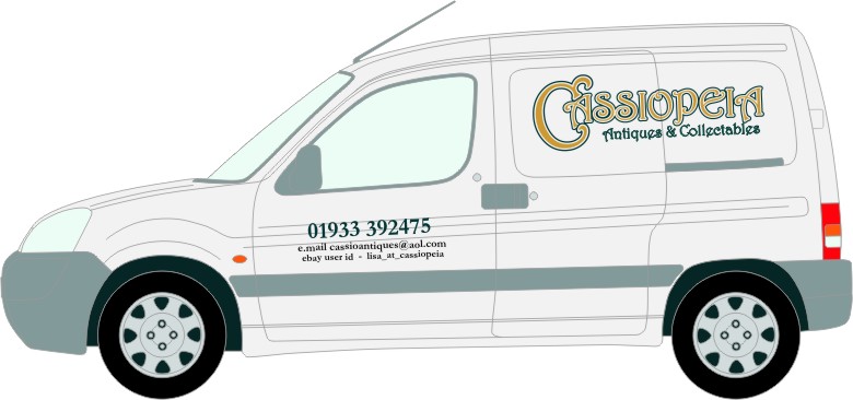
    You know what? I’m not very good at vehicles. I spend hours on ’em and usually end up with something I’m not very happy with.

    So, what about the attached. I’m fairly happy with what’s in the back panel. What can I do with the contact details to make it all tie together a bit?

    Any ideas?


    Attachments:

    John Harding replied 20 years, 9 months ago 5 Members · 5 Replies
  • 5 Replies
  • Terry Bull

    Member
    12 February 2005 at 01:35

    Not got a lot to play with but the way id go is …
    Change the black text to same as side panel

    Raise the details on door up a bit and add a 10mm stripe
    6mm over the side rubbing strip then above that
    a 3mm stripe in yellow

    Posted a pic of a berlingo for a sex shop little while ago
    that posed the same problem

    Terry

  • Shane Drew

    Member
    12 February 2005 at 09:22

    Big G is the text you used for the name your idea or is that their logo style?

    I just think it looks a bit busy thats all. Bit hard to read imo.

    easiest way to join the two panels is use the same colours.

    Other than that, as Terry says, not got a lot to play with.

    Cheers

  • Bill Dewison

    Member
    12 February 2005 at 11:25

    Andy, what type of budget do she have for this?

    Reason I ask, you could do something like a digital print of her products to the rear panel, but with it cut off by the pinstriping Terry mentioned, sweeping down in a curve towards the front of the vehicle. The main logo could then be overlayed, so half is on the white of the vehicle and the other is layed over the digital print. The rear could then be a full digital print with the logo and details laid over it.

    Expensive option, but it would make a unique vehicle in the end 😀

    Cheers, Dewi

  • Jill Marie Welsh

    Member
    12 February 2005 at 14:12

    Big G,
    I like what you have but not the arrangement.
    I also think that the font you chose is hard to read,
    and perhaps is one that should not be all-caps?
    Here’s my take, since Cassiopeia is a constellation,
    I used a star theme.
    (PS we spell it “collectibles” here & I know my phone # looks illegible)
    Love….Jill
    Mine would be in SignGold with a black outline,
    looks real sharp on white.


    Attachments:

  • John Harding

    Member
    12 February 2005 at 21:22

    Just a small issue, I always think these vehicles look best if the text/logo etc are layed up parrallel to the bump strip and not following the contours as it appears to be doing in your illustration.

    John

Log in to reply.