Home › Forums › Sign Making Discussions › Graphic Design Help › can anyone help with this logo please?
-
can anyone help with this logo please?
Posted by Michael Lafferty on 12 May 2005 at 17:13Hi,
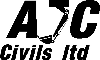
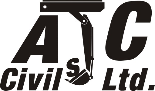
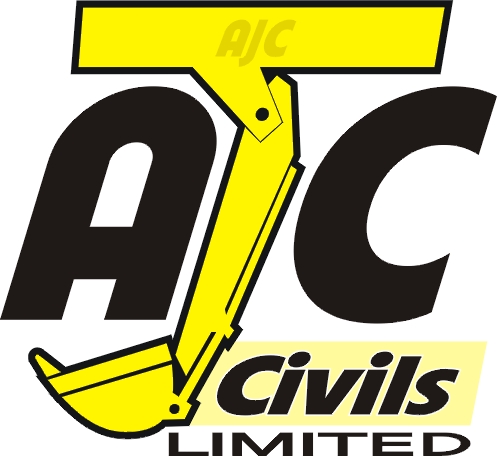
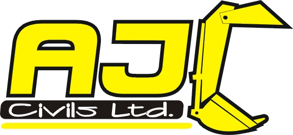
Looking for any opinions on a sign/logo I made up. It should read AJC Civils ltd, does the digger arm look like a J ?
Thanks
MichaelPaul Goodwin replied 20 years, 5 months ago 14 Members · 35 Replies -
35 Replies
-
I think it looks quite good Michael but must admit when i 1st looked at it i thought it was a phone, sorry.
The point is Joe public looking at a van driving past only has seconds to read it or interpret what the logo means!
Just something to think about as you are probably too close to it as you are working with it
L J -
Thanks for the reply L J.
This is why I posted it, I need a second opinion from people who haven’t seen this. Saying what you first see does help.
Cheers
Michael -
Yes I think we all have the same problem, to involved with what we are working on.
L J -
There are two things I noticed:
1-Why is “Ltd” not capitalized?
2-If you made the “J” thingy bigger, taller than the other two letters, with that arm extending under the “A”, it might look better.
It’s not a bad concept but it does need some tweaking.
Love….Jill -
quote Jillbeans:There are two things I noticed:
1-Why is “Ltd” not capitalized?
2-If you made the “J” thingy bigger, taller than the other two letters, with that arm extending under the “A”, it might look better.
It’s not a bad concept but it does need some tweaking.
Love….Jilli agree with jill on this one mate, erlier andrew and i were havig a look and he said almost the same as jill has just there…
thanks for using the forum mate, keeps things intresting round here 😉 -
If I were to agree with jill, about the Ltd then you must add a full stop….Why do sign peeps not remember this poor little chap?
-
it could be made into a c but is the top bit right (?)
the L in ltd should be capitalised and have a full stop after itLynn
-
Changed things a bit, again please say what you first see and if you have a preference.
The L in Ltd was a personal thing I thought I might get away with, I didn’t know about the full stop though.
Simon I think you were right about the C.
Been having to much fun with this, I now need to go and print some t-shirts. I might not reply for a while.
Cheers
Michael -
Michael,
I like the idea of #3, it gives it “movement/motion”, something that i find hard to implement in signs.
I would however change the digger bit to yellow with black outline, people would then automatically know what it is.
JCB’s are always yellow,right
I’ll get me coat
Iain
-
I like number 2 but for me it needs to lose the first knuckle and the long jib section should be more vertical…. oh and also lose the full stop. It interferes with the centre justified look and isn`t necessary.
-
I like #2 the best, however, I would make that J thingy bigger, non-italicize the whole deal, and also make it yeller with a black outline as suggested, with the rest all black. I’d like to see the A and C a bit smaller. I like how the bucket on the J hangs down into the center of the secondary copy.
While I like #1, it throws the design out if balance to me, because the hook on the J interferes with the A.
#3 is just cheezy (sorry 😳 )
Love….Jill
-
can you upload a vector of one of these mate?
just lets us all play around a bit with your work and makes things a bit more fun, i know, i, for one am terrible at explaining things typing. :lol1:
just make a reply post and attach your file, if you want to that is, its cool if you dont. 😀 -
I will upload a vector file in the morning. I don’t have one at home.
Cheers
Michael -
Vector file attached.
At the moment the logo is in black, just because I mainly work black on white when designing. The yellow and black sounds good, I haven’t discussed colours with the customer yet. They just said do something and after a few things the J with the digger arm stuck in my mind.
Although I am now swaying more to the C design.Cheers
Michael -
-
quote Simon C:Had a little go…. got vector if any good
The vector would be great please Simon. 😀
Gives me something to compare against. I’ll print them all, stick up on a wall and stand back.
Hopefully one will stand out and shout I’m the one.Cheers
Michael -
jill you beat me to it… guess we were thinking along same lines… :lol1:
[c]
 [/c]
[/c]edit- having a look at mine again looks too off centre… bottom heavy?
-
Rob the only thing I noticed about yours is that the light source is confusing to me on yer shadows & bevels. But I like it, especially how you’ve added that border.
The only thing bottom-heavy around here is me!
I like the top of Simon’s arm thingy. Wish I was better at Corel.
Love….Jill -
Thanks Jill and Rob, I like them both. Maybe just tweak Rob’s slightly.
Instead of doing other work I keep opening up this design and saying it looks like a J, it doesn’t look like a J, it does, it doesn’t, it does, it doesn’t…………
Oh and Jill how do you always make it look so easy 😀
Cheers
Michael -
Michael, altho I’ve been a sign painter for 20 years I have only been learning Corel since Christmas.
I still have a long row to hoe.
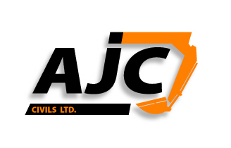
Here is a go with the “C” version.
Love….Jill -
I think your doing fine Jill.
You could be an expert in Corel, but if you can’t visualize the finished design you can’t get it into the computer or paint it.That’s the difference between you and me, I wish I had 20 years experience behind me or turn back the clock and get into graphic design instead of spending 18 years in a factory.
Michael
-
I really like your second design Jill. It definately looks like a “C”. The “J” was a little harder to be sure of what it was.
-Marek -
-
Oooh I like that one.
It ties it all together and it looks contemporary.
Love….Jill -
Jill… you took the words straight out of my mouth!
I like that one, it looks good!
Ali
-
Andrew, I like the look of that.
I am swaying away from the digger in a letter shape, your design is a better compromise. It gives me a new direction.
Cheers
Michael -
Micheal,
I don’t like saying this as i reckon i can see Andrew’s head getting bigger by the minute, but it has defiantly got to be Andrew’s so far. It looks very good indeed.
Just think of all the hours you have spent on that computer Micheal.
L J -
nice one andrew you smooothey………..i like it too but would change the colour of civils ltd to white 😀
Nik
-
I agree on this as well Nik.
would also make registration easy for print…..
it would be interesting to see what keeps the customer happy
Cheers
Andrew
-
Looks good that one Andrew…. And yes which one will the customer go for…?
Simon -
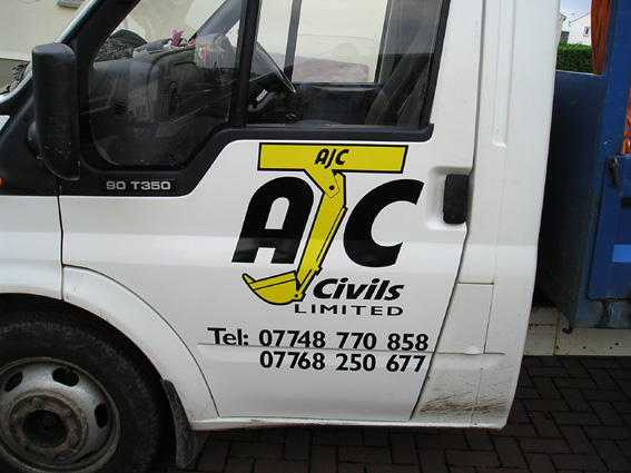
Just to update which design was chosen
The customer chose Jill’s version with just a few slight changes. It fitted the door panel nicely as well as other plant machinery and helmets.
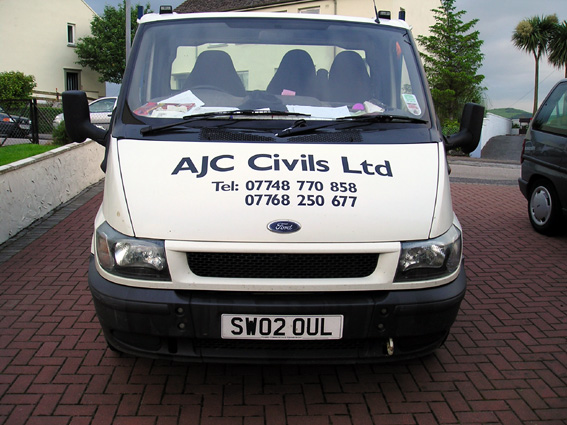
Tried to persuade them to put it on the bonnet, but no luck, would have looked nice there.Thanks everyone for their help with this, customer loves it
Cheers
Michael -
That turned out really nice Michael. Cool to see it from rough design to finished product.
-Marek
Log in to reply.


