Home › Forums › Sign Making Discussions › Graphic Design Help › can anyone help with this logo please?
-
can anyone help with this logo please?
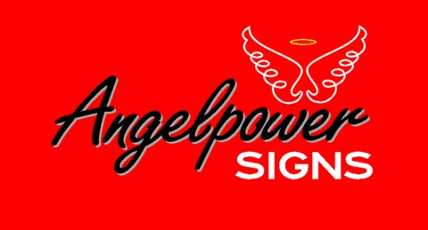
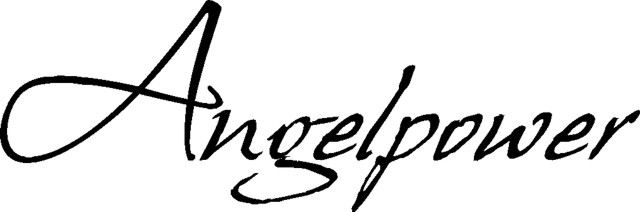
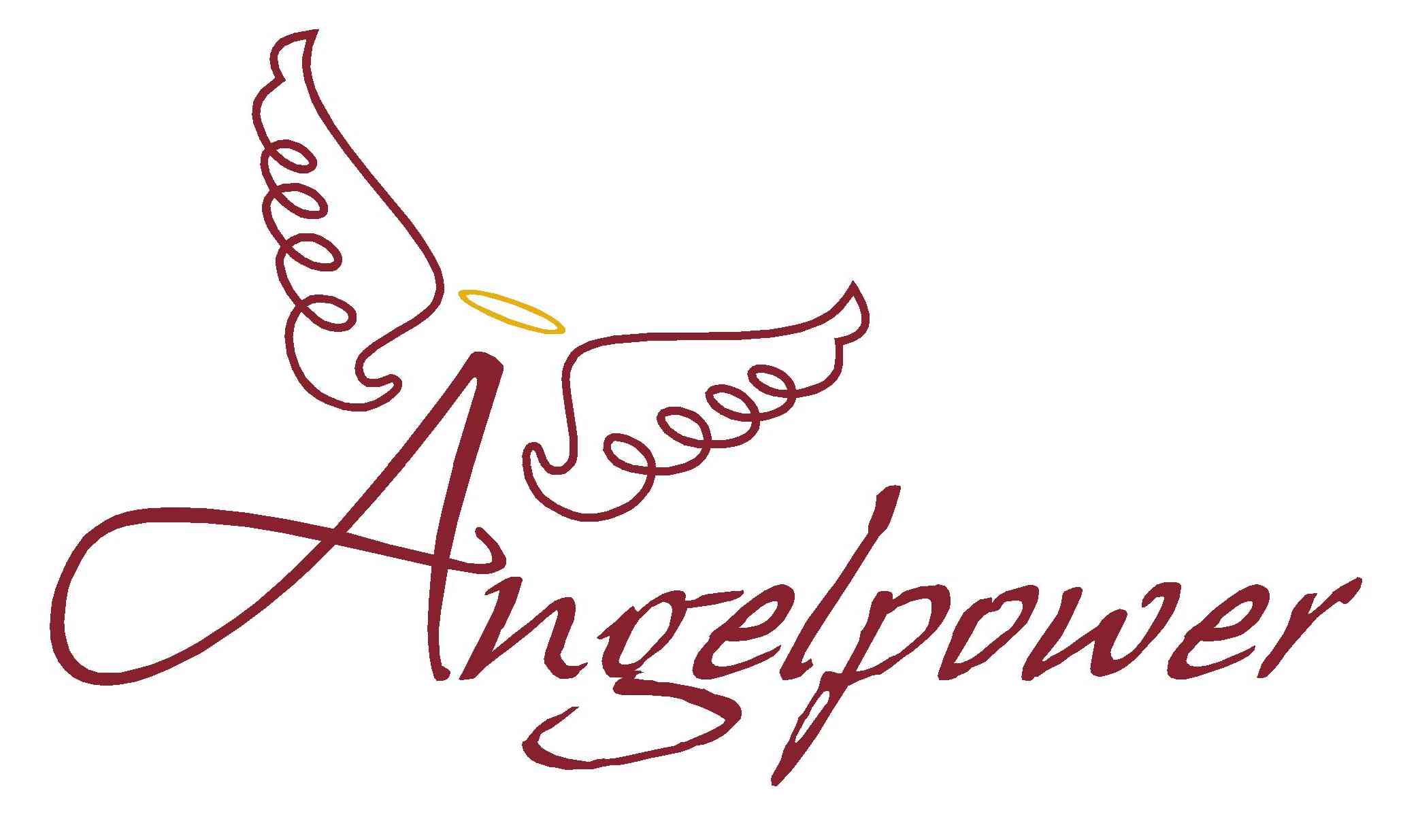
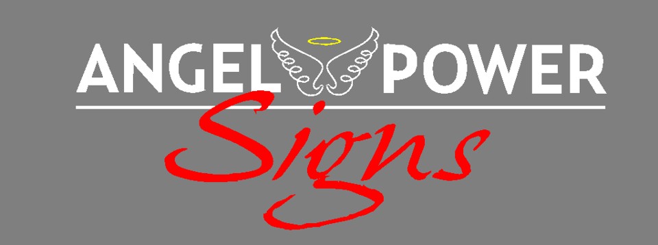
Posted by Angelique Muller on 24 September 2007 at 15:31I finally plucked up enough courage to post this picture on here. It is of my new logo that I am working on. I am looking for some feedback on it. Thank you…..
Attachments:
 John Harding replied 18 years, 2 months ago 20 Members · 52 Replies
 -
52 Replies
-

HI Angelique,
i think i’d put more emphasis on the wings than there currently is, maybe enlarge them to fill the space, give them some fill, and more of a transparent look, the the text over the top,
i know what i mean, i’d need to play with it to see for myself, but i think i’d be going bigger with them, hmmm,
not too sure the red is very complimentary, it’s a bit harsh,
is this the elements you want within the logo, it might be worth posting the design as an ai (no later the ver6 is best for me) and we can play away !
-

Hi Angelique,
I also quite like it apart from the red and as Hugh say’s a bit more emphasis on the wings.
Lynn
-
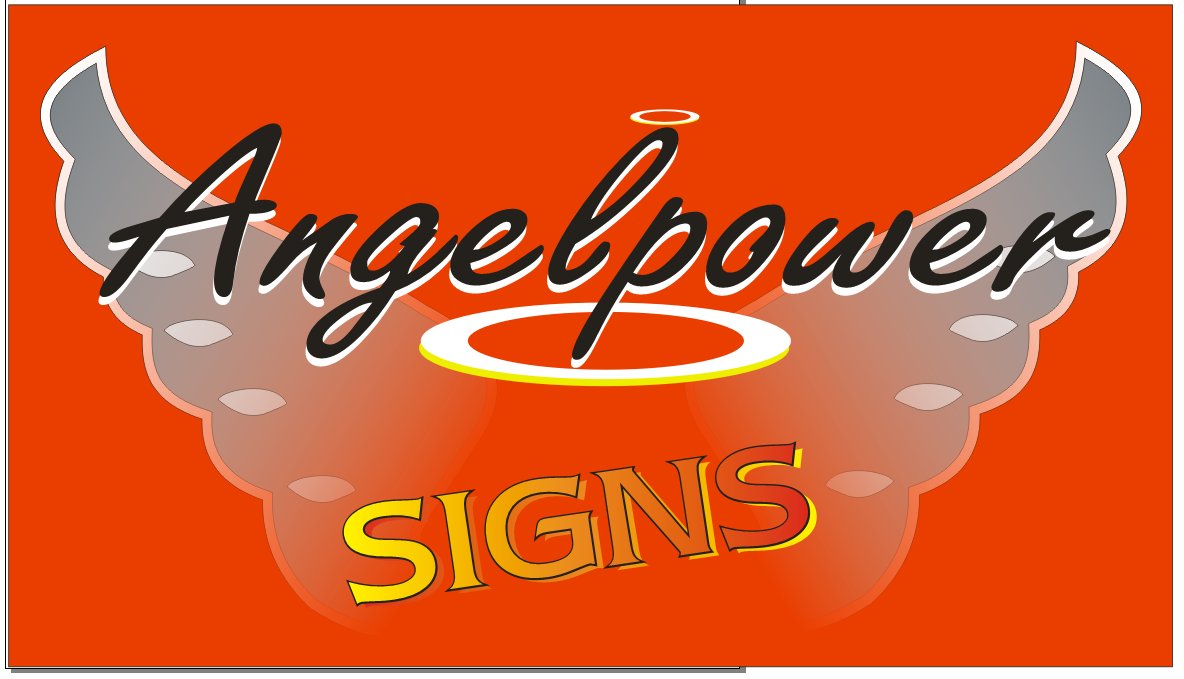
right, a quick ten min effort, and maybe this is ott, but i’s some way to what i was thinking,
Hugh
Attachments:
-

I’m gonna disagree with you Hugh! :lol1: 😳
I like the smaller wings better.
I’d align your text to the right Angelique and perhaps a blue or silver background, something a bit more ‘sky’ like to suit the name. 😀 -
Thanks for feedback.
I chose red as a background because I kinda like red and my car is that colour (I was hoping to put it onto the car for advertising). But had not put that much thought into it…… You have made me think! (reason for posting it).
I was struggling a bit with combining the image of the wings with the words. In general I like to centre things, but in this case it’s found it was not working with the word Angelpower because of the ascender ‘l’. I would like to use a Script font (something casual that would go with me as a person), but am quite partial to something like futura or gill sans in capitals……Hugh I like the fade effect, but that would make it hard to cut from vinyl…..I will take your suggestion and post it as a AI file….. just have to convert the file first from my signblazer software……
-

I’d agree about the red thing, a bit too strong a colour for the harmonious angel image. Can you upload a vector, I’d be tempted to make the word SIGNS a bit bigger, but keep it in a similar place, but you could make the tail of the ‘p’ in angelpower link with the ‘I’ in signs, if you see what I mean. 😀
-
hmmm, as i mentioned, just a quick ten min redraw, looking at it, i think i’d still keep larger wings, but use more detailed wings, not too fine, but more ‘feathery’ !
-
Here it is in illustrator…
-
 quote Angelique Muller:I was struggling a bit with combining the image of the wings with the words.
this is where i see the problem too… it looks like there is three things going on… the "wings", the word "angelpower" and the word "signs" they need tied together to form one. I also think there is too much emphasis on the name (size) and wings… i think "Signs" should have priority.
maybe when the finished combination of all three will work…sorry if that doesnt make much sense?
😕 -

I will try to make sense too….I think its too common a font for the main name…it looks weedy and not very classy and I think using a light shading colour is wrong in most cases. Anyway…..here’s another version to add to the pot! I do like the wings though and the red. Just my opinion though 😀 😀
Attachments:
-
just another option. Keeping it simple.
Attachments:

-
Harry, I see your point about the main typefont.
I had this font I really liked, but I felt it was not going with the wings…..
I really like the way the wings are drawn out of a continues line but agree with Rob, that the whole thing is not really coming together yet……
But how do you do that?
I am a bit stuck with it and hope that a few suggestions from you nice folk will give me some direction….
Attachments:
-
Can you post that word in an AI or EPS, I agree it’s a really nice font.
-

I think the word Angelpower should tie up with the logo. 😀
Attachments:

-

I’m not the most creative but always like to try and contribute anyway
so my attempts keeping as close as possible to yours 😳
Attachments:

-
Here it is Harry. The main body is ‘hans hand’. The A is from ‘scriptina’ that I changed a bit…….
For anyone who is suggesting options: I am in no way stuck on any of the elements: and I believe that ‘less is more’.
I considered just a halo above the ‘A’ and no wings at all.
I am just hoping to end up with something that will appeal to a wide audience & that I am comfortable with aswell. -
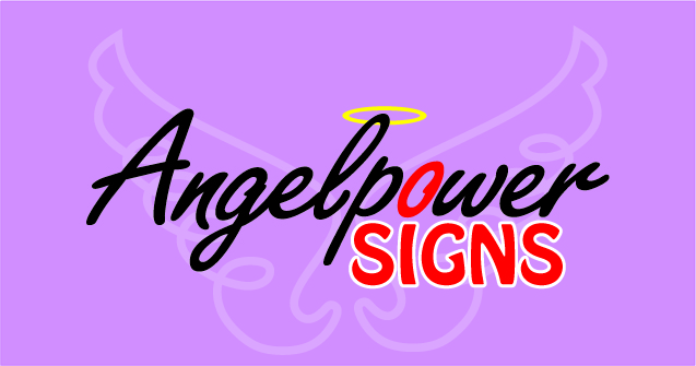
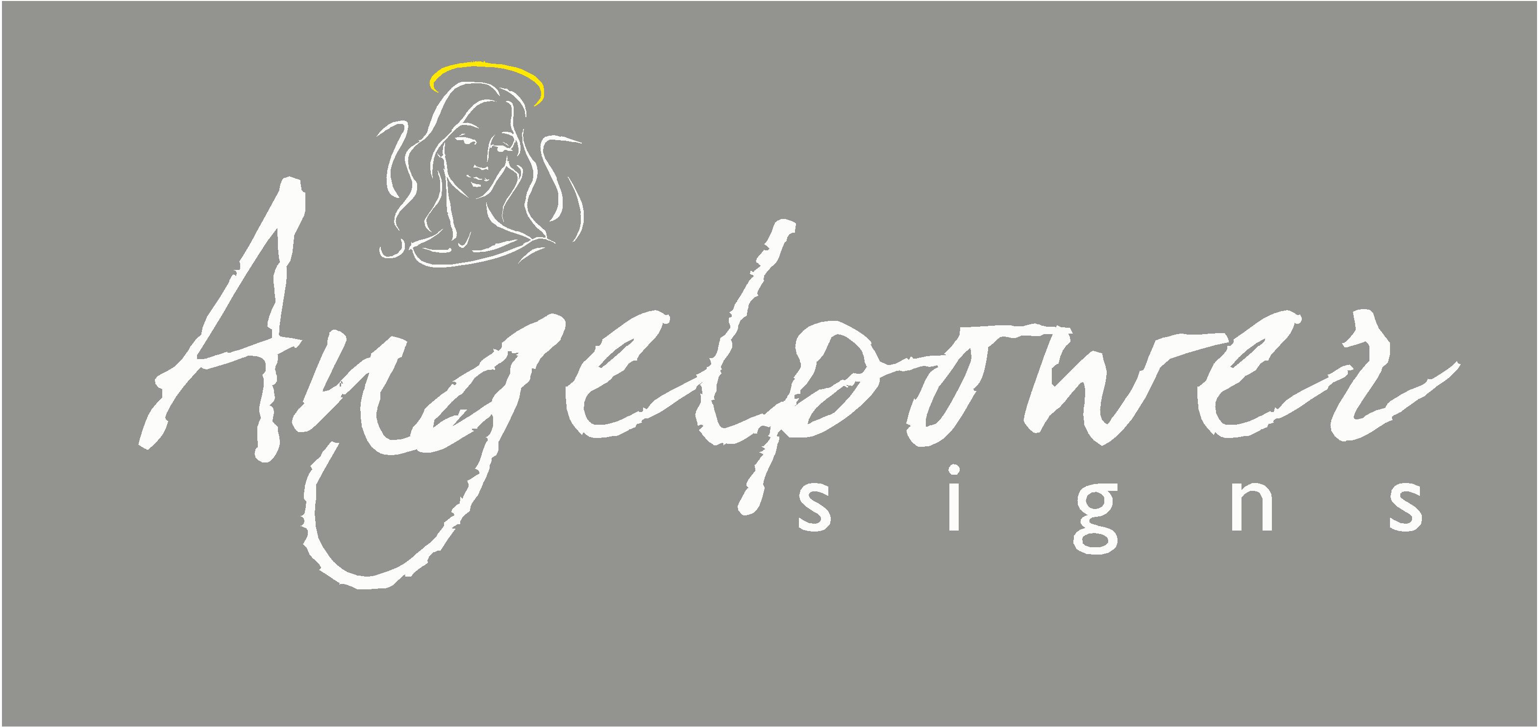
Okay….. this is what I currently use as my logo…. I spend hours on it and still quite like it (there is no mention of the word sign because I use it for my other ventures like painting/decorating aswell). Unfortunately I did not realize how much it looks like the symbol for nuclear power until people commented on it!!! 😳 (maybe not bad with the word ‘power’… but it’s not quite the kind of image I was looking for)….
So time for a change!! -
another……….
I’m still struggling with the red background.
Attachments:

-
I am more than happy to drop the red, but I am just not sure if I can deal with pink or lilac…. 😮 That’s just not me…….
I can sort of see that the fonts that Andrew and Marcella picked go better with the wings, but I wonder if I should stay away from script altogether….
let me dig out my old sketches and see what the opinion on them is…. -

I would just rearrange a bit, and change colours,
Peter
Attachments:
-
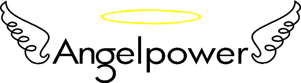
another idea …….. sorry the wee halo disappeared…. it should have been there.
Attachments:

-
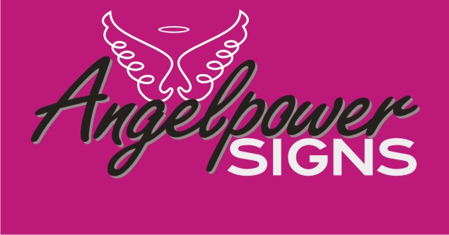
From the original artwork i kinda prefer Nick minalls, but i like marcellas last one best. maybe a bolder or different font on "signs" or something, not sure… but that one appeals to me best so far.
-
Oooooh I see interesting things!!!
I love the way you turned the wings into the ‘w’ Marcella! But I also like what Andy did, with the wings in the centre. I kinda like that retro look that is happening there…….
This is one of my older ideas…. but seeing the latest few suggestions…. I think I’d like to do something with that!
Attachments:
-
Inspired by Karl on this one… :lol1:
sorry… I’ll start again… 😳 😳

.
-
Yeah… Rob… that’s a definite NO!!
Andrew: I really like that. But I just wonder if it is too edgy/modern for my ‘market’. I am based in a very rural area and the local business people in general are quite traditional… -

Not much time ’cause I’m at work. Don’t want the boss to lash me for playing around to much. Anyway, I did steal a little of these ideas from other posts. It just looks like the A in that script could be a flowing dress. Sorry, I would love to call out each one, but no time. Maybe I will be able to later. Anyway just my 5 minute thumbnail. 😀
Attachments:
-
P.s. Rob: from a business point of view you might be on to something. With a sign like that I might get a lot of work from the many bachelor farmers in the area….. but I am fairly sure they won’t come looking for signs 😀
-
one more from me, that pot got full very quick!! 😀
Attachments:

-
Thank you all for your suggestions. You have given me plenty to think about! I shall go back to the drawing board and let you know how I get on.
Thanks again! -

Cant beat Robs but heres’s a couple of ideas –
Attachments:
-

probably a bit late but here’s my attempt
Attachments:

-

LOL at Rob…
Angelpower, well my mind boggles but I find if you did a close up picture of your face with powering ‘look into my eyes’ and add some wings picture with Angelpower under it. People will remember who you are and you will stand out, that stick a massive sign up on your building in the style of Karl.
Ok, I stop now
-
What about this latest attempt?!?
Is it any good?
Look forward to all the comments 😀
Attachments:
-
Hi Angelique,
Personally – i just dont like the wings you are using – a bit like the Aerosmith logo but more like a pair of frilly knickers or a nappy? – dont know if you see where im coming from – but again – it is only my opinion!
Nigel
-

I’m not keen on the wings, either. They do remind me of a nappy print.
They have some nice ones on iStock tho.
I try to avoid using black with red in a design, as it can lack contrast.
If you slanted your script up into the design it might flow better.
Here is something I doodled around with:
Love….Jill
Attachments:
-
I like the top one Jill. Very nice. Also I think it’s a little more feminine and playful than using more traditional fonts (although there obviously is a time and place for them).
-
Aaaaah really? I kinda liked my wings 🙁 .
I really like the top one Jill, but it is kinda girly…. hmmmm am I the girly kind!??
Not sure. 😕
I do think it looks really atractive though I think it could work really well……. Let me sleep on it (and get in touch with my ‘inner’ girl)…Thanks for feedback
-
How about grey (silver maybe) instead of black.
I have moved the word sign up a bit into the other text. Is that better?
Attachments:
-
The signs in red is too "Devily" for me…..it doesn’t sem to go with the theme you are trying to create
-
I try to design in black and white first…the background really isn’t a part of the logo.
The logo can be adapted to any background by making color changes.
I tend to make everything the same color on a logo (text) but that’s just me.
Moving the Signs part up did help it, but there is still not enough contrast on the grey.
Love….Jill -
I really like your top design there Jill…I can see it might be a bit girly for some people but I’ts a really nice design
-
Hey just turn the heart upside down and it will look like a scrotum…
Nuthin’ girly about that!
🙂
Love….Jill -
What are the names of those fonts you are using (the one that says ‘signs’ at the bottom design)?
I don’t really tend to use those kind of fonts…. maybe I should…… -
Script is Rister, SIGNS on bottom is Edoras Regular, both from
http://www.artandsignstudio.com/fonts.html
The signs on the top one is (I think) Baskerville Old Face.
Love….Jill -
quote Jillbeans:Hey just turn the heart upside down and it will look like a scrotum…
Nuthin’ girly about that!
🙂
Love….Jill:rofl:
-

Hi Angelique – just wanted to say your last post could be misread as angelpower sighs not angelpower signs so care over font selection or you might as well run with Robs idea
😀
John


Log in to reply.