Home › Forums › Sign Making Discussions › Graphic Design Help › can anyone help with this logo please?
-
can anyone help with this logo please?
Posted by Ade Brown on 1 November 2007 at 23:41HELP!!
got a logo to come up for a friend and its driving me wild – everything I’ve come up with he says he fancy something different..
The guy does race support at Motorcycle meeting but his main line is Tyre supply
He trade under Drew’s Race Tyres..
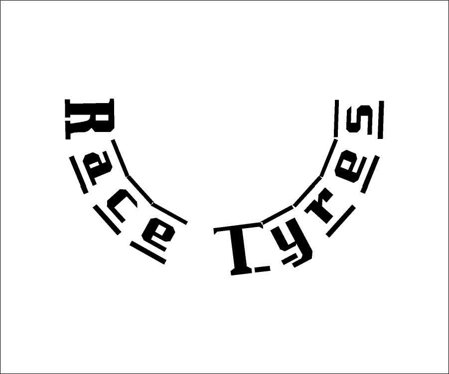
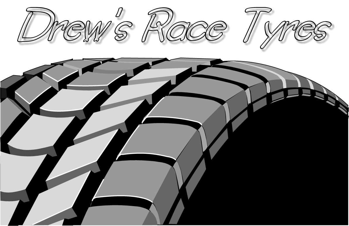
hers my last attempt – or should i say 10th attempt (hot) design colour/colours are not stipulated…
any help will be greatly appreciated
Ade
[/img]Andrew Boyle replied 18 years, 1 month ago 17 Members · 52 Replies -
52 Replies
-

hi mate, please load a jpg of the image as well as a working layers file as you are more likely to find more help when folk can see a visual. 😀
-

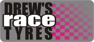
Here’s the .jpg, too beat to doodle up anything.
I’m not keen on that font, especially slanted, but I know it’s getting popular again.
Love…..jill
Attachments:
-
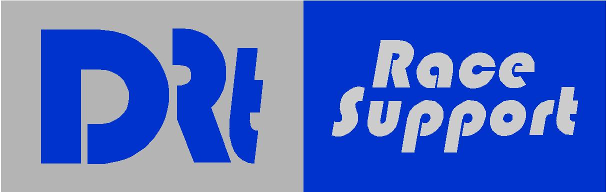
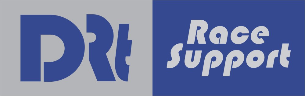
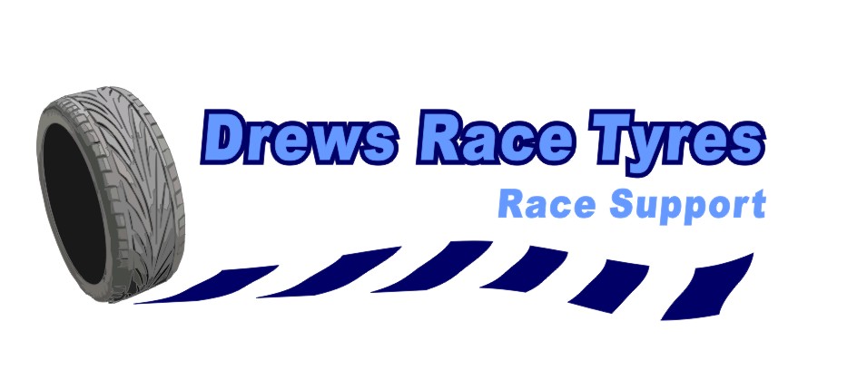
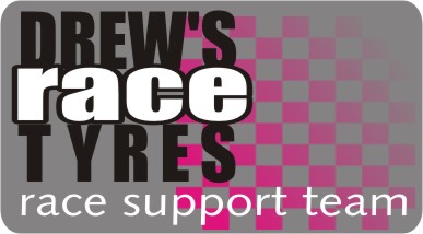
Here’s what I came up with (and I know it doesn’t look like a motorcycle tire)
I think you need to emphasize his name, and that’s why he didn’t like the DRT thing.
Also emphasize tyre, as that is what he sells, and by adding a picture even someone who is illiterate can tell that they could get a tyre there.
This may look too "bikerey" but it’s just a suggestion. I left it in monotones as I was too lazy to add color. And I made mine just say "support" because I didn’t want to use the word "race" twice.
Nice one, Chris…I like how you made "tyre" stand out.
Love….Jill
Attachments:
-

Hi Jill
what fonts are they fancy a play!! not to sure on the Race Tyres font!!
Ade
-
They are both Letterhead fonts.
One is Old Block (I think) and the other is Old Blackletter. That is a bit hardcore as a font and has very limited applications.
The Old Block used to be a freebie on their site but I don’t think it is any longer. You can probably find something similar on DaFont.
Love….Jill -

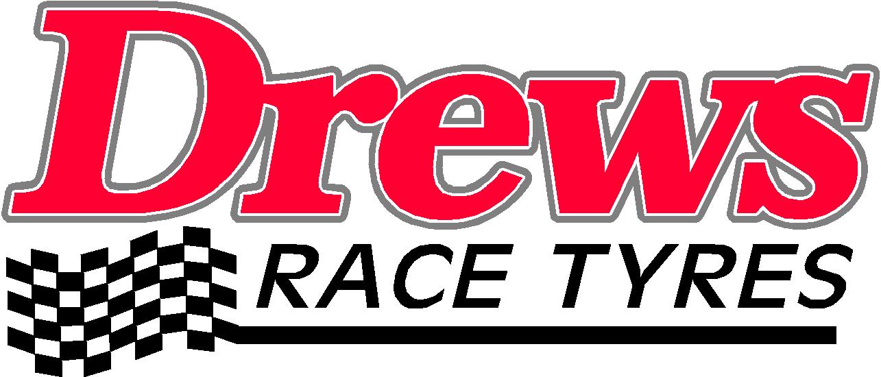
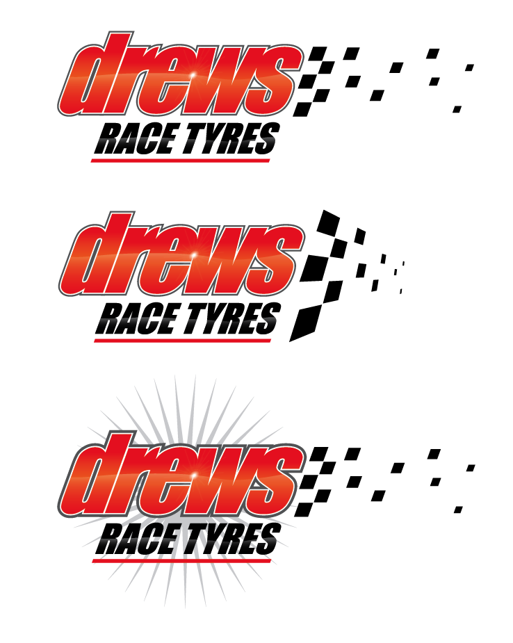
Here’s my take. I stole a bit from Jill though. 😀 I used more of a raceway type of font. I wish I had more time to play around with this. I would like to have added some a rim, some crossed checkered rally flags on top and maybe to have done a banner on bottom with some copy in it similar to Jill’s (oops stealing again). I’m always impressed with what Jill can do in such short time too.
Attachments:
-
Hi Simon,,
I do like that one – i’d done one very similar lines but i quite like the fonts!!
i used caps for Drews, which i do have terrible habbit of using caps way too much (:)
Cheers
-
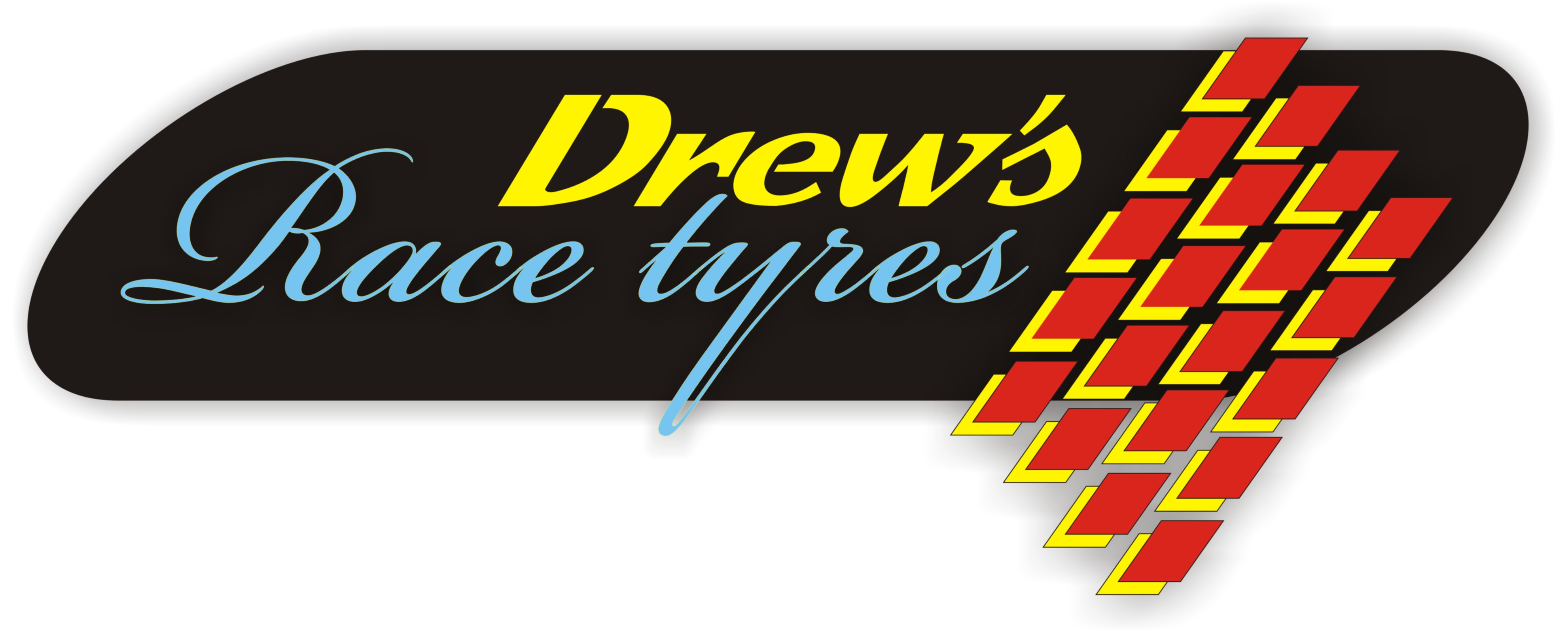
The one that I used is called Lambrettista. I think it’s a free font. I had to modify the rule lines (see jpg), because the lines that are part of the font are straight and not curved. There were some other fonts that I liked better (Speedway or Magneto ), but they’re not free of course. I’m figuring since you’re doing this for a friend you’d like to keep it free as well. Anyway good luck.
Attachments:
-
Yes thats right
I use magneto for my corporate font!!
Can you send me an eps or ai file over – Think i will cut it and mount on some foamex give him a better perspective
Cheers
Ade
-
Cool! Yeah, I liked that Magneto font when I saw it. Anyway, here’s an Illustrator 8 file. Let me know if you have any problems and I’ll re-post it.
-
hi
Thanks – do you want me to mail you the magneto font?
Ade
-
Sounds tempting. I really like the font, but I feel guilty about swiping things these days. No offence. Thanks for the offer though. 😎 If you needed some layouts using it, it would be a different story. I have a few books from the guy that designed Magneto (Leslie Cabarga). Do a search for "Logo Font Lettering Bible" by him. It’s really really good.
-

Theres a font very similar to magneto called "Lakeshore drive"
thats free if you want it. -
Thanks Steve! I’ll put it in my arsenal. Downloading now.
-
Its not exact but from what i remember it in the same sort of style
-
Yeah, looks very similar. Obviously the Commercial font has a little more style to it, but the free one will do very nicely. I’ll probably find a use for it somewhere. Thanks again.
-

here’s my go…..not overly happy with the font but I haven’t got a great deal of choice on my laptop
Attachments:
-

.. restricted on the laptop like Glenn but here’s my Friday night attempt,
Attachments:
-

There’s a lot of text etc….maybe keep it simple [no decent fonts anyway] and a swoosh since Nik is watching:D :lol1:
Attachments:
-

a quick attempt as I’m off for an early night 😳
Attachments:
-
They all look great
Only problem being – sorry their all car Tyre’s!!
But there are some great designs coming out for quickie’s!!
Like Andrew’s its very freesh and clean looking
-
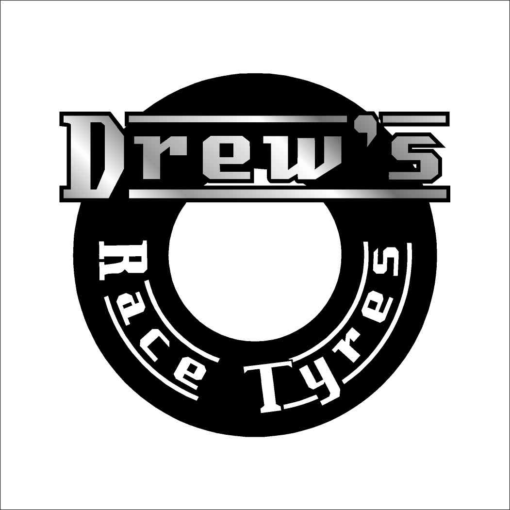
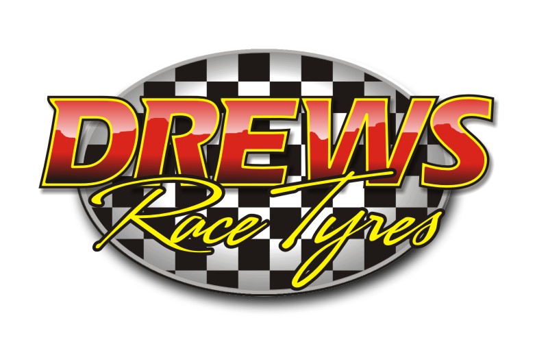
Well i just done this one
same sort of theme as Chris
Attachments:
-

class andy but could you try racetyres in Sarah script. best so far
chris
-

Yeah it looks ok with a script – Sofia looks better than Sarah….
Attachments:
-
Nice one
I do like that – using crille as the font!!
it seems to get used a lot in the race game
cheers
-
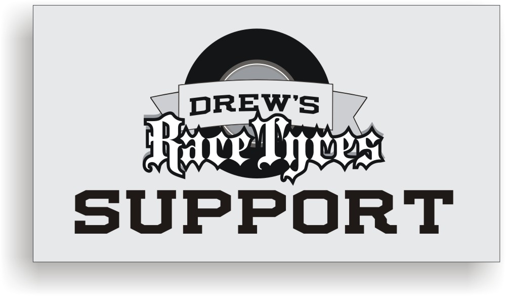
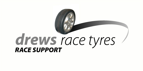
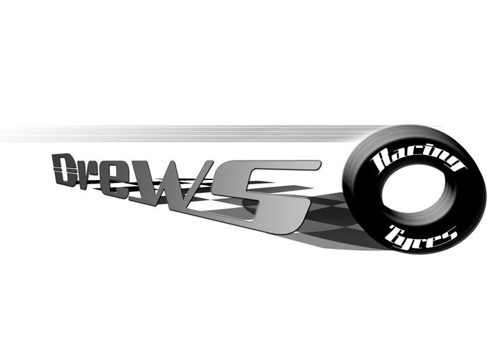
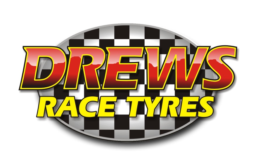
Did this quickly in photoshop.
All drawn by hand no clipart used.
Obviously colour can be added but left it in greyscale for illustration purposes.
Attachments:
-
quote a brown:The guy does race support at Motorcycle meeting but his main line is Tyre supply[/img]
is it motorcycle race tyres or car race tyres mate?
-

Loads of great ideas and inspiration, but I have to admit I really like Andy Gormans designs the best :thumbup2:
Very 3 Dimensional – and the main lettering has a simulated high gloss effect that works for me. How did you achive that Andy? (I’m guessing you put in a few graduated tints – or is this an eyecandy effect?)
-
one of the ways to do that, you could fill the letters with a gradient underneath solid red on a different layer then rub out some of the red to give that effect,
there’s tons of different ways to achieve that, no filters needed.
Simple but effective. -
Ha Ha, just as I said.
Filters like eye candy are ok in an emergency, but theres not many effects you cant achieve in the standard version of photoshop (if you know what youre doing) that you can in filter packs. -

Hi guys fair play on the use of filters but do you think on a time scale filters like eye candy is fast way to create great effects with speed or is it i just can draw!!!
Rich
-
quote :or is it i just can draw!!
no you just haven’t master the right tools yet.
look for a demo by stevo on chrome lettering using corel that will give you a cluechris
-
quote a brown:Hi Rob – its for motorcycle tyres
Cheers
Ade
cheers ade, i sorta thought thats what it was for but thought i could be wrong as the tryes being used was for cars. guess it doesnt really mater as its an easy change… but thought ide ask anyway. 😀

Log in to reply.