Home › Forums › Sign Making Discussions › Graphic Design Help › can anyone help with this logo please?
-
can anyone help with this logo please?
Posted by Heng on 21 September 2007 at 09:39Hi everyone 😀 Been trying to design our logo and business card for the last 10 days. The more I do it, the harder it gets so I hope I get some help and suggestions here before I go crazy.
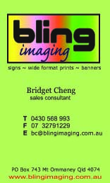
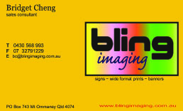
I have done up a business card ( front and back )with a logo in it. Can you help me pick one out of the few I did? Or better still help me with a completely new idea.
I am open to all suggestions so fire away 😎Sorry but the photos seem really blur once I load them up 😕
thanks heaps
Heng
( and thanks from my wife Bridget !! )
Attachments:
 Jeff_Brown replied 18 years, 2 months ago 13 Members · 26 Replies
 -
26 Replies
-

Hi mate.
Ive been a designer for 5 years but I’m new to the sign industry, and in my opinion the orange car stands out a mile from the rest.
its a nice clean design…. I stay away from weird outrageous fonts as i think they make advertising look cheap… IMO.Hope this helps.
PS… Stick with the logo on the card Ive chosen…
-

Yeah, the orange one. What does it look like with a white background instead of the orange?
-

I prefer the layout of the green one myself…(although I would centre the T F E block as everything else is centred
I think the layout of the orange one is a bit disjointed
I’d also be tempted to lift the descenders on the g’s in your logo off the base line
-

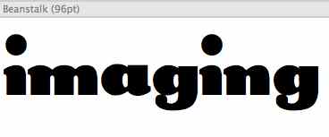
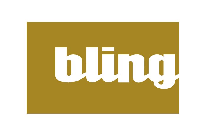
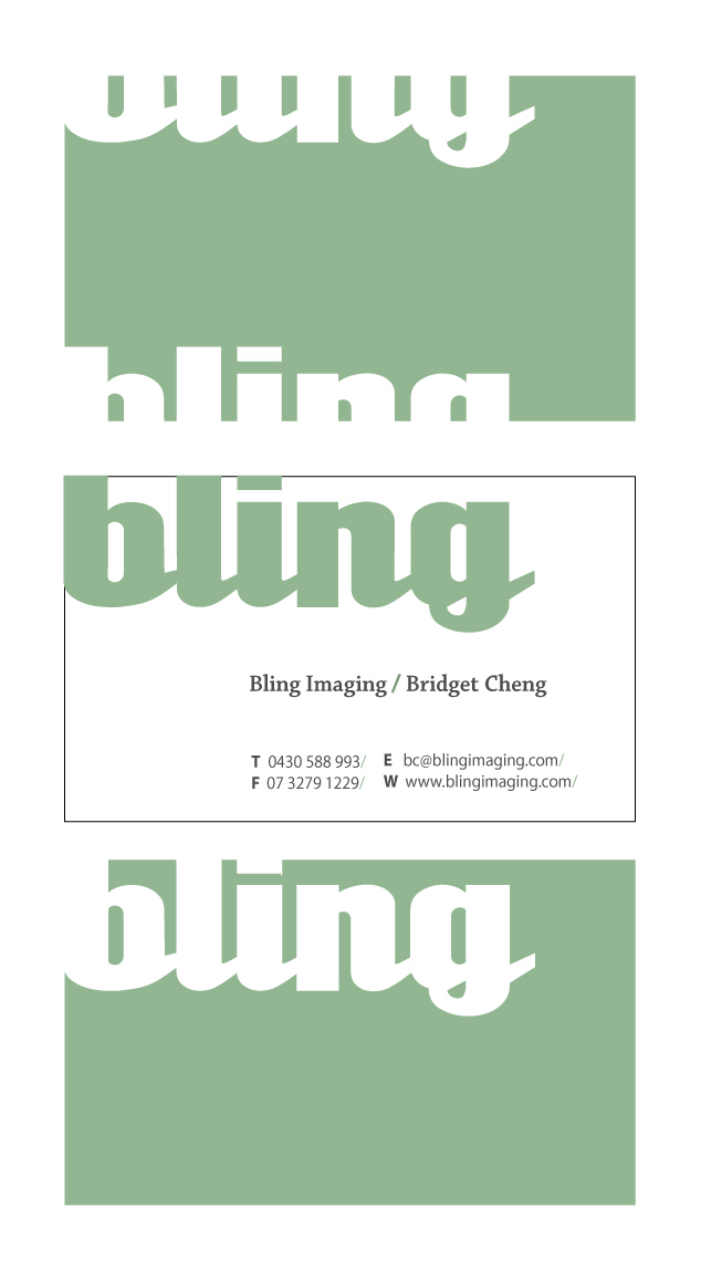
Hi, I would draw some thumbnails up for you with some ideas, but I don’t have much time right now. Maybe I can do some later Three suggestions right from the start. I would maybe put a radius on the corners on the box that surrounds (try two or four and see how it looks) because it will match the font that you’ve used a little better. Also I think the color gamut covering the whole logo is a bit much, maybe try and do only a band on the bottom or side. I’m not very fond of the script font that you’ve used for "imaging". I would suggest maybe using the font beanstalk (or something similar). I’m attaching a picture of "imaging" set in that font. The font was made by a foundry called NovelFonts! Corporation in 1994. I can’t even find a listing for that foundry though using Google. Nor can I find that one for sale even. I assume that it would be ok for me to give the font to you if you want it. Another font comes up when you do a search for Beanstalk. That’s not the same one that I have. Is the main font that your using called Korataki? Anyway, just some ideas.
Attachments:
-

I think the word bling needs a wee bit of time making sure it’s correct 😀
Attachments:
-
Nice font choice. What is that one anyway? Like the gold a bit better than the gamut too. Matches up with the definition of "Bling".
-
just got it for your word unicorn from dafont 😀 😀 😀
nice name………
Cheers
Attachments:
-

like it andrew, your design style reminds me of the layouts from the 40’s and 50’s…..some cracking stuff way back then too 😉
nik
-

Wow, thank you all so much for the input.
First of all – Thank you to Andrew for the lovely design. I will try with that font and post the result. Hope I can reproduce your work though. I think I like it on the gold but I have tried doing gold and never could come up with it properly.
And thanks to Simon – Please do post your design with the imaging done in your font. I have been cracking up over this word as well as I wanted it to be in a different font. The main font in the logo is called Beach House. I think I took it off one of those free font site.
quote :Yeah, the orange one. What does it look like with a white background instead of the orange?Andy, I will remove the colour and post one in white later today. Will see then how it looks.
And thank you to Danial and Glen .
I will redo the g’s and you are right, they are touching the bottom line. I thought about the TFE block in the green card but somehow the TFE looks good only if lined up under each other which is why I did the orange version which I can align to the side.So, I will work on it again today but it will be much easier now as I have some support from you guys. I really have to settle on something soon so I can get on to doing the website and flyers.
Cheers
Heng[/quote]
-
No problem Heng…………..is Bridget Cheng your wife ?………
Cheers
-
quote :No problem Heng…………..is Bridget Cheng your wife ?………
Andrew, yes she is indeed 😛
So once I get this sorted out, she can prepare the website and flyers.
Cheers
Heng -
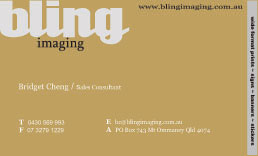
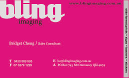
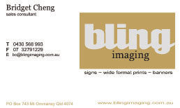
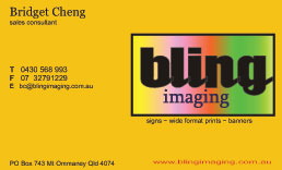
I have done up all the versions now and I need to settle on one of them so please help me as I need to go to the printers asap. I just can’t decide on my own!
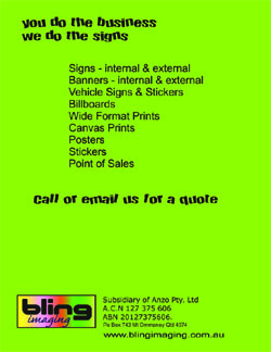
The cards will be double sided with the logo and personal info on the front. The back will be the service list and company nos in small print. eg the green card shown at the start of thread.
Front and back will be different colours.Many thanks all
Heng
Attachments:
-
the white one with gold logo all day 4 me…
Nice 1 mate….
Dan -

wow, i get you that it gets tuff to decide. i have the same problem myself.
from the latest bunch i´d choose the red (magenta) one. that one blows you away. and that will stay in your memory…
all the best.
bernardo
-
oh yeah just thought that the letters in a rectangle often give me the feeling that the letters are being held back. like sheep in a pen. the same with the colors. unless you stretch the colour blends to the edge of the card, and leave around one third for the text information on a one color background. mmmh am i confusing you ?
seeya, b
-

Nice work Andrew
nice clean and legible, a distinctive image that can be reproduced for all applicationsTerry Bull
-
quote :oh yeah just thought that the letters in a rectangle often give me the feeling that the letters are being held back. like sheep in a pen. the same with the colors. unless you stretch the colour blends to the edge of the card, and leave around one third for the text information on a one color background. mmmh am i confusing you ?
Bernado, what a great idea. I never thought of that and was having a hard time thinking how to put the words there and have it show up in a different colour :lol1:
Will get to work on that.Thing is, everyone went for different designs, so can we have more votes please ?????
Cheers
Heng -

I can’t offer design advice at the moment as I am too tired (just back from a letterhead meet)
But the verbiage on the card really bugs me.
Instead of using the word "stickers" try "decals".
Stickers sounds so unprofessional.
Try saying "Vehicle Lettering".
Using "External and Internal" (especially twice) sounds more like a doctor’s exam than for signs.
Try "Interior and Exterior Signage"
With the word Banners, I don’t think you need further description.
Does an average customer care if you have a wide format printer?
Wouldn’t "Full Color Printing" sound better?
While I do think that a colored bizcard will stand out in a crowd, I do think you always need to be concerned with contrast.
As always, Andrew’s layout is stellar.
Love…Jill -
Thanks Jill for the tips. Duly noted and will make the changes 😀
Cheers
Heng -

good advice from all here, I agree with Jill too.
For the record I like the magenta but it look similar to the AGS card, just that it was cyan instead.
Just my 2c’s
-

How are you going to print these business cards, you have to remember that a cmyk process won’t print those bright colours.
-
How are you going to print the business cards, you have to remember that a cmyk process won’t print those bright colours.
-

Check with a pantone color bridge book…. Then tweek… Then get a DECENT proof run out. A proper certified proof. Not one from your mates bedroom setup! 🙄

Log in to reply.