Home › Forums › Sign Making Discussions › Graphic Design Help › can anyone help with this logo please?
-
can anyone help with this logo please?
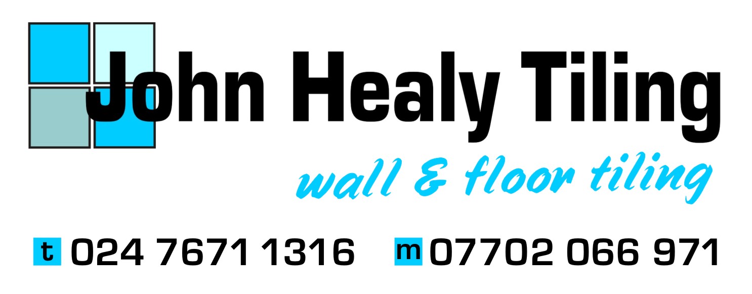
Posted by Cheryl Tissington on 13 August 2007 at 16:15Hi,
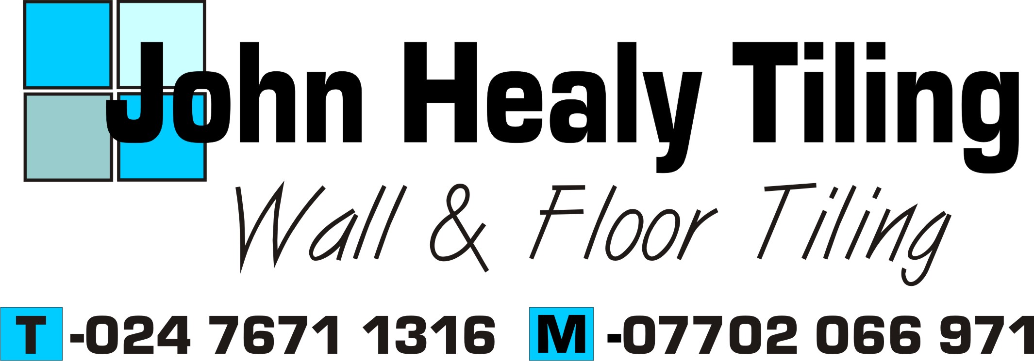
am I on the right track with this or not ?
The client wants Wall & Floor Tiling under his name, but if I do it in the same font, tiling under tiling doesn’t look right.
So I’ve used a font that’s completely different……does it look wrong ?
Someone looking over my shoulder just said they didn’t like it and now I’m unsure ! 🙄
Any comments really appreciated…….please be gentle ! 😕
Cheryl
Martin Pearson replied 18 years, 4 months ago 15 Members · 28 Replies -
28 Replies
-

is there no other option i.e
John Healy
Wall and Floor Tiling -

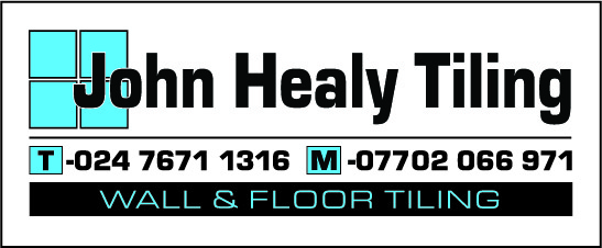
Hi Matt,
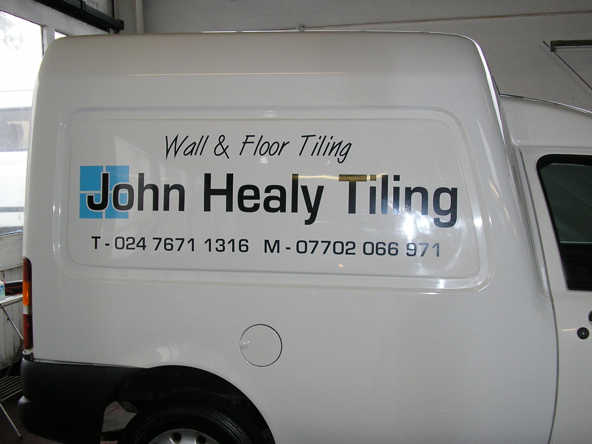
no, unfortunately he’s called his business John Healy Tiling.His name and 4 tiles are how it is on his business card.
-

Cheryl,
Could you not just change the tag line to read something like…
for walls & floors
so you do away with repeating the word
-
Debbie,
the client has business cards that he wants to copy the format and wording off. 🙄
I’m not too worried about duplicating the word tiling providing I can make it look a bit different to the header.
He’s wants to use this font style for his name, but is open to suggestion for the other.
Thanks,
Cheryl 🙂 -

Cheryl – I think it would look better if you put a white oultine around the letters "Jo" to make them stand out from the 4 tiles in the background. Also allow some good size margins all around.
-
Thanks Phill,
I’ve done what you’ve suggested.?
I’m still not sure about the "wall & floor tiling" font.
I’ve taken the blue tile off the T & M too.
Attachments:

-

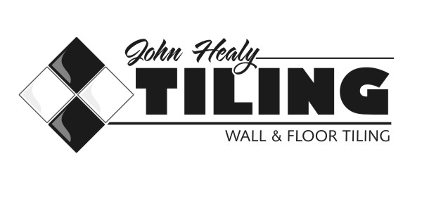
What about using a different weight Eurostile, and moving the text down
to the bottom, similar to this?Cheers,
Jamie.
Attachments:
-
This is how I would do it using your design but altering the positions and sizes
Attachments:

-

I’d take Jamie’s layout and reverse the position of the numbers and subcopy.
By placing the subcopy in a panel, it makes the redundant "tiling" look better.
(I just got a new computer and have yet to install my sign/design software on it or I’d help)
Love…..Jill -

Did you think of maybe jazzing up the tile icon that you have. Here’s a quick idea that I drew up in about 5 minutes (sorry I couldn’t spend more time playing with it. I’m at work right now). It of course would need some work to be finalized, but it’s just an idea to play with. I remodeled my bathroom similar to this.
Attachments:
-

do you need the word Tiling twice ?
in the company name yes… but what about "Walls & Floors" instead ?
anyone mock that up to see what it might look like ?
just an idea ? – my first contribution to this kind of thing – be gentle !!!! :lol1:
-
quote Frank_Galloway:do you need the word Tiling twice ?
in the company name yes… but what about “Walls & Floors” instead ?
anyone mock that up to see what it might look like ? IMO it looks wrong with “tiling” twice
just an idea ? – my first contribution to this kind of thing – be gentle !!!! :lol1:
-

Tell him the whole thing is bloody horrible and he needs a new layout.
Attachments:
-

Suggest "Wall & Floor Specialist" to avoid using "Tiling" twice. They know he’s a tiler by his name, why repeat it 😕
-

I like Jamies idea of just changing the lines about a bit. The first lot of business cards he had done probably won’t last him that long and the van will be with him for years.
You could also just change the wording a little to say " Tiling for walls & Floors"
-
Andy, that looks damn nice!
Clever way of switching things around so that they look "right"!
Love….Jill -

ooh I like Andy’s design, that’s classy!
I also like Jamies too looks well balanced and the reverse text panel along the bottom is spot on. -

i like andys as well.
reminds me of the mike stevens mastering layout book cover
as marcella said classy.derek
-
Yeah Andy, I think that looks really good the way you’ve set it. I really like the font choice and typesetting. Cheers. I do agree about not using the word tiling twice. I think specialist, as suggested by Frank & Warren, is a better fit for the tag line. Everybody here have such good ideas! 😀
-
Thanks everyone for you input.
Appreciate all your help.
Andy……Nice !
Unfortunately the guy is a complete numpty and won’t change his font and tile design. 🙄
Thanks again
Cheryl 🙂 -
That’s a pity, because I think Andy’s is miles better than his original one.
-

Yes that’s a shame because I think Andy’s design is a real winner too. Perhaps you could try hitting your client over the head with it 🙄 😀
-
I’m pleased you found that to be useful.
It was done following the formula for "Natural Layout" as described in Mike Stevens book. 😀
-
Phill, is that where A equals 15% of shortest axis and B equals 17% of horizontal axis?

Log in to reply.