Home › Forums › Sign Making Discussions › Graphic Design Help › can anyone help with this layout on works van please?
-
can anyone help with this layout on works van please?
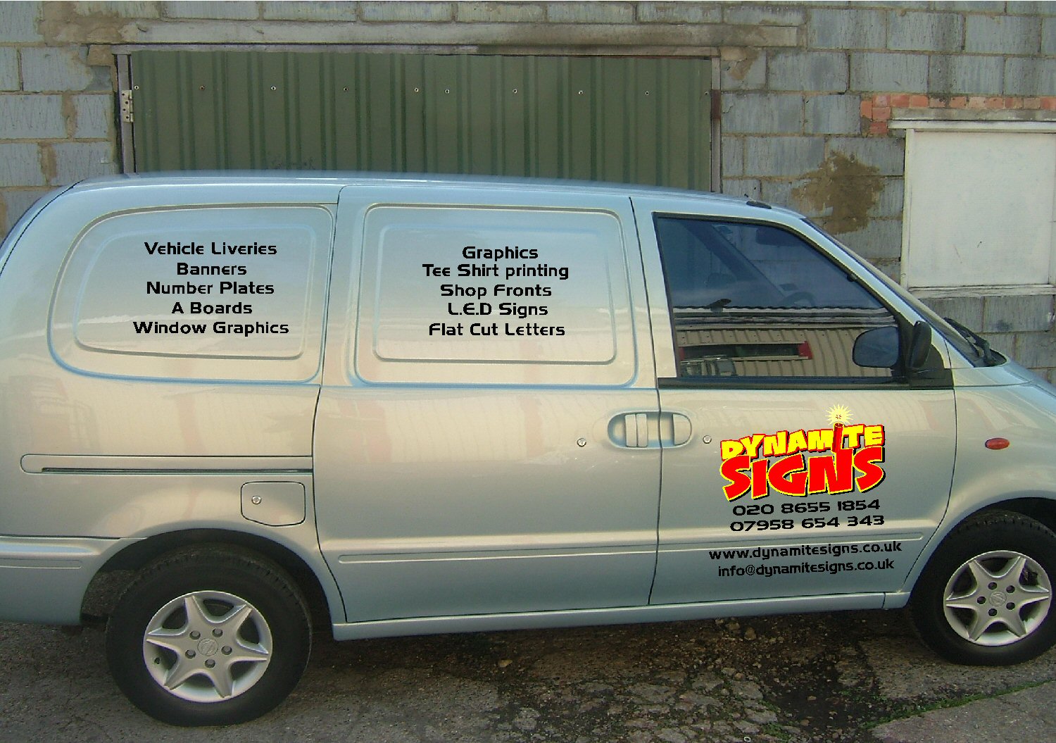
Posted by Richard Urquhart on 31 May 2005 at 10:49hi all do you think this looks ok it my van and want company logo but dont want to go big in ya face this time
Attachments:
 Robert Lambie replied 20 years, 5 months ago 9 Members · 12 Replies
 -
12 Replies
-

Looks good mate, but I’d have bullet points on the text in the window spaces.
Shane
-

Yes, what Shane said,
and I’d eliminate 1 phone number and put the 2 web addies in a straight line separated by a stick of explosive under the list of services.
Maybe use a yellow sparkley thing for the bullets too.
Love….Jill -
Jill is good mate, I think her suggestion here is spot on. :thumbsup:
-
PS
“Printing” needs to be capitalized….(after Tee Shirt)
Love….Jill -

Van looks cool Rich 😀 How come you’re going for low key though? I thought you only had one volume setting? 😉
Cheers, Dewi
-
 quote Richard Urquhart:i just want it low key
hi rich 😛
do you need to have the black lettering on the side panels?
just a thought, cause you have your logo on the doors which really stands out anyway 😀Nik
-

Rich
I would be tempted to right justify on the panels cause they are odd shapes and I think you need at least your phone number higher
and instead of black what about charcoal metalic, looks good as it is just my thoughtsLynn :lol1:
-
Rich, I would be tempted to just have the door logos, as it is a really good design..
Or change the colour on the listed items and add some colour, yellow and red, maybeSimon
-

Hi
I would move the email & web address, as I think it’s too low down. Maybe even take the email address off altogether, as most people who are going to email you would tend too look at your web site first anyway, and presumably they can contact you through the web site.
Perhaps keep the logo on the door and move the contact details to the lower side panel, or vice versa.
Ali -

hi all and thanks for all the advice i will have a play around with the design and see what looks best thanks all
richYES I CAN NOW REPLY IN GRAPHIC DESIGN HELP
thanks to who made it all possrich
-

Hi rich
I had a look at your account mate, all seemed to be in place but because you said you still couldn’t reply I had a few buttons to tweak but got it there in the end. Not sure why mate… just hope it’s not a system glitch?As for van? Constructive crit:
Leave logo as it is, drop the least used number.
Drop web address and email.
All the signage you do… type each panel in one long line separated by something simple like a red dot. Then repeat the lot in four lines, stacked on top of each other to fill the whole sill area from wheel to wheel…For a side on view this will be low key. Basically do similar on the back but much smaller, this time including the web address and email etc
People have plenty time to read the back details sitting at traffic lights. So if interested they will get pen out and write down details. If they are glancing at the side. They don’t have time… Use one number to allow them to grasp what they need to remember fast!thanks for taking the time to post your work mate 😉

Log in to reply.