Home › Forums › Sign Making Discussions › Graphic Design Help › can anyone help with this design please?
-
can anyone help with this design please?
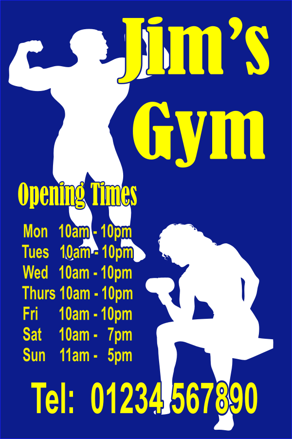
Posted by wanderer on 10 February 2005 at 23:07I’m just trying to see if I can design anything any good.
I’m using an old corel program so i don’t know how good it is or how good I am. Not sure if I’m uploading this right.wanderer replied 20 years, 9 months ago 13 Members · 37 Replies -
37 Replies
-

hi, sorry mate but you must load a picture file like .jpg .bmp etc
that way we can see it at a glance and is compatible to veiw with everyone. 😀 -

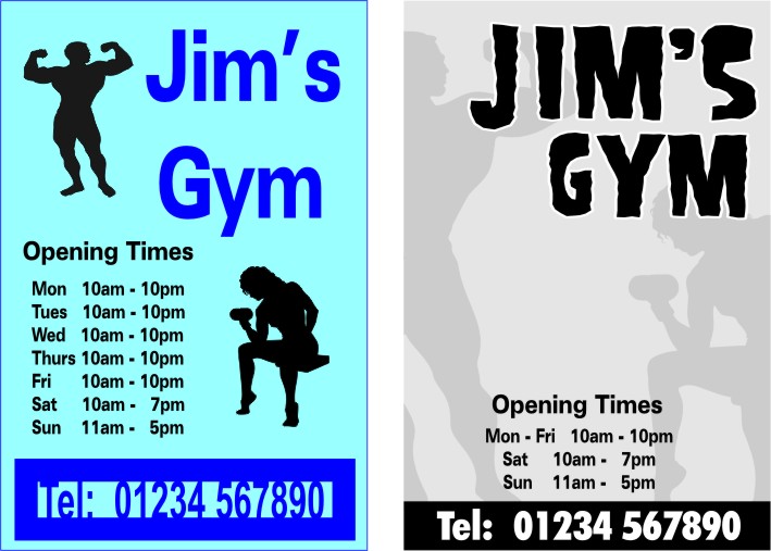
Don’t want to overstep the mark here, but I’ve made a couple of changes to start you off. I find that simple silhouette images such as these can look a bit boring but are massively improved if used as a subtle background image. Also, as many people do, design in black and white first and then add colours last. Sometimes helps.
I’ve posted your original on the left. (Which shows good balance, by the way, which is a good start)
Attachments:
-

hi wanderer and welcome from me. The text (pm. bit) is out of alignment on the Tuesday line, needs to move back a tad to be in line with other days. You have also left a text box just above the (from memory) second or third letter towards the bottom of the sign. It is very basic, which is ok if that is the remitt (is that correct?)(you can correct me 😀 ) but you MUST be accurate. Big tip. The hardest job is to find a customer, work hard to keep them and your books will fill up with referalls. Work sloppy and you will always be looking for the next customer instead of them looking for you.
Mark 😀keep going for it.
-
Nice one big G, simple, readable and a lot more flair. not overstepping the mark just showing your trade skills.
wanderer, you too can do this, feel the force, let it guide you my son!
sorry mate but his is a fine example. you must take note of all the stuff around you and pick only the best to work from. -

Sorry Big G but I disagree with you on this one.
I can’t download the original image but if it is exactly as you have shown on the left hand side, I personally do not think there is too much wrong with it.
A few little tweaks here & there wouldn’t go a miss but in general I think the layout is pretty good & easy to read.
I would just have the telephone No in the main light blue background colour, coming out of the darker blue & maybe make the silhouettes a more subtle colour. Use a more interesting font for the main text & Bobs your uncle. :lol1:
I think in Big G’s design, it does show more artistic flair but the impact of what the sign is saying is lost – I think the cropping of the images & placement of the text over the body builders arm are too subtle & you are dependant on reading the main text to tell you what the sign is for.
-

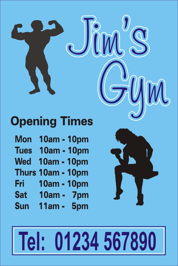
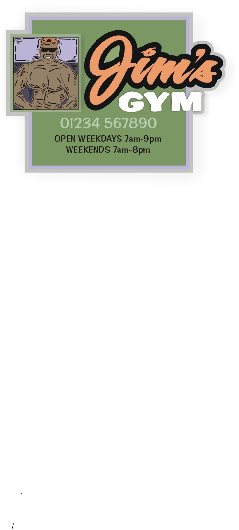
I thought it looked fine,Just thought the text looked a bit flat.
Simon
Attachments:
-
Many thanks for all your advice. I’m taking it all on board.
I havn’t started in this business yet, hence the “Just practising” subject line.
A friend of mine said I could do a sign for their gym when I get going. Nothing too fancy he said in a gruff bodybuilder type voice and I aint gonna argue.
I have done another version, but how do you change a coreldraw file into a jpeg. I can’t seem to find away. -
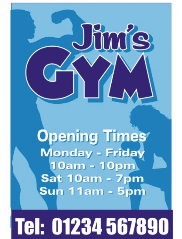
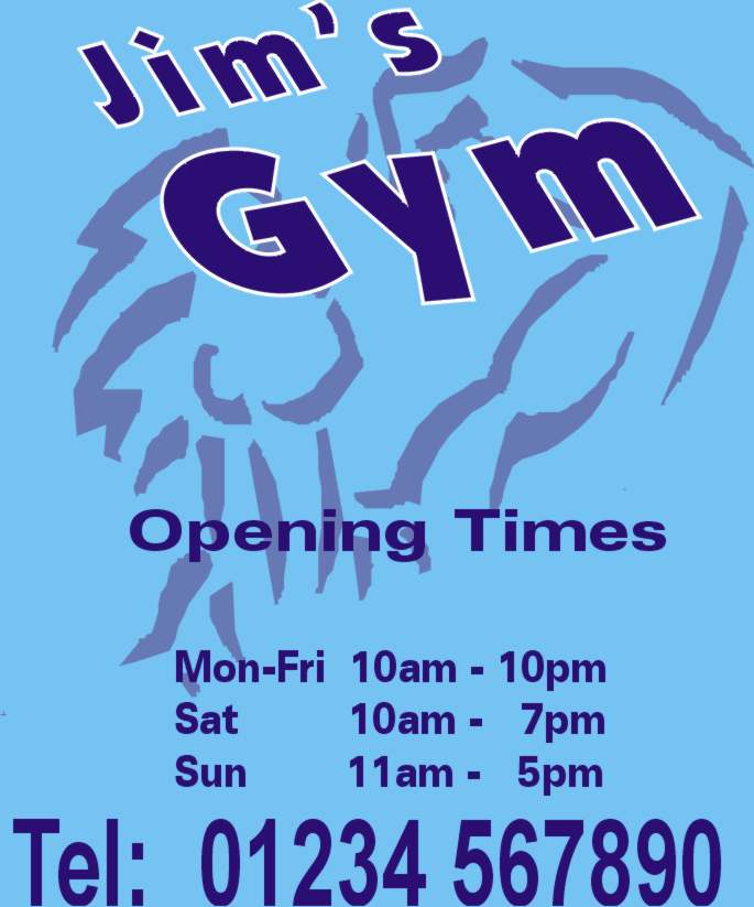
I have to agree with big G and his comments.
Here’s my example
Attachments:
-

Just to add my two pence worth…
A lot depends on what the customer is willing to pay..With the original then that would be a good budget option.. simple couple of colours.. says all you need to know would thin down the outline around the telephone number though…
With big G’s then that is less of a budget sign.. two greys, white and black.. appears a little more upmarket.. so the price should show this.
I like Simons design it softens it all up a little…
I always try to give the customers a couple of options…
Mind you they always want the classy one at the budget price!!!One of the biggest problems with all of us on here is we tend to go for designs that we like… which is not always the same as what the customer likes… They also seem to think they know best too!
Cheers
Ian -
Wanderer, great to see some of your practise work to begin with. As others have said, you’re initial design is pretty good and says everything the sign needs to, but the designs done by Andy, Simon and Steve show the same sign with the flair/ideas I was talking about in the other thread. Its one of the reasons I suggested you post in here, as instantly you can see how other ppl interpret the same information.
I can’t speak for everyone, but I really enjoy seeing stuff like this. Someone who is starting out and sharing their practise work, hopefully being able to see how time-served signmakers would go about it. Really look forward to seeing some more of your work Wanderer (do you have another name btw?) 😀
Cheers, Dewi
-
Nothing wrong with some difference of opinion. 🙂
Here’s a question – if you were to go to a prospective customer asking for, let’s say £300, for this sign – which design do you think would get you the job? Wanderer’s original or Steve’s?
A couple of extra metres of vinyl to make a sign wow the customer really doesn’t make much difference to the price.
I’m not having a dig at wanderer because his original attempt did have some good points – easily readable, clear and balanced, but we are trying to get people to part with money and we should be doing the absolute best we can do.
Anyway, good thread. A good example of how a basic layout can be developed, I think.
-
… For £300 Big G he can have them all and I would even throw in the screws to put them up with!!!!
Seriously I agree with what you are saying… but living out in the sticks here the signs that you and Steve have done would not be picked by most of the customers we deal with… They are both great and the reason I do this job is to design things along those lines but around here they always seem to go for the bog standerd design..
As I said previous I always do a couple of different designs for each job and leave it up to them to decide..
As you said a good thread and some interesting points.
Cheers
Ian -
quote Higgi29:but living out in the sticks here the signs that you and Steve have done would not be picked by most of the customers we deal with… They are both great and the reason I do this job is to design things along those lines but around here they always seem to go for the bog standerd design..
IanThats cos you Yorkies are all tight gits :lol1: seriously I used to think like that but customers just need educating, it takes time granted but you can get them to spring for more ££££ even yorkshiremen, and Ian you can’t anymore out in the sticks than I am :lol1:
-
I know my first attempt was pretty basic and the examples on here are excellent, especially Steve’s.
I’m still trying to get to grips with Corel. It’s called Coreldraw Classic and it’s a few years old so i don’t as yet know how to manipulate text/images all that much.
My other attempt is,I think, a bit more stylish. But I can’t seem to change it to jpeg format so that I can upload it.I’ll keep trying.
Btw my names Tony
-
Tony, look under ‘File’ for ‘Export’. Select JPG. Make sure your image is less than a4 size and select 96dpi.
Try that. 🙂
-
 quote wanderer:I know my first attempt was pretty basic and the examples on here are excellent, especially Steve’s.
I’m still trying to get to grips with Corel. It’s called Coreldraw Classic and it’s a few years old so i don’t as yet know how to manipulate text/images all that much.
My other attempt is,I think, a bit more stylish. But I can’t seem to change it to jpeg format so that I can upload it.I’ll keep trying.
Btw my names Tony
Hi Tony, been a few years since I used the classic version, but can you not export as a jpg? Can’t remember but would be suprised if you can’t. If not, export as a bmp.
Cheers
Shane -
I agree with Ian, its all down to price, as you say Big G, if i was going to be charge £300 i would go for Steve’s, but if i was told £300 or 150 for Wanderers one I’d have that… It down to what the customer is willing to pay
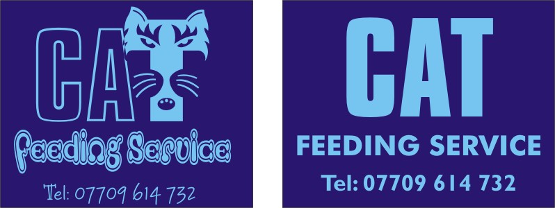
I did some designs the other day, both the same price for a dark blue car to go on the doors.The first design you have to look and read, which i think stays in the mind i like the unusual, the other plain boring text. I bet you can tell which one they went for!
Simon
Attachments:
-
Tony, Corel Draw9 £20
http://www.shopcreator.com/mall/product … &did=53195
its what I used to do my example.Errr Si I’d have gone for the right hand one too, the left hand one is just too busy, too much mixture of fancy fonts, for me right hand sign but the fancy T from the left. i know its a home moggie feeding service but it could confuse by using the caterpillar logo :lol1:
-
Well done Simon.
Sometimes we find clients are conservative, and they will take the boring text version. That is why I loke to give a couple of options.
This is my take on the gym sign tho. I thought for a first up design it was a good starting point. The key is perhaps to stand back Tony, and leave a design for a while, then revisit it later. You’ll be amazed how some new ideas will come to your mind after you have had a break from the original design session.
Sometime you just need to concentrate on something else for a while.
Cheers
Attachments:
-
I’ve exported this into jpeg, but when I view it the top and bottom text is pushed to the edges. Lets see what it looks like on here.
After this I got to pick the wife up from work and go shopping.
I can’t tell you how excited I am 😮
Attachments:
-

This has been an interesting read, with some good examples of design. my 2p in the pot, the silhouette of the lady looks to much like that “thinker” statue or a lady reaching for the toilet roll, and I would remove or modify the plank up her Arsenal
Peter -
Wanderer, I noticed in your file that you have used a blue background for your page. Don’t do that, instead use a “no background” background and create a rectangle the same size as your page, then colour the rectangle. This will stop it from cropping the image when you export to jpg.
(A quick way to make a rectangle exactly the same as your page size is to double click the rectangle tool.)
-

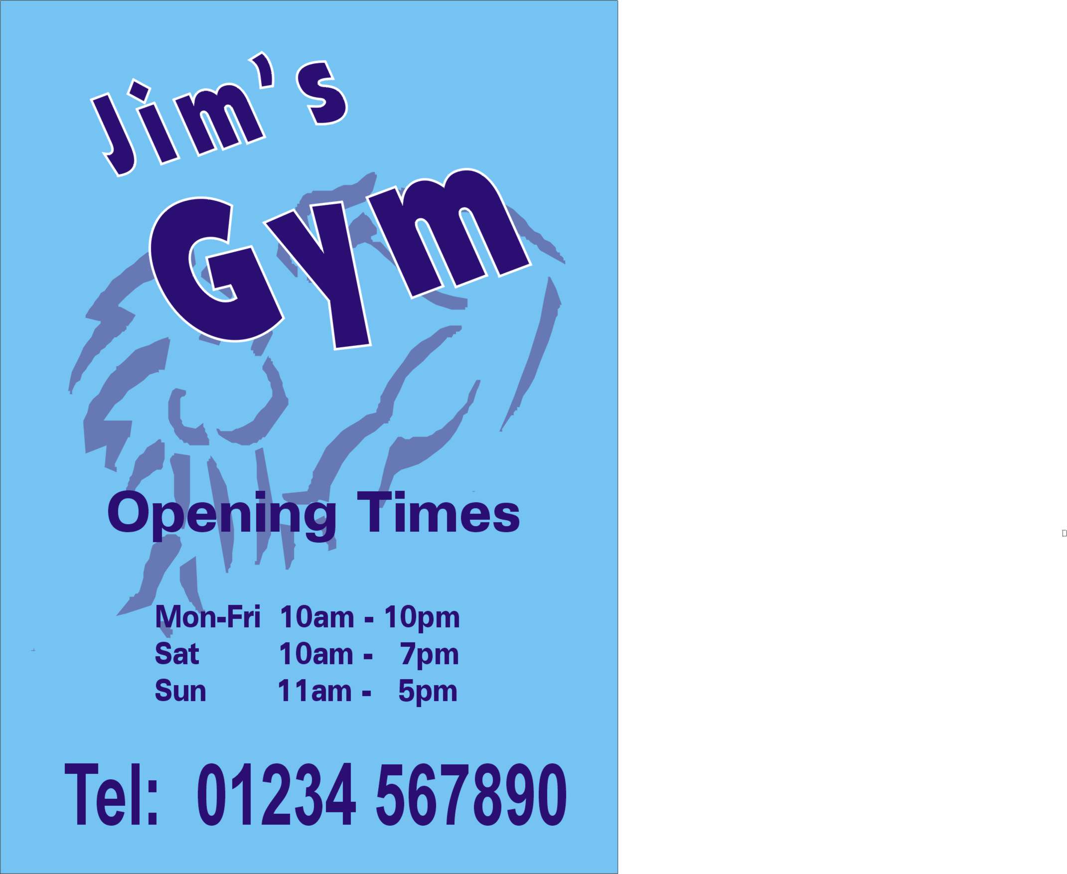
Here’s my version.
I always like to keep it simple.
Why repeat the same hours over & over?
And never be too distortion-happy.
Love….Jill
Attachments:
-
S’good that Jill.
I told you not to use that picture of me as clipart!
-
quote big G:S’good that Jill.
I told you not to use that picture of me as clipart!
You wish Big G, you wish 🙄
Well done Jill,
cheers
-
This thread has been a perfect example of peoples differing opinions on “what makes a good sign?”
For me, the main reason that particular sign is going to be displayed, is to pass on the necessary information to it’s reader and I think a tidied up version of the original would do just that.
I agree that a sign like that should look visually pleasing, but does every sign have to be an opportunity for the designer to showcase their artistic flair or does simple design & standard text layout not have a place in modern sign design 😕
If I was viewing this sign from a distance, say from accross the road or on a bus, I think I would get more immediate information from the original design than I would from Big g’s or Steves sign (nothing personal lads).
So if you are dependant on being on top of the sign to gain its information – is the sign doing it’s job?
I think a sign like this, that has information to pass on does not have to be overly artistic or look expensive to fulfill it’s job – it just has to be easy to read and for me that is what the original does 😉
-
I agree that a sign should convey information effectively, but when it comes to the design, I think the artistic flair of the signmaker is very important. If every sign was made to a standard layout of text, just a functional sign, how would anyone differenciate between one business and another.
Humble opinion but when a sign is designed in the way Steve and Big G has designed them, they stand out from the crowd, conveying the necessary information and doing it with style & often a Wow factor. I’d favour a information only sign if I was designing for a council sign, or a sign that was offering directions etc. but in this case, the sign gives the business its identity to the ppl who pass by it.
Also I think that if a sign is designed by a particular signmaker, it should leave a mark from that designer. How else would the GP decide between signmakers? Steve and Big G have two very different styles, and from the customers point of view, they have a choice. If you make a direct comparison to mobile phones for instance, customers often don’t buy a new phone because it will ring a number for them, or even take a picture, they buy it because its a well-designed, fashionable item that looks good when they’re texting on the train. We live in a country where if one product looks better than another, it’ll sell, and fortunately or not, the same applies to design. An asthetically pleasing design will always sell for a higher premium, or at the very least, sell more quickly to a potential than a purely information based sign.
Cheers, Dewi
-
I agree Dewi. Ever seen something that you think is ugly or a load of rubbish, and yet someone actually paid money for it? Thats because we all see the same thing from a different perspective.
I agree that some signs just need to be a informative, and others would benefit from artistic flair. The gym sign to me is just an information style. It is reasonably small so artistic flair would probably be lost. Certainly if it was going on the front of a building, artistic flair would be more of a benefit.
End of the day tho, it is not good spending time on being art crafty when the client does not see the need for it, and thus will not pay. First of all, get a feel for the clients budget and work from there.
IMO an opening hours sign would, for most clients, not be something they’d be expecting to pay a lot of money for, and would not warrant spending a lot of time on.
Just my 2c worth
Shane
-
Since I’ve been thinking of starting in the sign business, I’ve been looking at every sign that I see with an analytical eye.
Some of them are so overdone and have fancy text that you can’t make out what they are trying to convey without standing and staring for a little while.
Surely this defeats the object. You want to know what the message is right away.
I’m going to have to start the business soon, I work in engineering at the moment and keep getting laid off or the company goes bust. I’m into my 3rd week with no work.
If anyone wants a hand for a few days let me know, I can make tea, sweep up, and do just about anything.
I still have to get up early every morning to get the wife off to work 😉Tony
-
Signs can be overdone, I agree, but Steve’s effort for example is straight forward, bold and effective. I always assume opening times signs to be just outside the entrance, at eye level and the only signage that ties in with overhead signage such as a shop fascia, could be why I’m thinking along the lines of it being an important sign. 🙄
The main thing is obviously the information, but I do think that a sign should be as individual as you can make it. As you say, problem is if its overdone with fancy effects and flashy graphics. I guess thats what makes the difference, a good designer knows just how much to put in to make a great sign, never adding too much as to detract from the information. I’m just over a year in with signage and I struggle alot to make a sign individual, but not overdone. Sometimes I succeed, but I’ve learnt from alot of signmakers here, its practise and learning by mistakes… and I make more than I should 😳
Cheers, Dewi
-
Tony just to let you see that the type of effect I showed earlier will work with all subjects here’s a job just designed , 4ft x 2ft reynobond
Attachments:
-
I like that Steve……but why have you used cabbage leaves 😀 only kidding
Simon :peek:

Log in to reply.