Home › Forums › Sign Making Discussions › Graphic Design Help › can anyone help with this design please?
-
can anyone help with this design please?
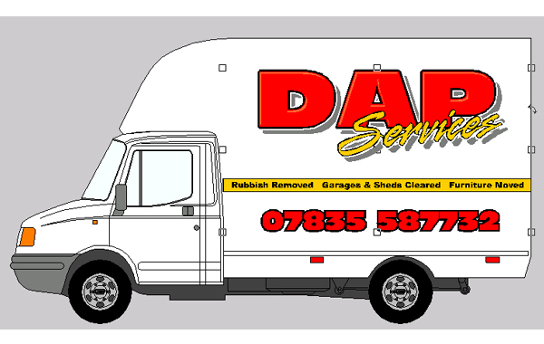
Posted by David Arch on 5 December 2004 at 19:35As is normally the case, I’m stuck for ideas, can anyone throw anything at me design wise?
Cheers
Archie
Andy Gorman replied 20 years, 11 months ago 7 Members · 11 Replies -
11 Replies
-
I really like that! Bold, colourful and eyecatching. Humble opinion, I’d reduce the size of the phone number a tad, enlarge the main logo and move it down slightly. I still think it looks great though, nice one! 😀
Cheers, Dewi
-
hi mate as dewi said bold and colorful (and i do like bold and colorful)
how about move the yellow line up to line of cab ,then bring main logo down and put phone number below yellow line after reducing its size
-
As Dewi has said, drop the main logo down, so there is same gap top and right hand side… see what that looks like.
Great Design
Simon
-
Looking good 😀 I prefered the phone number in the yellow, but thinking about it, it may not show up as well as the red will. Looks good for go 😀
Cheers, Dewi
-
see what it looks like with line and phone number moved down a bit more
say the yellow line same hight a cab door handle -
I agree with dynamite about the stripe, would look nicer if it followed the line on the cab, my 2ps worth dont use the grey drop shadow.
Peter -
Grey drop shadows are OK, but only if you use a VERY light grey. Watch out for outlining red text with black. These colours together will look messy from any kind of distance as they tend to blend together.
-
the reason i suggested to not use the grey shadow was because of the cost.
Looking at the piccie there are already 5 colours if you include the bevel.
In my opinion the customer is unlikley to want to pay for the bells and whistles. If he does , thats fine, go for it. -
Also, I think you should put a circle or something between the 3 items on the yellow stripe, just to separate them.
Log in to reply.


