Home › Forums › Sign Making Discussions › Graphic Design Help › can anyone help with these two layouts please?
-
can anyone help with these two layouts please?
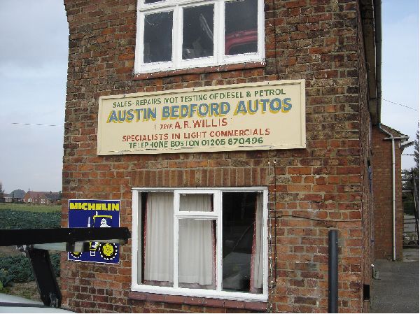
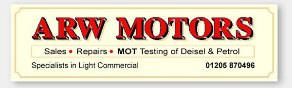
Posted by Steve Broughton on 9 November 2004 at 17:13this is whats there at the moment :-
Attachments:
 Robert Lambie replied 20 years, 10 months ago 19 Members · 49 Replies
 -
49 Replies
-

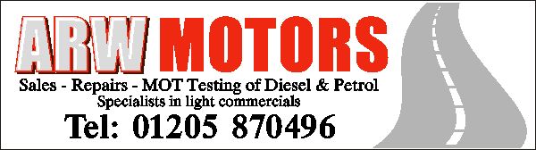
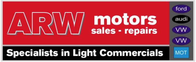
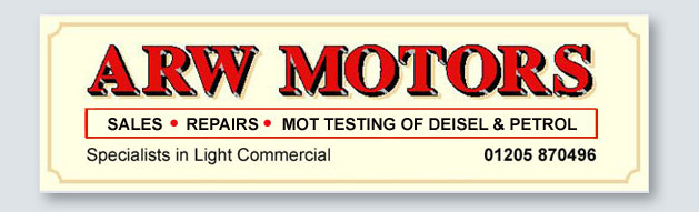
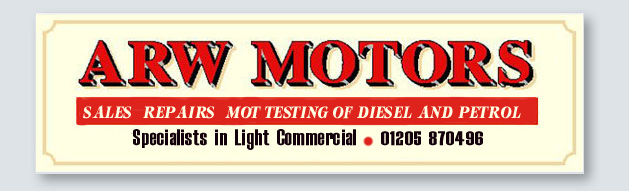
and these are 2 examples that I’m doing for the customer
Attachments:

-

What a cool old building!
I like the bottom one Stephen.
It suits the age of the building more.
Not to sound like a smartypants, but do you have to have the word TELEPHONE?
I would like to see the by-line under the phone number put into a red panel.
Go get ’em!
Love….Jill -

I agree with Jill, the bottom one compliments the age of the building more. Nice work…
-

I agree as well. The bottom one is a lot better and in keeping with the building. I like the word Telephone – sorry Jill
Lee
-
Hi Steve,
Nice work !!
I agree the second sign is in keeping with the building.
If I may suggest that you ‘Initial cap’ the – Sales – Repairs – MOT Testing of Diesel and Petrol, I think that would be less aggressive than all caps, plus it would make the MOT more prominent as you have done in the first sign.
Look forward to seeing the finished sign.
Mark
-

yep love the bottom one. and as it is the customer should be overjoyed with it.
i am being very picky here kerning of the ARW and I like jills box idea but not a lot of space left and any way are you sure that wall could stand sutch a masterpiece
chris
-

Bottom Steve, you know it makes sense. Is that the place next to the railway crossings near Old Leek?
-

I also prefer the bottom one Steve, and the highlighting on the black of the main red lettering is a really nice touch 😀
-
Steve
I would agree with the second option too, in keeping with the building. My opinion on the layout would be that the bottom two lines are two close together (lines overlap), especially as there is alot of space left near the top!
In fact, does there need to be such an empahsise on the tel no. anyway? Surely the main purpose of this sign is to tell customers what services are available, not how to contact to ask the question!? -

Yeah, second one. Has a kind of ‘traditional’ garage sign look to it and would suit the building. Also, knowing your manufacturing methods Steve, I can imagine it’ll look a treat when completed.
-

“Austin Bedford”, blimey thats going back a bit? 🙂 Sign seems to have lasted well if it was erected when those commercials where kings of the road.
When i first looked at the sign and the house it`s on, it reminded me of Scripps garage in “Heartbeat”. Very quaint and very 60`s in style.
I also like the bottom one better, you seem to have a good feel for those traditional type signs Steve. The jpg probably doesn`t do the sign justice.
Nice one.
-
:lol1: Austin Bedford IS the name of the guy that used to own the garage , he’s about 70, there’s an Austin Healey that plays rugby for England :lol1:
-
 quote lasabledps:.
If I may suggest that you ‘Initial cap’ the – Sales – Repairs – MOT Testing of Diesel and Petrol, I think that would be less aggressive than all caps, plus it would make the MOT more prominent as you have done in the first sign.
I agree with everyone else here Steve, the bottom is the better choice. Mark makes a good point too.
It would be nice to have some buildings with history over here, other than old jails reminding us of our convict past 😕
Well done,
Cheers
-
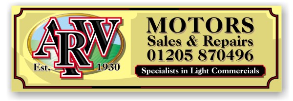
Cheers folks
Nope tried this, the descenders in lower case interfere too much with the text below and make it look untidy.
Attachments:

-

Hi Steve, here’s a very basic suggestion.
If you introduce a nicer box (than I’ve used here) around that line of text and maybe even make the black text, white or cream.Just a thought
Attachments:

-
That’s the box I was referring to, but on the “specializing” part.
I like the MOT line all-caps because it acts as an underline to the main copy.
Still don’t like TELEPHONE tho! 😉
A lot of people dislike the use of red & black, but it doesn’t bother me.
Love….Jill -

personally guys, I think you are missing the point on this,
whilst the lower sign looks more in keeping with the building and is more traditional, the owner has a business to run.
the other sign, whilst not my cup of tea, is more modern and is likely to get the owner more work on newer cars with a greater profit margin.
The traditional sign is likely to have passers by thinking…
“old garage, quaint, but are they up to servicing my 2004 reg Audi Diesel?”
Complementing buildings in signage is great, but at the expense of viable business it means nothing.
Try to do both…
-
Had a quick play with this,
I don’t like white backgrounded signs, prefer a colour
Needs the phone number on and maybe a tinted version of the road graphic in the background.
Logos are optional, but recommended
Maybe don’t put MOT on sign, suggest a separate projecting sign with the official MOT sign on it, its what motorists look for.
Whilst this maybe not everyones cup of tea, it is more likeley to attract the correct customers for you client?
Attachments:
-
quote Webeasel:personally guys, I think you are missing the point on this,
whilst the lower sign looks more in keeping with the building and is more traditional, the owner has a business to run.
the other sign, whilst not my cup of tea, is more modern and is likely to get the owner more work on newer cars with a greater profit margin.
The traditional sign is likely to have passers by thinking…
“old garage, quaint, but are they up to servicing my 2004 reg Audi Diesel?”
Complementing buildings in signage is great, but at the expense of viable business it means nothing.
Try to do both…
Right maybe I should have explained, this place is an old and very well established business thats been there for years, its just been taken over because Austin has retired at 71, i think they used to work on chariots :lol1: in a small village that is about 2 miles from the main A52 between skeggy and boston, the road that goes past the garage, through the rest of the village to ……………. nowhere :lol1: their trade comes from the locals, the kind of place where you turn up to have your car serviced and end up making tea for yourself and everyone else, he wouldn’t know what to do with a 2004 audi as I doubt very much wether he has the enormously expensive electronic diagnostic gadgetry to plug into the cpu :lol1: gotta disagree with the comment on complementing the build, out here in the sticks its important that signage should complement the environment, putting some ‘orrible stainless steel carbuncle on a 300 yr old building is tasteless and vulgar, but we all get to know our markets, and mines rural not a city, for instance theres a blanket ban on any neon signage throughout the boston borough.
I’ll have a look at the box thing thanks folks.
-
quote signworxs:Bottom Steve, you know it makes sense. Is that the place next to the railway crossings near Old Leek?
Ooops apologies Paul missed your post, its in Old Leake right past the White Hart towards Commonside , the other side of OLGA just across from Howsams Mill, thats got all the non yellowbellys confused ain’t it? 😉
Customer just called “Can I have 2 of the bottom one?” bonus! originally only doing 1 :lol1:
-
quote :its in Old Leake right past the White Hart towards Commonside , the other side of OLGA just across from Howsams Mill, thats got all the non yellowbellys confused ain’t it?
.
thats well deep into twelve toe country then – 😉
chris
-
😛 Thats good coming from a Cornishman, do you lot even speak English, I thought you were nearly Welsh :lol1: (Ducks out the back door to avoid the hail of pointed flaming leeks from the Taff contingent) 😉 :lol1: :lol1:
-
born in peterborough only been down here 25 years and another 25 to go of my probation means il never have to go to skeggy again 😛 😉
-
Hey WOOOH!!
only trying to help, new to the forum, but been in sign & print design for a while.
Still think you have to balance the requirements of succesfully marketing a busineness with effective signage and that of complementing a building?
Never suggested you have S/S or Neon?
I REALLY liked the road graphic on your first sign, it SAYS so much more than the other one – only my opinion, but it is YOUR work.
If I did have a slight criticism, it is that your 2nd sign has too much of a centred approach, what about splitting it somehow?
for example
Attachments:
-

based totaly on what the majority have went for i have altered steves design a little were i felt it was conjested.
as much as i agree “somtimes” signs should fit in with the surroundings. i also agree that with a jiggle about like webeasel has done in his last design can make all the difference. its not traditinal granted but can & does give a more inviting sign, but still keeping with the country feel to it.
having said that i do feel webeasels design is a little conjested, but hey.. thats just my opinion. doesnt mean im right 😉
Attachments:

-
OK, now if you made that box RED with cream colored all-caps lettering….
and spell DIESEL right! hahahahaha
Love….Jill 😉 -
I’m laughing here Jill :lol1: :lol1:
i actually said to myself.. i better spell flippen diesel right or they will have a Field day with me 😮 :lol1: :lol1: :lol1:what did i do? i know i know… wouldn’t be a rob lambie sign if it wasn’t spelled wrong now would it? 😉 :lol1: :lol1: :lol1:
-
Your dyslexia only adds to your charm Rob.
Hey, at least you have a signature style!
j. 😉 -
Ok jill
seeing as i have to fix the spelling anyway 😉 and that a after second look i did actualy think the main word in those colours made it look top heavy, i think your suggestion of red border is better. still not sure on the caps though 😕
anyway.. im sure steve will decide whats best after he chucks these ones in the bin 😉 :lol1:
Attachments:

-
:rofl: :rofl: :rofl: :rofl: :rofl:
Nice one Rob, that will keep the spell checkers quiet for a while.
Mark
-
Just tarted it up in Adobe. Not exactly what fonts I’d use, altho they are Stevens ones.
Attachments:
-
In reply to webeasle, firstly I like your second design. Knowing the area where Steve is going to put this sign ( I used to live 4 miles north ) marketing is not going to be an issue. As he said in an earlier post the place really is in the middle of nowhere, the new owner will only get the same custom as the old boy which will be the few villages around him. Strange folk the yellow bellies :lol1: once they trade with a place thats it for life they will not go to any body else. The new owner will be assured of years of loyal trading. As I remember Austin used to do a lot farm machinery repairs as well.
-
Sorry Webeasel I wasn’t having a go and yup I like your designs too, great for the right customer, but not this bloke, have you seen that film “the wicker man” ?? bit like that round here, ain’t it Paul :lol1:
Rob ta! for those and the signature Lambie style :lol1: :lol1: think I’ll have a play 😉 -
Webeasel,
I like what i see, thanks for taking the time and effort to post your capabilities.
Hope to see more of your work, keep it coming.
-
I’m glad that you are one of the rare men who LISTEN to advice!
Looks good Steve.
Love….Jill -
quote Jillbeans:I’m glad that you are one of the rare men who LISTEN to advice!
Looks good Steve.
Love….JillShhh don’t tell the wife :lol1: thanks Jill 😉
-
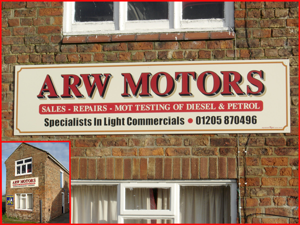
Very nice Steve came out well… nice one. 😉
Constructive criticism:
I think the bottom line appears congested.
The overall height of the third line could do with being dropped about half an inch.
The telephone number could go more to the right, right justifying with the panel on line two.
The specialists in light commercial could go to the left, left justified with the panel on line two.
This would create a larger space between both, appearing as two messages rather than one line, at a glance. I know the red dot is there, but i feel it appears as a separator, rather than a decorative dot.Just my feelings on the final sign mate, but still a very nice sign indeed.
-

Um, I’m not sure if it’s been mentioned, so am I the only one who think the kerning on the ARW could have been eddited slightly?
the A and the R look too far apart when it’s compared to the R and W, because the R slants downwards into the W’s slanty thingy (only the best technical terms for me)
apart from that, the sign looks awesome!. wish I could do things like this.
btw, is anyone on here actually dyslexic, the best designers I’ve met (Including my graphic design teacher) are dyslexic.
but it does mean I have to correct mistakes, such as “chiropody and message”
-
dislexik, dislike… dyslexic… yep thats me.. 😉
i know what you mean about A-R but i dont think its a kerning problem, more the letter shape. even if you decreased kerning the “A” wont close up.. and if you increase the R-W it will look way out im sure 😕
-
someone gave a sample earlier on in the thread, where it seemed to be better.
I’ve always been taught to look out for things like VA or RW LA and things like that, I’m not sure what the design rules applying to these are.
-
you could be right mate, many things can be done to a font/s to make them look better but kerning… increase/decrease the space may/may not work.
you could simply have larger spaces and it would start to look better but ide think it would appear as 3 seperate letters & the following text too tight in comparison. just my opinion mate, it doesnt mean im right… 😉

Log in to reply.