Home › Forums › Sign Making Discussions › Graphic Design Help › can anyone help with some ideas for a van layout please?
-
can anyone help with some ideas for a van layout please?
Posted by Stuart Whitehouse on 13 October 2004 at 14:38I have just taken on a job for a new printers. They want me to create a flashy design and a flashy logo on their new van
The company name is New Print. They do business cards, letterheads etc and they have a new shape Astra Van which is silver.
They want something a little bit ‘different’ and flashy so the design side of their business will stand out.
I don’t have a digital printer so photo’s, images etc. are out.
I would be very grateful if somebody could come up with something as I am really struggling with this one!
Thank you
StuartRobert Lambie replied 21 years, 1 month ago 8 Members · 11 Replies -
11 Replies
-

Go to
http://www.letterheadfonts.com/
And check out the galleries there.
Plenty of eye-candy to get you into a designing mood.
Love….Jill -

Would be best putting up your own ideas 1st, rather than expecting people to come up with something from scratch! 😮
Even I managed that, got plenty of good advice too 😀
-

I echo Brian’s comment. You will find a lot of people will be willing to help if you at least provide a starting point for the design. Also, I don’t think you should completely dismiss the idea of a printed image. Buying in a digital print doesn’t have to cost an arm and a leg and, if appropriate, should be considered.
Show us what you have come up with so far. However much you’re struggling, it’s a start.
-

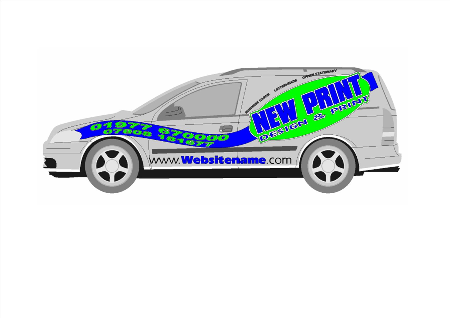
Sorry folks, I’m new to this forum. I’ll try and upload what I’ve already done. Apologies if it doesn’t work out right as this is the first thing I’ve ever tried to upload
I’m not really happy with the design and I am open to suggestion for everything
Thanks
Stuart
Attachments:
-
I.ve just seen that the image has come out massive. does anybody know how to make it smaller and I’ll try again?
Stuart
-
Delete it and resize to 500 pixels wide.
I thought it looked pretty nice, even if it was HUGE.
love….jill -
Yes I like the logo to the rear too, but I’d ensure the spelling of stationery is correct , because at present it reads office stopped, not moving 😉
-

nice design…but be careful with the roof. the text at the top (office stationery) would disapear onto the roof. suggest the whole logo is lowered a little 😎
-
The same applies to the phone numbers at the front, might disappear over the bonnet a bit. Also, I would place the “business cards…” etc under the logo so it reads in a more logical order: business name then product range.
-

i would drop the whole thing by 15% in size. its screaming for some room.
dropping the size a bit will allow for more clearence in areas as suggested.
if you keep at that size you will hit receses and corner recesses that will give you problems unless fitting is done good and “dry”.drop the web address a bit in size also and ide loss the outline on it. you have already made it blue so no need to emphasize it anymore. also. blue and black shadow doesnt really work, just makes it harder to read.
nice design though mate… certainly original. im sure over next day or so you will get the design your looking for.. just needs teaks here and there..

Log in to reply.