Home › Forums › Sign Making Discussions › Graphic Design Help › can anyone help with new Aboard design please?
-
can anyone help with new Aboard design please?
Posted by Richthom1976 on 27 December 2003 at 20:47Hello
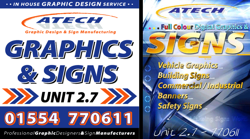
We are trying to evolve our coporate image to show that we have full colour capabilities. I have attatched an examply one of our old aboards (plain flat colour) and a proposed new one. Our corporate colours are mainly blue and orange, so we have tryed to stay as close as possible. Its hard to move an image along with out loseing the feeling and recognisability (if thats a word) of the original. Please can you let me know your thoughts on what to change or start again.
I will also be trying to continue this theme through all paper work and vehicles.
Thanks in advance to all that help.
Rich 😉
Attachments:
 Nigel Fraser replied 21 years, 12 months ago 10 Members · 19 Replies
 -
19 Replies
-

Instant thoughts……
The blue stands out more than the Gold colours therefore it’s difficult to see what you do at a glance, is it possible to switch the colours??? I don’t know how this would work, b ut worth a look maybe?
Second the font used for the unit no. and tel no. I would think the unit is 2.1 and the tel no/. is 11… mybe worth changing this if it’s of importance
-

I’d ditch the colour fills and graduations immediately, it’s really old hat, theres nothing more off putting than this, it’s just plain tacky. There’s a number of sign businesses around my area who are hell bent on exposing their (un)capability of extravagant digital print, sadly they fail in a miserable design and thoughtlessness in a real ‘power punching’ message.
Sign businesses seem to think they have to show I now can(not) do this
and think the money will roll in, fools.Concentrate on producing quality work and keep your logo/ design clean and professional, the consumer is far too lazy to waste his/her time trying
to figure out your message, if its more complex than ‘black and white’
they’ll move their attentions on to something less taxing within seconds, interest happens within three seconds, if the image is too complicated you’ll lose their interest and they’ll move on and ignore it.We have the capability of digital print, as I assume most do.
But thankfully we don’t have to ‘boast’ about it.
Neither should you.After the initial outlay of that expensive machinery, the small investment of a dictionary may be beneficial also, because like it or not you’ll be doing it twice if the spelling is incorrect and there’s no profit in that 🙂
-

i think the design is very smart.. and very creative.
i think its important to allow the customer to know “what is” possible. rather than letting them guess. although digital printing is ready available to us sign makers, the public are dumb to it.
i dont know how many customers talk about vehicle wraps thinking its paint? we think its silly.. “are they daft?” the reality is no.. its upto us to promote our cababilities & whats possible.
ok.. ive seen the odd over the top stuff some sign companies go to.. but done tastfuly then there is no reason why not.as much as i like your design it does need a more focal point..
maybe allow the back ground to promote the digital, but keeping the text a little flatter.
like has been said i dont think the numbers do it much justice..
“digital graphics &” seems to be lost in the background also..hope this helps..
remember its all too easy for us guys to here sit on the fence poking at a design.. 😉 -

Hi Rich….
I agree with Outline, my friend.
This sign has just too many bells & whistles going off at once.
I am sure that you are excited about your new digital capabilities,
but it’s almost (to me) like a woman who wears big earrings,
several huge necklaces, rings on every finger, a rhinestone blouse,
& more make-up than Tammy Faye Baker!
Think of what you want the customer to see first
and prioritize your copy. Maybe just a very soft digital background
with non-shaded lettering, etc.
Your old sign is much more effective, in my opinion.
Love- JILL 😉 -
I agree with Jill, your existing A Board is a very bold board that does what it was designed to do, tells people who you are, where you are and what you you do.
The new design tells people who you are and kind of what you do (but that gets a little blurry as you move down the board) but the main problem imho is where you are. As Lorraine pointed out, the font choice means its hard to distinguish the numbers and could easily be misread.
Maybe if you take the bold elements from your existing design and mix them with a faded version of the background, and add in the cmyk colour bit, it’s work well together (?)
Cheers, Dewi
-
Hi every one,
realy appreciate all you comment, they are all makeing sense to me and backing up my own thoughts. I think I got a little carried away and lost my own view of simplicity with a little jazz always works.
I am going to take things apart and re-work the base design.
Once again thanks for all your comments
Rich
-

Hi Rich, I have to agree with Jill and Dewi on this one, it is easy to get carried away and add all sorts of effects just to show that you can. Keep it simple like your old board and things will work a lot better. You can always print some stuff off for inside the shop which shows people your digital capabillities.
-
Hi every one,
realy appreciate all you comment, they are all makeing sense to me and backing up my own thoughts. I think I got a little carried away and lost my own view of simplicity with a little jazz always works.
I am going to take things apart and re-work the base design.
Once again thanks for all your comments
Rich
-
Hi
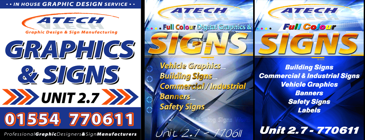
I have had a look at simplifying the board and come up with this first amendment.
Do you think we are still to far out or are we getting a little closer.Thanks every one you have been a great help.
Rich
Attachments:
-

Hi Rich
I like the adjustments
Still a little noisy in a few places but how much clearer the message!!Tells us what you do and ……..
Where you are without ambiguityI compared your original A board with the first digital and I would, like the rest opt for the vinyl cut. However, that isn’t the case with second design.
I would go for the digital. 😀 -
There’s me thinking, this is no different to the first, moving up and down the screen to see the first post compairing to the second.
I read Johns reply and thought adjustments where!!!
Then i realised, there was more and the first two images of the latest design fit perfect on my screen…… having to scroll right to see the latest design lol
Anyway, I think the latest one looks great, go for it!
-
Really like the new design Rich, its a great mix of your previous designs and as John says, Tells us what you do and …….. Where you are without ambiguity.
Cheers, Dewi
-

Rich,
I think the second revised layout is a great improvement, but I would be tempted to try and do something with the top section of the sign behind your logo – To me it looks a little fussy and washed out compared to the bold deep colour of the bottom section. If you made the background of the top section a continuation of this dark blue and altered the logo a little to make it still stand out the “SIGNS” section would become a real focal point which after all is the first thing you want people to see anyway, followed by the subtext detailing your services. If the sign is to go near your premises, then the actual name/logo is much less important as customers will tend to simply remember “there was a shop selling signs” and that location.
Thats my constructive points anyway for what they’re worth 🙂Nigel
-
Hi Rich!
Man, you’ve really done your homework, buddy!
99% better!
The other 1% will follow if you take Nigel’s advice.
He is right on the money. I was gonna say almost the same thing!
It is fun to watch the progression of something…
especially when I don’t have to do the work!
Hahaha.
Love- JILL 😉 -
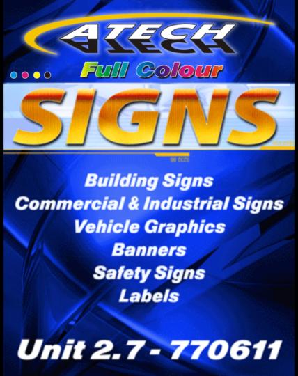
Rich,
Since Jill agreed, and I’m bored I thought I’d throw a sample together to see how it looked !
What do you think, any better ?Nigel 🙂
Attachments:
-
Wow!
My only change, Nigel, would be to soften down that top shadow
to a navy or reflex blue…the black is just a wee bit too strong.
Just my two cents!
But you’ve really made this design pop!
You get a gold star on your forehead!
Love- JILL 😉 -
rich
You’re redesigns simplify the design which seems to work well.I’d lose the shadow on signs on the riright side. the 2 tone arrows dont work for me, maybe one colour or 2 shades of same. Do you need the “full colour”?
What does that mean to the punter exactly? won’t a colourful board suggest that? I’d lose that too. really like the background on the left side,works great with the white print.
Regards Noel 😉 -
Hi
sorry for the dalay with a respoce, I have been to New York for a week.
We had the most amazeing time out there, just like being on a huge movie set.Nigel thanks foe posting your ammendments, but only one thing. For some reason I can not see your art work.
Is there any chance of reposting for me to have a look at.
I have made a few of my own ammendments and will post those tommorrow as well, to see if you guy’s like them or not.Well thanks again and happy new year.
Rich
-
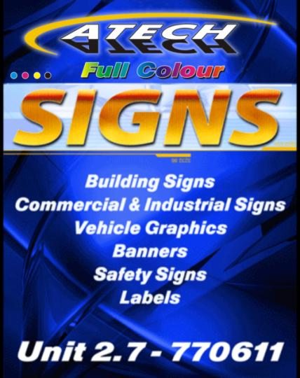
Rich – Don’t know why you can’t see the image, but here is a second go !
Nigel
Attachments:

Log in to reply.