Home › Forums › Sign Making Discussions › Graphic Design Help › can anyone help with my window layout please?
-
can anyone help with my window layout please?
Posted by Bill Dewison on 28 November 2004 at 19:05Its been almost 12 months since I did the window graphics on my shop with the help of ppl here at UKsignboards and the design has got alot of attention by local traders and passerbys. But some restructuring in my shop, namely increasing the size of my office/workshop to accommodate staff etc means I could really do with redoing it.
There lies the problem 😕 I can design all day long for everyone else, but with my own stuff, its harder to design than an elephant trying to fit inside the fridge to leave those trademark footprints in the butter! 😮
Below is what I’ve come up with, its just bold text atm, but I want to make an impact. The 2 panels to the left hand side I need to block out the window completely, as that is where I’m siting another workshop (halving the size of my shop, but hopefully it’ll get the work out quicker) The right side window, I want to keep clear, but I can’t seem to get in the windows what I do specifically… ie… shop signs, floor graphics, window graphics, leaflets etc etc etc.
Cheers, Dewi
Attachments:
 Rodney Gold replied 20 years, 12 months ago 10 Members · 13 Replies
 -
13 Replies
-

Hi Dewi, cant believe its been over a year since you joined, dont know where the time has gone. If you are looking to put up a list of the work that you do why dont you just do that. Put up a bullet pointed list on the two windows of all the types of work you do. The background to this could then be a montage of some of the work you have done yourself locally. That will get people to look even if its only to see if there job is there or they know any of the places in the picture.
-

Dewi this is only my ten cents worth as jilly would say…..
On the total block out side i would look at doing something real flash but modern i.e. digital print even if you have to buy it in on the other side go real traditional.
To me it will give a full in ya face design one side but on the other a real feel of old style (i know what I’m doing ) that will give clients confidence.
i.e. your not a graffiti artist.
-
It does look a bit like graffiti doesn’t it 😕 The position of the shop is very close to a hump back bridge and a junction, so I was aiming to catch attention the minute they reach the bridge.
Martin, I would just list what I do, but I think it would look a little plain for what I’m after getting across. Its still worth considering though if I can play around with text sizes, come up with something that looks a little different.
Cheers, Dewi
-

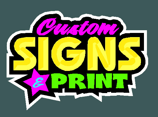
Here’s my two cents Dewi.
Plus a 5-minute layout!
I’m no Stevo…But….
Remember a splash HAS to be bright.
Love….Jill
PS
(Not keen on the distortions in your words)
Attachments:
-
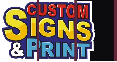
Thats what I was going for Jill, but I showed a couple of ppl some ideas I had and they’ve all said its just too bright. I still might go for something like like but here’s something completely different I’ve been thinking of, any good?
Cheers, Dewi
Attachments:
-

not a mention of num plates then
i like all 3 might change the print font on the last one but think jills would have more impact
chris
-
quote mrsticker:not a mention of num plates then
:lol1: :lol1: Well spotted! I’m still doing them, just don’t want to advertise the fact on my front shop window. Yeah, that font does look a little dodgy, playing with some alternatives atm.
Cheers, Dewi
-

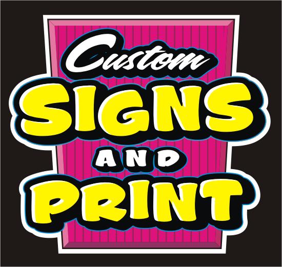
Looks ok Dewi, I dont really like the font used for print or the &. Its getting there though.
Carrie 😀
-

i prefer the last one you did mate. i know its not jumping out and dragging you in the door, but… well you know my taste, so it figues. :lol1:
i like the colours, the cut away scoop etc and how its been listed. just not a lover of the fonts used 😕
overall i like it much better 😉 fandabby! -

Dewi whats a pavement sign? do you do chalk drawings at the weekend for a few extra sqibs? :lol1:
-
Thanks guys, still working on it. I’ve swung from liking the top bit, to now thinking it looks like a circus poster 😕 And I agree the bottom font is all wrong, but I’ve tried loads of different fonts and nothing seems to look right 🙁 It’ll all be worth it in the end though 😀
Peter, its just my fancy schmancy way of saying I do A boards, swing signs and the like. My current display lists it as A boards, but then ppl come in and say “Ahhh, but do you do swing signs?!?” So I thought pavement signs sounded better 😀 Wouldn’t mind being able to do the chalk art stuff though, I’m a big fan of Terry Bull’s work, oodles of detail and really colourful designs that hit you round the chops, then come back for more! 😀 In other words, I like em 😉
Cheers, Dewi
-

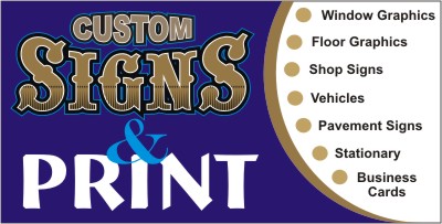
Dewi
Just an idea. I think the first one you had done was on the right track. The second one you have has very little contrast and no flow in your typestyle choice, it looks like a business card on a window.This one i did I went for the staple window splash look of high impact and vibrant colors. I think it will attract alot more attention.
With the impact this one has it pretty much says what you do. I feel there is no need to have a list on your window. People are lazy they wont read all of it.
Stevo
Attachments:
-

Dewi , I like the one that looks like a business card , I just think the word “Signs” is way out of place font wise. I would use something “cleaner” or less billboardy or pt barnum. In general , I think it has an air of professionalism , says what you want to say and isnt in your face. I would also try get away from a totally square look , so as to make it less like a business card and more like a sign.
I love the letterhead type style and the retro type signage and think that some of the signs I have seen in that style are works of art and really wish I was as talented as to make em.
However you have to look at your customers and potential customers as to the image you want to portray and convey to them. If you have a lot of “olde worlde” type businesses , I would go the “letterhead” route , if most of your custom is not in that vein , I would keep it more “clinical”. My personal taste is understated elegance and obviously that colours my comments.

Log in to reply.