Activity Feed › Forums › Sign Making Discussions › Graphic Design Help › can anyone help with my own car layout please?
-
can anyone help with my own car layout please?
Posted by Warren Beard on April 16, 2007 at 8:42 pmHi All
My turn 😉
As I will be going at sign making full time from the end of May I need to start working on my vehicle graphics for advertising. I have magnets on at the moment so my employer does not find out I am working on the side but now need to finalise permanent signage.
I have created a logo that is proving a tough one for vehicle layout so now I am turning to the masses out there to throw in their ideas, crits and comments.
All help is appreciated and anything goes really, although I would like to keep the logo as is, the rest is negotiable :lol1:
Thanks in advance to all those who will contribute. 😉
cheers
Warren
Richard Urquhart replied 16 years, 10 months ago 33 Members · 105 Replies -
105 Replies
-

Hi Warren.
I think all that logo really needs to help it is a thin white outline.
That should make it pop.
As for the vehicle layout, your text is so small on the services and the tagline that you may as well not have them on the sides!
I would lose the tagline.
(it offends me in a way, making me think that you think other shops are highway robbers…maybe you just mean that you don’t take long to make signs?)
I would keep the services on the back, as that is a good advertising spot.
I would also make your logos larger.
Love….Jill
Attachments:

-

Warren, as Jill has said a white outline will probably help lift your logo off the dark colour of the car, lose the tag line or think of something better, it does sound like you are putting down other sign companies which I am sure you aren’t trying to do.
Not sure if you can make the logo as big as Jill has it on the side of the car though, does it have a bump strip running along the side? If it does then it will be right through the middle of the word signs which will make it a bit more difficult for you to fit but also might make the word signs look a bit odd.
Lose the word signs from your list of services, as I have just said in the post Lee put up they are all forms of signs and this just looks like you couldn’t think of anything else to put and don’t forget it is already in your company name anyway. -

Thanks Jill & Martin
Great help, I have not been using the tag line but I put it in as a small experiment to see if the response had changed, it hasn’t and is out.
There is not a bump strip on my car so that logo size could work, I just tried to avoid the handles 😉
I think the white outline is a must as I have this logo on magnets at the moment on my car and in very dark areas the Hold Up wording is hard to read, I was thinking of using reflective for the word "signs" and now maybe also for the outline?
Today I thought of a tag line I really like;
"Signs to hold up and be proud of"
Hopefully some others will throw some options together for me so I can see some out of the box design ideas.
Thanks again
Warren
-
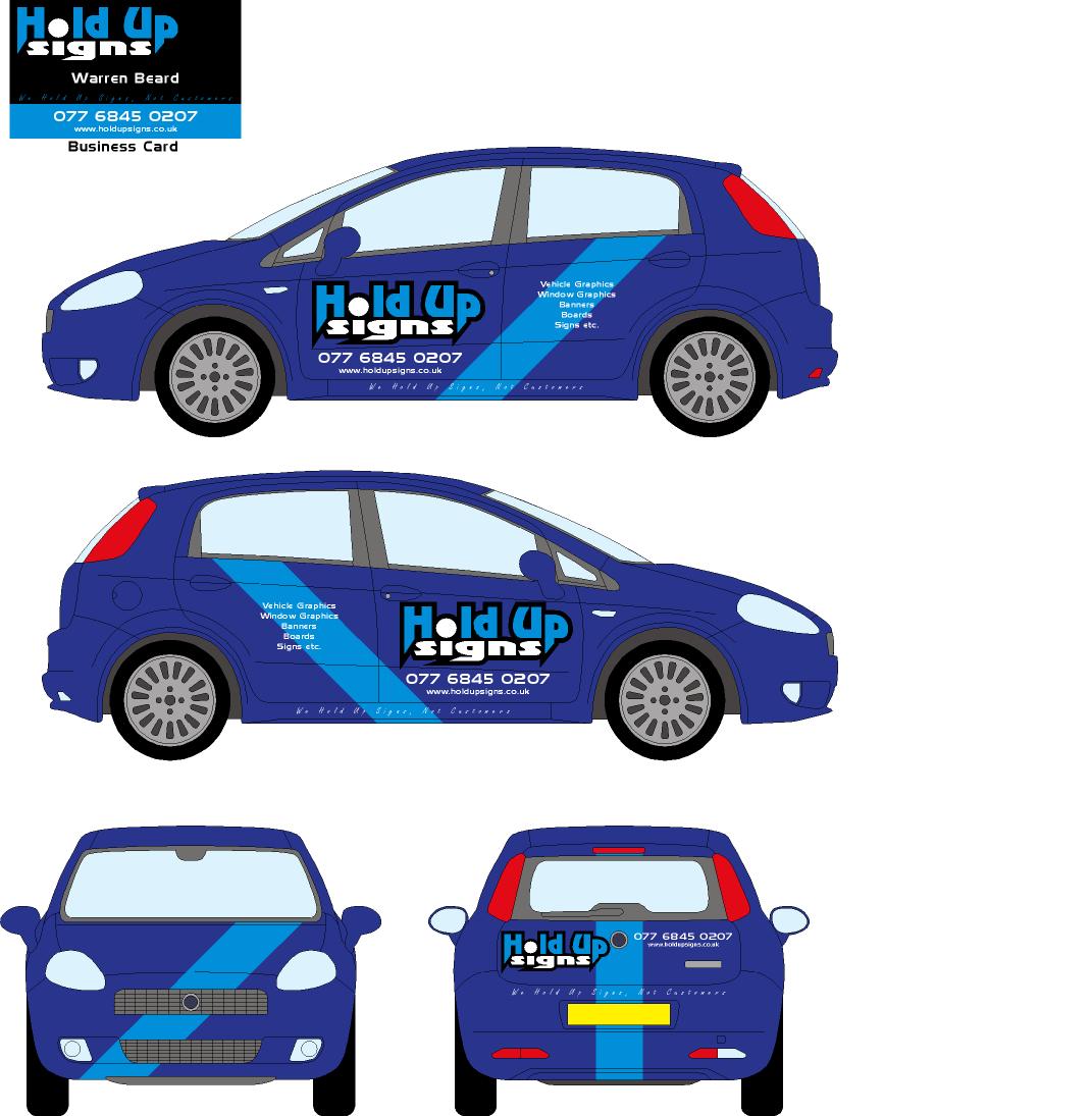
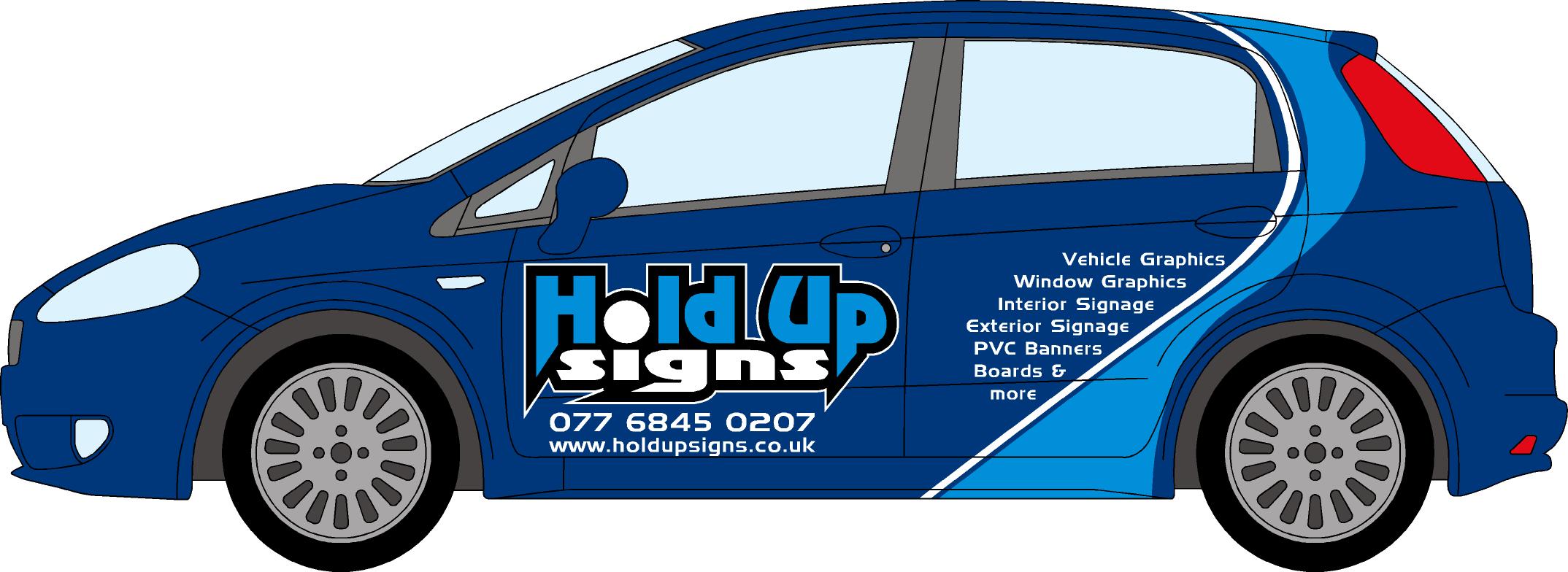
Design coming along so far thanks to Jill & Martin
Not sure if the rear is starting to look too busy and cluttered?
Any other ideas???
Attachments:
-

Warren, I’d lose the secondary text on the back ……… it doesn’t need it. The company logo and telephone number would suffice there. You’ve got all the other info on the sides anyway.
-
Warren, no reason why you shouldn’t use reflective for the word signs and the outline, just one little word of warning though, put an ordinary calendered or cast vinyl underneath it or you will regret it when it comes time to sell the car and you try to remove it!!! By putting a vinyl layer on under the reflective when you take it off the reflective will come off with the other vinyl and you shouldn’t have any problems.
Like Marcella says you don’t really need to much on the back if space is limited then I would just be inclined to put less on.Why don’t you put the logo on the back window? If you are worried that you need to be able to see out just get one of the nice members on here to print it on contra vision.
-
Hi Guys (and girls)
and thank you for your comments.
My latest offering is a slight variation, it is much more eye catching and bold although is starting to seem a bit busy 😕
I think I could live with a bit busy if it catches more peoples eyes? or have I got it wrong?
Regarding colours, in your opinion, should I use white, silver or reflective or even a mixture of two?
Opinions and comments always welcome and most certainly wanted.
Fire away (:)
Cheers
Warren
Attachments:
-

i like the design 🙂 the only thing that i would say is that i always prefer to see a land line number on a vehicle…….just a personal preference :
-
It’s far more attractive, Warren.
I think you could use a mix of white and white reflective (On the name only)
I would not put the list of services on the sides, you have them so small.
I still say the back is the best place for this, as someone behind you in traffic might notice these more there.
Love….Jill -
Hi Guys (and girls)
Thanks for the quick responses and comments, very much appreciated.
Firstly, I will be getting a land line number which will go on in place of the mobile number, I just don’t have the number yet so am using mobile number for illustration purposes, but I agree, land line is better than mobile.
Jill, Strangely enough the size of the font on the sides is smaller than the back but I though due to my response from my Poll I did about what areas of the vehicle get noticed more it is fairly close between the sides and back, so my think was if I can get it on the sides and back and it looks OK then I should do it. It it was really hurting the design I would take it off, it will look good without the list of services on the side so I can just remove them if it looks odd once applied, but I think it might be OK to keep it on to see.
Jill, in regards to the white and white reflective, would I be correct to say I should make it a white border and reflective for the word "signs"
What should I do the white stripes in, keep them white or do you think silver will make it more punchy?Thanks for the words Karl :lol1:
Thanks to all
Warren
-

Looks great Warren.
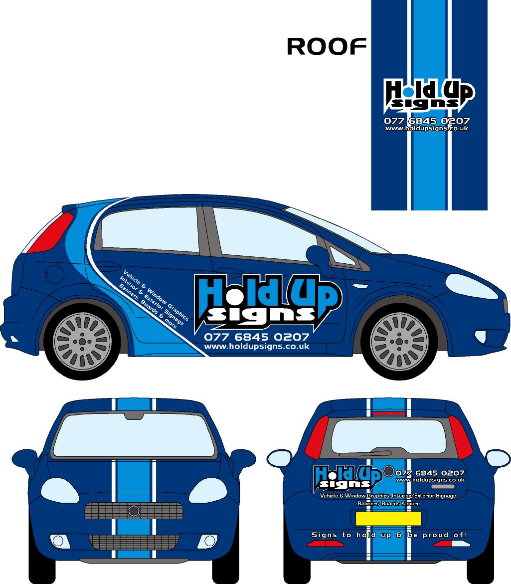
I like the roof, I think there was a mention of roofs in a post earlier in the week and it got me thinking about putting something on the roof of my pickup.
I agree with Jill, keep items to the rear.
Nice colours too.
Neil
-

What an improvement Warren, Looks great!
It’s going to test your application skills though, don’t think I would like to have a go! -

Warren,
What’s the significance of "Hold Up" I know it’s the name….but what’s behind it?
Mark 😀
-
quote Creative 3D:Warren,
What’s the significance of “Hold Up” I know it’s the name….but what’s behind it?
Mark 😀
Hi Mark
It’s a long story and has since changed but basically most signs are held up one way or the other, so I thought hold up signs, every other name I thought of was already being used and I wanted to be unique :lol1:
My slogan is " Signs to hold up and be proud of!"
Tell me honestly what was your first impression, honestly really.
cheers
Warren
-
Hi All
From the comments received regarding the sides here are 2 other options;
1 with no services on the side and another with a different layout.
Thanks & opinions please.
cheers
Warren
Attachments:

-

i had a fiesta and couldnt decide if i was to put a list on it, wasnt sure if it looked to cluttered, so i put it on anyway just to see what it would look like, i took it staright off,
so stick them on, its not much vinyl and if you feel its better without then take them off, when its on it may look better than the visual.
-
Prefer it without the list and maybe just reduce the overall size of your logo.
Looking good though. 😀
-
Hi Warren,
Well….as an old marketing guy I would say use an image of a smoking gun….maybe a tag line like "prices that don’t feel like you’re getting robbed"
Or even a name like
"Image Makers"
"Quality Sign Company" QSC
"Sign Systems Inc"
"Sign Design"Just thinking out loud…
😀 😀
-
quote Creative 3D:Hi Warren,
Well….as an old marketing guy I would say use an image of a smoking gun….maybe a tag line like “prices that don’t feel like you’re getting robbed”
Or even a name like
“Image Makers”
“Quality Sign Company” QSC
“Sign Systems Inc”
“Sign Design”Just thinking out loud…
😀 😀
That is sort of how the name originated but here in the UK it is a big no no, I’m originally from South Africa where images of guns and stuff don’t matter or are so common they are not offensive, it is very different here in the UK.
Check out my old post at this link and you will see the development of my name and logo, it makes for interesting reading also.
https://www.uksignboards.com/viewtopic.p … highlight=
Old tag line was " We hold up signs, not customers"
I liked it but did not reflect well on my opposition so I changed it and tried to make the name focus on physically holding up signs instead of being held up at gun point.
Cheers
Warren
-
Warren,
I would say without the list on the sides mate. But put the list somewhere on the back. The colours work well and I think you’ll get quite a bit of business from the car looking the way you have designed it.
Make your number larger on the back as well. You’ll have to post a piccy on the boards when it’s done! -
[quote="KARL WILLIAMS"]Warren,
I would say without the list on the sides mate. But put the list somewhere on the back. The colours work well and I think you’ll get quite a bit of business from the car looking the way you have designed it.
Make your number larger on the back as well. You’ll have to post a piccy on the boards when it’s done! Will it be done in time for Sign UK? -
Hi Karl
I’ll probably do as I suggested earlier, I’ll put it on and if I don’t like it I will take it off.
It won’t be done before SignUK, I will more than likely only start it about mid May so it is ready by end of May when I go full time in Winchester.
Thanks mate
Warren
-
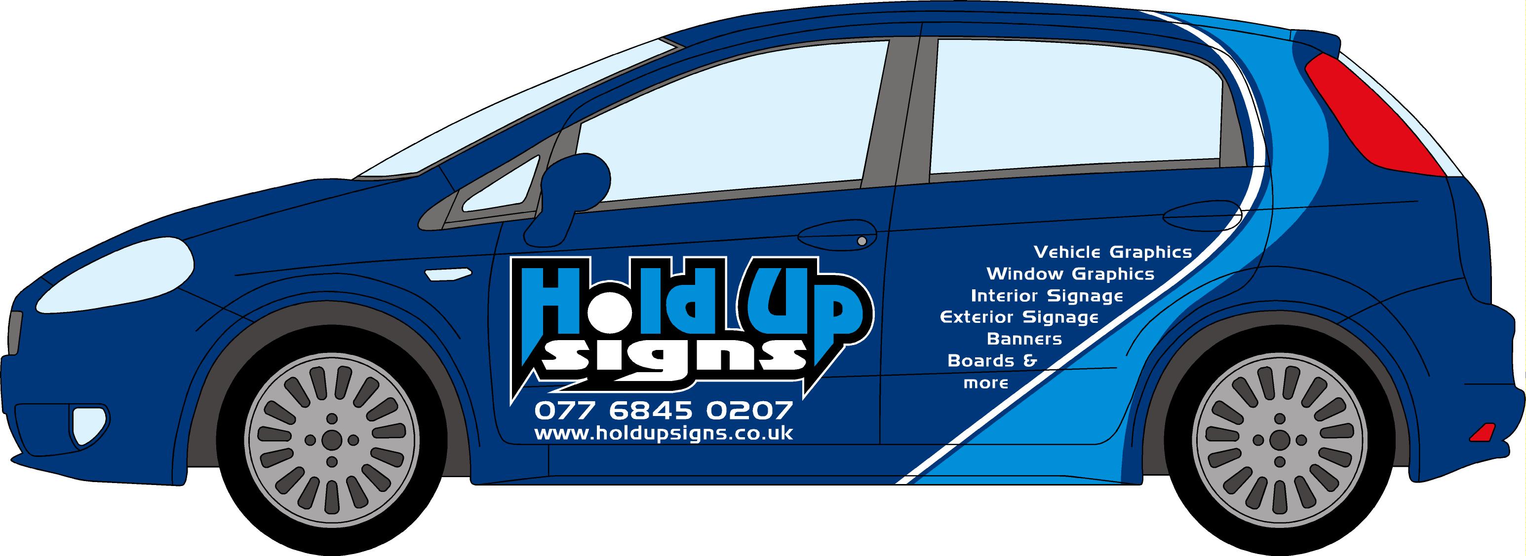
It’s looking great Warren, I really like the colour scheme. I would suggest that you reduce the size of the logo and tel. no’s beneath, perhaps even to fit on the front door only. This will then give the list room to breathe, and make it more readable.
-
It’s looking great Warren, I really like the colour scheme. I would suggest that you reduce the size of the logo and tel. no’s beneath, perhaps even to fit on the front door only. This will then give the list room to breathe, and make it more readable.
Without the list it looks a little bit ‘jaggedy’, doesn’t flow terribly well because of the curve next to the pointy end, just an empty useless space. Still think it looks well though, streets apart from your original ideas! -
Thanks Lorraine
How’s this then?
Like I mentioned earlier there seems to be a 50/50 split as to having the services on the sides as well as the back. I think I would like to have them on the sides and back and so wonder if this makes it fit in better on the side.
Thanks
Comments still welcome, maybe I’ll have to put every body’s names on it to give accreditation’s when final design is complete :lol1: I’m sure that will make people look and ask me what all the names are 😉
Warren
Attachments:

-

Looking good
Warren,……….I agree with the smaller logo no list point of view.
I also think the stripe might not work to well with the curves on the side…..and the back will show blue on the top so the stripe might be a little weird.
Great how it’s taken shape 😀
Attachments:

-

I think it’s looking good but I don’t think you need the list on the side, and I am leaning towards silver for out lines and line near the light blue on the side instead of white jmho 😀
Lynn
-
sorry posted that whilst Andrew was posting love that front Andrew
Lynn
-
Warren
Try keeping the list to the previous size, just cos you have more room doesn’t mean you should fill it! Negates the reason for reducing the size of the logo.
Also, with the logo smaller, if you do decide against having the list on the sides, the empty space doesn’t clash with the pointy/square logo.
Try it & see? -
Thanks for the comments all,
Here it is with the original size text and one without the text (both with smaller logo)
I did an option with the logo on the front but thought it was total overkill as it is on the roof, I thought it was starting to go in the corny direction so I took it off the front, tried a few funky ideas instead of the stripe but kept coming back to it.
Do you think silver is better than reflective white? Was going to do all stripes in reflective, outlines and also the word "signs" in the logo, if I did use reflective for all that is silver better for the list and contact details? I would think reflective at night on the text would be too much?
Bring it on 😎
Warren
Attachments:

-
silver as opposed to reflective or white, no list, smaller logo,
Lynn
-
Warren, just had a thought about the text on the other side-can you post one up? Can’t get my head round whether it would look odd or better…. (tired, poor thing)
-
quote Lynn:silver as opposed to reflective or white, no list, smaller logo,
Lynn
Why not reflective Lynn?
-
because if he is keeping it uniform same on back, white reflective it not supposed to go on the rear of a vehicle , so silver all around no con flickt
lynn
-
Lynn is that law? if it is I don’t think I have much of an option but to do it in silver 😕
What about if I did the curvy stripe on the side and the word "signs" in reflective only and the balance in silver? no white at all.
Lorraine, other side of car as requested 😀
Thanks
Warren
Attachments:
-

Hi Warren its OK (joke mate)
I really like it , a great design idea and i like the text on the side it looks like there is something missing without it. I also like andrews idea.
Great stuff mate
rich -
quote Richard Urquhart:Hi Warren its OK (joke mate)
:lol1: :lol1: :lol1: :lol1: :lol1:
You been waiting to get me back haven’t you 👿 👿 👿 :lol1: :lol1: 😉
-
Warren you have really done well, the difference from the chocolate box design you started with has come on leaps and bounds
love it !! 😀 😀 😀
-
 quote Warren Beard:Lynn is that law? if it is I don’t think I have much of an option but to do it in silver 😕
What about if I did the curvy stripe on the side and the word “signs” in reflective only and the balance in silver? no white at all.
Lorraine, other side of car as requested 😀
Thanks
Warren
The LAW in the ‘Lighting Regulations’ states no white light to be shown to rear, no red to front. HOWEVER, although ‘reflectors’ as classified as a light source, a minimal use of reflective white vinyl is entirely legal. So long as it’s not of a sufficient area that when illuminated could cause even the remotest confusion as to the orientation of your vehicle it’ll be fine.
eg, BT, Telewest, GE all use(d) relective white vinyl text & logos on the rear (and sides) of their vans.Dave
-
I thought that the text wouldn’t work on this side, (nearside), but it does, even better than the offside if anything. Now you could possibly do with balancing the text on the bottom of the list (or am I going too far now….?)
-
Dave don’t the AA also use white reflective on the rear ??? this is a really confusing area, and I don’t think there is any legal requirements as yet ?
Lynn
-
I think I will go silver on everything and use reflective for the word "signs" only (this was my original idea) What do you think of that?
I added "PVC" before Banners and it has rounded it nicely, agree?
Anything else or should I hit the cut key? :lol1: :lol1: :lol1: (before Lorraine changes her mind 😉 :lol1: , seriously I appreciate the help though)
So how we getting on now with this?
thanks
Warren
Attachments:
-
Warren,
I see now how it all came to be…. I guess I was a few posts late on the topic. Anyway…Really like the design….I just can’t get my mind around the name thing… cloud 9 was way to cuddly, but I’m not sure Hold-Up communicates your product well. You have just a few seconds to make the connection to the buyer. The name in size, style, and verbiage should tell the buyer some sense of what you do….and most importantly why you do it better then the guy down the street.
Maybe some printed bolt heads on the letters like it’s bolted to the car….or something…just something that the normal person can graphically combine with the name to make the connection….
Somebody help me out here…what is missing?
Anyway…just my thoughts….
Mark 😀
-
don’t cut yet !!! I think I would just put banners, instead of PVC banners
then "A" boards sorry ?? and lose & moreLynn 😳
-
quote Warren Beard:I think I will go silver on everything and use reflective for the word “signs” only (this was my original idea) What do you think of that?
I added “PVC” before Banners and it has rounded it nicely, agree?
Anything else or should I hit the cut key? :lol1: :lol1: :lol1: (before Lorraine changes her mind 😉 :lol1: , seriously I appreciate the help though)
So how we getting on now with this?
thanks
Warren
Cheeky! Looks lovely Warren, but before you hit the ‘final’ key, just move the phone no/www. so it’s centred under the logo will you?
Colours-great. Why not try for a really pale silver, a couple of shades only up from white? Reflective white is a little ‘silvery’ anyway. Metamark & Mactac’s silvers look well against the reflective (IMO), I’ve just checked. (Don’t ask what I’m doing in the shop at this time of night 🙄 )
-
warren go do it oracle’s silver is really nice, show us the finished article 😀 you can do too much refining go for it or it will never be done 🙄 apparently we only have three day’s of this weather left so it’s now or sometime in the future 😀 and let’s face it if you/we hate it, you are a sign maker, you can change it soon enough 😀
Lynn
-

Use white Warren for maximum contrast (silver is nice but can be dull in certain light).
Forget about using reflective vinyl – it won’t fit around the contours and you’ll wreck your cars paintwork when you try to take it off again prior to selling the car.
-
 quote Phill:Use white Warren for maximum contrast (silver is nice but can be dull in certain light).
Forget about using reflective vinyl – it won’t fit around the contours and you’ll wreck your cars paintwork when you try to take it off again prior to selling the car.
cant see any contours where the reflective would not be appliable (as opposed to complex curves) and if you apply it on top of normal vinyl, it will come off easy peasy, like the rest of the signage, (left to long, ghosting will still happen)
Peter
-
quote Phill:Typical, I say black, Peter says white 🙄 😉
I think thats a grey area Phil 😉
Peter
-
quote Phill:No not grey but gray surely 😕
GRAY= absorbed dose of ionizing radiation, equal to an absorption of 1 joule per kilogram.
maybe I’m wrong again, perhaps absorbed to many grays
Peter 😉
-
Hi All
Thanks you all for the help and responses, Peter and Phill will agree to disagree :lol1:
I’m going to lull over it for a few days now and then take another look, watch this space 😀
Thanks again to one and all and I will definitely post the finished article (once completed)
Thanks again
Warren
-
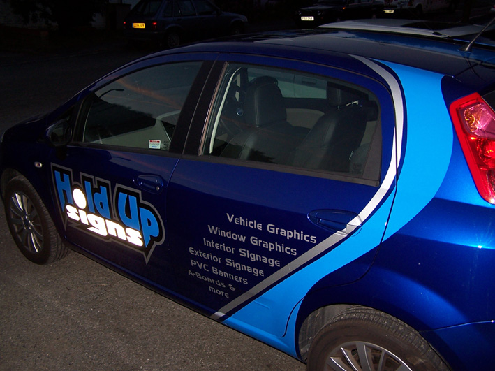
I got itchy fingers and had to do something, so today I decided to do the blue swooshes on either side of the vehicle to see how difficult it was going to be, well it was fairly difficult and had to redo both of them as my first attempt went t1ts up.
The finished items though look good, now need to order the silver and reflective to get more done.
The current ads on the doors are magnets as I’m sure you can see and the white viper stripes have been on for a while and will be replaced with the blue and silver stripes as per previous post/design.
cheers
Warren
Attachments:


-

Nice stuff Warren. Should impress potential clients. Boy are you buying loads of beer for everyone on this thread when you get to Sign UK!!! 😀 😉
See you there
Peter
-
I love the stripe! You can really see how it will look when finished, it will really ‘pop out’, as Jill says! :lol1:
-
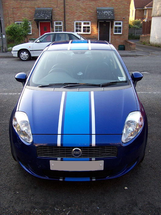
Another up-date folks,
Today I added the blue and silver stripes. I’m definitely learning a lot from doing this but it has all been good and is looking good. Took me about 4 hours to do them. Had a hassle laying the silver stripes straight until I remembered a tip I read on here, I laid masking tape along the edge of the blue and then by hand without app tape I laid the silver stripe up against the masking tape, worked a treat.
and all done dry 😀 😎
Attachments:

-

looks great Warren, looking forward to seeing it finished,
creative3d, our rear plates are yellow reflective by law 🙁 white on front.
-
Thanks guys,
I have to "hold up" (see what I did there :lol1: ) with the rest of the graphics until I am finished at my current employment at the end of May. I will post the completed job when finished.
The colour of the plates are weird, in SA they are blue and white on front and back. Does anybody know why they are different colours front and back, everybody I have asked does not know why.
Cheers
Warren
-
quote Warren Beard:The colour of the plates are weird, in SA they are blue and white on front and back. Does anybody know why they are different colours front and back, everybody I have asked does not know why.
Cheers
Warren
it’s to do with reflective stuff, white on the rear could confuse people, we normally always park on the same side of the road as we’re travelling on, so people see red reflectors and yellow plates, if they saw a line a white plates infront of them, tit may well confuse ! !
btw, spotted this car within seconds of arriving at the hotel, knew instantly it was yours !
-

no plates have to be a diff colour so women can tell which way the car is pointing
😀
Derek -
Derek, that’s a very sexist thing to say.
True but sexist all the same :lol1:
-
:lol1: :lol1: :lol1: :lol1: :lol1:
Very good, my wife was not impressed to hear that :lol1:
Is that the real reason or is it just what you think it is? Seems a bit silly if it is because not everybody always parks the same direction, unless you are suppose to by law but I see many cars in my road that park both ways on the same side of the road 😕
I’m glad you noticed it in the car park, if it did not stand out I would have to re-think the design, although there is still all the other graphics still to go on.
Watch this space !!!! 😉
cheers
Warren
-

Looking nice so far Warren.
Reflective vinyl is legally treated as a lamp, so you can’t have white on the back unless you are reversing. Unless you want to nip out and change the plate every time you reverse into a parking space!
Anyway, nice stripey things.
-

Hi Warren, didn’t stand out in the car park as much as "Go Girl" maybe you should have used pretty pink 😀
-
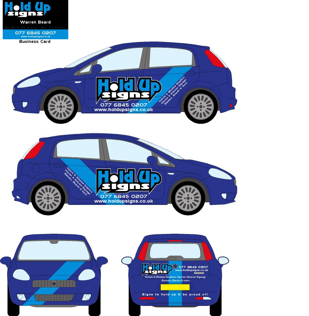
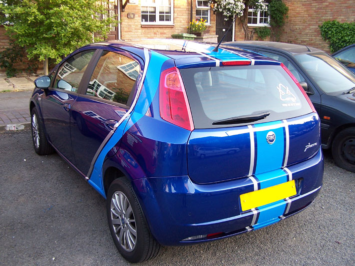
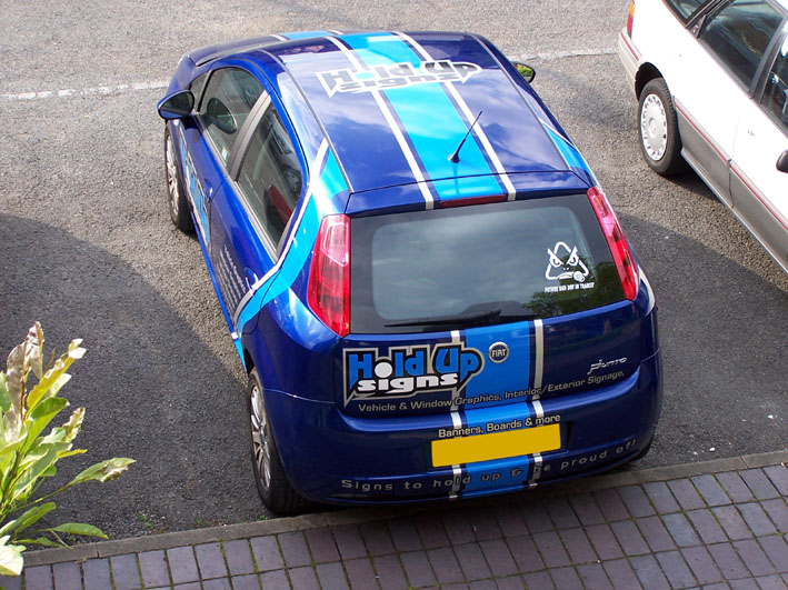
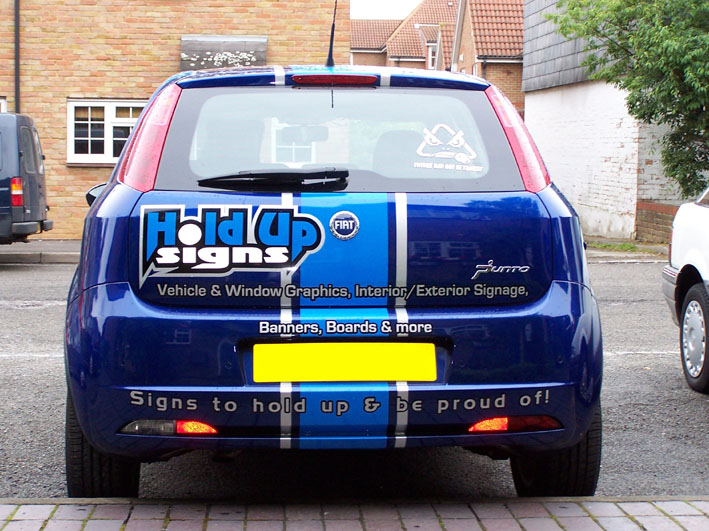
Update;
All done except telephone number and web address. I am moving to Winchester on Saturday and will only find out my number on Tuesday so am waiting until then before I put it on as it is a waste to have my mobile on there for a week and not even be living in the area 😕
It came out as good as I had hoped and am very happy with it. I will wait until I am forced to remove the reflective from the back before I do :lol1:
The only difficult area was the logo on the back due to the compound curve in the corner.
Attachments:

-
I like it! Looks really good, well done. Edit:Oops, just realized I wrote the same as Hugh!
-

That’s great Warren, love what you have done with the reflective :thumbup2:
Dunno what the cops will think about the yellow vinyl over the number plate though :lol1: :lol1: :police3: :police2:
-
Looks good…. are you hiding the reg No. so no one will recognize your car?
-
Hi Guys
Thanks for the responses.
I suppose you are right about hiding the plate no. makes no difference does it 😳 😕 😉
cheers
Warren
-

That looks spot on Warren, i’ve been watching how you have progressed as we joined about the same time and i’ve been doing the design for my van which i’ll post soon (if i’m brave enough!) then let them rip it apart and rebuild 😀
Well done.
Lee
-

Hold on he has pulled it of.
i never liked the logo but you have managed to really do your self proud.
i think that is a fine advert. well donechris
-
Just try and do your customers vehicles quicker than you did your own mate! 😀 😀 😉
-

Hi Warren
very nice, just 1 point is that white reflective on the rear.Kev
-
quote KARL WILLIAMS:Just try and do your customers vehicles quicker than you did your own mate! 😀 😀 😉
:lol1: :lol1: :lol1: I’ll try my best 😳
discounts to those customers who let me do it at my own pace 😉 ……..tortoise pace :lol1:
-
quote Kevin Flowers:Hi Warren
very nice, just 1 point is that white reflective on the rear.Kev
Yes it is 🙄
-
Looks the business Warren.
I wasn’t keen on your logo but it ties in nicely with the whole style of the stripes etc. -
well Warren that has come a long way looks good 😀
Lynn
-
Hi warren
what i mean’t was that white reflective shouldn’t be fitted to he rear of a vehicle. Re- lighting regulations but its a very nice jobKev
-
Looks great Warren……….not sure about the bottom line on back and spacing on lower case text [sheep stealing]…….but it looks great …..and fast and it shows what you can do 😀
Cheers
-
I think you’ve made a great job fitting that Warren. As Andy said, I wasn’t keen on your logo either, but the overall job is looking smart. Well done.
-
 quote Kevin Flowers:what i mean’t was that white reflective shouldn’t be fitted to he rear of a vehicle. Re- lighting regulations but its a very nice job
ive had the same on the back of my trucks and vans and never had a problem 😕
nice job warren…wasnt a fan of your logo either…but you have made it look like its a part of your vehicle, and fitted well too 😉
nik
-

nice work warren,
I like your logo, i think it looks smart and it stands out. Its the hardest thing to create your own logo.
Your car looks superb mate, does it go any quicker now its finished.
Cheers Stephen 😀
-
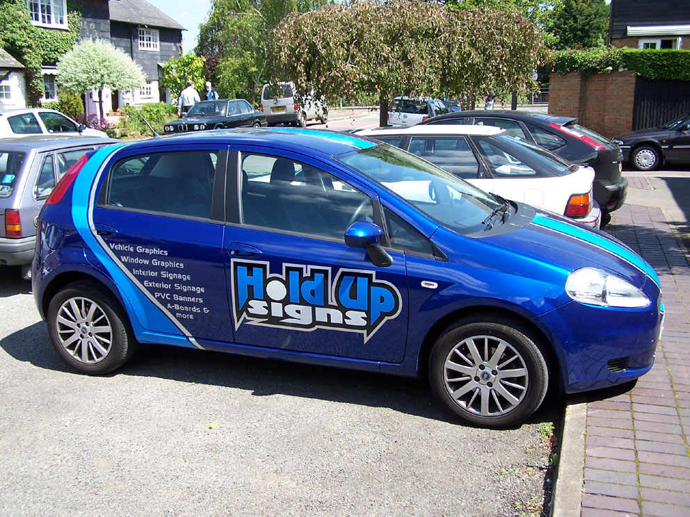
Thanks for all the comments.
I know there will also be people who don’t like other peoples logo’s but could those who don’t or didn’t like it tell me why so that I know what to look out for in the future. Is it colour, shape, font or everything 😮 You guys know I can take constructive criticism 😉
and a day picture of the car, tel no and website still to go under logo.
cheers
Warren
Attachments:
-
I think the colours look great Warren. For me it is mainly the font and the spiky bits pointing down ….. 🙁 But that said, the overall effect is really great, I think you have done an excellent job!
-

Is that a Technical Term Marcella…….’spiky bits’…lol
Looks the business Warren……..have to agree with Marcella though. Maybe you could of rounded the ‘spiky bits’ ( technical term) on just the white outline.
apart from that it looks great love the colours.
Tim.
-
Warren, looks like you have done a cracking job overall. Now if that doesn’t get noticed and fetch some inquiries I don’t know what will.
Log in to reply.
