Home › Forums › Sign Making Discussions › Graphic Design Help › can anyone help with my logo that needs putting onto truck?
-
can anyone help with my logo that needs putting onto truck?
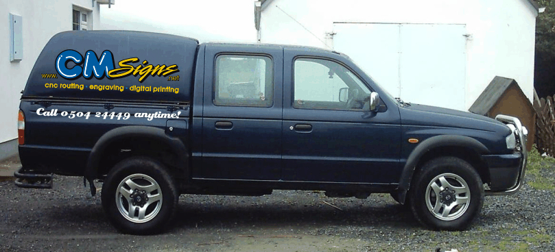
Posted by Brian Maher on 2 January 2006 at 22:18hi all,
i want to put our logo on my pickup so that it ties in with our letterheads cards etc…. but as usual when it comes to our own vehicles us sign people cant do it for ourselves 😕 :lol1: …
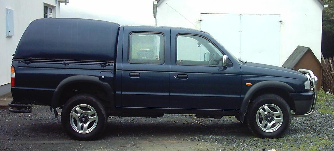
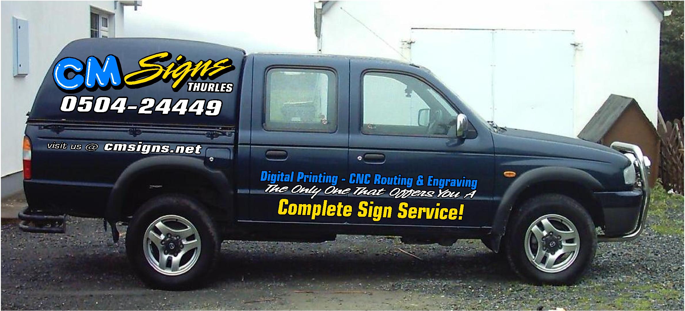
i’ve attached the logo and a picture of pickup,its a mazda barracuda 2500 double cab 2002any suggestions will be appreciated,
cheers,
brianjust noticed i left out phone number on the copy of letterhead posted below…0504-24449 😉
hope i’ve done all this right…
Simon Kay replied 19 years, 7 months ago 8 Members · 18 Replies -
18 Replies
-

Looks like it has alot of potential. Do you happen to have any ideas for it?
Stevo -

this is basically what i want on it but not able to get it just right…
we currently print on a gerber edge but hope to move up to a larger machine this year… i dont want to go mad with a wrap either as i may change the jeep soon and dont want to waste too much money on it…but still need to keep the company name in the public eye, who knows if it looks good enough with a bit of help from here i might keep it :lol1:
thanks again
Attachments:
-
hi stevo,
like u say loads of potential but damned if i can nail it down.. :lol1: -

While I do like the logo,
(lots!)
on your truck it is overpowered by that HUGE phone number.
I would try to prioritize your copy
(do you really need all that stuff on the sides?
maybe a list of services would be best on the back
or a smaller bulleted list on the second side window)
and if you are going to put all that copy on the sides,
it needs to be tied into the cap of the truck,
and higher up too.
Just my 2¢, you’re off to a good start. -

Brian,
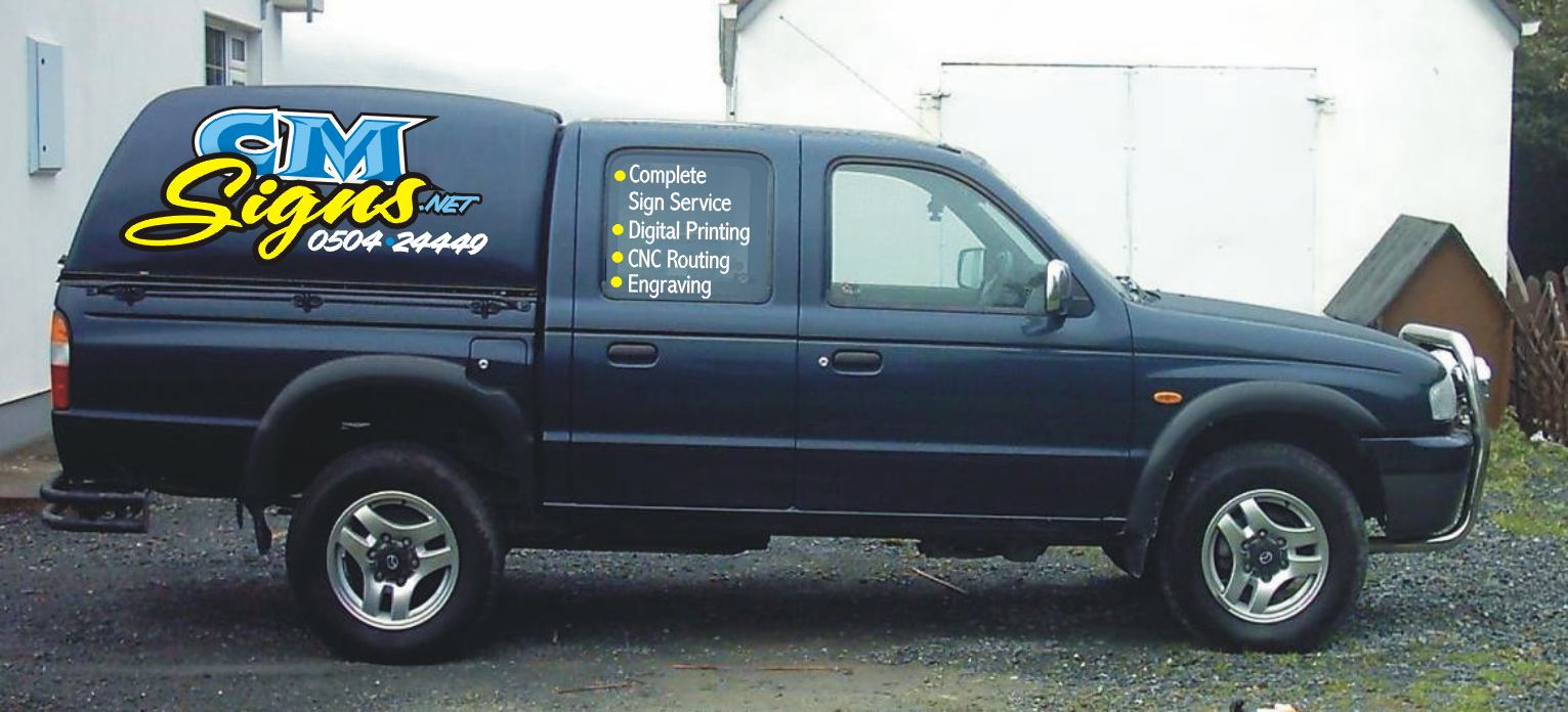
I dont think the black shadow on the cm signs would stand out at all on the truck, if it is as dark as it looks in the picture, perhaps a medium grey would be better ?Peter
-
hi jill,
thanks for your input…
maybe i dont need it all on the sides 😕
less is more…and all that 😀
i would prefer to stay off the windows,if possible…but am willing to keep an open mind..brian
-
Here, I had a play.
I tinted your window and kept everything up top.
I could not separate your logo so I had to do a mock-up.
Your logo is actually MUCH nicer.
My son cannot believe that this is a Jeep!
(He drives a CJ model)
Love….Jill
Attachments:
-

I like Jills idea (and avatar 😛 ) but I don’t like text on the opening window.
This was an idea I had. I am a ‘less is more’ type of guy too 😎
Attachments:
-
those look great guys…thanks for taking the time to help..
will try and use these as inspiration.. 😉 and see how we go..
brian
-
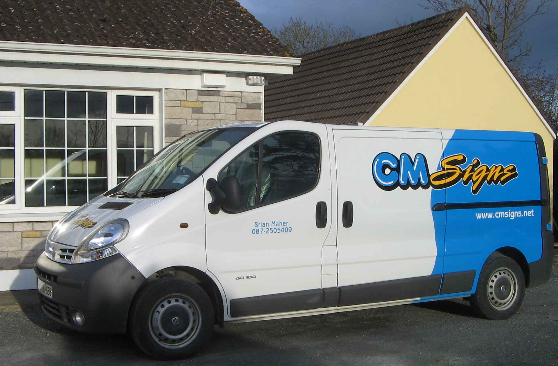
decided to get rid of the 4×4’s and get a couple of new vans on the road instead.. 😉
opinions welcome.. 😉
Attachments:
-
Nice Brian, not to fussy and to the point. did you wrap the blue?: or is it Painted?
Peter
-
thanks guys,
the blue is painted, match to the blue in our logo 😉
vans are already getting a lot of attention so it was a good move 🙂
-

like it a lot…….
not sure if this addition improves final design (?)
Attachments:

-
Andrews addition is certainly not a negative to the design Brian. I’d probably do that too it were mine. 😛
He is a talented bloke that Andrew Boyle fella 😉
Thanks mate. Well done..
-

I like that a lot Brian.
Andrews addition is eyecatching too, and could be done retrospectively I presume?
How good is it having a decent van to work out of after a cramped ute?
Cheers
Simon.

Log in to reply.