Home › Forums › Sign Making Discussions › Graphic Design Help › can anyone help with layout of signboard please?
-
can anyone help with layout of signboard please?
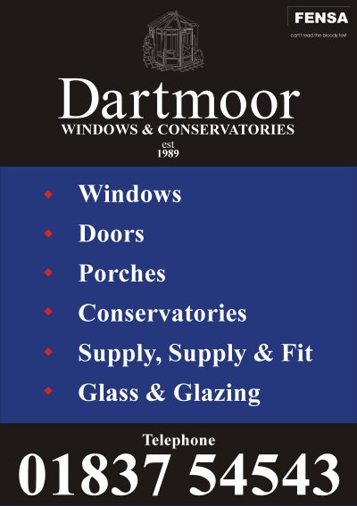
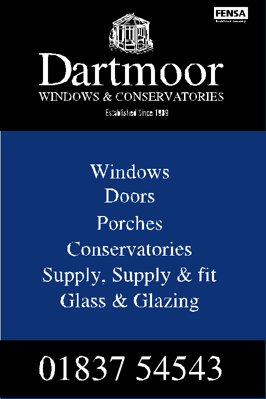
Posted by evo1v on 6 May 2004 at 18:58Hello all, In need of some expert design tips on layout, recently had a customer inquire about a signboard, they want to change their image, so could be quite a bit of work with them!! Okay specifications are ALL information as below plus victorian conservatory some how incorporated, ohh and they wanted a subtle look. Heres my interpretation, it feels like somethings missing? Any constructive critism greatly appriciated.
Lawrence
Chris Wool replied 21 years, 6 months ago 7 Members · 26 Replies -
26 Replies
-

Only a humble opinion Lawrence, I’d tighten up the logo and est. at the bottom, they look a bit lost. I’d also consider putting the telephone number at the bottom, but thats just a personal preference thing on my part 😀
Nice design btw 😀
Cheers, Dewi
-
hey the words humble and dewi dont go together, deffinatly agree something is lost (apart from me) 😮 ohh thats not there logo though just what I put together,
Lawrence
P.S yes the spacing is a bit up the creak
-

My two ‘pennorth
Too dark!!!,Conservatories and windows are designed to allow light in!!!, i think you need to get this over on the board.
Image element a little small? .. move it from the centre..left? make more of the name?
Keep the bullet points if you must, center justify text?
As Dewi said really after that little outburst,tel. number to base and accreditation logo’s tightened up..
Darryl -
Bloody good points! couldnt make my mind up about cetral justifiying, would you put fensa above the tel number?
-
Sorry, I couldn’t resist 🙁 Just what was in my head when I commented 😀
Cheers, Dewi
Attachments:
-
Yeah the dimond points are much more classey, also fensa. and est. up top look great, personaly I’d prefer to keep it blue straight to the bottom, but hey Im just a novice. Thanks so much for your comments fellas!!
Lawrence
-

my opinion folks!!
dewi i would ditch the word telephone reduce the size of the telephone number (never make it bigger than the company name) make (est 1989) full established since 1989 all in one line below the company name!
central or bullet? would go with central!!
Nik
-
😆 😆 I always do my telephone numbers way too big 😀 Must be a scale thing in my head, either that or my phone is a little too important to me 😉
Agree with the fully established bit, alot more of a professional feel to it, but Lawrence 🙁 the telephone number looks all alone again 😉 😉 😆 😆
Only kidding, looks great 😀
Cheers, Dewi
-
your getting there!! (just my humble opinion being used)
make established smaller
keep the black box at the bottom at the phone number!!
i feel awful not posting a sample, as i can only work at speed with signlab, which i don’t have in the house!! anyway,your design will all fall into place eventually!!nik
-
Okay, Okay keep your black box down the bottom, hows this, I must agree its looking much better, thank you both so much for your advices, much appriciated, sorry did someone say signlab- dont get me started, lol.
Lawrence
-
it’s getting there!! lawrence
only wee niggle change the height of the est. 1989 or change the font, looks a bit odd and centre it as well!! being a pest again!!
oh and the d is too close to the a!! in dartmoor!!nik
-
Two “Supply”‘s on one line, that’s the first thing that jumped out at me mate. 😕
-
ye! i thought about that too nobby! but maybe the customer requested it!!
nik
-
Yeah I hated that bit too, thats what the man said though, but I’m just a stupid signmaker so what do I know?, Hey Nobby didnt you offer me a coffee in one of your posts?, now isnt that a bit stindgey considering you just won 24 beers, or have they gone already?
Lawrence
-
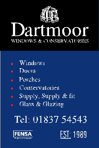
Thank you all for your input on this design!! I ended up taking a mixture of both niks and dewi’s to customer. Customer says “sorry mate me and my brother got mixed up!!! he meant 3ft in length and 2ft in height!!!!! but we want it 3ft by 5 ft now anyway” whilst thrusting their own crapy design infront of me!, heres what Ive come up with, your probably fed up with me, but any comments welcome!!
Lawrence
Attachments:
-
Thats really cool Lawrence! 😀 Have you got the go ahead on it yet?
Cheers, Dewi
-

Cool looking sign,But you may find the fensa must always be in black???
-
nice one lawrence!! 😀
everything always works out in the end!! 😉 😉
Nik
-

just out of interest nice sign by the way that consevatory is already on 2 local company’s signs or very very simular
local meaning devon cornwall boarder
just a thoughtchris
-
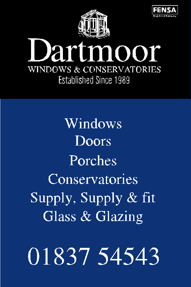
Took the design to the customer this morning, not sure if I scared him off with my price!!, first he asked me how much could I do it for with-out the top and bottom blue bands, then says he can get the credit card stickers himself, finaly throws in that he’ll have everything in black!!!, and would I mind just printing that out so he can see how it will look!, by this time I’m biting my lip so hard its starting to BLEED!!! so I got home sat down at the desk—phone rings its the bloke on the phone, — asks how much I can do it for if its a 3ft x 3ft!!, Im sure you can Imagine what the design looks like right now, thanks for your help on this one though, its great to have experienced opinions!!
Ohh I didnt know about the fensa colour but its all black now anyways, that was the one and only conservatory I could find mrsticker mind you I dont think they’re to fussy,
thanks again for all your comments
Lawrence
-
welcome to the wonderful world of customers
he dont know it but you have put a lot of effort into that design and now for nothing zero – blank – sod all.
you have now learnt that if you don’t know the customer find out whot he wants to pay first then you know how much effort to put in to it.
or tell him straight forward is X – to put time and effort in to the design is Y
a hard lesson and i feel for you we have all been there ONCEsorry
chris

Log in to reply.