Home › Forums › Sign Making Discussions › Graphic Design Help › can anyone help with layout for travel agents panels?
-
can anyone help with layout for travel agents panels?
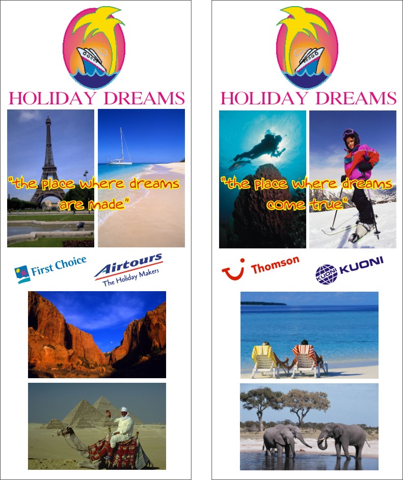
Posted by Stephen Ingham on 23 August 2005 at 21:48Hi all just done a sign for a local travel agents and they are wanting to put up some panels on the wall outside the shop.
They measure approx 950mm x 2000mm and are to be printed on our versacamm
Any help or advice appreciated
Cheers
stephen*probs attaching file, i’ll try tomorrow*
Stephen Ingham replied 20 years, 3 months ago 4 Members · 8 Replies -
8 Replies
-
Hi Stephen,
Sorry If I’m being a bit dim here …… do you want constructive criticism of the designs or help in some other way? … Sorry, I’m reading your post but unsure what exactly you are asking? I presume graphic design/layout suggestions, seeing as your post is in Graphics help???
😀
-
sorry carrie, yes any design suggestions
there are to be the two boards next to each other
so any design help appreciated
cheers
stephen -
I see … thought so 😀
Personally I would probably like to see all four images blending/fading into each other with the slogan across the centre of them and place the tour/hol peeps logos at the base of each sign?
Im sure some other peeps will have a few ideas too??
😀
-
-
nice one carrie i like that, its not too crushed 😀 but i would have made the holiday dreams a bit bigger? 😀 and the logo smaller or better still move the photos up a bit to give the bottom more room 😛
nik
-
It would like a whole lot better if you feather the edges of each image and blended one to another.
Kev
-
:lol1:
nice one carrie, gives food for thoughtI’ll have a play with the concept
cheers
stephen
Log in to reply.


