Home › Forums › Sign Making Discussions › Graphic Design Help › can anyone help with layout for ‘a’ board please?
-
can anyone help with layout for ‘a’ board please?
Posted by Keith Nilsen on 29 July 2005 at 22:40I have been a member for ages and have just realised I have never posted! Here goes then…
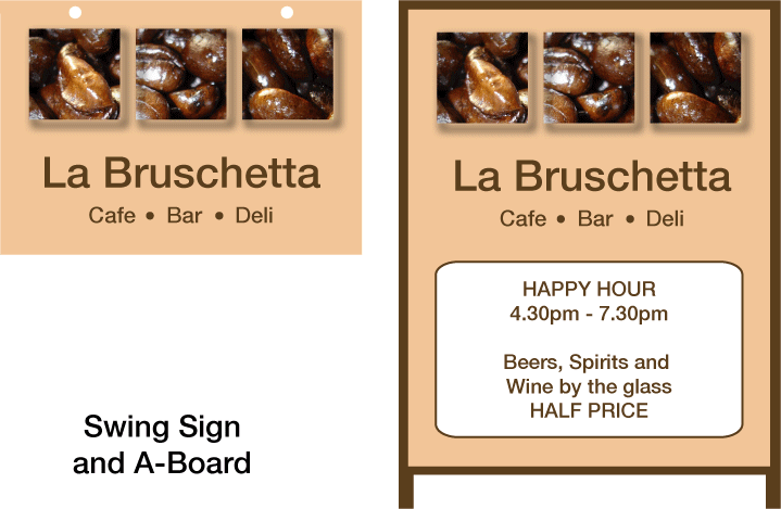
A-Board and hanging sign, digitally printed with vinyl lettering in the white panel to allow for ongoing amendments and offers.
Feedback?
Attachments:
 Jill Marie Welsh replied 20 years, 3 months ago 5 Members · 6 Replies
 -
6 Replies
-

I like it mate. Now of course you have got me thinking about food so I may have to go off and have some breakfast..
I am always amused when a happy hour goes longer than an hour tho. 😛
Make sure you laminate it tho, as taking the computer cut off down the line will be murder and may damage the print…. but I guess you probably know that.
Cheers
Shane -

i like what you have done with the beans and colours are relavant too. not sure about font but still works well. both keep in uniform too.
thanks for the post mate and il look forward to more 😉
-

Good ole Helvetica…. unfortunately exists as part of the clients identity already so worked with it. A lot more scope without such a limitation but we can’t have it all I guess!
-
the helvetica family is probably my favoure sanserif font. have a couple but like that best.
-

helvetica…………..had to draw every £@%& single letter freehand at college………had an an enlarger for photography….cheated and passed…..
strange things happening on every single letter, things that look straight aint ….a great typeface although myriad is better…Cheers 😀
-

I’m not keen on Hellvetica myself,
but if that is what the customer wants…
hey at least it looks nice and clean.
I find myself substituting Impact or Avant Garde,
but my favorite sans serif is Arthur Vanson’s Chesham Sans,
a Letterhead font.
I like the colors, BTW.
Love….Jill

Log in to reply.