Home › Forums › Sign Making Discussions › Graphic Design Help › Can anyone help with ideas for newspaper ad please?
-
Can anyone help with ideas for newspaper ad please?
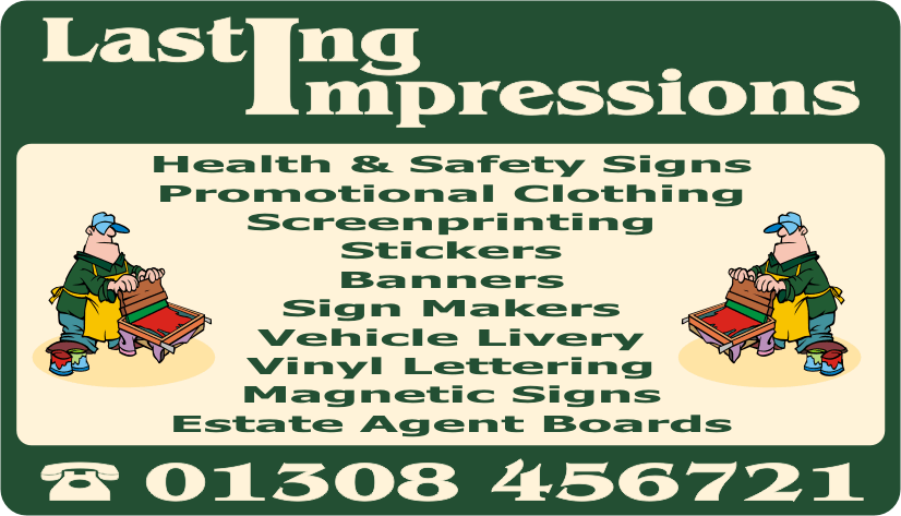
Posted by Terry Gall on 18 February 2005 at 22:38Can anyone give me any ideas on how I can update our newspaper ad? The present one is just boring and I want to try and make it more eye catching and jump out of the page. Why is it that we can create eye catching designs for others but struggle with our own?
Any ideas would be gratefully received.
Cheers
Terry 😕
Paul Rollason replied 20 years, 8 months ago 11 Members · 26 Replies -
26 Replies
-

my advice would be to firstly take out unwanted text such as “stickers, sign makers & vinyl lettering”, that way you could then pull the remainder of the text down as it is far too squashed up , each row of text needs to be taller to give it it’s correct prospective.
In other words you have too much info squashed in that is not needed.
hope this helps.
L J -

Like Long John says:
We would probably advise our client who presents us with what he wants on his sign and generally he wants to cover everything – absolutely everything
But what would we advise him?
“Trim it down mate”
“Don’t cram too much info in”Try and group what you do under one heading
Sometimes we ourselves make the very mistake we advise our clients against
John
-

Get rid of everything. The biggest thing on the advert is your name. Why is that? No one cares who you are. Your name isn’t going to catch the eye of your target audience. What will attract anyone who is interested is what you do, so I would imagine the words “Signs & graphics” (or whatever) should be the main element. As for lists of products: it’s hard to narrow it down, but I’d stick with maybe 5. An easy to read list of 4 or 5 items is much more attractive than a squashed in list of 9 or 10.
Just out of interest, do you get much work from newspaper advertising? I’ve thought about it in the past but found it rather expensive.
-

We get a steady stream of customers from local advertising, and get a good rate from the paper at only £12 + VAT a week. This adverts was just something I knocked up when we started (2 1/2 years ago) and I was a bit useless with Corel. We needed to get our need across and cram on as much as we could in the space (£15 a week was a big expense in the beginning). I know it is cramped etc that is why I hope you can help!!
Cheers
Terry 😳
-
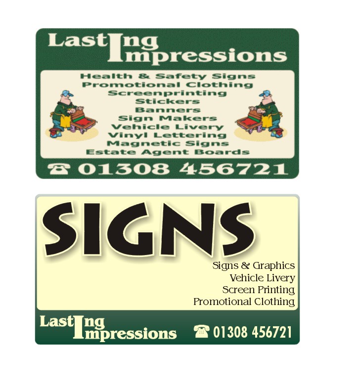
OK, this isn’t supposed to be a finished advert (obviously) but rather just to illustrate a point.
I would tend to think that the opportunity to catch someone’s eye with a newspaper advert is very short. So I would make what you do the most prominent feature, rather than the business name.
Attachments:
-
Northants??? :lol1:
But do you see how immediately it grabs your attention 😮
and yet it says enoughIf they can’t figure it out after that do you really want them phoning you?
John
Nice layout Andy
-
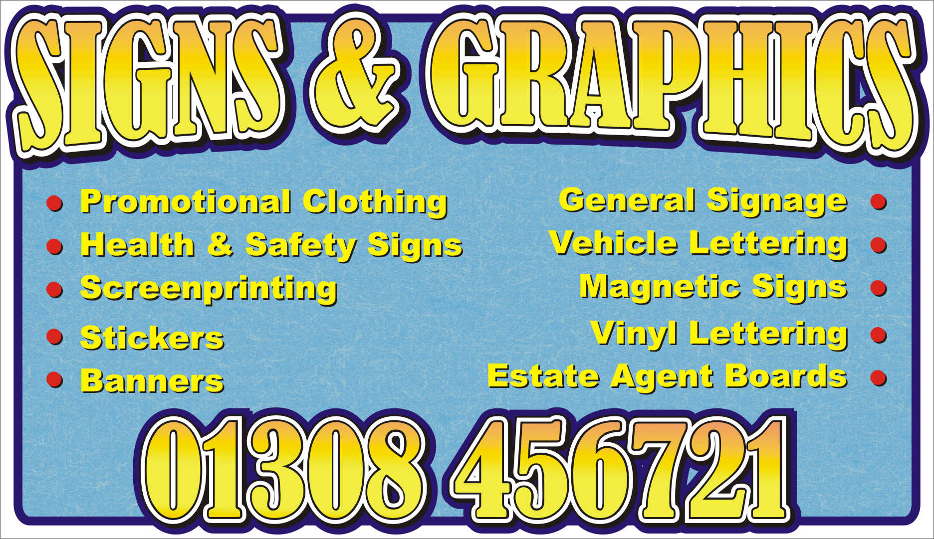
Just playing about, but it may give you some ideas 😀
😳 Sorry I didn’t fit your logo in there 😳
Cheers, Dewi
Attachments:
-

I like them both guys, but for an advert in the paper I’d probably go with Dewi’s. I agree 100% with all the comments here, the original ad was way too cramped. Having said that, you should target the majority in paper advertising as you only have 1 shot to get the broadest spectrum of customers.
Big G’s ad is good if you want the core responses to be sign work. There is a merketing theory based on the fact that the most people don’t think past what they read. Dewi has a layout that covers a wider spectrum. The theory is that the smaller the community you live in, the more need you have to be more descriptive. The fact that your old descriptive ad gets such a good response could be considered proof of this theory.
Just my opinion based on my marketing days 🙄 Of course, who said marketers are always right 😳
Cheers
-
Don’t you guys ever sleep!!!!!
Brilliant ideas so far, I think Britchenko’s one would be ideal to use as promotional flyers but think the detail text would be too small to print in our local paper. I like the way the hand is in the background. Any chance you could post the file for me to play with.
Cheers
Terry 😀 😀 😀 😀
By the way, vinyl is spelt like this
-
quote tgall070:Don’t you guys ever sleep!!!!!
Brilliant ideas so far, I think Britchenko’s one would be ideal to use as promotional flyers but think the detail text would be too small to print in our local paper. I like the way the hand is in the background. Any chance you could post the file for me to play with.
Cheers
Terry 😀 😀 😀 😀
By the way, vinyl is spelt like this
I agree, great layout 😛 , but printed in a paper would lose the detail. Make a great business card tho.
… sleep? what’s that?
-
Yeah, like the handprint idea. That would make a cool promo leaflet. As for the paper ad’ definitely something simple and eyecatching as there are usually lots of other ads surrounding it. A clean simple one will jump out of the page more.
-

Thx for the comments as you said we never sleep!! 🙂
Looking at it now can’t agree more the small text is too small for a paper ad.
It might be that i was sleepless?If you want the file to play a bit just send me a PM, with your email and i’ll be glad to send it to you. It was made in Corel if you need other kind of file let me know.
Cya -
Hi Britchenko
For some reason I am not allowed to send a PM. Could you send the file to this email address: terry@lastingimpressions.uk.com.
Many thanks for your help, I really appreciate it.
Cheers
TErry 🙂 🙂 🙂
-
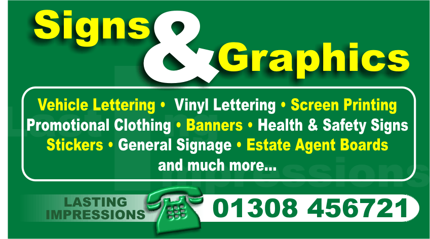
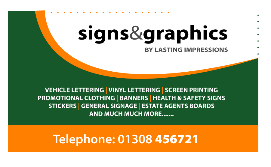
Just a quick update on this project.
Thanks to Britchenko’s designs and a bit of rescaling this will be my new advert. I think it is a lot clearer than my previous attempt. I will let you know if it makes any difference as far as responses go.
Thanks to everyone for their comments – all have been stored for future reference.
Cheers
Terry 🙂 🙂 🙂 🙂
Attachments:
-
Looks good!!
I see you liked the idea of the box that i sent you in 2nd file.
And if the news readers will love the advert as i liked playing with it then u’ll have a full shop very soon. 😉
Did you lost my beloved hand? 😀
Cheers
Britchenko -

sorry to put a spanner in the works……..
but the last design looks a bit like a weaker version of Britchenko’s design, maybe let the typography do the work and loose the border…….
sorry for being so opinionated……..
on a laptop and can’t work properly without a mouse but here’s mine anyway…..
all the best
Andrew
never been convinced about photoshop filters for newspaper ads
would change the dots?
Attachments:
-
If I had to choose I would be hard pressed
Can’t make my mind upThey’re all great designs
Such great talent on these boards
John 😀
-
Don’t worry Britchenko, I have not lost your beloved hand. When printing the advert correct size it did not show up to well. On larger copies of the ad your hand will most certainly take pride of place!!!!
Cheers
Terry 🙂
-
Well at least you can say Britchenko had a hand in your design Terry
John
-
quote johnalphasign:Well at least you can say Britchenko had a hand in your design Terry
John
(splat)
(disolve) -

Some fantastic designs and some very useful coments
Andrew, I noticed on your design you included some dots.
You must see dots in your sleep
Paul R(Mackerelbus design)


Log in to reply.