Home › Forums › Sign Making Discussions › Graphic Design Help › can anyone help with design to go on sign tray please?
-
can anyone help with design to go on sign tray please?
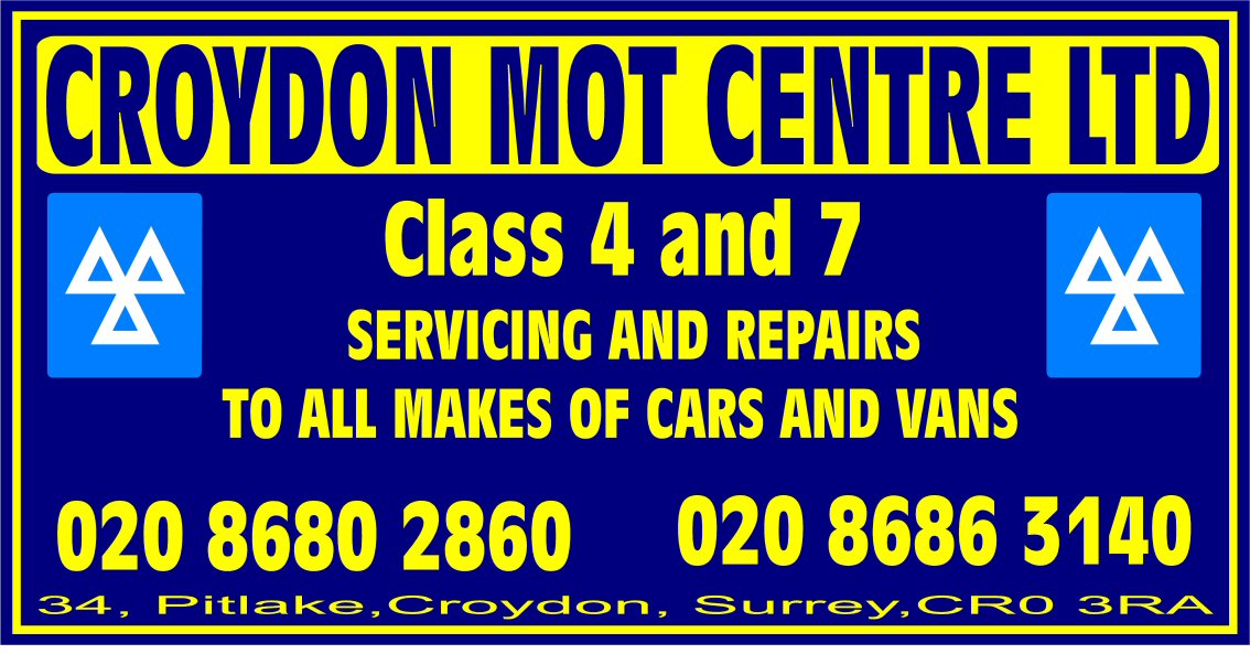
Posted by Richard Urquhart on 16 February 2005 at 22:04hi all got this job been given te go ahead but would like a way to liven this sign up 10×5 blue reynobond made into a tray and covered in yellow vinyl
any one fancy a play with it
thanks rich
Attachments:
 autosign replied 20 years, 9 months ago 11 Members · 23 Replies
 -
23 Replies
-

hi rich, would it be possible top attach the vector of this work also mate?
that way folk wont need to start from scratch.. they can just download work, jigg it about, then upload… just a thought mate 😀we are a lazy bunch you see :lol1:
you can do this by click edit post and just do another attachment and it will add one along with the one you have 😉
-

thanks mate please find ai
-

I kind of missed the .ai file 😳
Anyway, quick play inbetween beers :lol1:
Cheers, Dewi
Attachments:
-

Like the way you’ve done the outlines, Dewi
Looks real cool!John
-
:lol1: :lol1: :lol1:
Just goes to show, I can’t spell those southern nancy town names even when I’ve had a drink 😮 :lol1:
Go on Andy, show me how its done! 😀
Cheers, Dewi
-

ha hah hah ahahahah aha a ha a hahahhahhahah! 😉
the easiest thing I typed all week!!!!!!! ha aha ahha aha ah 😀 -
 quote big G:Yeah but how do you spell Croydon?
Yer jessie! 🙂
Hoorah for the one and only good speller amongst us 😉 :lol1:
-
You can almost hear Big G’s mouse clicking furiously away as he designs a masterpiece unseen since the Mona Lisa! 😀
Either that or he’s flicking a beer can 😉
Cheers, Dewi
-
quote :Either that or he’s flicking a beer can
Come on Dewi that ones easy *drink*
John
-

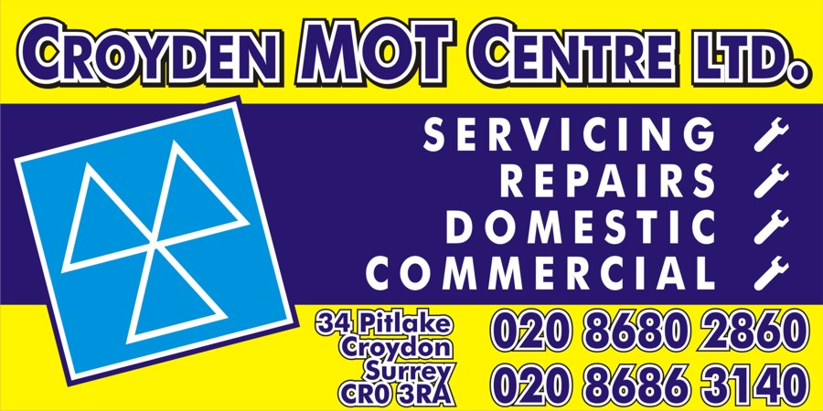
Just remember, Dewi goaded me into this…..
I’d have the MOT logo on a separate panel, fixed with studs, just to be a bit funky. Just like Dewi, I find that placing logos on the p1ss makes up for not being able to fit them straight after a night on the beer.
Attachments:
-
Now thats a class sign! 😀 I’m not overly keen on the telephone number bit, but everything else is cool. Rich did say though that the panel was going to be blue, what does it look like with the darker yellow changed to blue?
Cheers, Dewi
-
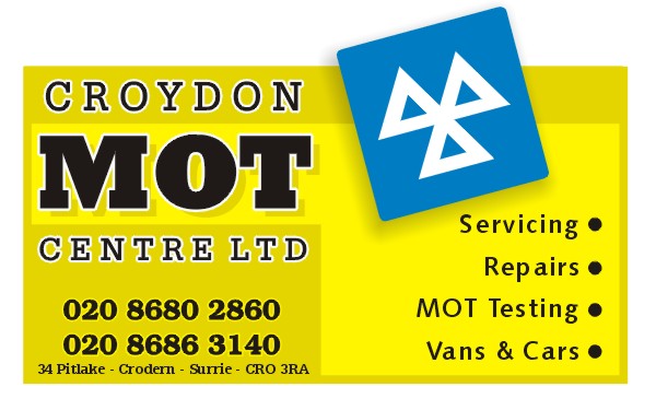
I prefer the dark yellow version.
Rich will just have to change it won’t he!?I always struggle with the positioning of phone numbers for some reason, but then I always struggle with everything.
Attachments:
-
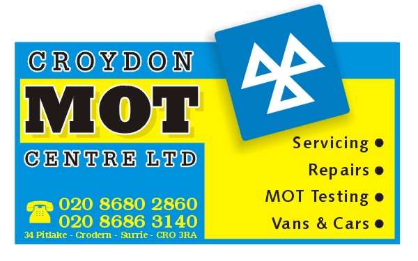
i messed about with this one but just as i was posting i noticed i havent used any yellow 😮 😕 anyway… suppose it gives another idea.
http://www.uksignboards.com/images/demos/misc/mot.jpg
.
-
Like the blue one Big G 😀 The telephone symbol thingy looks pretty cool as well, yeah, I like that one. All gives Rich some ideas 😀
Robert, I like that as well, more modern somehow. And before anyone else says it, you’ve made the same spelling error as me with the CroydEn :lol1: Really will have to get the UKSB Dictionary updated :lol1:
This is definately my favourtie forum of them all, seeing different interpretations of the same information on a sign and how ppl handle graphics etc. is fascinating stuff. 😀
Cheers, Dewi
-
wow what can i say i went to bed and got up to even more help than o thought poss
thanks for the ideas i will let you see finished sign oh and by the way i like all of them you guys have some blinding ideas
thanks for all the help i have the materials coming to day its got to def be mid blue background can change vinyl a bit
thanks big time its given me new ideas
thanks rich -
Some excellent ideas there…must say i like Robs the best followed by Rich.
Simon
-

Here’s a Couple I have knocked up. God I miss this trade……….. 😥
Attachments:


Log in to reply.