Home › Forums › Sign Making Discussions › Graphic Design Help › can anyone help please with this landrover layout?
-
can anyone help please with this landrover layout?
Posted by Neill Hague on 28 July 2006 at 13:41Hi
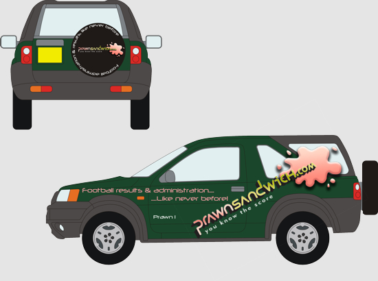
got a job to do for a guy who just bought a new Freelander in dark green.
He wants the logo on the sides as big as possible.any opinions or suggestions on this layout would be welcome please.
thanks
Neill Hague replied 19 years, 5 months ago 6 Members · 8 Replies -
8 Replies
-
Dont know why I got 3 topics – sure I only pressed submit once
hope the other two get removed soon!!Know what you mean Micheal – one of those designs where the logo wont fit nicely
-
Hi Neill
I really like the wheelcover, but I don’t like the side, but I can’t decide why. I think because the prawnsandwich bit is too large, and the whole design is off-key. Sorry to be so negative, especially as I am not explaining myself well.
-
Hi Neill
I quite like the idea of a bigger splodge on the window ! 😮
However, you have to think about what it will look like on the other side of the car.
It wont be on the window the other side unless you rearrange the layout of the logo.It might possibly look better working the name more into the splodge or underneath it. That way it would be equal on both sides of the car.
Clients never think of these things do they 🙄 🙂
Cheryl 😕
-
I like the logo, what typeface is that? Just not sure about the layout. As already said wheelcover works perfect but the side needs a bit of adjusting as it won’t fit the same on the other side.
-
thanks for the comments
I agree with you all, its the sides that I am not happy with.
Dont know what font it is Marcella the logo came as a low res jpeg
Customer is going to get better artwork for me. Think I will get him to supply the ‘splodge’ on its own so I can reverse it for the other side (if he wants this layout).Time to leave this job till Monday me thinks!!
-
Hi Neil,
Feel the same as comments already said, how about posting up a vector of this so we can have a play? :lol1:
Also, don’t suppose I could be cheeky and ask for a copy of your freelander outline please please pretty please, got one to do and it doesn’t seem to be on my discs. 😳 :lol1:
-
Log in to reply.


