-
can anyone give me a few pointers on how to improve this?
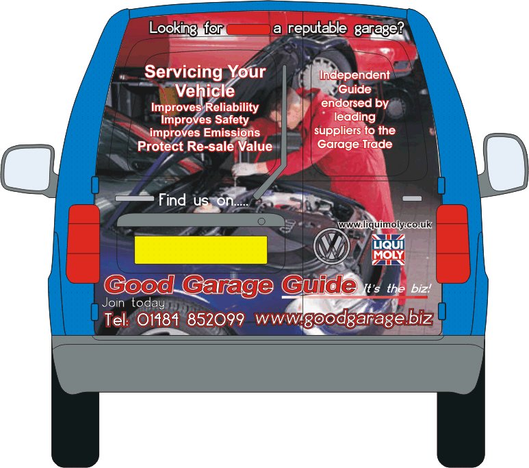
Hi all can anyone give me a few pointers or ideas on how to improve this a little, please
cheers
stephen
Attachments:

Log in to reply.
Hi all can anyone give me a few pointers or ideas on how to improve this a little, please
cheers
stephen
Attachments:
Log in to reply.
Please confirm you want to block this member.
You will no longer be able to:
Please note: This action will also remove this member from your connections and send a report to the site admin. Please allow a few minutes for this process to complete.