-
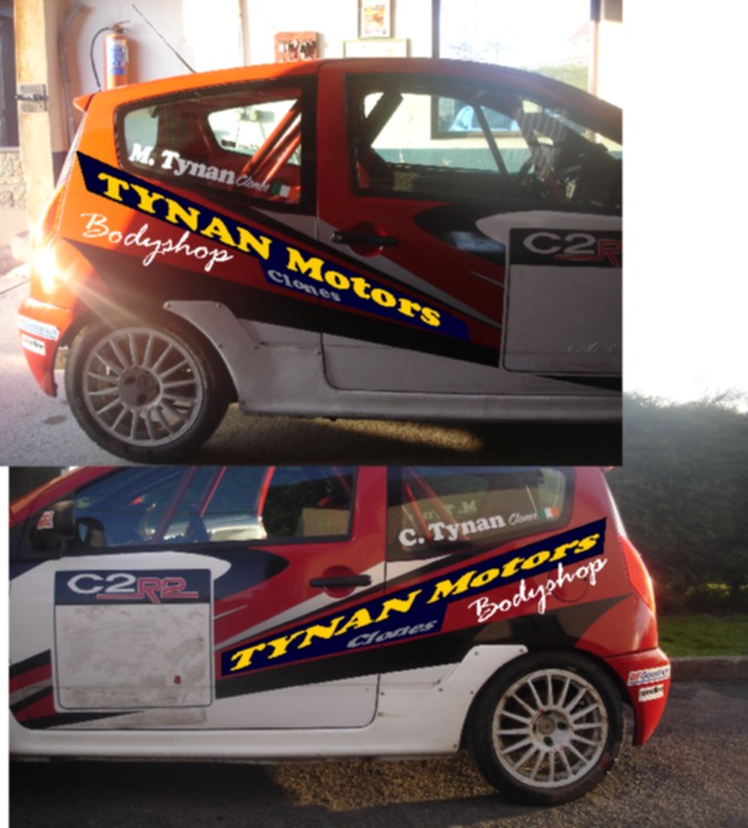
Can anyone advise on a better way to lay out this car?
This is just for layout purposes. Really at a loss on this one, I can’t see the wood for the trees anymore.
Can anyone advise on a better way to lay this out that will look well on both sides?
Colours have to remain, could be able to talk him into a change of font though.
Help please! 🙁
Attachments:

Log in to reply.