Home › Forums › Sign Making Discussions › Graphic Design Help › can anyone add more ideas to this logo please?
-
can anyone add more ideas to this logo please?
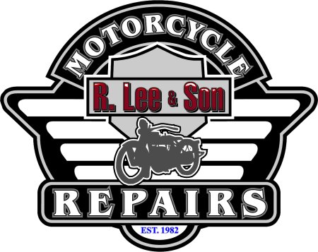
Posted by Bill Dewison on 4 January 2004 at 16:20I’ve been working on some sample sign ideas for the display area of my shop (when I finally get it open), just to give customers examples of the type of work I can do. The idea below started as a joke between myself and a biker friend of mine, but I thought it’d be a great idea for a sign.
I’m trying to get used to working with flat layers, welding shapes etc. so although this is quite basic, it took a while to do. As far as I know it could be cut quite easily (though it might take a while 😉 )
Its not finished but I wanted to post here to get your opinions. 😀
Cheers, Dewi
Attachments:
 Tim Painter replied 21 years, 11 months ago 9 Members · 15 Replies
 -
15 Replies
-

very nice dewi, but i would change the colour of the r.lee & son you cant really see it.
and move the est. above the name and change the colour of that also.my view Nicola
-

Nice one dewi..
What software did you use to do it?
Like Nicola has said.. I would maybe change the colour of r.lee & son
To a brighter red or maybe drop the shadow and keep the thin outline.Seeing as the theme is for a motorcycle company. Why not make the grey pinline etc in mirror foil. Gives that chrome bike effect sorta thing… it also although you to show how foils can be incorporated into the vinyl work.
The blue doesn’t do it for me.. Kinda disassociates itself from the rest. Maybe make it a brighter red also.. Ties things together.
Although I think your outlines work well in this design. It’s sometimes an expensive unnecessary extravagance to go to. I don’t mean that in a bad way, but every layer of outline is increasing the cost of the job for the customer & yourself.
great work none the less mate. thank you for sharing! 😉
-

Hi Dewi!
Not too shabby.
Here is my two cents:
The thing that stands out to me is that there are many elements struggling with each other.
Also, I think you need a bit more contrast.
The vertical bars are OK…but it bugs me that the outline does not contour these bars and has a circular bump-out.
Perhaps try to smooth this out to follow the triangular shape?
I like how the motorcycle graphic overhangs the bottom panel.
I would worry just a tad about using the shield and bar doo-hickey because Harley Davidson might get testy…
but I would also borrow an idea from them and add orange to your color pallette.
I would remove the bar completely, enlarge the shield and bump up the “R Lee & Son” in a beefier font…..
possibly a sans-serif prismatic font in an orange with yellow-orange highlights.
I would make the shield a peach color and the vertical bars a lighter peach tone.
I would outline the MOTORCYCLE and REPAIRS with orange.
And remember to leave a bit of breathing room around them in their panels.
The “EST.” etc. I would change to a cooler Pinhead style font, maybe in red.
I have no ideas as for the color of the outline around the whole thing….
that’s as far as my brain goes this morning. Maybe red?
There…I didn’t rip your design apart too much, eh? I do like it.
Sincerely….”Miss Know It All” -

Hi Dewi,
I think that’s really good, did you make it up from scratch yourself?.
As Nic said, the R. Lee & Son could do with being brighter/lighter colour perhaps gold would look nice? I think the Est… bit looks OK where it is but colour needs changing though.
As you say, if making this up in vinyl only it would be a bit time consuming because of all the multiple outline colours etc. Have you put an emboss effect on the text ? (I can’t see for sure) – If so are you planning on printing this or having a go at airbrushing it ?Anyway I like it a lot mate – keep up the good work !
EDIT > Looks like we all answered simultaneously then !! I like Robs idea of incorporating some chrome into the design, I think if I was going to make this up I would probably use a black foam pvc or acrylic blank and overlay the other colours on that, still a bit of a fiddle but all good practice eh !
Did you get your plotter sorted out yet by the way ?
all the best, Nigel.
-

Thanks you for the input guys 🙂 I’m trying out the changes that have been suggested, mixing and matching a little 😉
I used CorelDRAW 9 to design it. Started (as you’ve probably noted) with a Harley Davidson promotional piece, as the R.Lee&Son (when said in my local twang) sounds very similar to Harley Davidson. Because I’m only using it as a display piece, ie not selling it, I’m kind of hoping that Harley are not going to mind I’ve ‘borrowed’ elements from their work, but even if this design is made and displayed in my home, its the practise I really want atm. 🙂 I designed each element from scratch, although admittedly I have again borrowed some design techniques to produce the outline effects etc.
Really love the idea of using a foil to give it the chromey look, I agree it’ll add to the overall effect. The est.1982 was thrown in if I’m honest, I find it hard when I’m working without a brief (although if I’d thought, I could’ve written myself a brief before I started). Colour-wise, another weakness of mine is I like greyscale. I tend to design in b&w all the time, then add in colours at a later date, so all your suggestions on colour schemes are much appreciated 🙂 The ‘R.Lee & Son’ bit was done by following a demo done by Phill at Right Signs. It’s lost alot of its colour and contrast in the conversion from vector to jpeg, but I agree, a brighter colour would make a big difference.
Nigel, not got the plotter just yet, although I’m hoping I’ll be able to grab one this next week. I have about 2-4 weeks before my shop opens proper and I could really do with getting used to the plotter in that time as well as putting together all my sample stuff. I already have 3 customers wanting stuff like A boards, a shop sign and some POS stuff at the beginning of Feb, so I’ll be in the deep end from day one 😕 Not that I’m whinging, its all fun 😀
Again, thank you to all for your time with this, I’m going to play around and hopefully come up with a more complete design 😀
Cheers, Dewi
-

Nice to see your stuff Dewi
Hope you get up n running soon
and all the best for the new year
John
-

I think it should read
R. LEE DESIRABLE.
myself otherwise very smart.
-
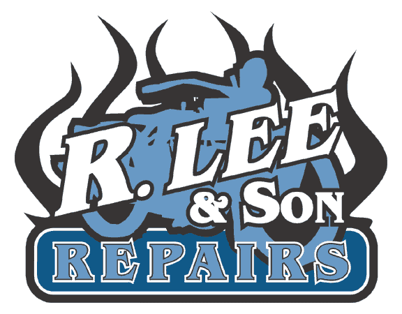
Thanks everyone for your comments/suggestions so far. Tried a few different ideas, still not working though 🙁
I have come up with this one over this afternoon… better, worse or ?? 😕
Attachments:

-

Dewi,
mail us an .ai version of the file and I’ll have a play.
Immediate thoughts are too busy, I’d probably get rid of the flames in the lettering
and make more of the motorcycle outline. Perhaps even dropping it in behind R.Lee.
Just knee jerk thoughts, I look forward to reading others observations.Cheers
-
Yep, theres deffinatly too much going on there mate – all kind of fighting eachother a bit. Btw you weren’t going to do that in cut vinyl as yer 1st job were you 🙂 !!!
Not sure what the significance of the flames is but I personnaly pefered the the original more classic design style, although it obviously needed a bit more tweeking.
If you really want the flames, I would put them mainly behind the text and have the odd one or two licking round the front of the letters. Then make the name a lighter colour so it stand out more, after all the main purpose of the sign is to show the company name followed by the nature of the business i.e. m/c repairs.
Still its all good practice though – are you using coreldraw for the design ?Just my suggestions anyway…
Nigel
-
Will do Pete, thanks for that 😀
Looking at it now (I threw it together this afternoon, then posted it without hesitating) it does look a little busy. I still like it, looks kinda quirky, but to explain the flames, I was speaking to the guy who gave me the original idea for the sign and when I said there were no flames… he just thought I should add some flames 😉
I like the original Nigel, just having a few problems atm putting together ideas on it. One of the problems I’m having is trying to get the name to stand out… I tried a few of the suggestions made above from various ppl, and I just can’t seem to make it look right. Ordinarily I’d whizz it into a paint package, chrome it, drop shadow and a couple of lighting effects, but without using anything other than vinyl… its a limitation I’m trying hard to adapt to. I have 2 to 3 weeks til my shop opens and this design is going up on the wall in the front shop, so I’m going to have to get a grasp of it. It’ll teach me not to take for granted that the printed graphic and a graphic made in vinyl are two very different animals! Hopefully I’ll get used to it all fairly quickly, it is fun learning though and its great to be able to post ideas here and get a broad opinion on where I can improve or develop an idea 🙂
Thank you again to all that have commented so far, I’ll have another pop at it (no doubt Pete will work some magic also) and I’ll post the results here for some more critiquing 😀 Hope I don’t have to sign the artists name to the bottom of this sign though, it could take a while to add all your names in 😉 😉
Cheers, Dewi
-
I can see your on the verge of wishing you had a nice shiny big solvent inkjet to render all your lovely shadows and chrome bevel effects 😆
All I can say is – stick with the vinyl its a lot less grief and shed loads cheaper ! I’ve spent years trying to convince myself to go for one of those machines, but I still think I’m right in waiting a bit longer though.
Plus you can always get it printed by a trade supplier on the occasions when it is required – and theres sooo many to choose from the costs have come right down to.
Seriously though, youll be amazed by what a nice job you can make of designs just in solid colours 😉
Keep up the good work mate,
Nigel
-
Dewi…
I like it. But it IS busy…
Could you just make the R. Lee solid red?
I was thinking of the southern Civil War General Robert E. Lee too-
maybe instead of the motorcycle…but that might make it too
“Dukes-of-Hazzardous” & americanized. (is that a word?)
You’re on the right track.
love- Jill -
Managed to scrape some time to have a play today.
I haven’t really altered the graphics, just reordered
them to see what they’d look like.
This was one of the more promising branches I took.Cheers Peter C
PS it looks ok without the background flames as well
Attachments:
-

Dewi
I think gif.5 is better as others say the name doesn’t stand out and the flames make it too busy.
I think you can incorporate the flames in the design ok with a few coming infront of the name if the name has strong enough definition.
I think maybe get the name right first maybe a lighter colour drop shadow to get it standing out.
If its any consolation I’m having one of those day 2 😡 must b Friday

Log in to reply.