Home › Forums › Sign Making Discussions › Traditional › brush & airbrushed signage: stems & gems
-
brush & airbrushed signage: stems & gems
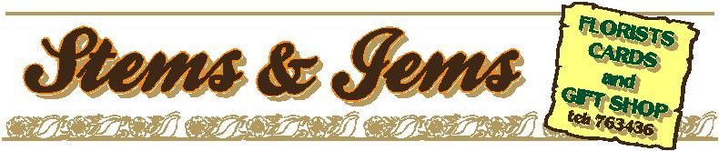
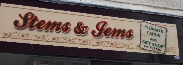
Posted by Neil Davey on 31 May 2008 at 11:10Hi all, here’s one I did last week. Signwritten with airbrushed detail on Alupanel finished in peach gloss.
Not great photos because the heavens opened as I fitted the sign, got soaked but customer loved it and even paid straight away, which makes it all worth it!!
Thought I’d post my initial design too.
Neil
Attachments:
 Neil Davey replied 17 years, 6 months ago 5 Members · 11 Replies
 -
11 Replies
-

that looks good Neil how long did it take you? did you do all the work off site then put it up ?
Lynn
-

You’re a talented man Neil, well done. What do you do to the alupanel to prepare it for paint? Just a light scuff with a brillo first then undercoat?
-

Lynn, sign took just over 6 hours spread over 3 days to allow for drying time and painted offsite in my dry workshop!!!
Hi Shane, yes scotchbrite first on the matt side of the panel and 1 coat of gloss using a 4" foam roller was enough but I would’ve gone for 2 coats if needed.
-

Neil……i just want to give my honest opinion…
I have no experience of brushwork whatsoever and I’ve looked closely at the the detail you have put into the sign…so I am speaking solely as a vinyl sign maker
The outline and inline highlights look great……the dropped shadow effect looks brilliant……I’ve got no idea how difficult these are to produce but I can only imagine they take a lot of skill.
I’m just not to keen on the the finished sign…..I’m finding the font a bit difficult to read and the layout just looks a bit busy…..the colour scheme seems a bit bland for me also.
Appologies for the negative response but as i say it’s just my opinion………..obviously all subjective…….Picasso was a talented bloke but I haven’t seen a painting I like by him 😛
-
Hi Glenn, thanks for the comments, the photos really don’t do the sign justice.
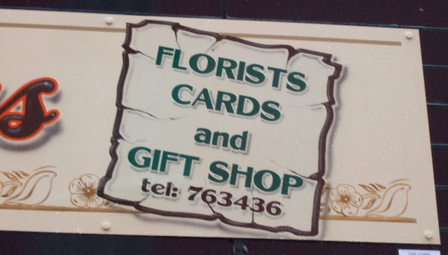
Also, the background colour and content were requested by the customer, I would have at least left the phone number off. But everything else had to be included.
I think the layout works well because the norm would be to just have the name and then the secondary copy underneath that. I always try and bring a bit of life to the work and I think the panel works quite well with the airbrushed shadow to lift it off the background.
Script fonts are always a little tricky but this shop is in a pedestrianized area and the passer by has plenty of time to figure it out.
The building is late 19th century and is in an old market town so I went for 1 shot brown, orange, green and tan as I didn’t want a gaudy or too modern look.
With all that said, I always view the finished job and try to look for ways I could improve and take these onto the next sign. Great thing about this profession is you never stop learning 😀
-
quote Neil Davey:With all that said, I always view the finished job and try to look for ways I could improve and take these onto the next sign. Great thing about this profession is you never stop learning 😀
The worst thing for me is when a finished sign lies about in the workshop for too long……………..I always look at them and see something I wish I had done differently………..even when I put a tweak into practice on the next sign I’ll still find something I’m not happy with……..probably says more about me than I’d like to admit 😳
-

I like it a lot.
It’s better than 90% of everything I see on forums.
(Even with the "Tel.")
BUT
There are two things about it which really bug me.
#1- Shouldn’t it be spelled "Gems"? Or is the woman’s name Jemima or something? I have never seen it spelled with a J. I know that script is harder to read, but I can read it OK and have even used it myself.
But I know that is a J not a G.
#2- I try to remove the "connector" stroke at the beginnings of script letters when they are not connected to another letter. (like the t in Stems and the e in Jems) Makes for a smoother transition. I didn’t always remove them in the past until someone pointed it out to me and I agreed with them.
Sorry for being nitpicky!
Love….Jill -
Thanks Jill, I had to make a mental note straight away not to write ‘Gems’. I don’t know why they spelled it that way!!!
I’ll take on board what you say about the tails and take them out next time. 😀
-
quote Neil Davey:Thanks Jill, I had to make a mental note straight away not to write ‘Gems’. I don’t know why they spelled it that way!!!
I’ll take on board what you say about the tails and take them out next time. 😀
Jems is a ‘craft’ term usually meaning or referring to hand made jewelry. Stems of course means flowers 😉
-
Neil, that would have driven me bonkers!
:lol1:
Love….Jill -
Your right Shane ‘Stems’ is the florist connection but I’ll have to find out why Jems for Jill.
All I was concentrating on at the time was finishing the sign for them……they’d been let down apparently by a few other companies who failed to get back to them or go and see them 😕
I was contacted on the Monday, quoted and provided a design by the evening,given the go ahead Tuesday PM and completed and fitted the sign Friday PM as promised. 😀

Log in to reply.